Wisp — Brand Identity Design

José Tovar


Wisp — Brand Identity Design
Wisp needed to make digital payments feel faster, safer and more human, without adding complexity or relying on the cold, corporate language common in finance.
We created a confident yet approachable identity that brings clarity to every interaction. A bold colour system, expressive typography and simple messaging position Wisp as a seamless financial app built to make paying, sending and managing money feel effortless.
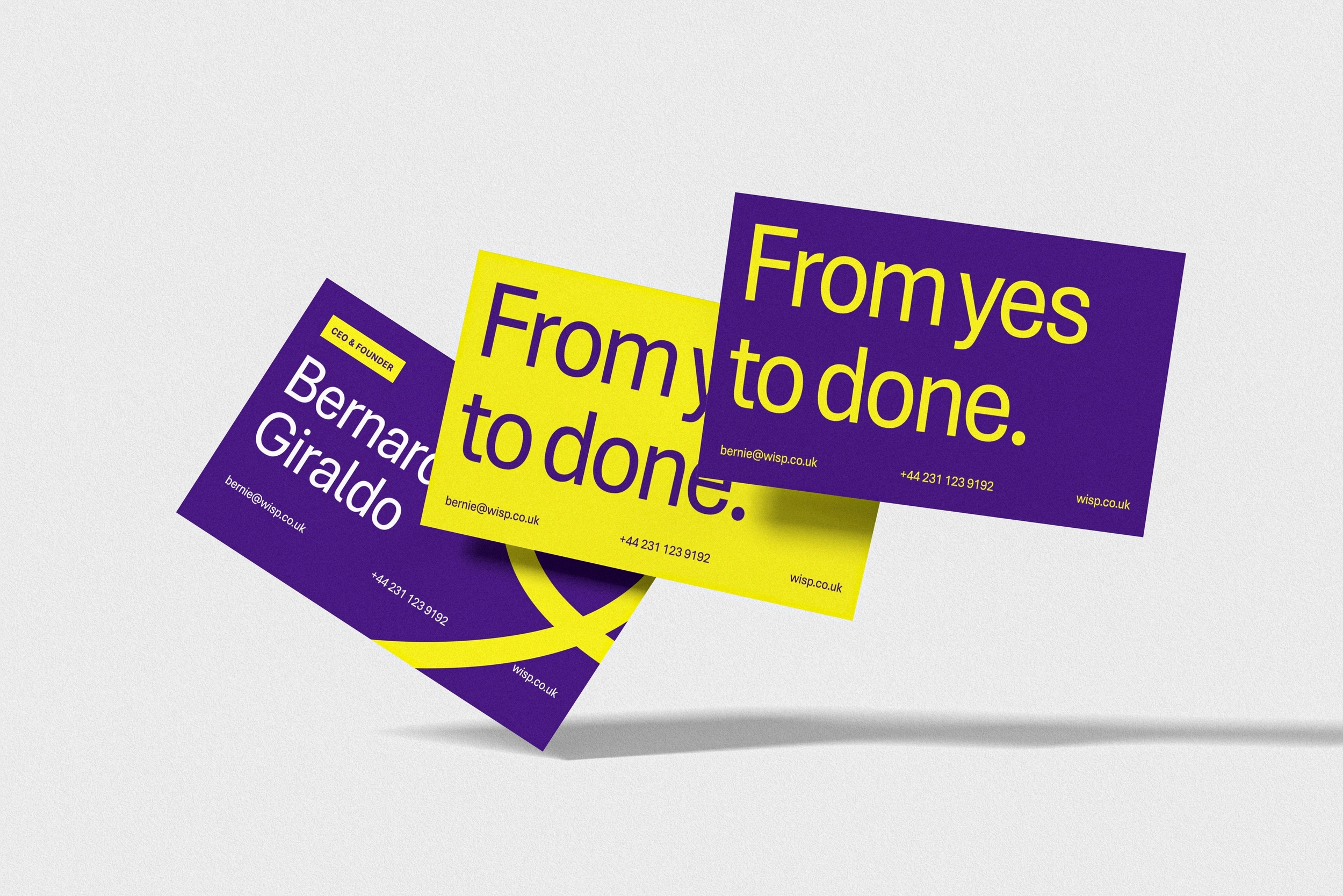
Business Cards
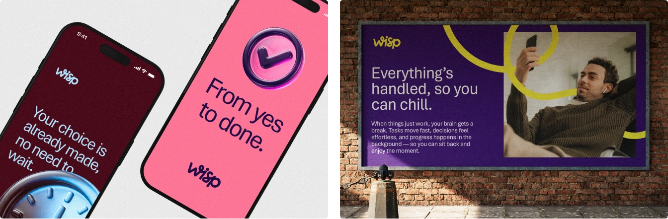
App & Poster
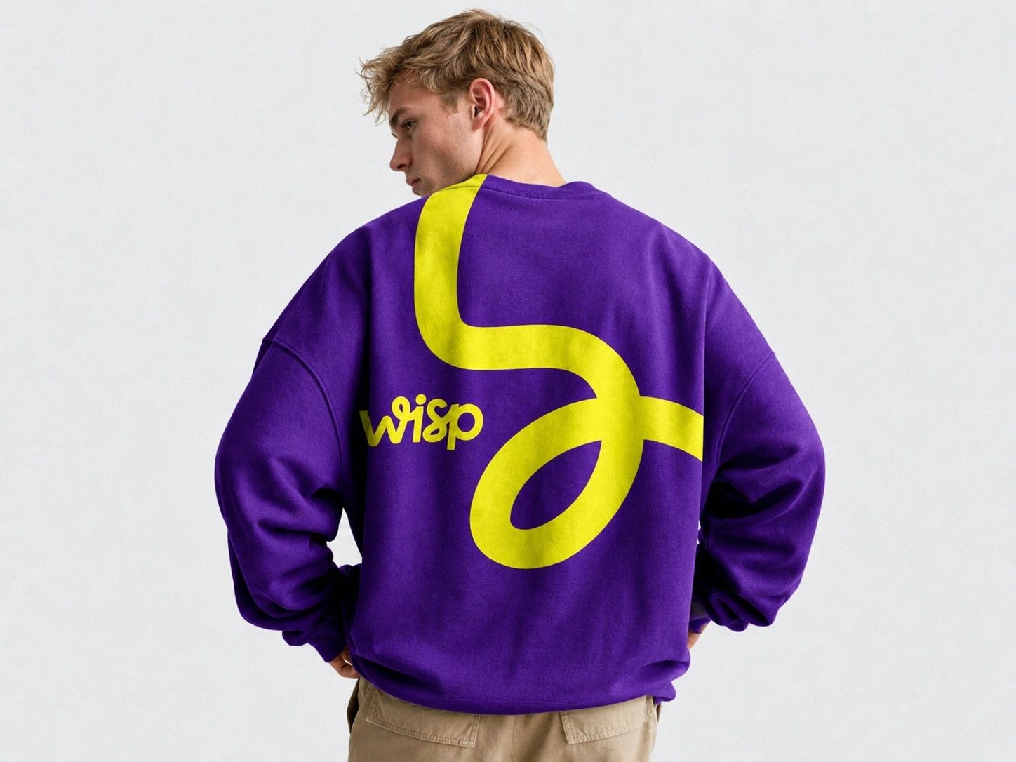
Sweater
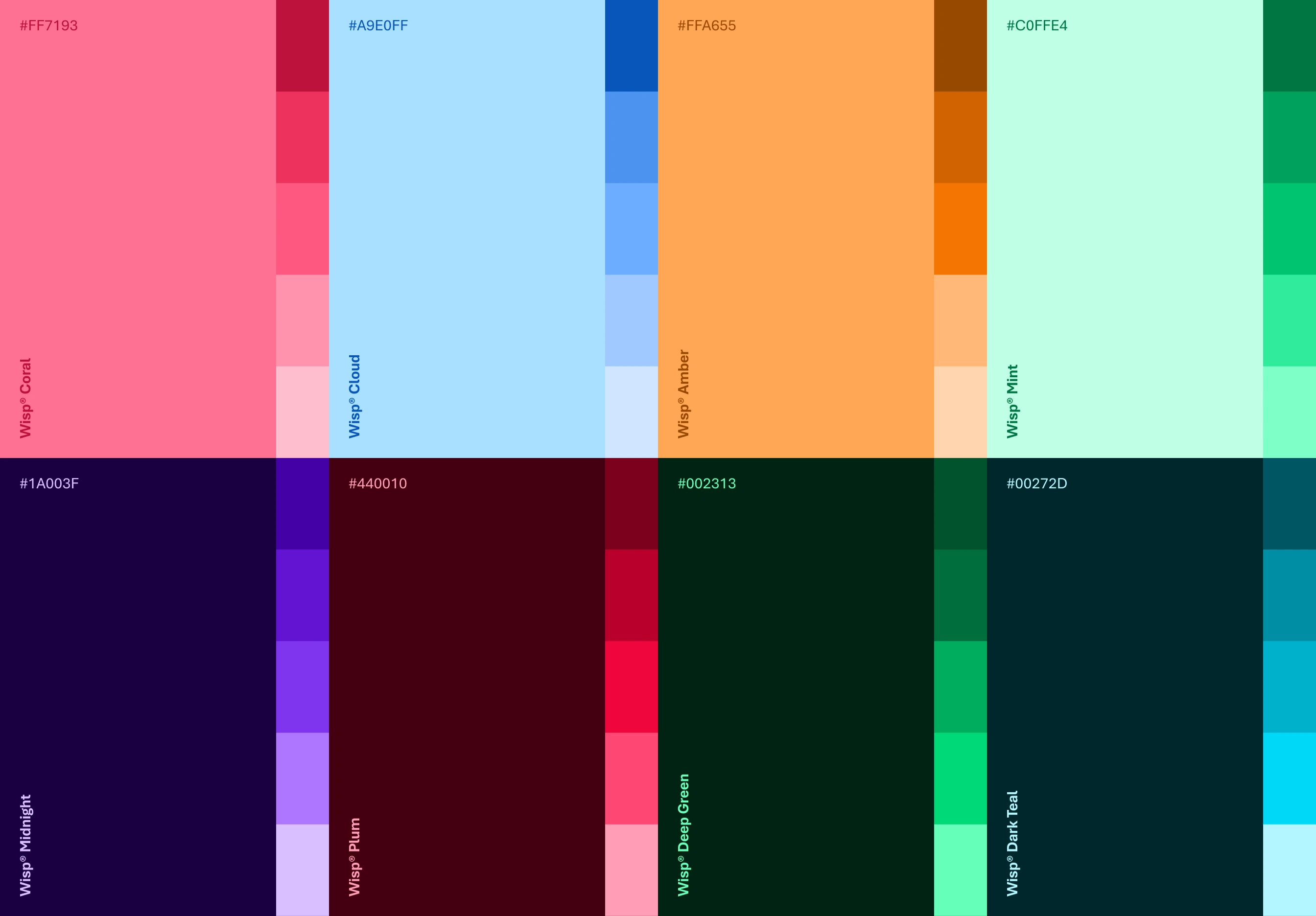
Secondary Colour Palette (Tone Axes)
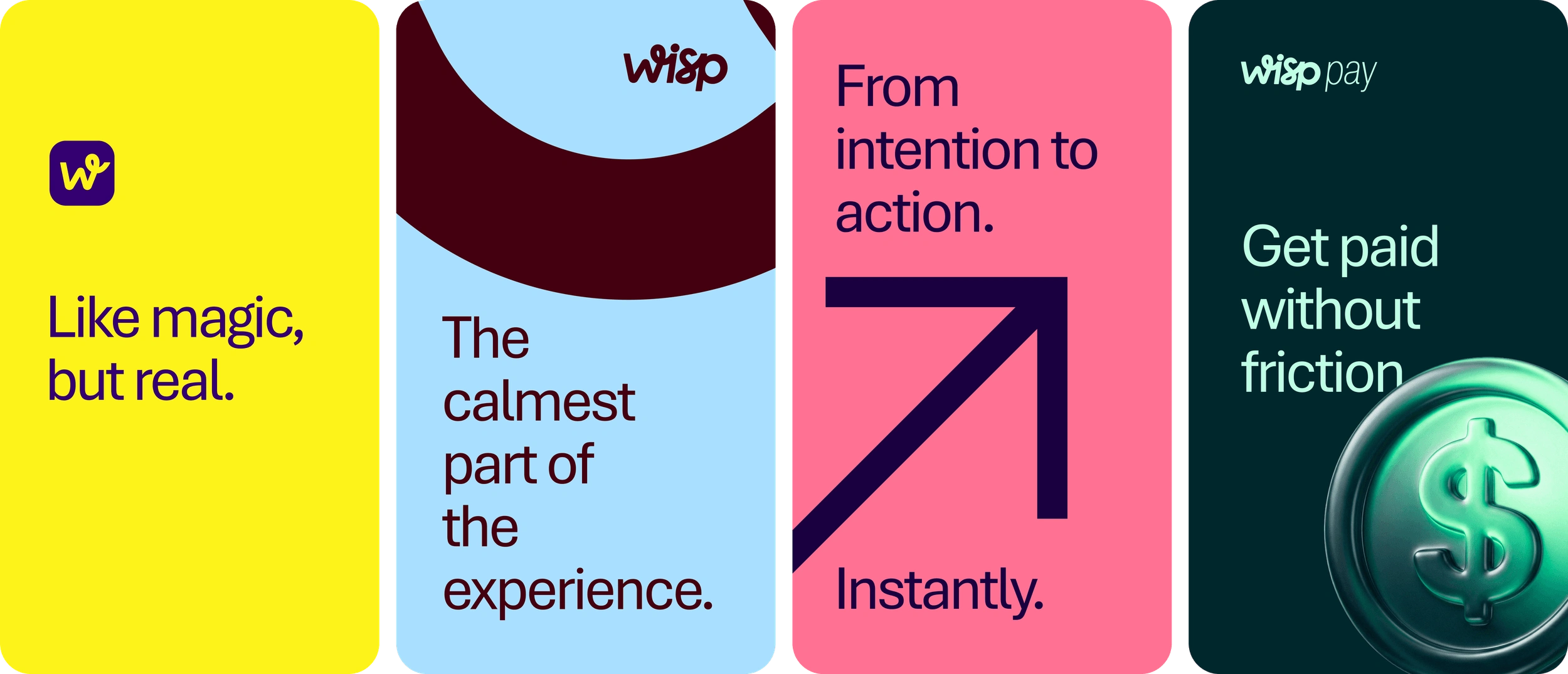
Stories
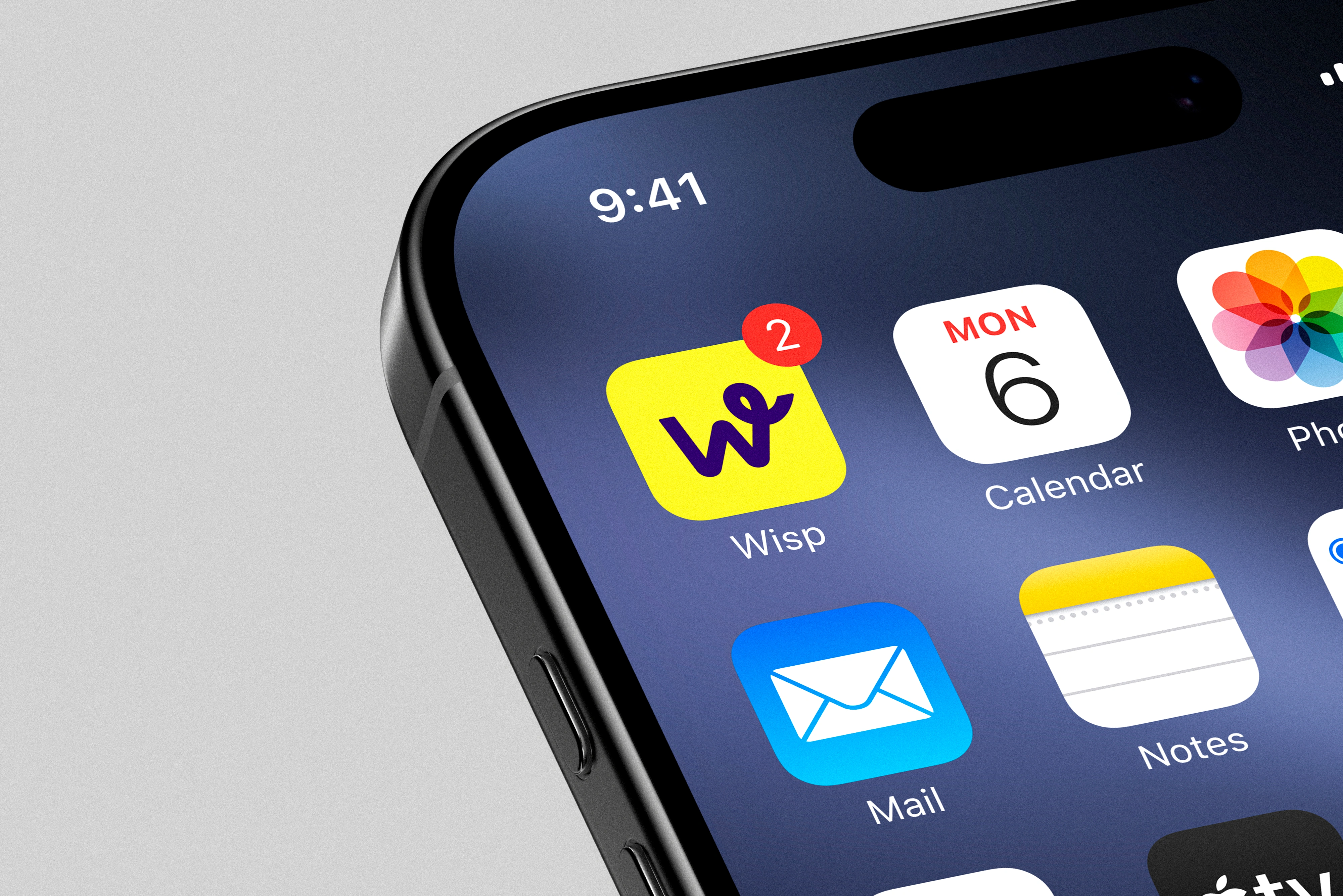
App Icon
Let's design a brand that matters together.
Like this project
Posted Jul 24, 2026
A bold, approachable identity that makes digital payments feel faster, safer and effortless through expressive colour, typography and clear messaging.