The network for creativity
Join 1.25M professional creatives like you
Connect with clients, get discovered, and run your business 100% commission-free
Creatives on Contra have earned over $150M and we are just getting started
Back to feedPost
Taste Test

I’ve been exploring motion and design for Gambo Café's hero: a danish pastry / colombian beans café in Copenhagen... and I ended up liking both concepts for completely different reasons. Now I genuinely can’t decide which direction feels stronger!
Which one would you choose, 1 or 2? Feedback is always appreciated!

27 voted
23%
89 voted
77%
116 votes
Closed

I'm a sucker for big typography, so I'll always vote for it ✌️
I love it too! I think that's kinda why I still preserved some of it on the Image Driven Concept. Thanks for your feedback @Lubos Belak

this was such a tough one, but i went with image driven!
I know! It's tough, I love that one, thanks for your feedback!

Amazing design, Jose

Typography driven for me. Great use of hierarchy, great spacing, and it balances super well with the image ratio.
That's great, detailed feedback. Thanks for your input, Tiago!

Image driven is the way to go for me, it suits the caffe industry. Nice work on both.
Thank you Mario! I like that one too, something about the image draws me to it.

I’ll always go for an image-driven layout. It looks more beautiful and visually engaging compared to a typography-driven design.
Thank you for your feedback, yeah sometimes images just really catch your eye!

GOing with image driven

I’d choose 2; the bold typography feels more distinctive, editorial, and memorable for the brand.
Interesting! Great insight here, thank you for your feedback.

Big typography looks so clean 🔥
It does doesn't it? People seem to be vibing with the image-driven one though!

This is such a brilliant design!

Image driven. love what you did with the "else" 🫡
Yes! Someone noticed. Thank you for your feedback!

images provides better context about the product

Image for me please


Both directions feel like they'd work, hard choice, but 2 works better.
This is awesome feedback, especially coming from you, love the work!


Image driven is what I will go for

Ohh it's tough both

Blending a danish pastry with colombian beans in one hero already gives you two really different stories to tell. My gut says typography driven fits a place leaning into that contrast, since words can hold the tension between two origins better than one image trying to show...
I agree, definitely the origins are different but they don't need to be separated! They go really well together and I like to see it as a whole, thank you so much for your insight and feedback. It's actually a concept of mine I've had for a few years and decided to turn it into a Framer template, currently WIP!

image driven envokes that emotions , make sense

since its a cafe and people are more interested in the vibe, the look of the place, its better to go with image driven design
Thanks for your input! I think the vibe indeed is important!

Image says more than text.

The "Image Drive" version is clearly telling the story in just 30 sec - what's the brand, what's the niche, what does the brand sell that the "Text First" version is failing to deliver...!

Image driven tells the story from the first second. But I love both options, they are very smooth, clean and professional. Goat from me

I like the second one.

the image Driven to me look better. i think its because the image gives alot more detail than the typography. tho both looks amazing

Amazing!

Team 1! The imagery conveys the store's vibe and interior aesthetic much better for a cafe concept.
Makes sense! The coziness of cafes and general architecture is what made me fall in love with Copenhagen so I wanted to feature that, thank you for your feedback.

I think an image-driven approach sells the café better than typography, so if you intend to add value to a business, I would go with that. But if you care about the design of the typography, that is the other way to go.

Image Driven 👍

typography driven

Awesome 🔥
The network for creativity
Join 1.25M professional creatives like you
Connect with clients, get discovered, and run your business 100% commission-free
Creatives on Contra have earned over $150M and we are just getting started





Related posts

Light or refined - which E-Bike product breakdown section design would you choose?
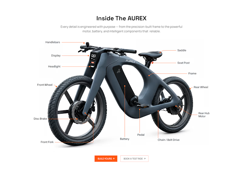
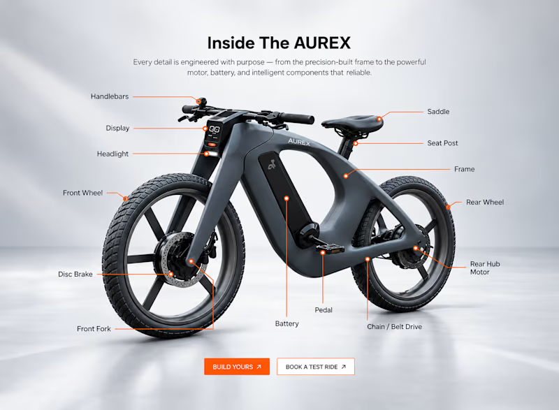
Two concepts for the same AUREX e-bike. Same product, same components, two different presentation styles:
A - Soft Studio: subtle gray depth, larger product focus, and a more premium visual feel.
B - Clean Minimal: bright white background, tighter spacing, and a more technical editorial layout.
Which direction feels stronger for a premium e-bike brand and why?

5 voted
31%
11 voted
69%
16 votes
Closed

A feels more premium to me. The soft gray depth and bigger product focus make the bike feel like something special. B is great for specs, but A sells the feeling

Meridian is an HTML or React template with AI-ready docs, contour maps drawn in the browser and a real route on top.
Preview it live to see the animations.
Starting at $29
https://no-code.supply/templates/meridian
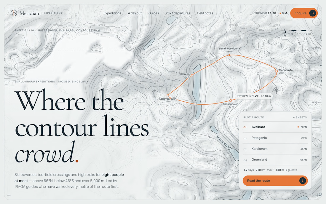

The contour-map rendering in the browser is a nice touch, most template sites just ship a static hero image. Is the route data generated per session or a fixed dataset baked into the template?

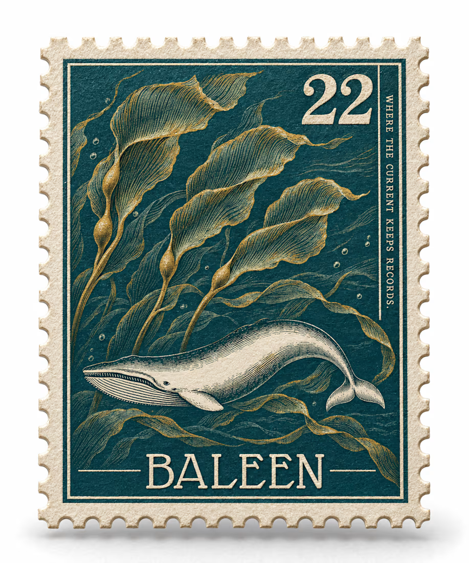
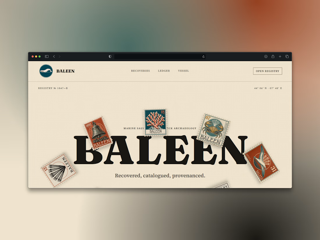
What if a salvage company's brand looked like it belonged in a stamp album, not a treasure map?
Introducing BALEEN — marine salvage & shipwreck archaeology, built on vintage natural-history stamp DNA. Every object recovered, catalogued, provenanced.
Website here