The network for creativity
Join 1.25M professional creatives like you
Connect with clients, get discovered, and run your business 100% commission-free
Creatives on Contra have earned over $150M and we are just getting started
Back to feedPost
Taste Test

Light or refined - which E-Bike product breakdown section design would you choose?
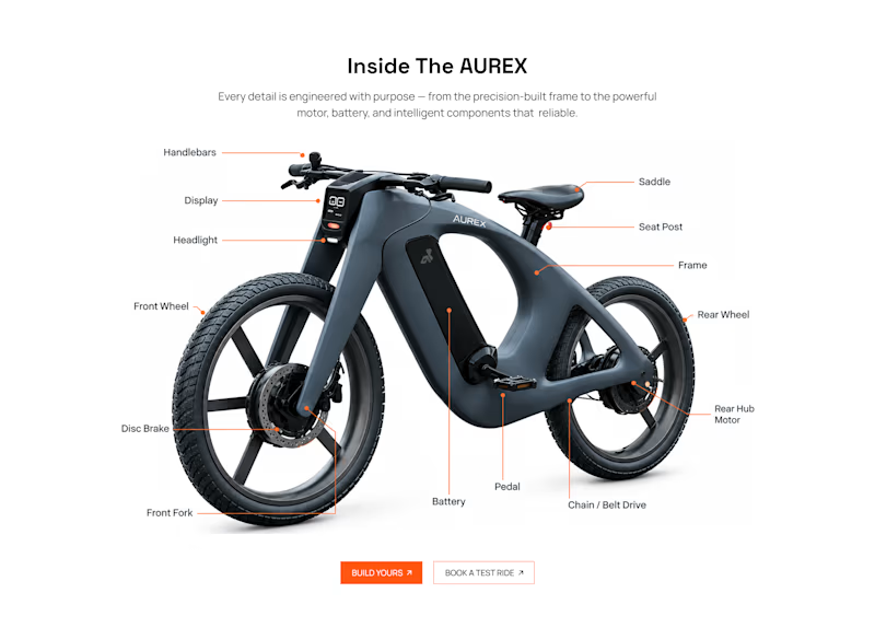
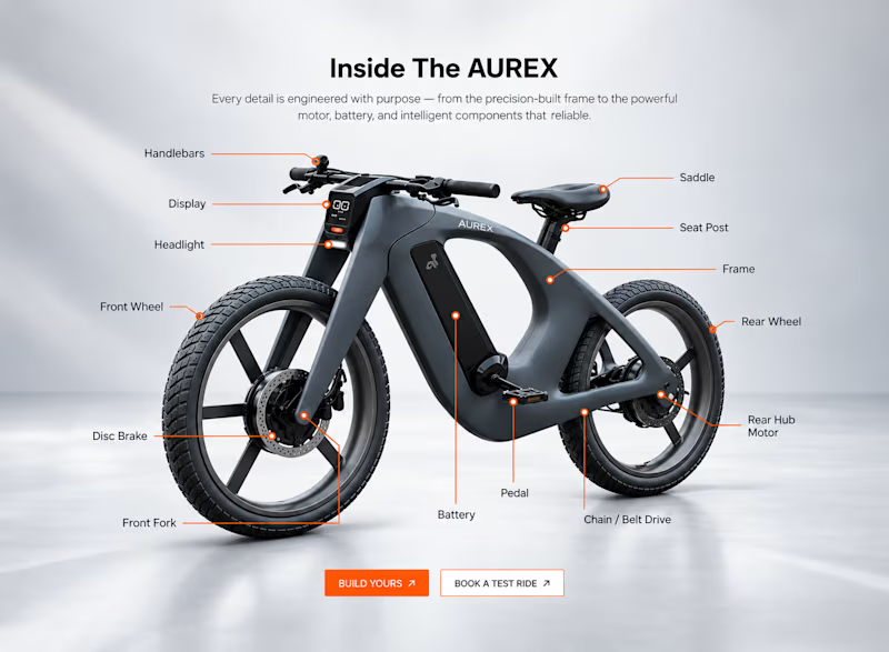
Two concepts for the same AUREX e-bike. Same product, same components, two different presentation styles:
A - Soft Studio: subtle gray depth, larger product focus, and a more premium visual feel.
B - Clean Minimal: bright white background, tighter spacing, and a more technical editorial layout.
Which direction feels stronger for a premium e-bike brand and why?


5 voted
31%
11 voted
69%
16 votes
Closed

option 2

Option A - Soft Studio is feels stronger.


Option 2 for me. The soft gray depth gives the bike more presence while keeping the component callouts useful. It feels more like a product showcase than a spec sheet.

Option 2 feels more polished and gives the product a stronger visual presence. 🔥

Option 2 is the hero!!

A feels more premium to me. The soft gray depth and bigger product focus make the bike feel like something special. B is great for specs, but A sells the feeling

For a premium e-bike brand, A — Soft Studio feels stronger. The subtle depth and larger product focus give the bike more presence and create a more refined, high-end feel while keeping the details easy to explore.
The network for creativity
Join 1.25M professional creatives like you
Connect with clients, get discovered, and run your business 100% commission-free
Creatives on Contra have earned over $150M and we are just getting started











Related posts

Which colour palette would you choose for the banner design for a domain business? 🔥 Fiery or 🧊 Frosty?
20 voted
36%
35 voted
64%
55 votes
Closed
Frosty seems really cool for me!!


Gorgeous 😍

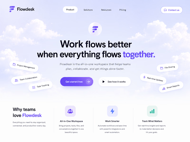
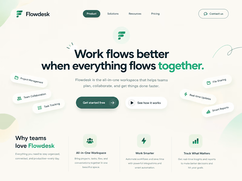
One SaaS header, two personalities.
Color changes how a product feels before anyone reads a word.
6 voted
86%
1 voted
14%
7 votes
Closed

Modern colors is absolutely stunning🔥🔥🔥
great job Amina🎉🎉🎉