The network for creativity
Join 1.25M professional creatives like you
Connect with clients, get discovered, and run your business 100% commission-free
Creatives on Contra have earned over $150M and we are just getting started
Back to feedPost
Taste Test

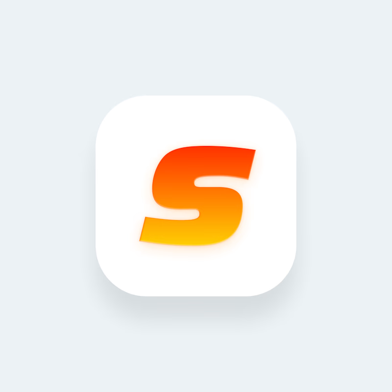
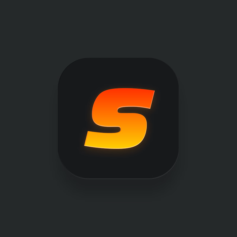

Love the visual for the logo. well done

Dark one for me. The details really pop against it

Dark makes the logo pop out more

Nice!

Dark, the orange gradient glows more on it. iOS lets you ship both now, light as the default and dark for dark mode. Have you checked the tinted version yet? A gradient S can go flat once it's reduced to a single colour.
The network for creativity
Join 1.25M professional creatives like you
Connect with clients, get discovered, and run your business 100% commission-free
Creatives on Contra have earned over $150M and we are just getting started



Related posts


We are testing two ways to browse a large template library.
Load More
Users initially see 9 cards. After clicking the button, 9 more are added while the previous results remain visible. Browsing feels continuous, but the page gradually becomes longer.
Pagination
The catalog is divided into numbered groups. When users select the next page, the current 9 cards are replaced with a new set. They can jump to a specific part of the catalog and easily return to where they were.
Load More creates a smoother browsing experience, while pagination offers greater control.
Which option would you choose for a template library?

17 voted
68%
8 voted
32%
25 votes
Closed

Load more

Live on Play Store. We made the launch video.
Motion design to show the screens, plus a short explainer so you get what the app does in a few seconds.
Kept it simple on purpose. Screens only move where it helps you follow the product.
Watch it with zero context and tell me what you'd cut.

Amazing

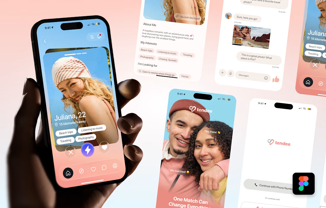
Tendee - Dating App UI UX Design
A mobile app UI design showcase focused on discovery, profiles, matching and conversation.
The visual challenge was to bring profile content, interest tags, primary actions and messaging into a consistent mobile experience. The design uses a soft lavender and coral palette, clear typography, rounded cards and recognizable navigation.
The selected mockup presents a profile discovery screen, detailed profile information, chat, onboarding and sign-in views. These screens demonstrate visual hierarchy, consistent interface styling and attention to mobile interactions.
Personal portfolio showcase. Project cost is an illustrative quote for comparable design work, not a past client payment. The date marks this showcase's preparation in October 2026; duration is an estimated production timeframe.


Love the colors!