The network for creativity
Join 1.25M professional creatives like you
Connect with clients, get discovered, and run your business 100% commission-free
Creatives on Contra have earned over $150M and we are just getting started
Back to feedPost
Taste Test

Two ad designs, same offer, very different vibes. Which one would make you stop scrolling and tap “Start Today”?
Drop your pick below and tell me why. I’m collecting honest feedback on layout, colors, and what feels most clickable.
Option A: bold, dark gradient with a glowing neon feel.
Option B: clean, bright, and playful with a white background.




4 votes
Ends in 1d
The network for creativity
Join 1.25M professional creatives like you
Connect with clients, get discovered, and run your business 100% commission-free
Creatives on Contra have earned over $150M and we are just getting started
Related posts

Two warm ups today, both might become full case studies:
Parlata: an audio-postcard service that records and archives local dialects. Every recording becomes a small printed card with a QR link.
MODULO: an Industrial IoT brand. Olive, navy, one wobbly blob.
One is warm and human. One is technical and playful. Which would you want to see go all the way?
31 voted
63%
18 voted
37%
49 votes
Closed

Love it


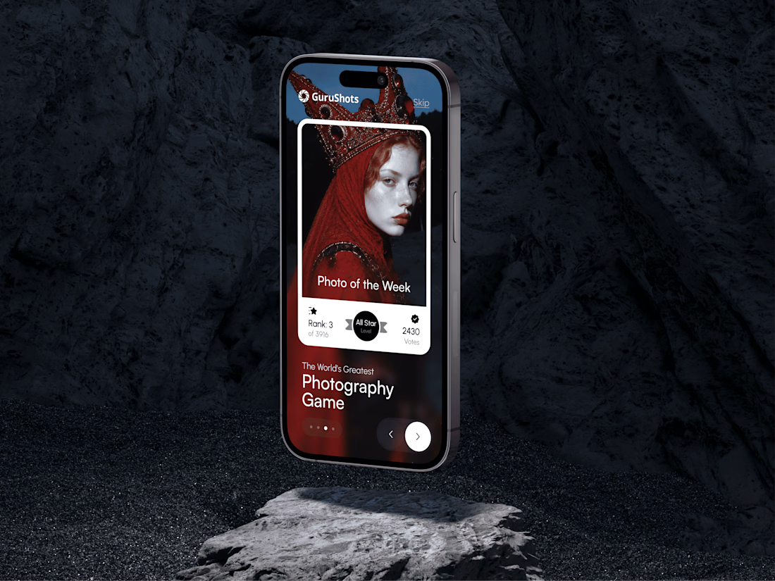
A new day, a new design to share! 📸
This time it is a photography challenge app that brings creativity and competition together through contests, voting, and gamification. What do you think of this one? ✨




Can looking at something change what you see?
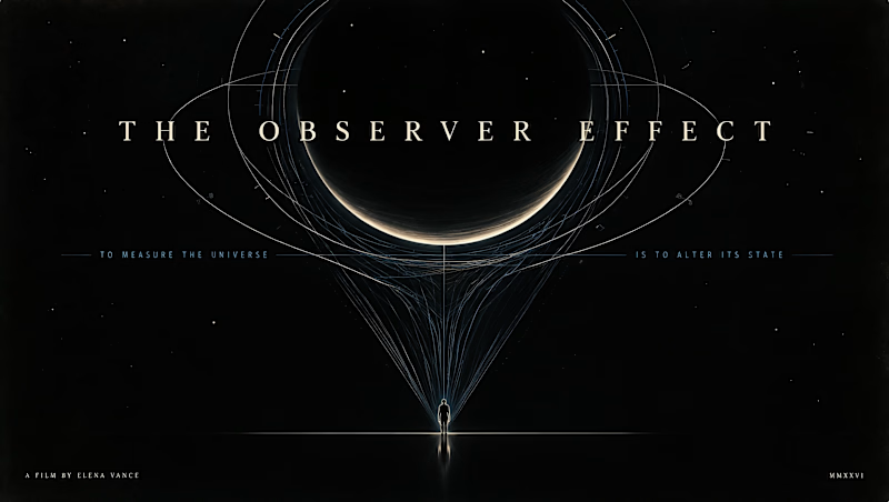
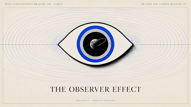
I wanted to put Canva Craft to test with an idea I've been sitting with lately: the Observer Effect.
It's a concept that got me thinking about the relationship between observation and reality, and how our understanding of what we see can get a little philosophical (and existential) very quickly:)
I gave Craft two different directions to interpret the same idea.
A: The Cosmic Observer takes a human perspective against the scale of the universe.
B: The Universe Looking Back turns the gaze itself into the subject, blurring the line between the observer and the observed.
I wanted to see how Craft would translate something this abstract into a poster and how differently it would approach the brief.
Which direction would you choose, A or B?

14 voted
52%
13 voted
48%
27 votes
Closed

This is so cool!