
Results-Driven Web & Product Design | Framer & Figma Expert


Results-Driven Web & Product Design | Framer & Figma Expert


0→1 Product Designer & No-Code Builder
0→1 Product Designer & No-Code Builder

We spend so much time in front of a screen (at least me) that sometimes it feels like floating in space, sealed off, weightless, untethered from anything real.
Serene is a step back.
A sphere breathes on the screen, slowly in, slowly out, not asking you to follow, just showing you what calm looks like. You mix the sounds yourself, rain with wind, forest with ocean, whatever pulls you closest to somewhere real. The kind of quiet that used to just exist before we filled every moment with noise.
It does not fix the fact that you have been sitting at a desk for six hours. But for a few minutes, it reminds your body that it already knows how to rest.
Built in Figma, brought to life with Figma Make.
🔊 Sound on.
🎨 Figma file: Serene Design
(https://www.figma.com/design/WiiNbTosedyFA9Wirwidv7/Serene?node-id=0-1&t=ZumGiCFZ90ihRdd6-1)🔗 Live project: Serene App
(https://mentor-rock-20170146.figma.site)🌐 Community file: Serene Remix
(https://www.figma.com/community/file/1649519163134663850/serene)🐦 Social sharing: X post
(https://x.com/LorantTrellay/status/2067699261005840750?s=20)
19
39
1.4K


Your Fractional Product Designer

I realize that no-code tools like Lovable are excellent for building small projects. So I decided to have fun and made a test call. Are you kidding me? That measures partners' mental health.
Some couples didn't want to take the test 😂 Would you like to use my prompt and check out the results?
1
13
424




Design Partner

Web designer (Framer) · 4y UX/UI, 10y marketing
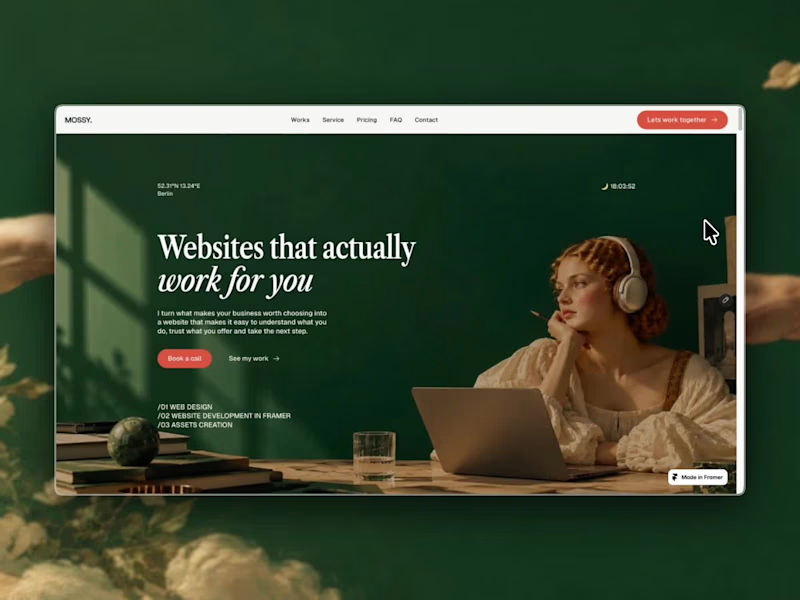
Mossy was long overdue for a little makeover. 🌿
I've been obsessed with Renaissance visuals meeting modern tech for a while, and finally found a way to bring that contrast into my own website.
A little old-world charm, a little modern thinking. Pretty much how I approach web design, too. So here it is: Mossy, reimagined.
Bookings for 2027 are open. Let's make something good together 🚀
1
163
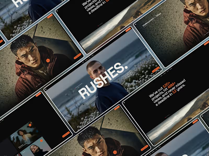
A little win for RUSHES. 🧡
Last month, my Framer template RUSHES. landed at #3 in the Best Templates ranking in the Portfolio category on Framer Marketplace.
Designed for video production studios, filmmakers, and creative teams who want their work to take center stage.
Always nice to see your work getting noticed (and remixed) 😉
1
162
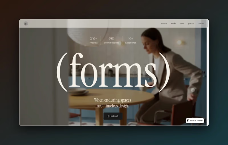
Forms is live — and it’s free.
An editorial Framer template I designed for interior designers, interior architects & creative studios.
Bold typography, immersive project pages, CMS-powered works + journal, and plenty of space for the work to speak for itself.
Built in Framer. Free to remix. ✦
https://framer.link/MG0s5kl
Oh, and if you need a hand personalising it, just reach out — I’m only a message away :)
5
9
577
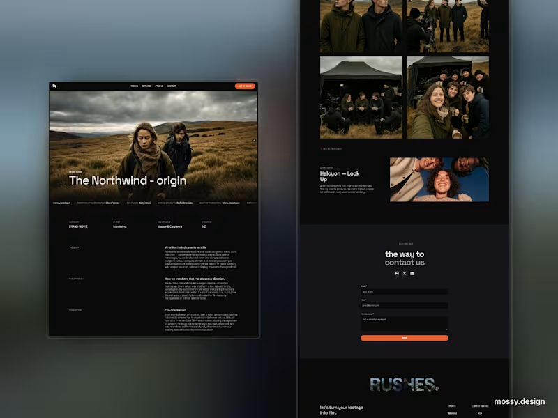
More on my Framer template: RUSHES.
Preview of the project page — balanced between text and visuals, with finished shots sitting next to behind-the-scenes moments to tell the fuller story. What I especially like is the credits line — almost like the end-credits of a film.
You can grab RUSHES. here: https://contra.com/products/rNNViTS7-rushes-framer-web-template-for-video-production-studios
2
311

Product & Brand Designer crafting impactful solutions
- 5.0
- Rating
- 10
- Followers
Product & Brand Designer crafting impactful solutions


UX/UI designer and AI creative for founders


