ManAray - Beauty Salon Scheduling App Website (Persian)
Nima Zaeimzadeh
Welcome to my new design for ManAray - Beauty Salon Scheduling App Website
1. Introduction
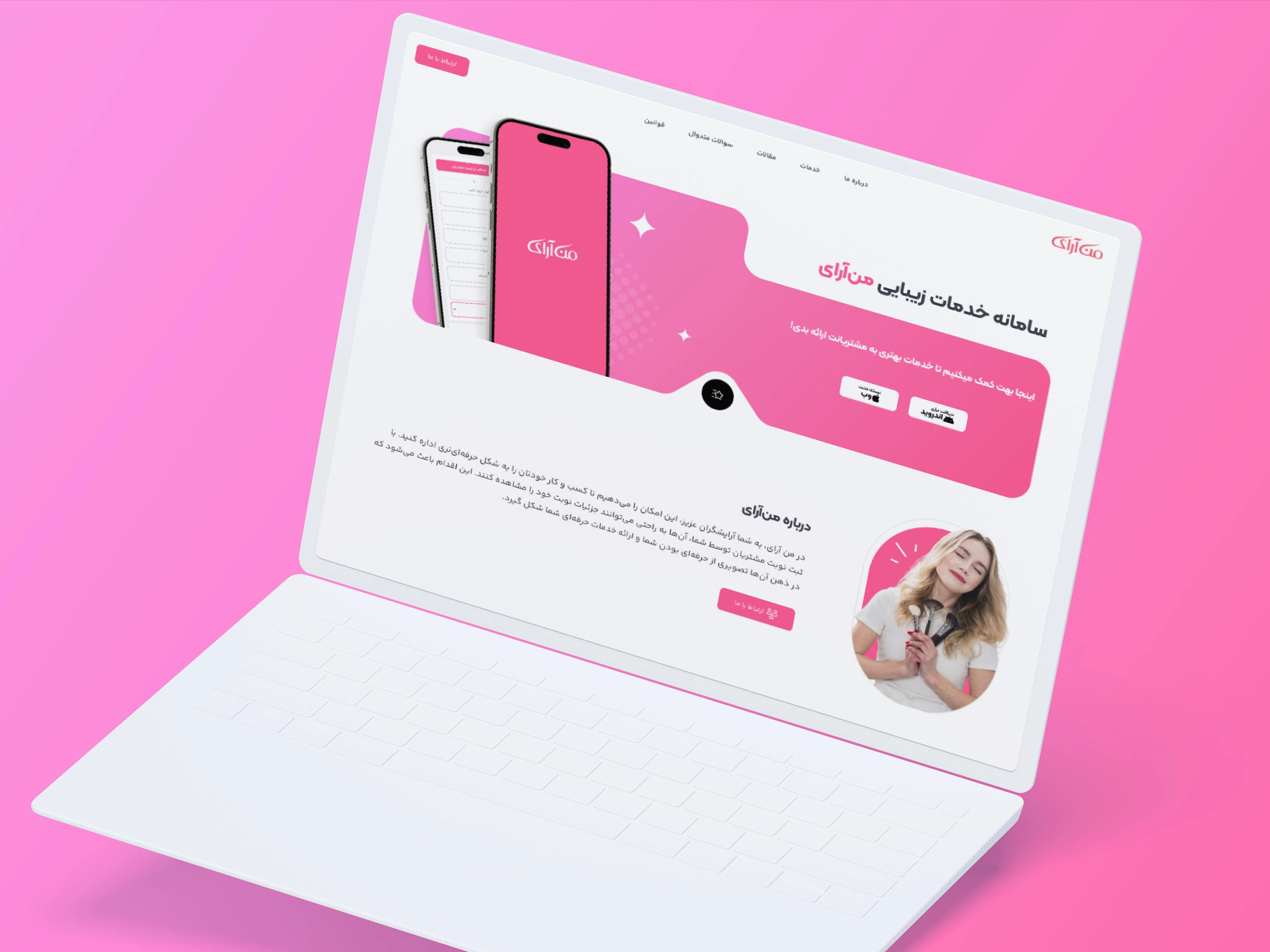
This project involved designing a website for an application that helps beauty salons schedule customers efficiently. The goal was to create a modern, minimalistic, and feminine design that resonates with the target audience while maintaining a seamless user experience. The entire website is in Persian, requiring careful consideration of RTL text alignment and typography choices.
2. Project Objective
The main objective was to design a website that effectively showcases the app's features, encourages downloads for both iOS and Android, and aligns visually with the aesthetics of beauty salons. The design needed to be elegant, user-friendly, and visually appealing to the target audience.
3. Design Concept and Visual Theme
The design concept focused on creating a modern, minimalistic, and feminine look. To achieve this, a pink and white color palette was chosen, reflecting the elegance and softness associated with beauty salons. The typography was selected to ensure readability and harmony with Persian text, maintaining a consistent and sophisticated style across all pages.
4. Website Structure and Layout
The website is structured to provide a seamless user journey while effectively showcasing the app's features. The sections are as follows:
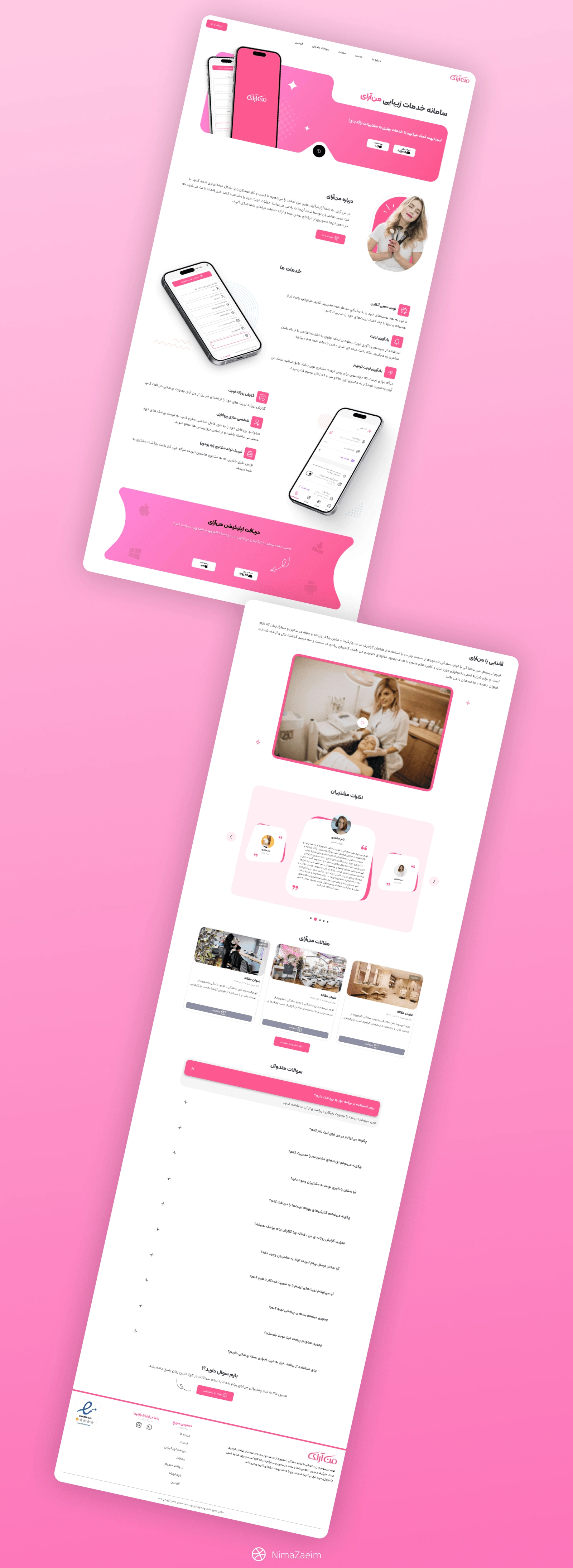
Hero Section: Opens with a banner displaying two mockups of the application and prominent CTAs for downloading the app on iOS and Android. This section immediately captures users' attention and directs them to the app stores.
About Section: A brief introduction explaining the app’s purpose and benefits.
Features Section: Highlights the app's features, accompanied by two additional mockups to provide visual context.
Download Banner: Reiterates the download CTAs to maintain user engagement and increase conversion rates.
Detailed About Us Section: Expands on the brand’s story and mission, helping users connect with the brand on a deeper level.
Testimonials: Showcases positive user feedback to build trust and credibility.
Blogs Section: A dynamic blog section managed through a fully functional CMS, providing valuable content and boosting SEO.
FAQ Section: Addresses common questions with a contact support CTA for further assistance.
Footer: Includes essential navigation links, social media icons, and contact information.
5. Additional Pages and Functionalities
The website includes several additional pages to enhance user engagement and provide comprehensive information:
Blogs Overview Page: Displays all blog posts in an organized layout, managed through a dynamic CMS.
Privacy and Security Page: Details the app's data protection policies, enhancing user trust.
Contact Us Page: Features a contact form alongside a mockup, making it easy for users to reach out for support or inquiries.
6. Challenges Faced
Several challenges were encountered during the design process:
Maintaining Visual Consistency: Ensuring a modern, minimalistic, and feminine design while maintaining consistency across all pages.
App Download Experience: Designing intuitive and appealing CTAs for both iOS and Android platforms.
RTL Text Alignment: Aligning Persian text while preserving visual harmony and readability.
Balancing Visuals and Content: Showcasing multiple mockups without overwhelming users with text-heavy sections.
7. Solutions and Design Decisions
To address the challenges, the following solutions were implemented:
A consistent pink and white color palette was maintained throughout the website to reinforce the feminine and elegant theme.
Download CTAs were strategically placed in prominent sections to enhance visibility and conversion rates.
RTL text alignment was managed by carefully selecting typography that maintains readability in Persian.
Visual hierarchy was established by balancing text and images, ensuring a clean and minimalistic look.
8. User Experience and Interactions
The website was designed with a user-centric approach to enhance engagement and usability:
Minimalistic Layouts: Ensured easy navigation and clear focus on essential information.
Interactive Mockups: Provided a realistic preview of the app’s functionality.
Micro-Interactions: Added subtle animations for a dynamic and engaging user experience.
Responsive Design: Optimized for seamless viewing on desktop, tablet, and mobile devices.
9. Final Outcome
The final design successfully achieved the goal of creating a modern, minimalistic, and feminine website that resonates with beauty salon clients. The strategically placed download CTAs encourage users to download the app, while the elegant visuals and organized layout provide a delightful user experience. The Persian text is displayed clearly, maintaining harmony with the overall design.
10. Conclusion and Reflection
This project demonstrates how thoughtful design and strategic layout decisions can effectively engage users and drive app downloads. By maintaining a consistent visual theme, ensuring usability in Persian, and balancing visuals with content, the website achieves a modern and feminine look tailored to beauty salons. This project not only enhanced my design skills but also provided valuable insights into designing for RTL languages and app-focused websites.
Like this project
Posted Feb 14, 2025
ManAray Beauty Salon Scheduling App & Website (Persian): Elegant UI/UX with intuitive booking, seamless navigation & vibrant design to boost appointments.
Likes
1
Views
29