Messaging App / Mobile / Light & Dark Mode - UI/UX Design
Nima Zaeimzadeh
The Design
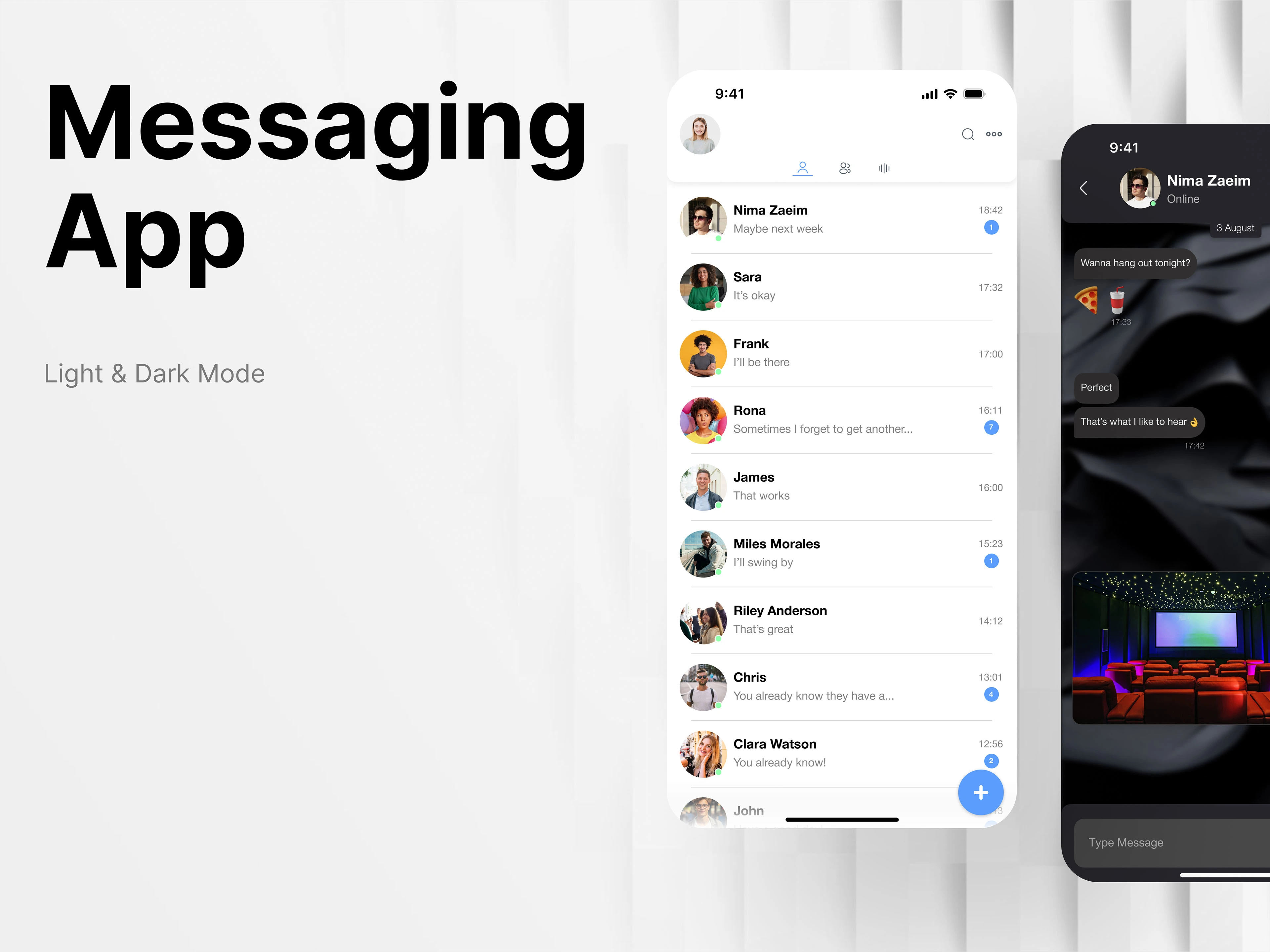
This messaging app boasts a sleek, minimalist design that prioritizes user experience and simplicity. Clean lines, ample white space, and intuitive navigation ensure a seamless interaction. Each section is thoughtfully arranged to provide a focused and clutter-free environment. The overall aesthetic combines functionality with modern elegance, enhancing usability without compromising on style.
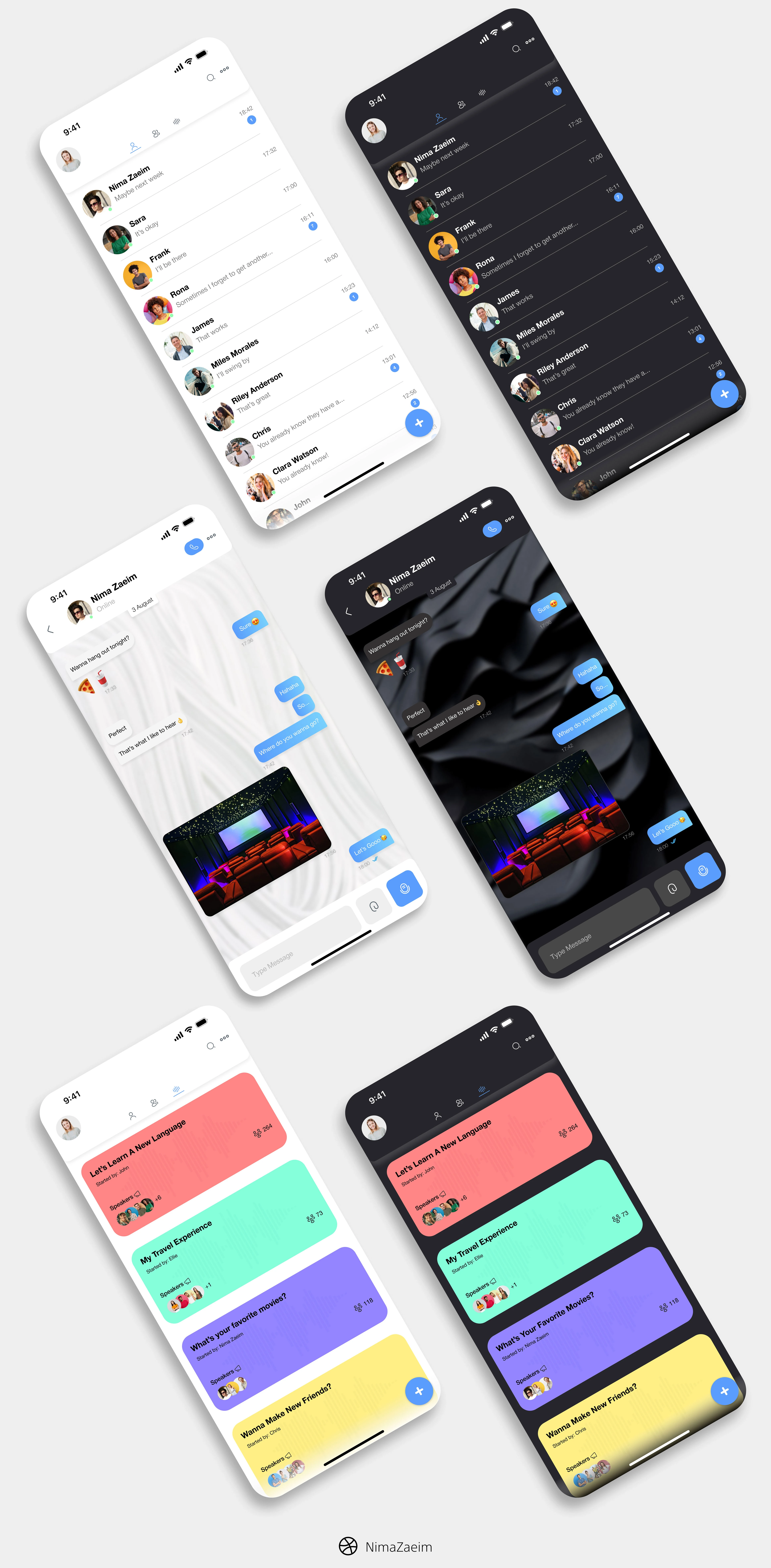
Main Page
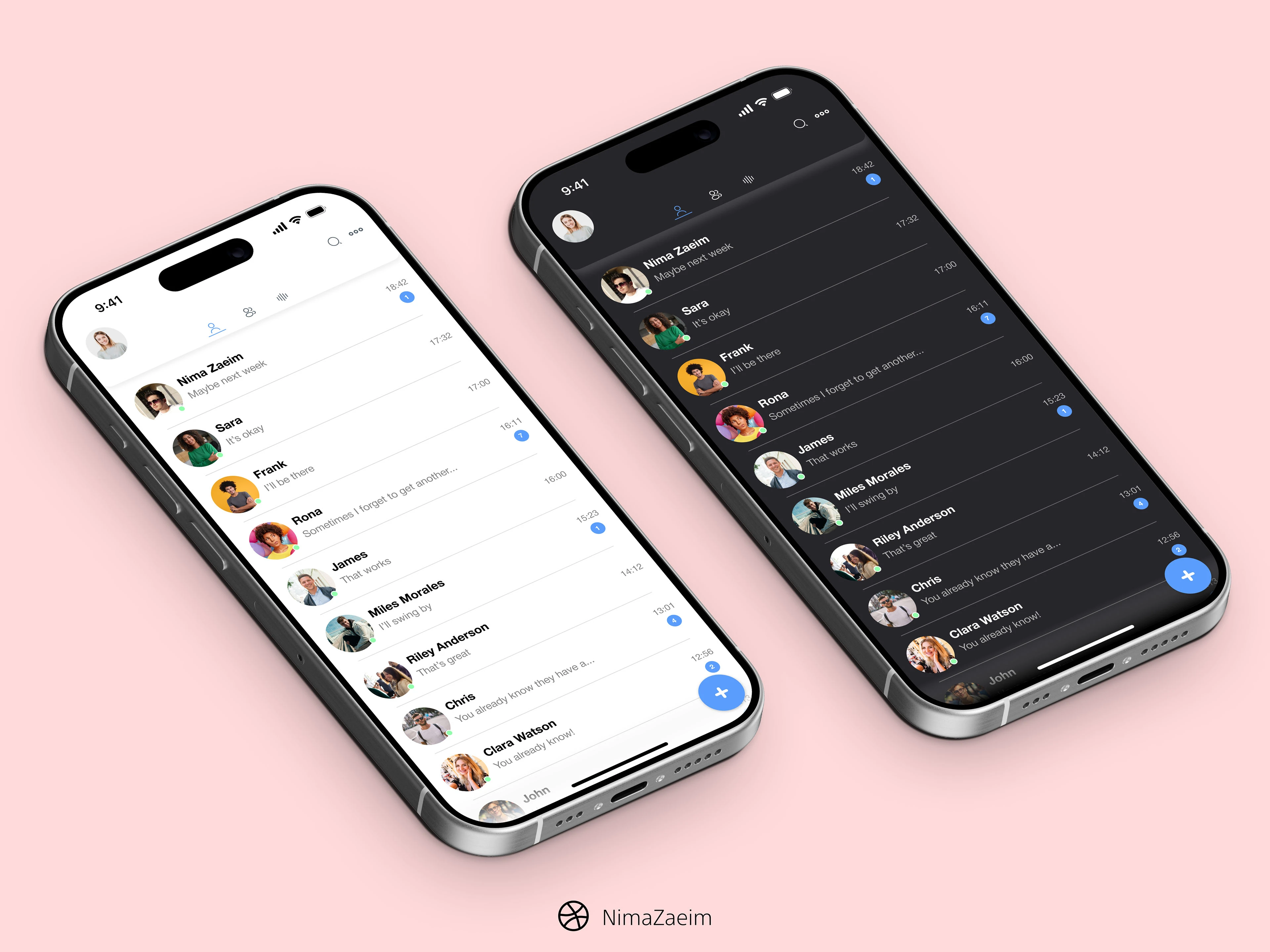
The main page of the messaging app serves as the central hub for users to access all their chats. Emphasizing simplicity and ease of use, this page features a clean interface with a focus on user-friendly navigation. Each chat is represented by a streamlined list item, including the contact’s name, profile picture, and a snippet of the most recent message. At the bottom of the screen, a minimalist plus icon provides quick access starting a new chat. The overall design ensures that users can quickly and intuitively find and engage with their conversations.
Voice Chat Section
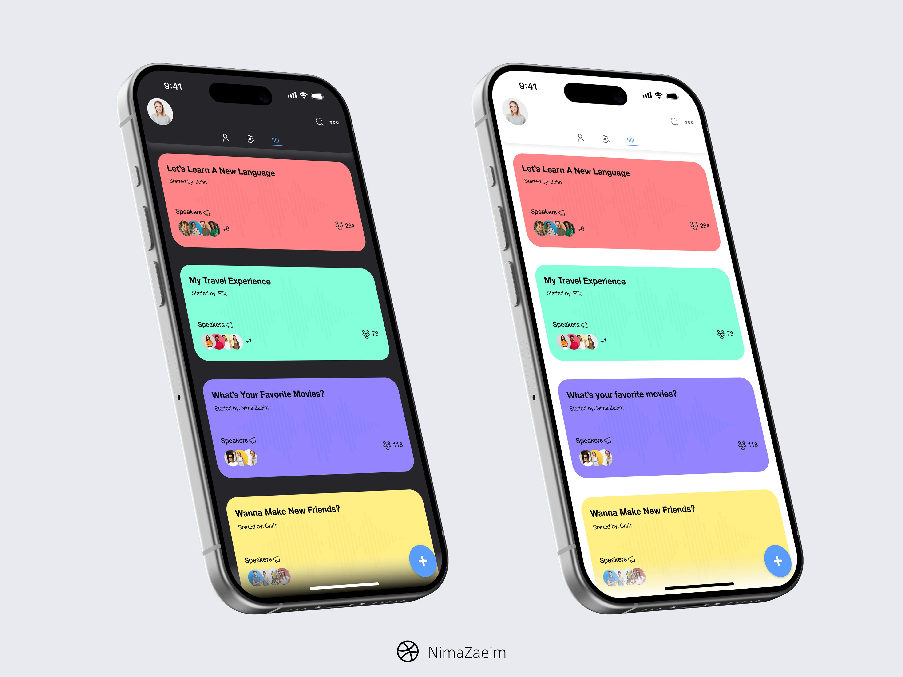
The voice chat section provides users with an organized space to access and manage ongoing voice chats. The interface follows the minimalist design principles of the app, presenting available voice chats in a simple list format. Each list item includes the name of the chat, the number of participants, and speakers. At the top of the screen, a search bar allows users to quickly find specific voice chats. The overall layout ensures that users can easily find and join voice chats, with clear and concise design elements guiding their interactions.
Chat Screen
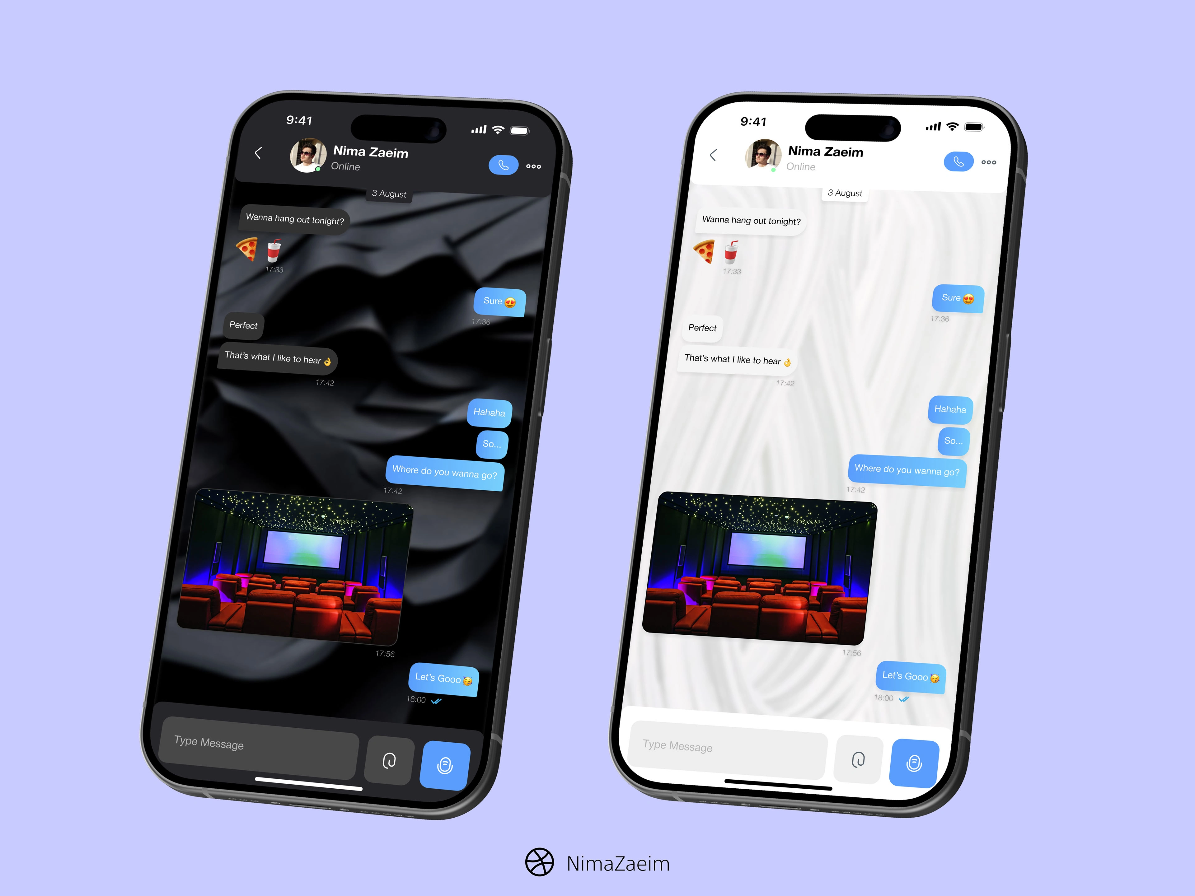
The chat screen is designed to offer a seamless and distraction-free messaging experience. Messages from the user and their contact are clearly differentiated through the use of simple color schemes and alignment, with the user’s messages aligned to the right and the contact’s messages to the left. Each message bubble is cleanly styled with ample spacing to ensure readability. The top of the screen features a minimalist header displaying the contact’s name and profile picture, along with essential icons for actions such as calling or accessing more options. At the bottom, the message input area includes a straightforward text box, an icon for attaching media, and a voice button, all designed to be intuitive and unobtrusive. The overall aesthetic is focused on maintaining a clean and focused conversation flow.
Like this project
Posted Sep 10, 2024
This messaging app boasts a sleek, minimalist design that prioritizes user experience and simplicity.
Likes
2
Views
50