
Brand & Website Designer | AI Video | UI/UX


Brand & Website Designer | AI Video | UI/UX


Brand & Motion Designer | AI Video, Visual Identity, UI/UX

Brand & Motion Designer | AI Video, Visual Identity, UI/UX

Providing Solutions, Not Just Skills| Award-Winning Designer


Providing Solutions, Not Just Skills| Award-Winning Designer


Motion Design for SAAS and Startups

Sagara Health • NexCM
Created in collaboration with our friends at Recog Technologies, this promotional video introduces NexCM, Sagara Health’s AI-powered care management platform that turns conversations into structured records and actionable follow-ups.
We focused on making a complex workflow easy to follow, bringing the product’s story to life through clear visuals, thoughtful pacing, and a clean, cohesive presentation. The story centers on a simple goal: less time on documentation, more time caring for people.
Made by saasmotiondesign.com
#MotionDesign (https://www.instagram.com/explore/tags/motiondesign/) #SaaSVideo (https://www.instagram.com/explore/tags/saasvideo/) #HealthTech (https://www.instagram.com/explore/tags/healthtech/) #ProductVideo (https://www.instagram.com/explore/tags/productvideo/)
4
4
397
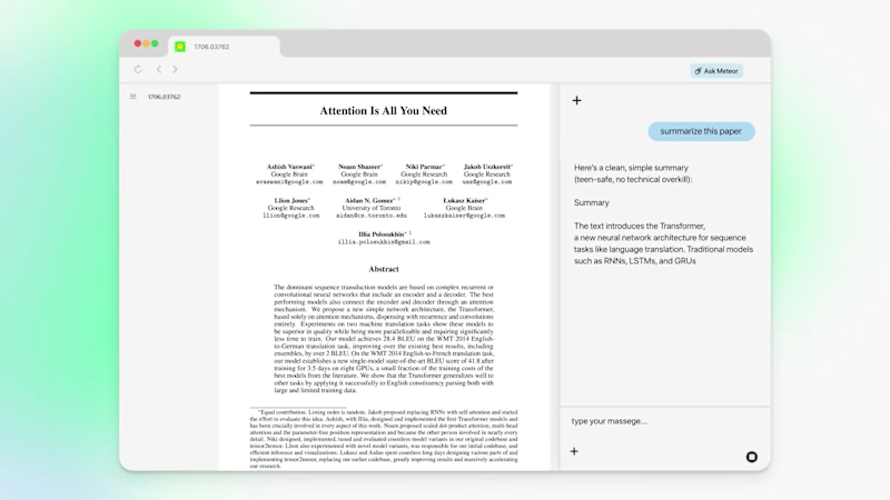
How do you prove a browser is the world's most intelligent?
We teamed up with Meteor (YC S25) (https://www.linkedin.com/company/browsedotdev/) last year to bring that claim to life through motion design.
The goal was simple to say and hard to execute: make Meteor feel as smart as it actually is, in seconds, before anyone leaves the website.
Here's how we approached it:
→ Benchmarked Meteor against competitors so the difference was impossible to miss
→ Spotlighted niche, real-world use cases that speak directly to power users
→ Revealed multiple features in a flow that felt intuitive, never overwhelming
Motion design isn't decoration. It's how a complex product clicks the moment someone sees it.
A few snippets below. 👇
If you're building something ambitious and want your product to move the way it thinks, let's talk. At SAASMotionDesign.com (http://SAASMotionDesign.com), we help SaaS and tech companies turn features into stories that convert.
Comment "Meteor" or DM me, and I'll send over our recent work.
#MotionDesign (https://www.linkedin.com/search/results/all/?keywords=%23motiondesign&origin=HASH_TAG_FROM_FEED) #SaaS (https://www.linkedin.com/search/results/all/?keywords=%23saas&origin=HASH_TAG_FROM_FEED) #ProductMarketing (https://www.linkedin.com/search/results/all/?keywords=%23productmarketing&origin=HASH_TAG_FROM_FEED) #YCombinator (https://www.linkedin.com/search/results/all/?keywords=%23ycombinator&origin=HASH_TAG_FROM_FEED) #VideoProduction (https://www.linkedin.com/search/results/all/?keywords=%23videoproduction&origin=HASH_TAG_FROM_FEED)
0
274

Brand & Web Designer

UX-led product design & dev agency for b2b saas and AI
UX-led product design & dev agency for b2b saas and AI
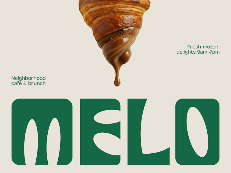
The best café brands don't introduce themselves. They just feel familiar from day one.
Most neighborhood café brands hide behind generic coffee cup icons, overused script fonts, and a color palette that could belong to a yoga studio or a juice bar or literally anything else. The logo promises character. The brand delivers nothing you'd remember by the time you reach the door.
Melo made familiarity the whole brief.
A custom palm tree emblem encircled in a clean oval, organic, architectural, impossible to mistake for anything else. Deep forest green across three environments: cream, burnt green, and dark olive, each one feeling as considered as the last. A rounded wordmark so confident it can fill an entire poster at display scale and still feel warm rather than loud. And right there on the campaign visual, a caramel-dripping croissant melted into the letterforms, like the food and the brand were always the same thing.
That's not just a logo system. That's a place people recognize before they even read the name.
Because a neighborhood spot that earns a place in someone's morning deserves a brand that feels just as inevitable.
What makes a café logo feel like it actually belongs to a place? 👇
2
4
473
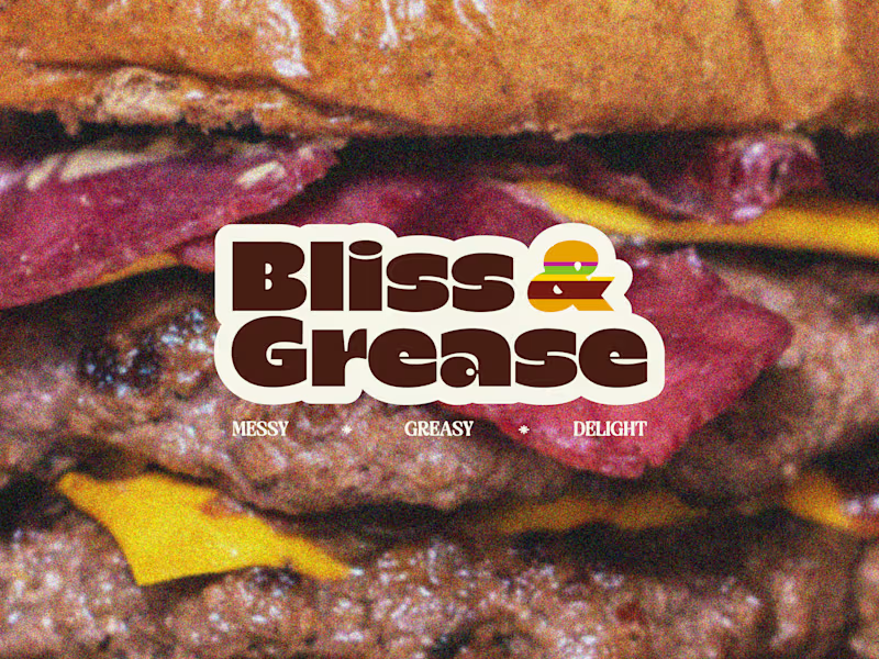
Some brands try to look appetizing. Bliss & Grease decided to look exactly like what it is.
Most burger joints hide behind polished food photography, clean white packaging, and a brand voice that pretends eating a double cheeseburger is somehow a refined experience. The menu promises indulgence. The brand delivers corporately.
Bliss & Grease built the honesty into the name itself.
Chunky retro wordmark with enough swagger to fill a wall. Deep chocolate brown, warm cream, and a rainbow-striped burger icon that nods to the 70s without getting lost in nostalgia. Grainy film-textured photography that makes the meat look exactly as messy and magnificent as it actually is. And right there under the logo, in three words: Messy. Greasy. Delight.
That's not just a brand line. That's a permission slip for everyone who stopped apologizing for what they actually want to eat.
The sticker-style logotype treatment, grain overlay, and macro burger photography turn a brand identity into something that feels like it belongs on a late-night food truck and a vintage concert poster at the same time.
Because a burger that owns every greasy, glorious bite deserves a brand with exactly the same energy.
What's the most honest thing a food brand has ever said about its own product? 👇
0
448
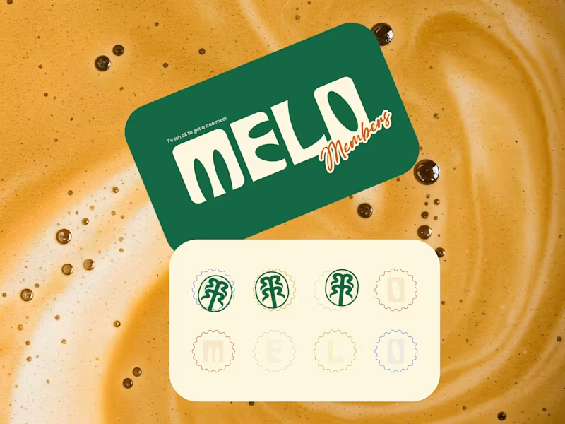
Every cafe looks the same these days. Melo decided that was everyone else's problem.
Most neighborhood cafes hide behind kraft paper textures, overused coffee bean icons, and a logo that could belong to any shop on any street in any city. The vibe promises warmth. The brand delivers nothing memorable.
Melo built the personality into every single touchpoint.
Bold rounded wordmark with enough character to own a takeaway cup at arm's length. Deep forest green paired with warm cream is grounded, inviting, and unmistakably its own. A hand-drawn palm tree emblem that feels like a neighborhood landmark rather than a corporate asset. And right there on the loyalty card, in plain sight, is "Finish all to get a free meal."
That's not just a punch card. That's a reason to come back eight times.
The scallop-edged stamp system, script members' lettering, and floating cup mockup turn everyday cafe collateral into something people actually want to hold onto, photograph, collect, and show their friends.
Because a neighborhood cafe that feels like a second home deserves a brand that feels just as warm.
What's the cafe branding detail that makes you choose one spot over another? 👇
0
437

Product Design | Website Design | Branding | App Design
Product Design | Website Design | Branding | App Design
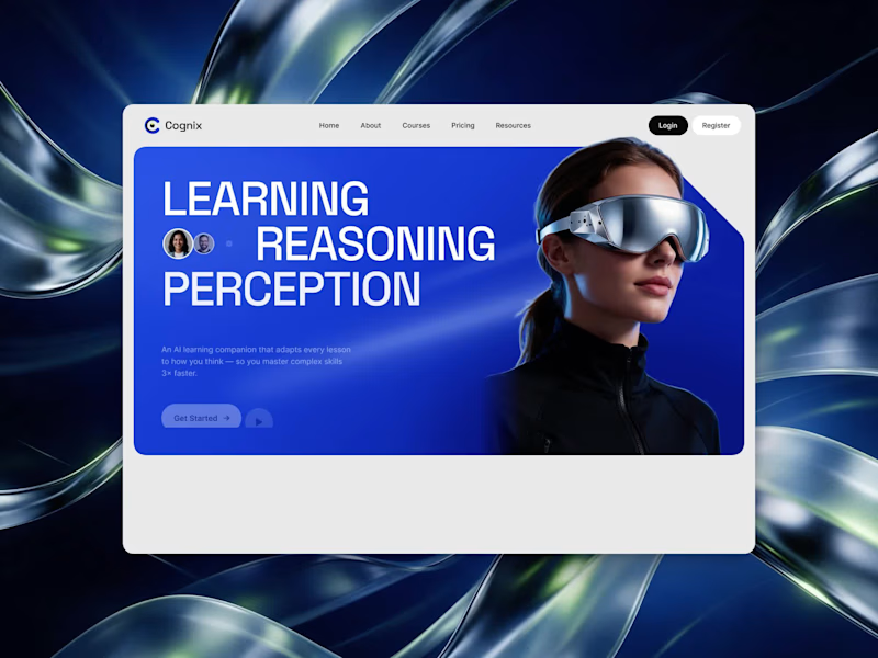
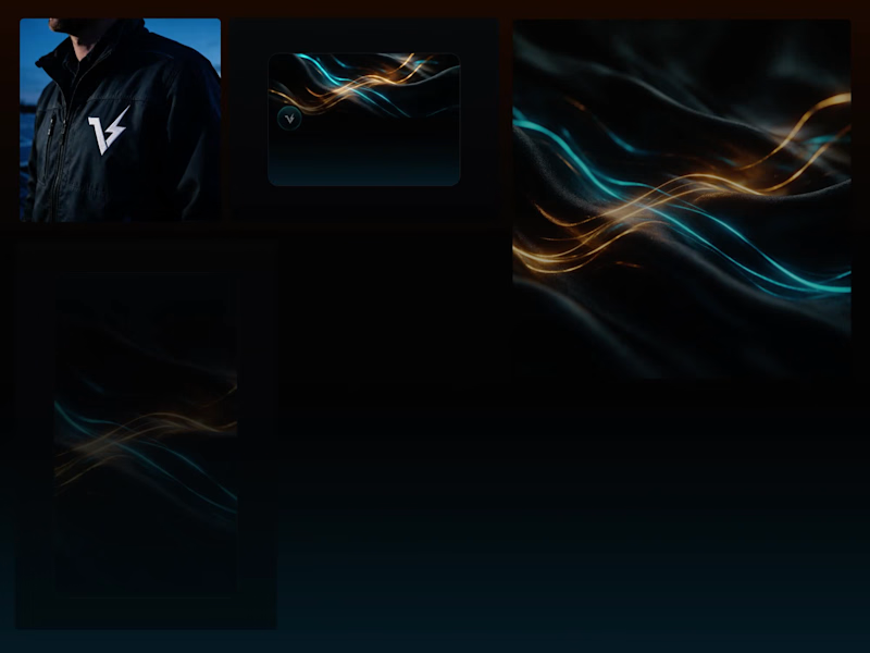
VOLTA — Home Energy OS | Brand Identity
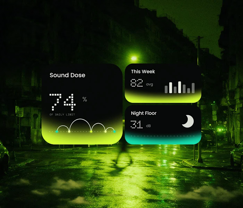
A bold visual identity and digital product experience for VOLTA, a home energy platform that brings solar, battery, grid, and energy usage into one simple view.
I designed a futuristic brand system and product experience focused on making complex energy data feel clear, intuitive, and visually engaging.
The visual direction combines deep blacks, luminous gradients, glass-like UI surfaces, and energetic accent colors to create a premium technology aesthetic. The identity was extended across the mobile app, digital touch points, product visuals, and brand applications for a consistent experience.
Explore Full Project Here: https://contra.com/p/qrrrXMFl-volta-home-energy-os-ui-ux-design-or-mobile-app-design?referralExperimentNid=DEFAULT_REFERRAL_PROGRAM&referrerUsername=rafee_alam_coruscatingart
2
4
1K

Helping founders & Brands become impossible to forget
- $25k+
- Earned
- 2x
- Hired
- 5.0
- Rating
- 21
- Followers
Helping founders & Brands become impossible to forget
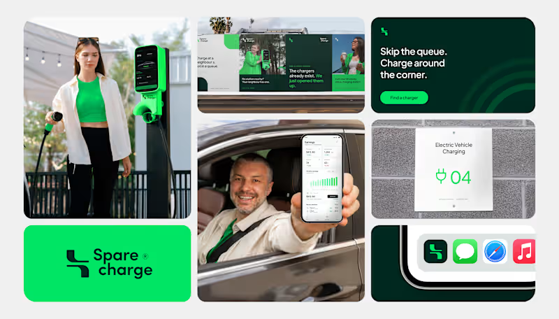
Spare Charge turns a neighbour’s driveway into a charging station.
The identity had to make a new idea feel simple and trustworthy. We built it around a plug inspired monogram a bold green and deep forest palette and a friendly voice skip the queue. Charge around the corner. It scales from billboards and charger signage to the host earnings app and app icon.
What makes a new idea feel trustworthy to you its look or its voice?
#BrandIdentity #LogoDesign #VisualIdentity #EVCharging #BrandDesign
0
27
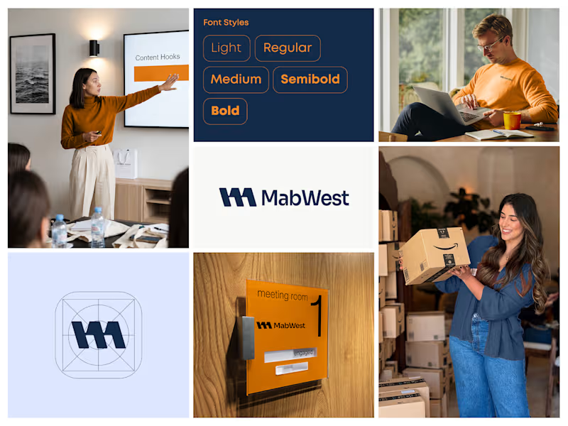
MabWest needed an identity that feels confident, modern and easy to work with.
We built it around a bold geometric monogram on a precise icon grid, a deep navy and warm orange palette and a clean sans serif in five weights. The system scales from app icon to office signage to team apparel without losing its character.
What makes a brand feel confident to you its colors or its structure?
#BrandIdentity #LogoDesign #VisualIdentity #BrandDesign
0
45
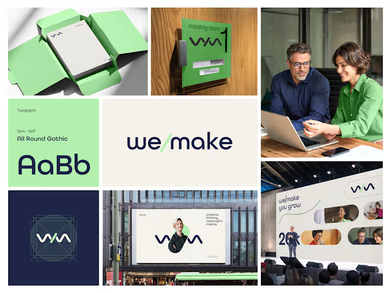
Most rebrands start with a mood board. This one started with a punctuation mark.
For we make the slash in the name became the logo, the monogram, the layout tool and even the campaign line: "we make you grow."
When one small idea can carry a whole brand, every new touchpoint designs itself.
Founders does your name have a hidden idea like this?
5
6
404
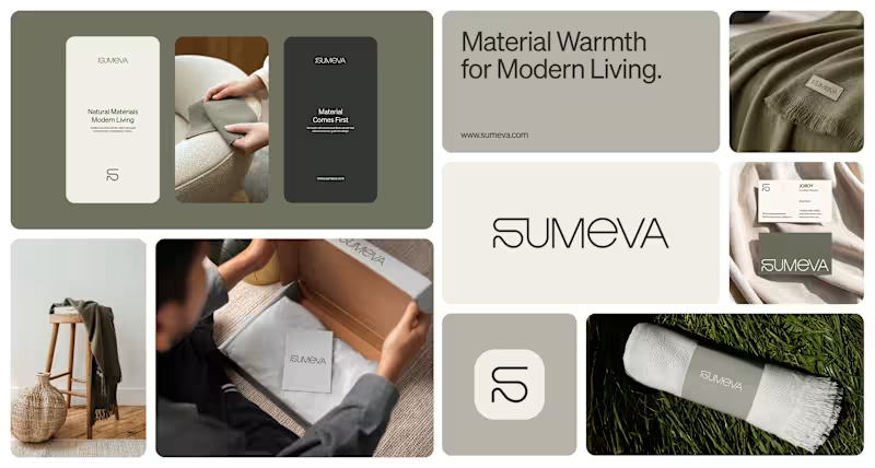
Sumeva is a modern textile brand built on one idea: material comes first.
We designed a warm, minimal identity to match a monogram and wordmark drawn with one continuous line like a thread, an earthy olive and stone palette, and a quiet system that carries from woven labels to packaging and social.
Natural Materials. Modern Living.
What makes a home brand feel premium to you its materials or its restraint?
#BrandIdentity #LogoDesign #PackagingDesign #VisualIdentity
1
74