Personal Brand & LinkedIn Optimization for Mohan Menon

sabbir hossien
Verified


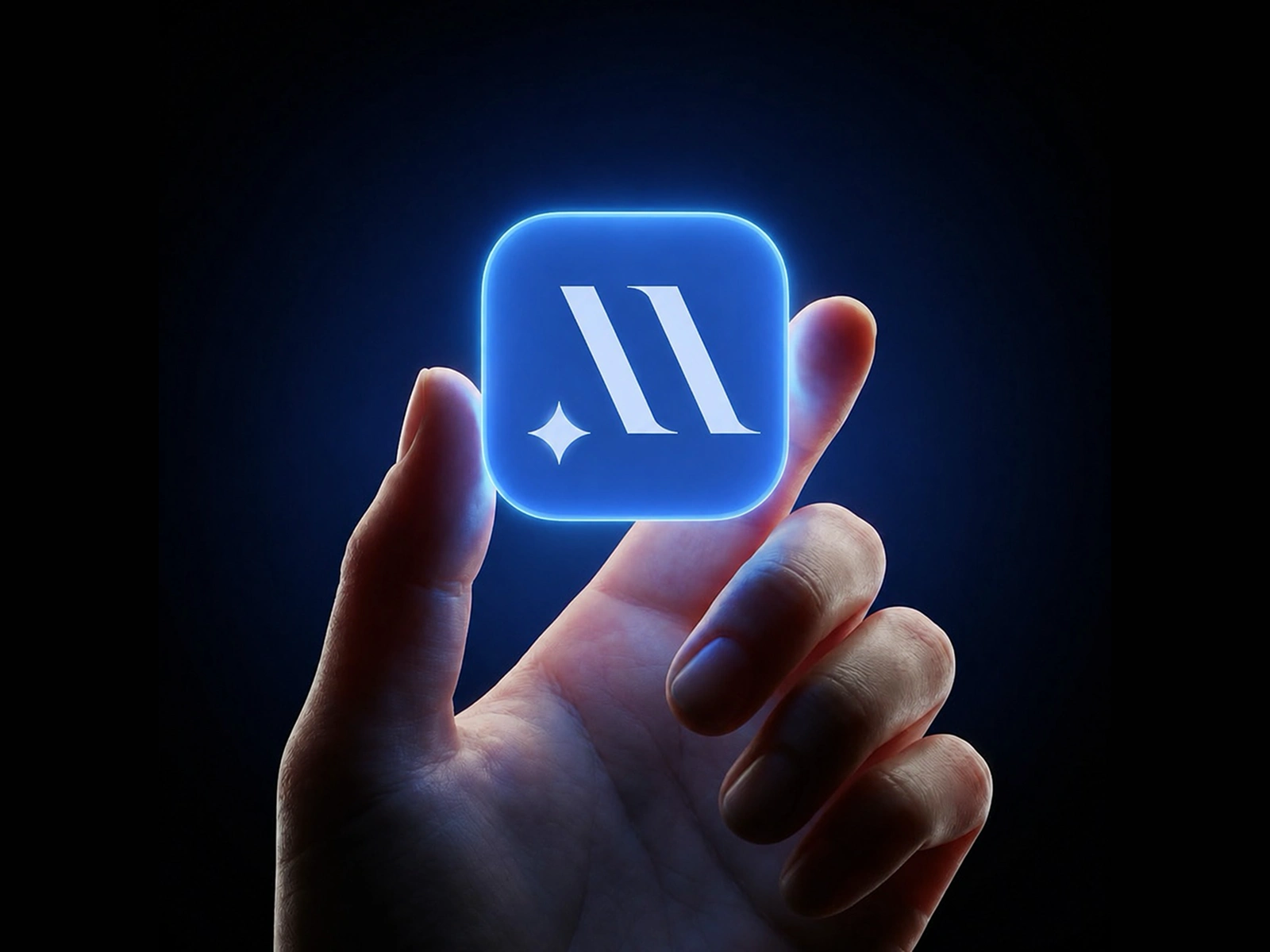
Mohan Menon — Personal Brand & LinkedIn Optimization
Project Summary
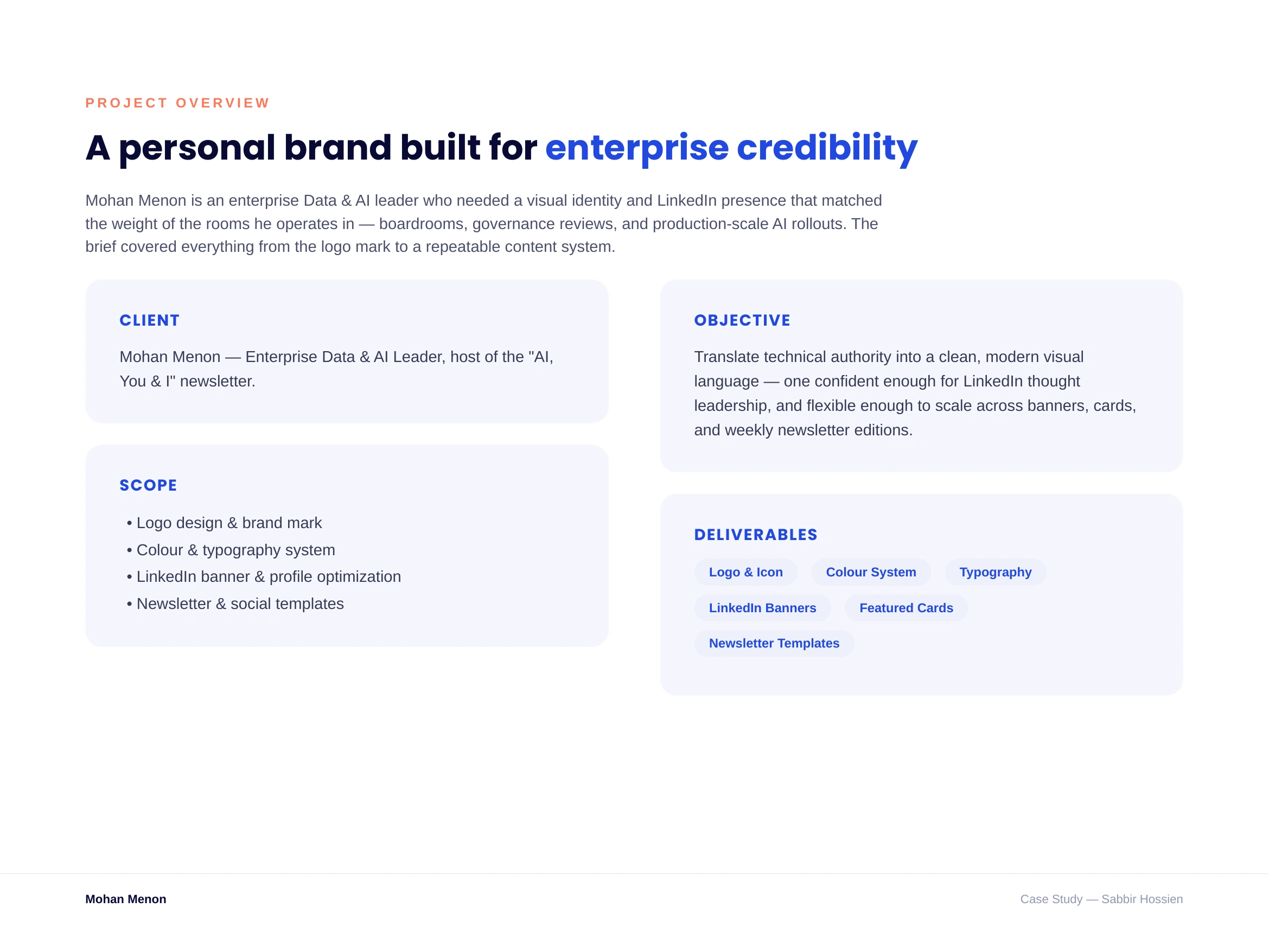
Mohan Menon is an enterprise Data & AI leader who needed a personal brand that matched the weight of the rooms he operates in. I designed his full visual identity logo, colour, and typography system — then extended it into a set of LinkedIn assets and a weekly newsletter template so he could show up consistently across his profile and content.
Problem
Mohan had no consistent visual identity — his LinkedIn profile, banner, and content were generic and didn't reflect his seniority or expertise in enterprise AI. He needed a system he (or his team) could reuse every week without redesigning from scratch each time.
Objectives
Design a distinctive, professional logo mark
Build a colour and typography system that scales across formats
Optimize his LinkedIn profile with a banner and featured link cards
Create a repeatable template for his "AI, You & I" newsletter
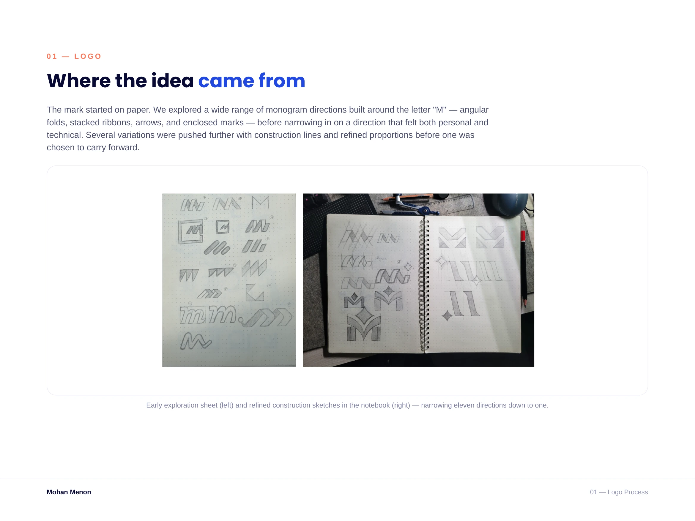
From pencil to pixel
Every direction started on paper — eleven monogram concepts explored around the letter "M" before narrowing in on one, then refining it with construction lines and proportion checks in the notebook.
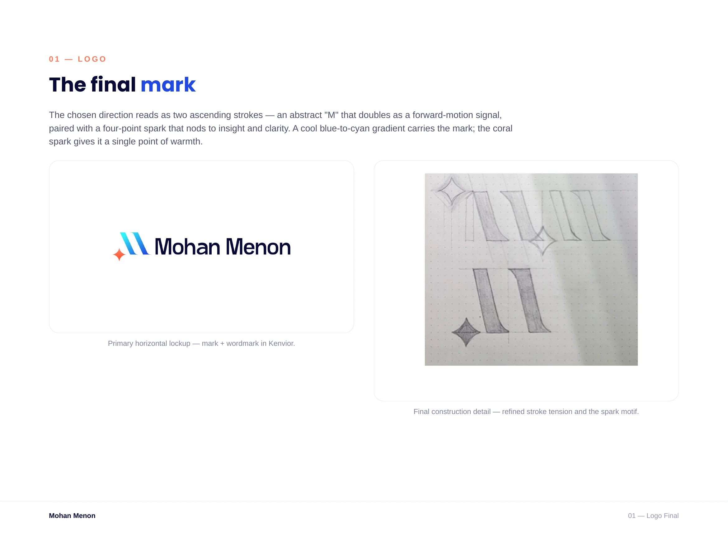
The mark
Two ascending strokes read as an abstract "M" and a forward-motion signal at once, paired with a four-point spark for a touch of warmth. A blue-to-cyan gradient keeps it modern and technical.
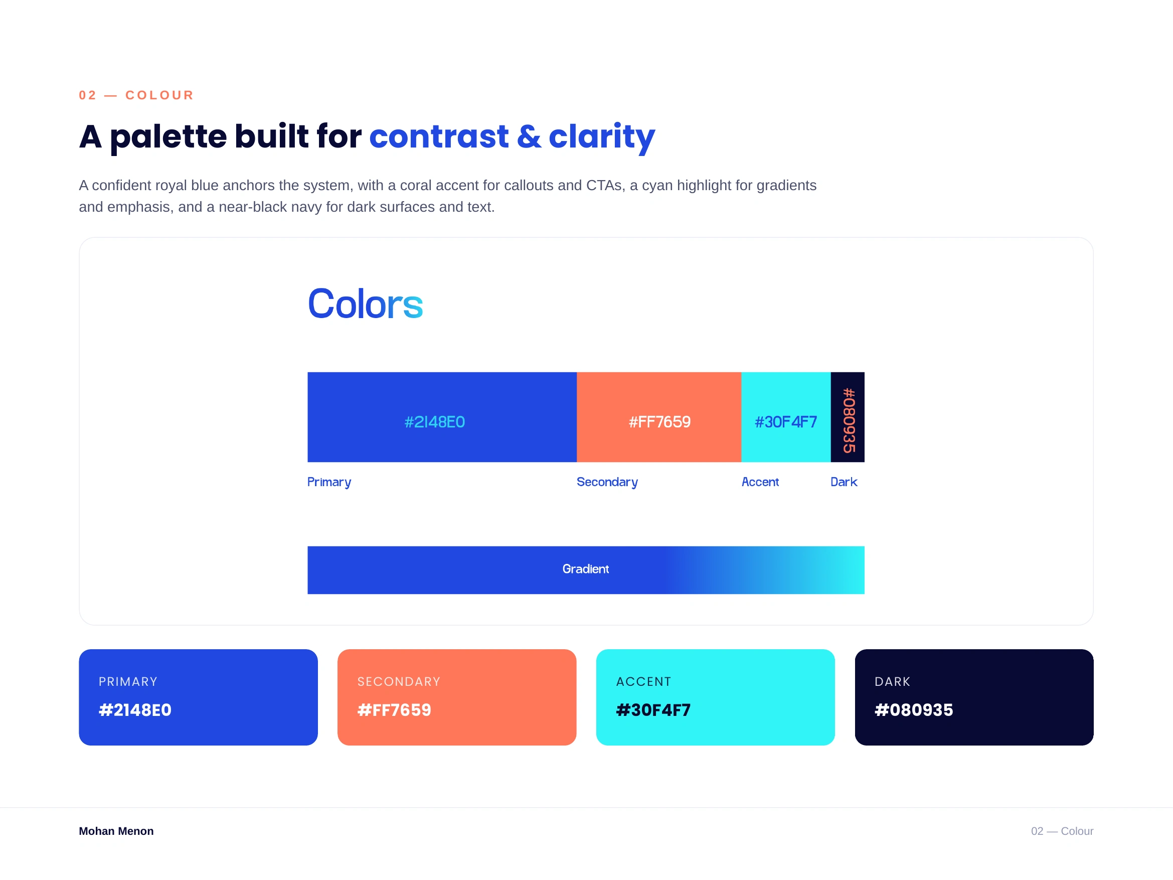
Colour system A confident royal blue (
#2148E0) anchors the brand, with coral (#FF7659) for CTAs and highlights, cyan (#30F4F7) for gradients and emphasis, and a near-black navy (#080935) for dark surfaces and text.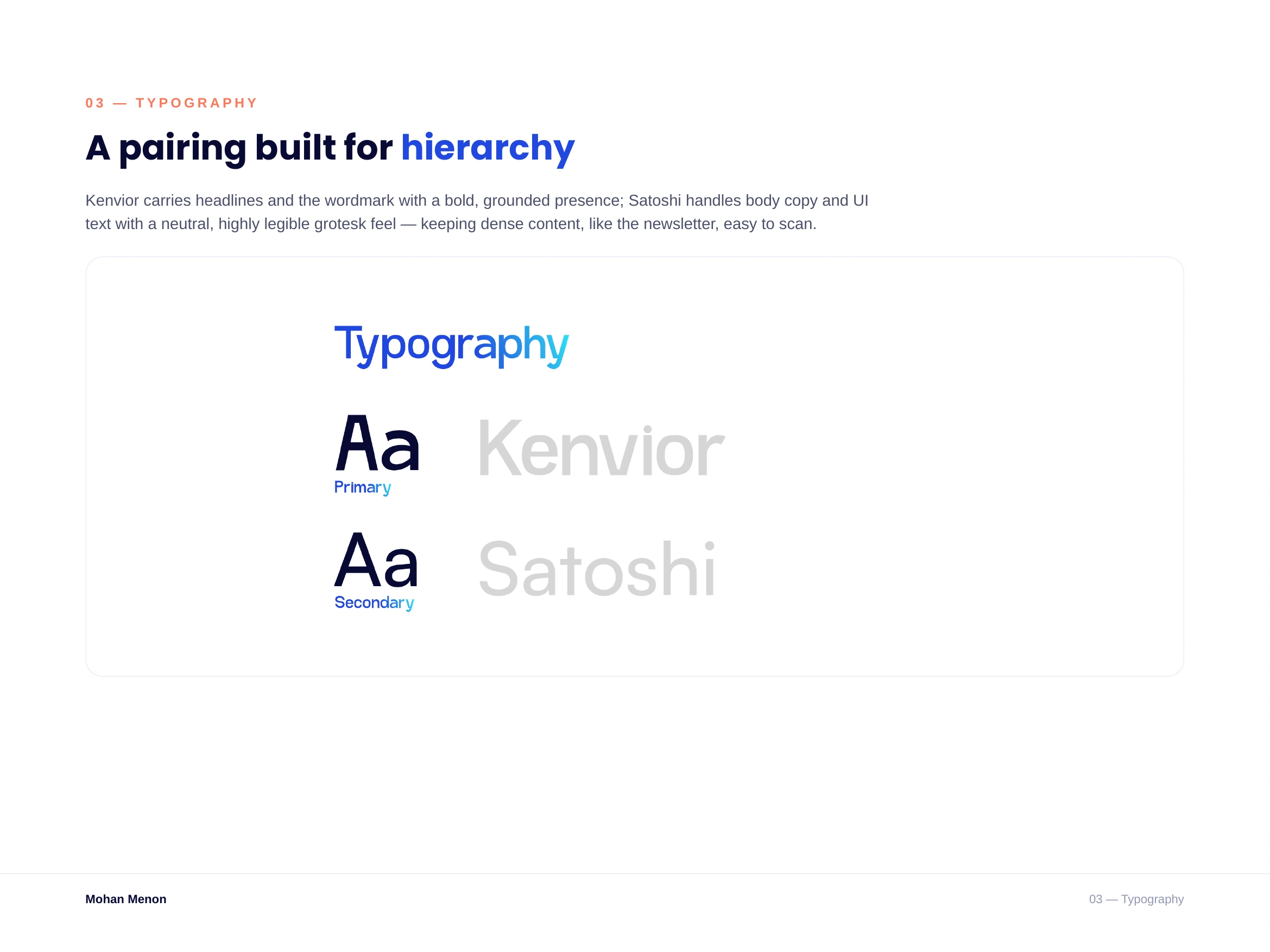
Type system
Kenvior carries headlines with a bold, grounded presence. Satoshi handles body copy and UI text — neutral and highly legible, which matters when the content (like the newsletter) gets dense.
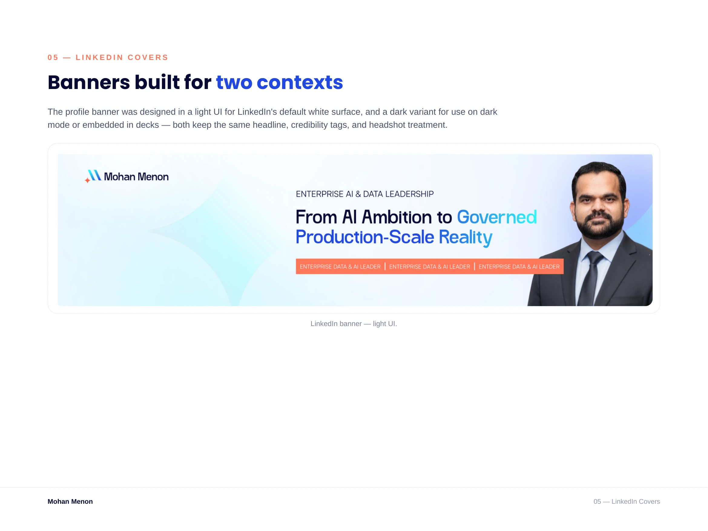
LinkedIn banner (light)
Designed for LinkedIn's default white surface — headline, credibility tags, and a professional headshot treatment that all reinforce the brand's colour and type system.
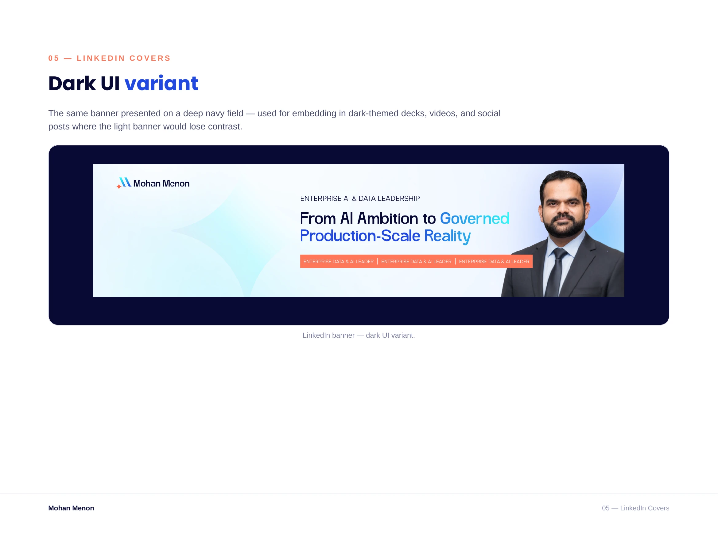
LinkedIn banner (dark variant)
A second version built for dark-mode contexts, decks, and video — same message and layout, adapted so it never loses contrast.
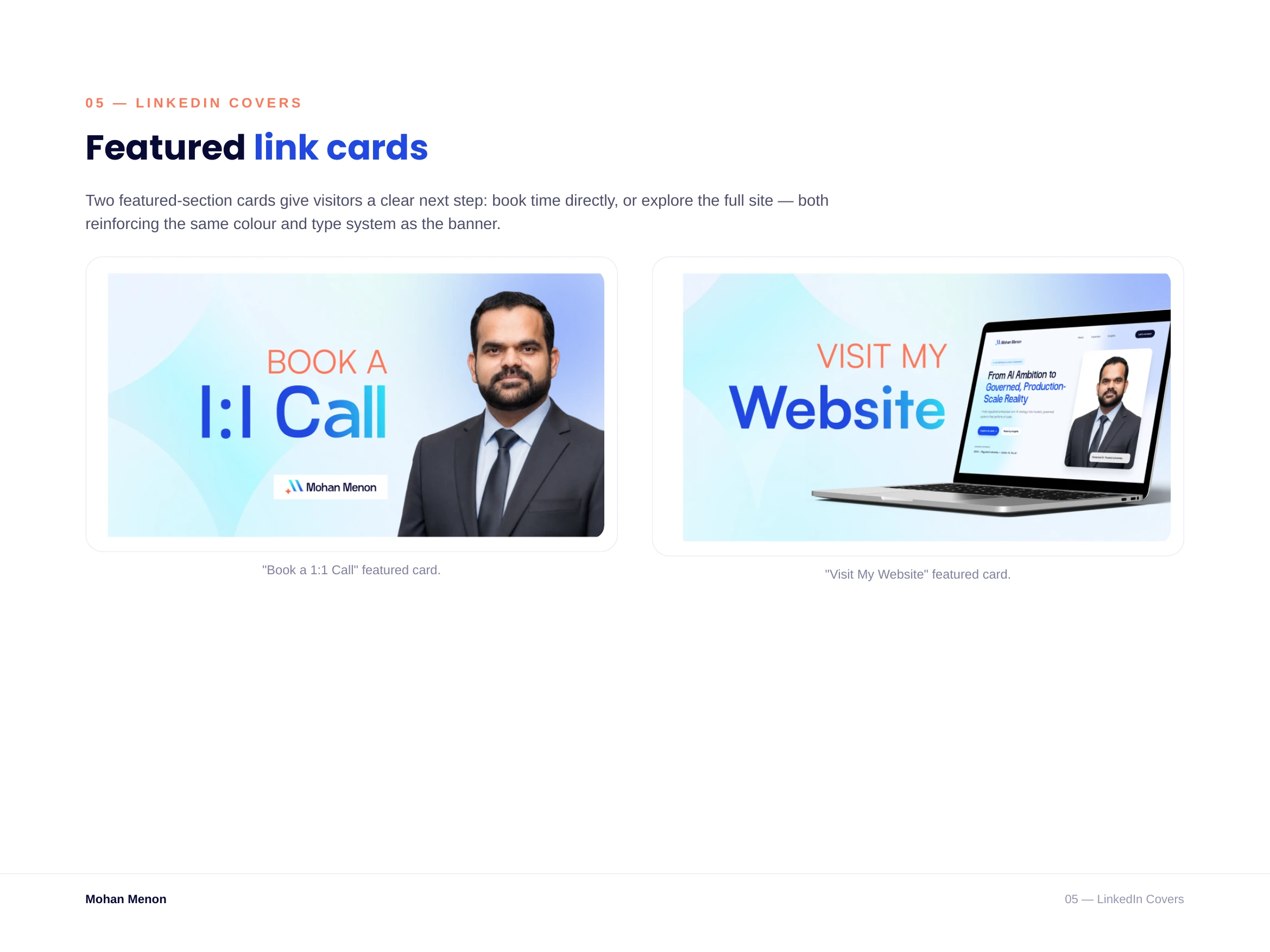
Featured cards
Two "featured" section cards give profile visitors a clear next step — book a 1:1 call, or visit the full website — both carrying the same visual language as the banner.
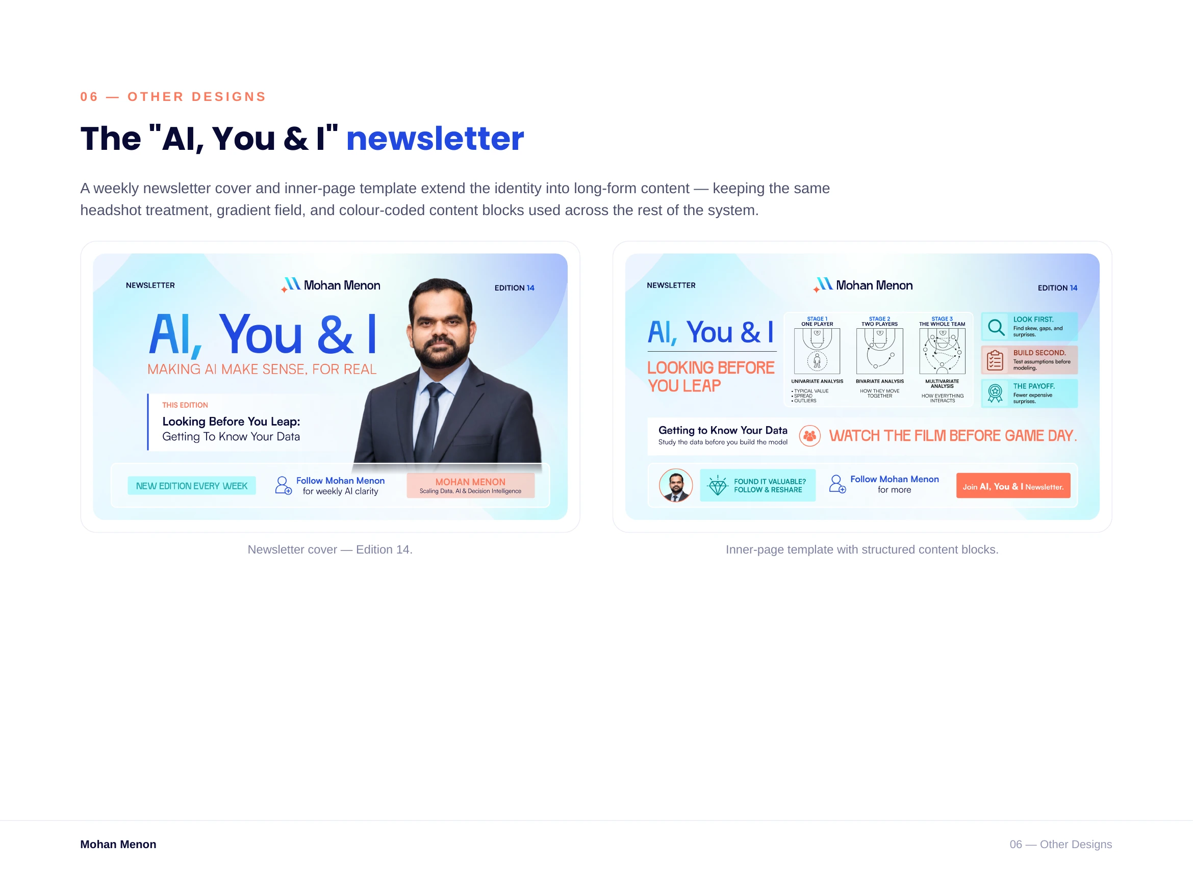
"AI, You & I" newsletter
A cover and inner-page template extend the identity into long-form content, so every weekly edition looks consistent without being redesigned from scratch.
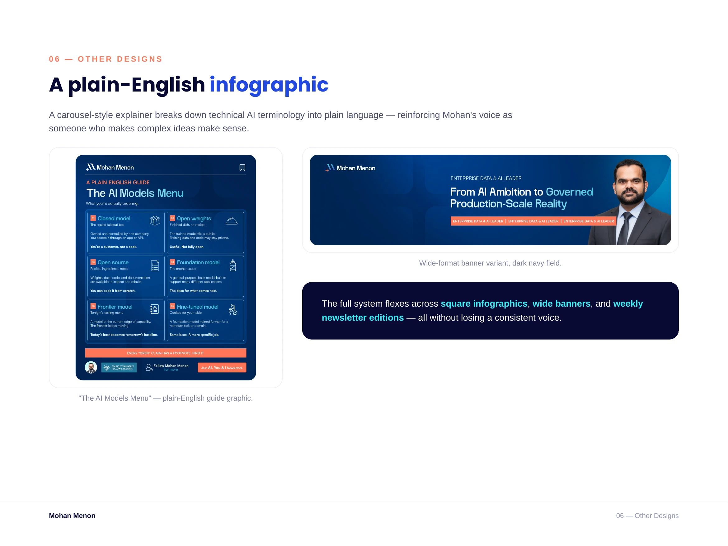
A carousel-style infographic breaks down technical AI terms into plain language — reinforcing Mohan's voice as someone who makes complex ideas easy to understand.
Like this project
Posted Aug 10, 2026
Mohan Menon is an enterprise Data & AI leader who needed a personal brand that matched the weight of the rooms he operates in.