The best café brands don't

Orbix Studio


The best café brands don't introduce themselves. They just feel familiar from day one.
Most neighborhood café brands hide behind generic coffee cup icons, overused script fonts, and a color palette that could belong to a yoga studio or a juice bar or literally anything else. The logo promises character. The brand delivers nothing you'd remember by the time you reach the door.
Melo made familiarity the whole brief.
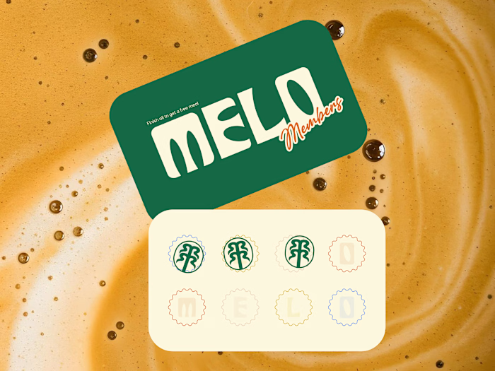
A custom palm tree emblem encircled in a clean oval, organic, architectural, impossible to mistake for anything else. Deep forest green across three environments: cream, burnt green, and dark olive, each one feeling as considered as the last. A rounded wordmark so confident it can fill an entire poster at display scale and still feel warm rather than loud. And right there on the campaign visual, a caramel-dripping croissant melted into the letterforms, like the food and the brand were always the same thing.
That's not just a logo system. That's a place people recognize before they even read the name.
Because a neighborhood spot that earns a place in someone's morning deserves a brand that feels just as inevitable.
What makes a café logo feel like it actually belongs to a place? 👇
Like this project
Posted May 21, 2026
The best café brands don't introduce themselves. They just feel familiar from day one. Most neighborhood café brands hide behind generic coffee cup icons, ov...
Likes
0
Views
10
Timeline
Jan 25, 2026 - Feb 21, 2026