Skincare branding has a confidence

Orbix Studio


Skincare branding has a confidence problem. Nobody fixed it until Norem did.
Most beauty brands hide behind clinical whites, sterile packaging, and ingredient lists that read like a lab report. The bottle promises transformation. The shelf presence delivers nothing.
Norem built the confidence into the brand itself.
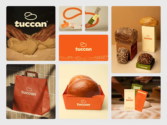
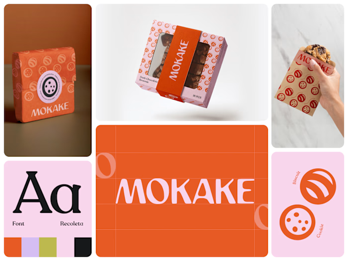
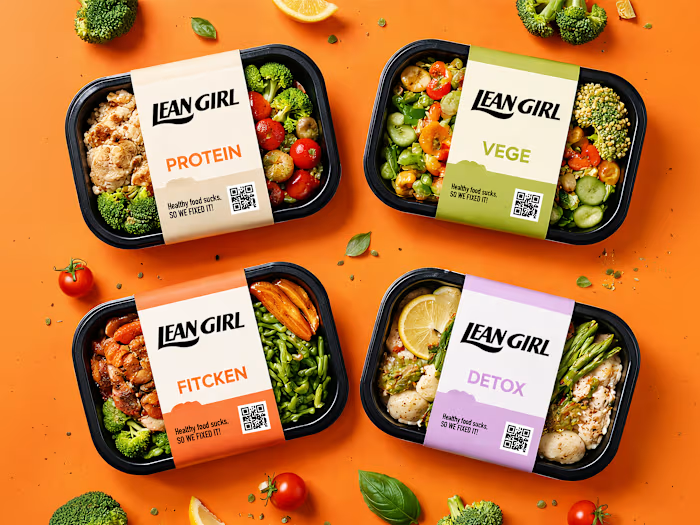
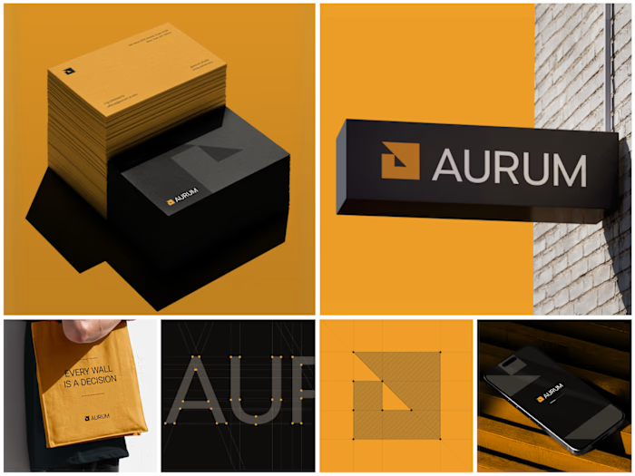
Bold rounded wordmark. A palette that feels sun-kissed rather than synthetic warm terracotta orange, pale butter yellow, or deep espresso brown. Real skin. Real texture. Real ingredients visible in every campaign frame. And right there on every package, in plain sight, is "let skin look like skin."
That's not just a tagline. That's the entire brand philosophy in five words.
The oversized typography, unapologetic color blocking, and three-word campaign Cleanse. Refine. Reveal. Turn a cleanser tube into a shelf presence that stops people mid-aisle before they even read the label.
Because skincare that's actually honest about what it does deserves a brand that's just as honest about who it's for.
What's the boldest brand decision you've seen on a beauty product? 👇
Like this project
Posted May 21, 2026
Skincare branding has a confidence problem. Nobody fixed it until Norem did. Most beauty brands hide behind clinical whites, sterile packaging, and ingredien...