
max
Orbix Studio
UX-led product design & dev agency for b2b saas and AI


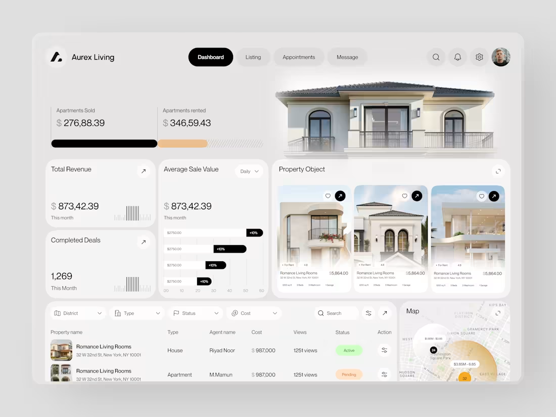
Real estate dashboards are usually built for data entry. Aurex Living was built for decision-making.
$873,42.39 total revenue. 1,269 completed deals this month. $276K sold, $346K rented. Property cards, agent tracking, map view, average sale value trending +10% - every number a real estate operator actually needs, on one clean white canvas.
Check it out (https://dribbble.com/shots/27350201-Aurex-Living-Real-Estate-Dashboard-Design)
12
17
1.8K
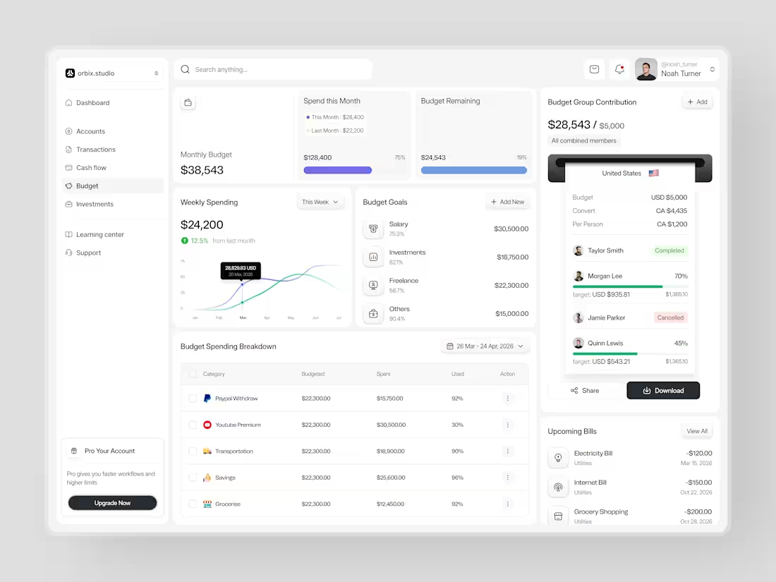
Most people set a budget once and forget it exists until it's too late.
This dashboard was designed to fix that. Weekly spending at $24,200, up 12.5% from last month. Monthly budget at $38,543 with 75% already allocated. Budget goals tracked by category salary, investments, freelance, and others each with a completion percentage and a dollar target that makes progress visible before the month ends.
The group contribution panel takes it further. Four members. One shared budget of $5,000. Taylor completed. Morgan at 70%. Quinn at 45%. Jamie cancelled. A collaborative finance tool that makes shared budgeting feel as clean as personal budgeting should.
Upcoming bills electricity, internet, grocery listed before they hit. A spending breakdown table that shows exactly what was budgeted, what was spent, and how much is left in every category.
This is what budget management looks like when the design treats users like they actually want to be in control of their money.
Does this feel like a dashboard that would change how a team manages their finances together? 👇
Designed by Orbix Studio
Tools: Figma
#DashboardDesign #FintechUI #BudgetApp #UIDesign #WebDesign #ContraFreelance #ProductDesign #SaaSUI
11
31
3.6K
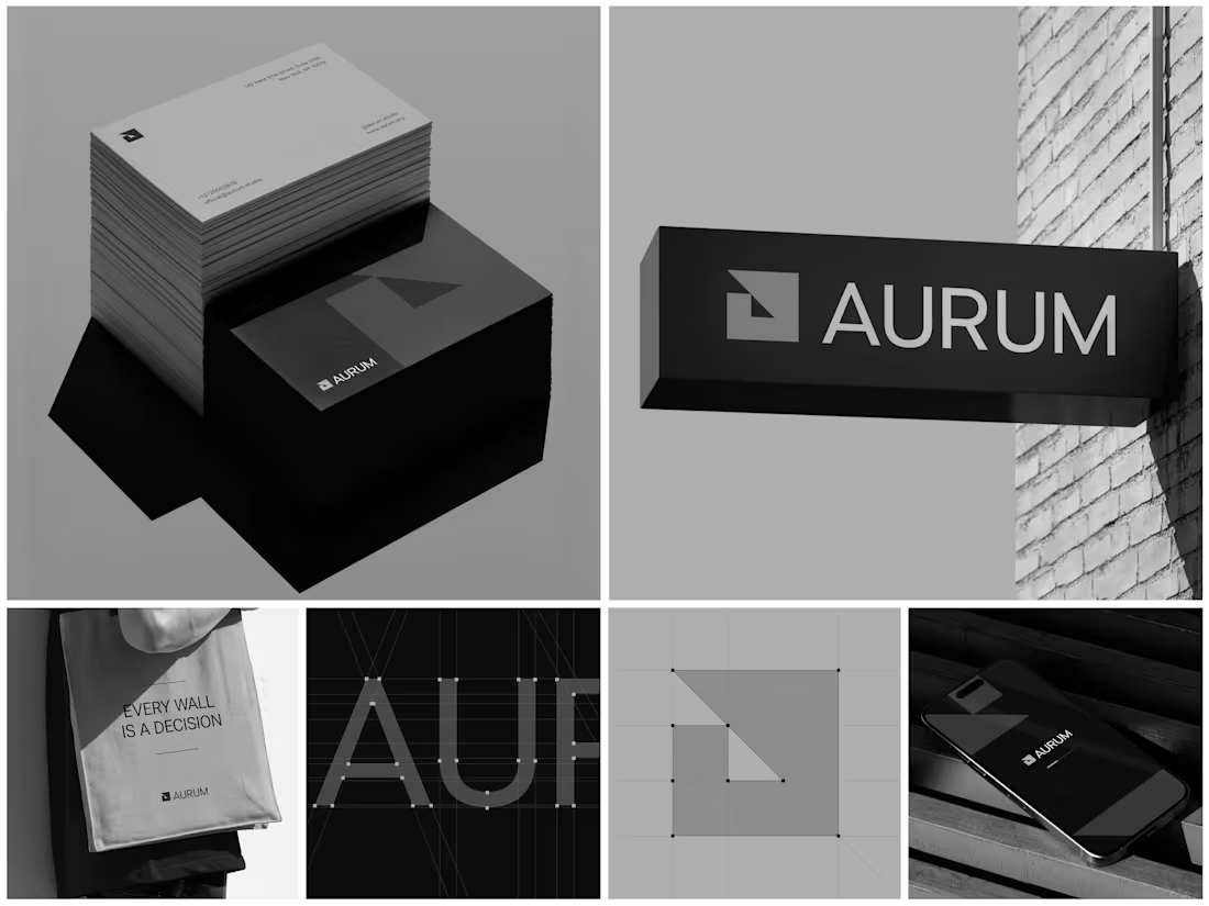
Aurum - Brand Identity System
When Aurum came to me, they had a name and a vision a studio that wanted to feel deliberate, architectural, and unapologetically bold in every space it touched. No logo, no system, just a line that stuck with me from our first conversation: "every wall is a decision."
That phrase became the seed for the entire identity. I started with the simplest possible geometry a square split by a triangle and built the mark from a strict construction grid so it would hold its proportions at any size, from a business card to a building-mounted sign. Once the mark was locked, I stripped the palette down to black, white, and grey. No color to hide behind just contrast, shadow, and negative space doing the work.
From there, the system grew outward: letterpress-style stationery with generous shadow and texture, exterior signage designed to read cleanly against brick and daylight, a minimal mobile app screen, and a tote bag that turned the brand's own tagline into a quiet piece of merchandise. Every touchpoint had to pass the same test does it still feel like Aurum at this scale, in this material, from this distance?
The result is an identity that's confident without shouting restrained enough for a business card, strong enough for a wall.
Curious how I'd approach building out a system like this for your own brand want to talk through it?
9
25
1.6K
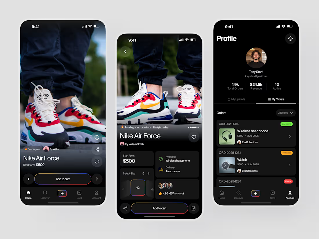
Most sneaker apps make you work to find what you want. This one puts the shoe on screen and gets out of the way.
Nike Air Force from $500. 4.95 stars, 657 reviews. Size selector, delivery tomorrow, trending now product detail that answers every question before the "Add to cart" tap. And a seller profile that tracks 1.9k orders and $24.5k revenue without a single wasted pixel.
Check it out (https://dribbble.com/shots/27747815-Sneaker-E-commerce-Mobile-App-Design)
1
7
464