HaaH Packaging and Branding Design

Kabeer.
1 collaborator


Packaging and Branding Showcase: HaaH
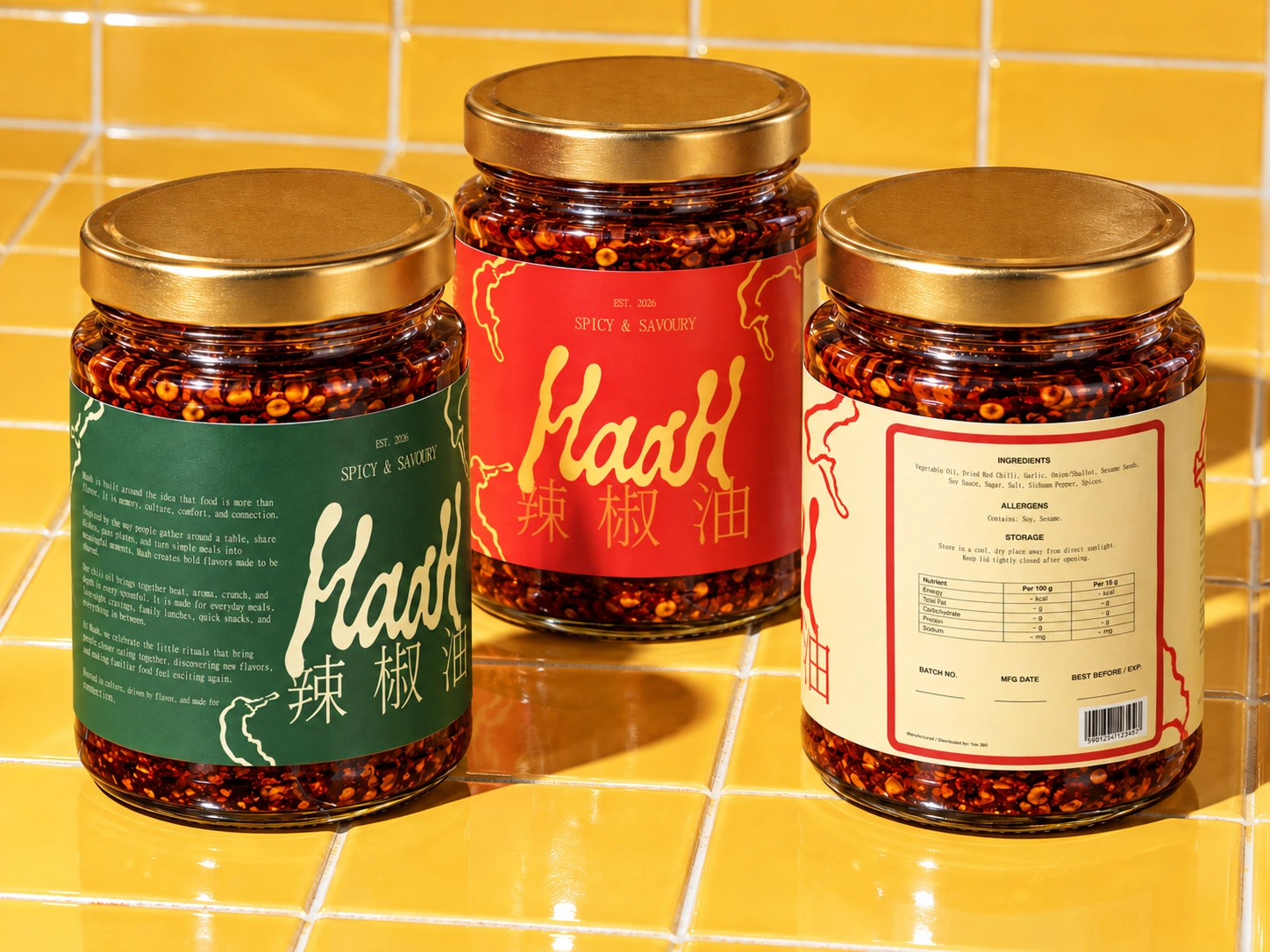
Haah takes inspiration from the visual language of traditional Chinese pantry products, then strips it back into something cleaner and more contemporary. The goal was not to imitate nostalgia, but to capture its warmth, confidence, and familiarity.
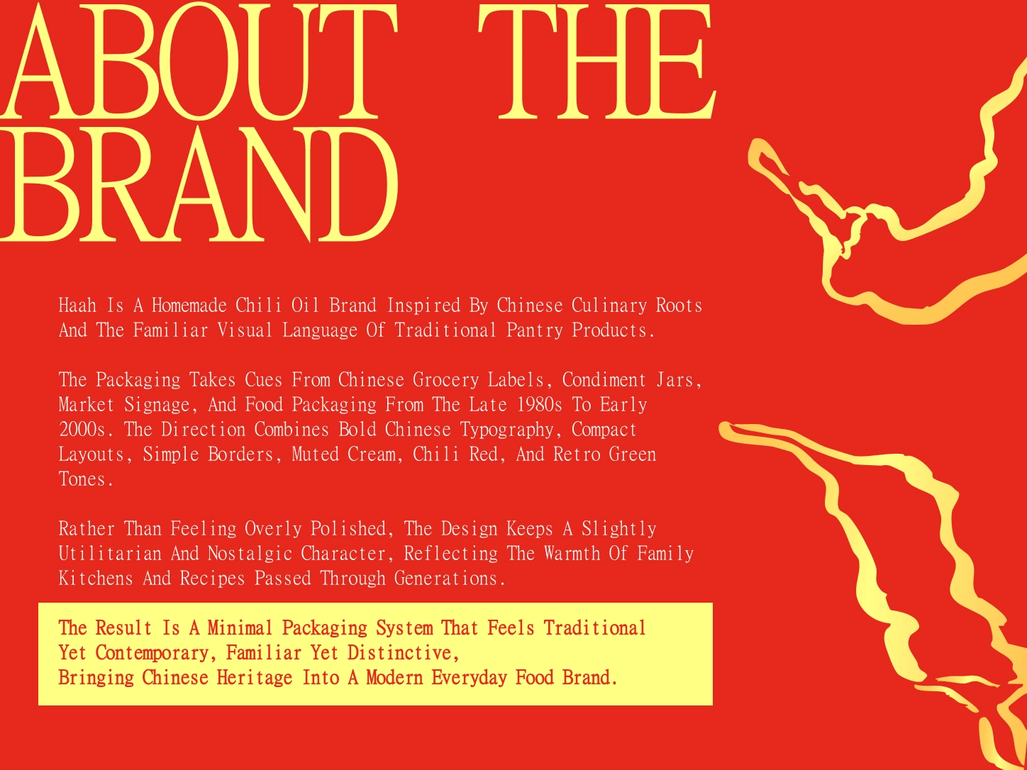
Rooted in tradition. Designed for a modern pantry.
The identity balances two sides of the brand: heritage and appetite. Restrained layouts and traditional typography establish the foundation, while saturated colour and food-led imagery bring energy and immediacy.
Rather than treating the packaging as a static label, we wanted the brand to feel tactile. Oil, chilli flakes, reflections, glass and texture become graphic elements of their own, extending Haah beyond the jar.
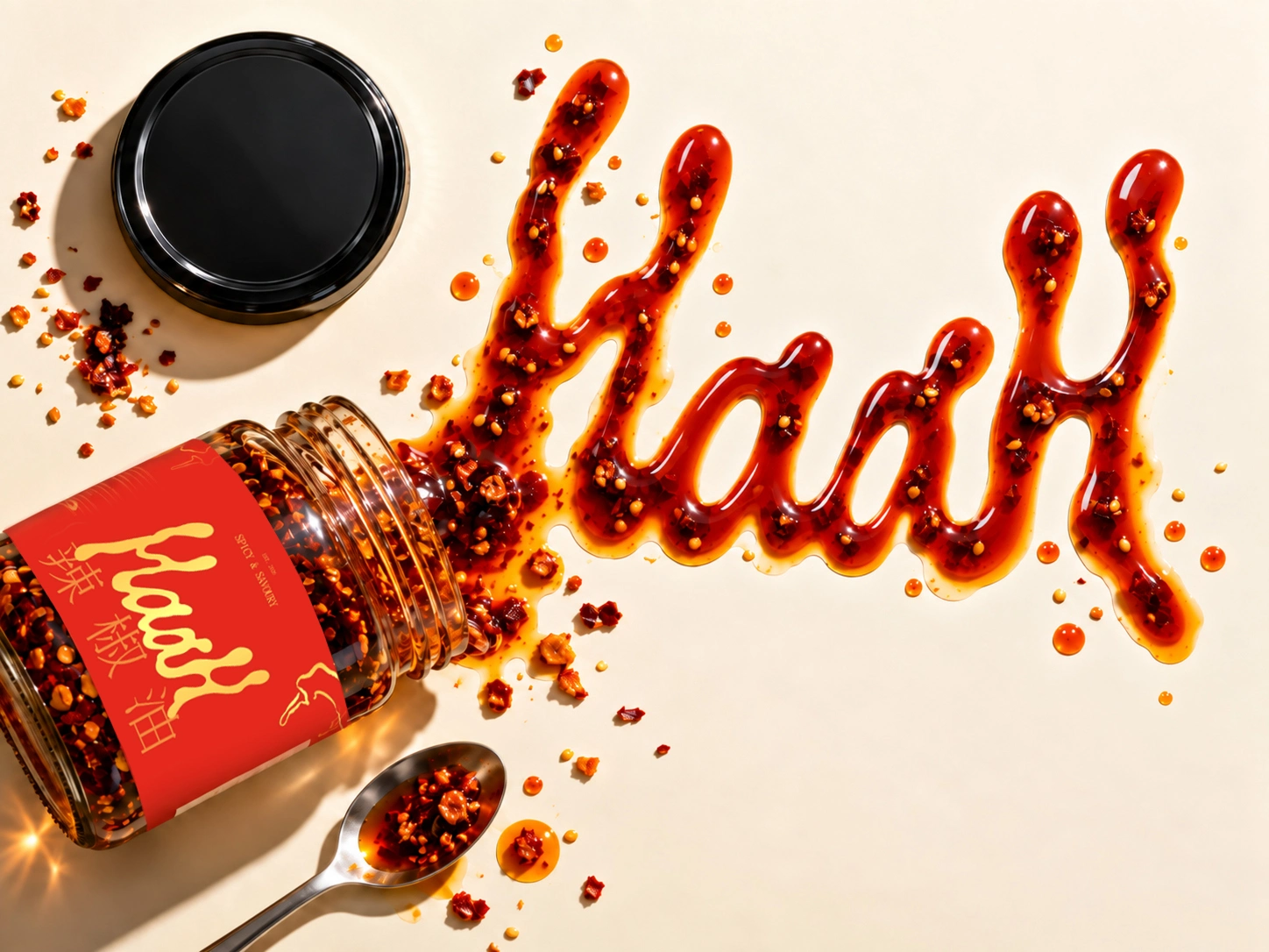
The product becomes part of the identity.
Rather than treating the packaging as a static label, we wanted the brand to feel tactile. Oil, chilli flakes, reflections, glass and texture become graphic elements of their own, extending Haah beyond the jar.
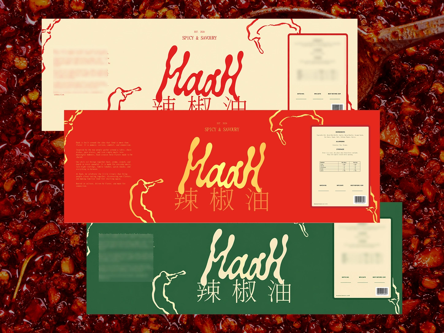
One identity, multiple expressions.
A flexible colour system allows Haah to shift between chilli red, pantry cream and retro green while keeping the same recognisable structure. Each variation feels distinct without losing the core identity.
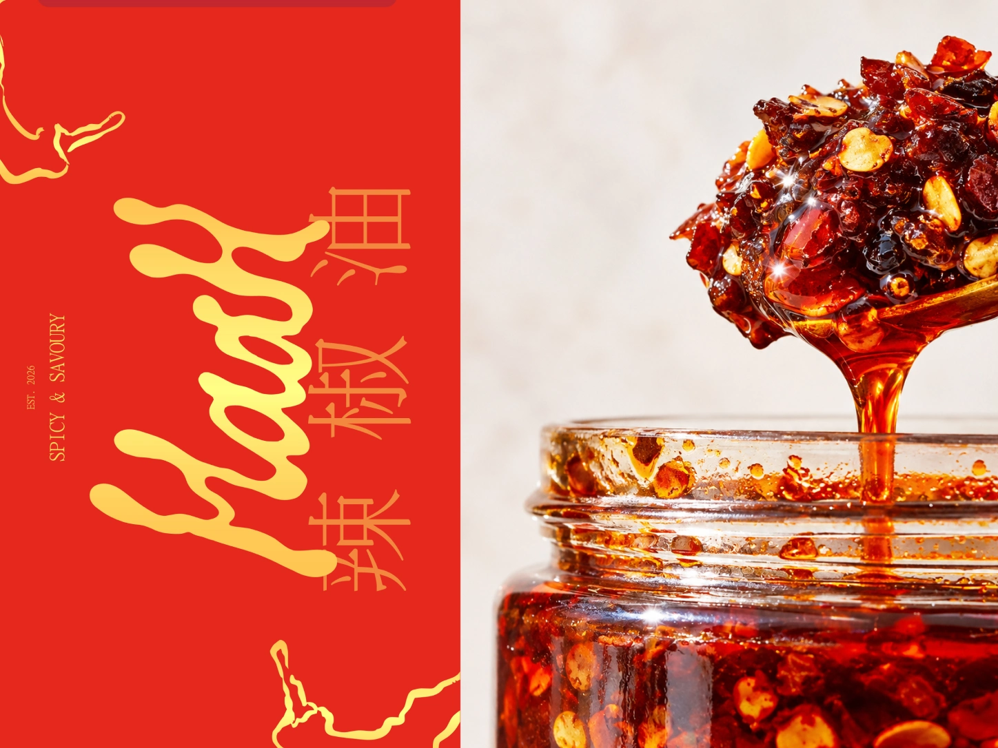
Designed to make the heat feel almost tangible.
Close-up photography puts the product itself at the centre of the visual system. The gloss of the oil, crushed chilli and suspended ingredients add richness against the otherwise simple graphic language.
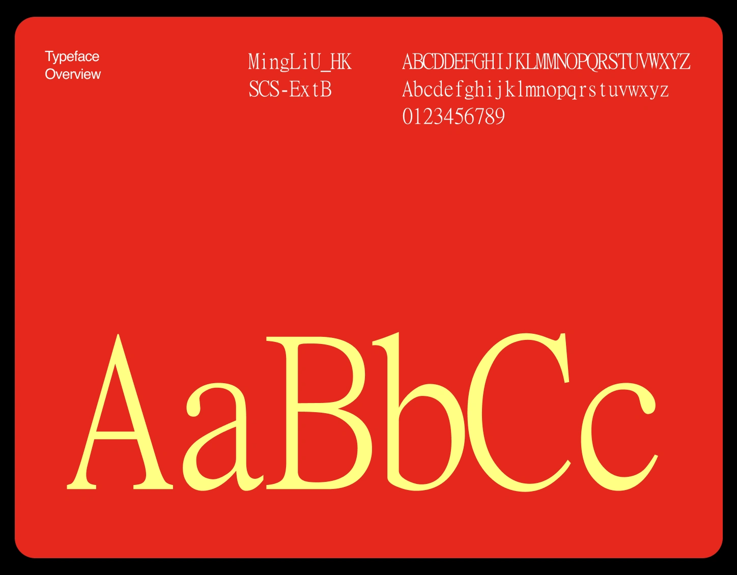
Typography gives HaaH its nostalgic backbone.
The type system deliberately avoids the polish of a typical modern food startup. Its narrow proportions and traditional character give the brand a slightly utilitarian quality, closer to an old grocery label than a contemporary lifestyle product.
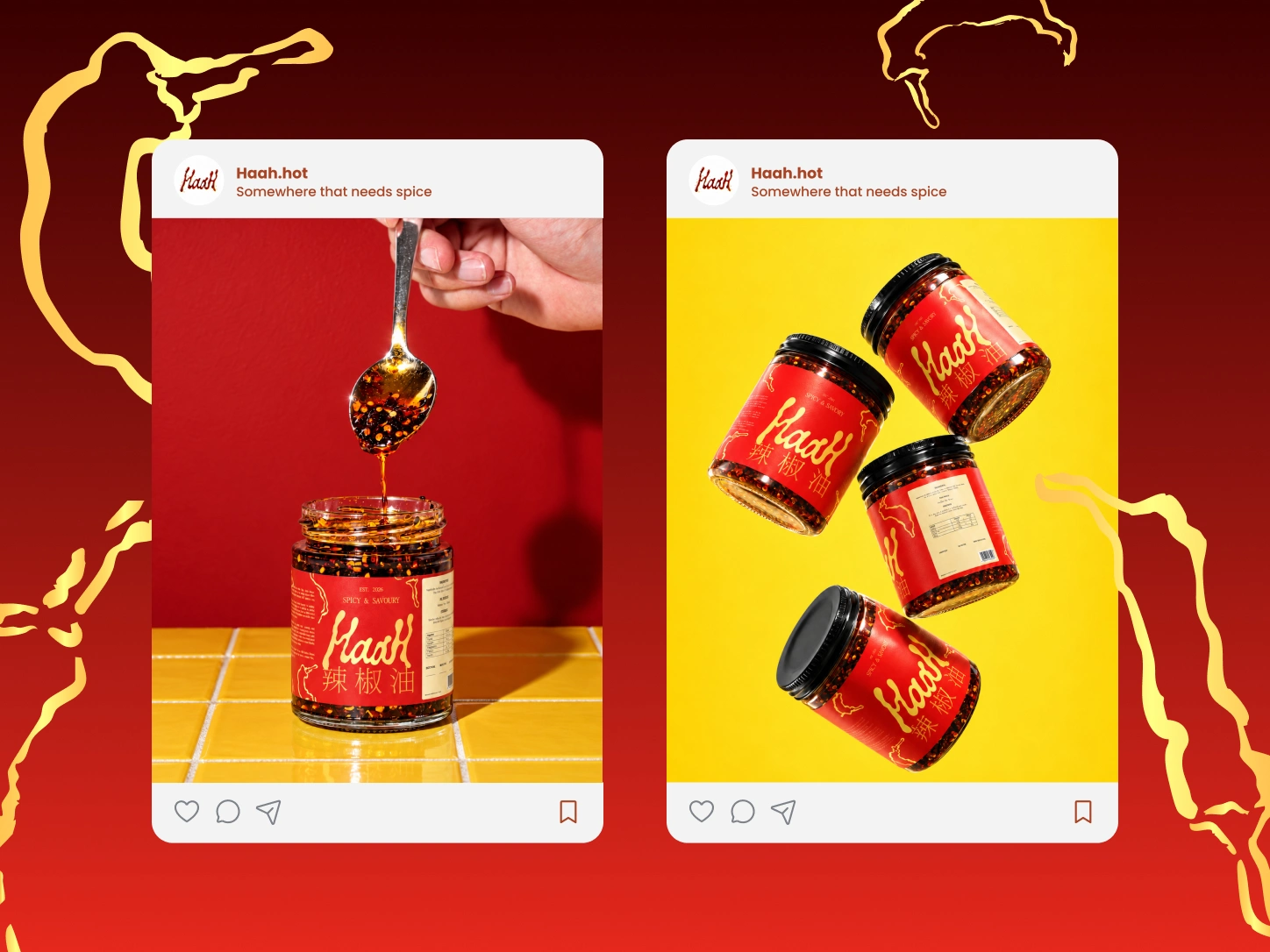
Built to stay recognisable beyond the shelf.
Across packaging, photography and digital applications, Haah maintains the same visual tension: traditional but not dated, playful but not childish, expressive without becoming complicated.
The result is a brand system designed to feel like something you might have grown up seeing in a family kitchen, reinterpreted for a new generation.
Like this project
Posted Sep 19, 2026
Designed a contemporary brand identity balancing heritage for food product HaaH.
Likes
1
Views
2
Collaborators