
Farhan Islam
Visual designer across branding and motion.
New to Contra
Farhan is ready for their next project!


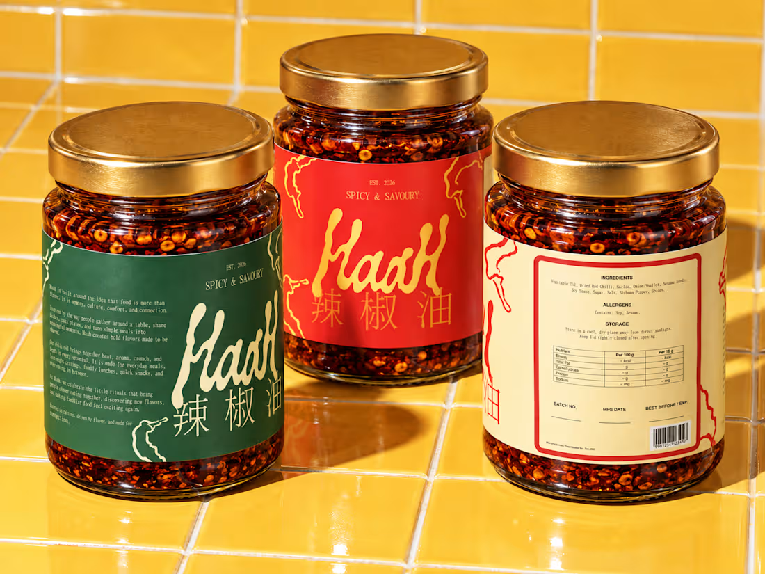
I really love to make chili oil and even more so love eating it!
I wanted to create something that would be not only attractive but also practical and meaningful. I did this by drawing my own sketches, looking at packaging reference images, working with typography, color, and photographing the images to direct the brand. With the help of generative AI, I was able to portray this into such production grade imagery.
I worked with the little visual details that would make it stand out from the typical modern food brand. Many of my decisions were based on a previous branding project I did. How to strengthen the visual system, how to make the packaging feel familiar at a distance, how to make the product photo part of the identity, and how to do it.
The final direction's visual language is a blend of chili red, retro green, cream tones, chinese typography and a touch of nostalgia. A feeling of tradition with a current enough vibe to comfortably sit on a shelf, website, or social media platform.
It was a very personal project, but also a great exercise to create a food brand from scratch.
If you're a food, beverage or consumer brand and you're looking for help with brand identity, packaging or visual direction, I'd be delighted to do something similar.
#branddesign #packagingdesign #graphicdesigndaily #graphic #packaging #customtype
0
37
Wrapped up the brand illustrations & direction for KaraOkay, a karaoke experience built around one simple idea: making singing, hanging out, and having fun feel more accessible and social.
The visual direction moves away from the usual microphones and music-note clichés. Instead, I explored lips, expressions, bold typography, playful colors, and a slightly nostalgic visual language to give the brand its own personality.
From the core identity to tickets, merchandise, signage, environmental graphics, and different brand touchpoints, the goal was to create a system that feels energetic, expressive, and easy to recognize.
Really enjoyed seeing this one come together from the initial idea to the final visual world.
I’ve shared the full KaraOkay Brand Identity project on Behance.
1
1
88
A motion presentation for one of my personal projects KaraOkay or কারাOkay. You can find the version with music here: https://www.instagram.com/p/DYc3GMxSu9S/
0
51
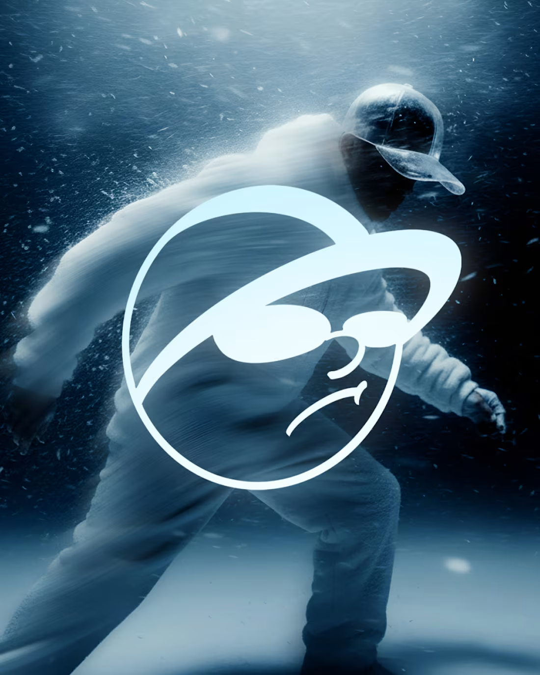
Used the free Google Nano Banana flash to create material for a fictional product that I named Halofrost.
This was mainly an experiment for me to assess how far I can utilize AI for my personal projects, in areas I don't have the production budget for.
The logo was hand drawn on Procreate.
0
52