
Oruma: Brand Identity & Packaging for Drinking Cacao
A slower kind of cocoa, wrapped in warmth, craft and a fox curled around a cacao pod.
Overview
Oruma is a drinking cacao brand made for people who want their daily ritual to feel unhurried. I designed the full identity, from the logo and illustration to packaging and stationery, around a single feeling: rich, round and unhurried. The result looks handmade, warm and quietly premium.
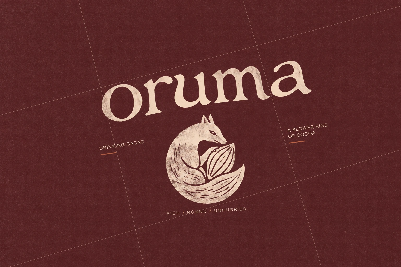
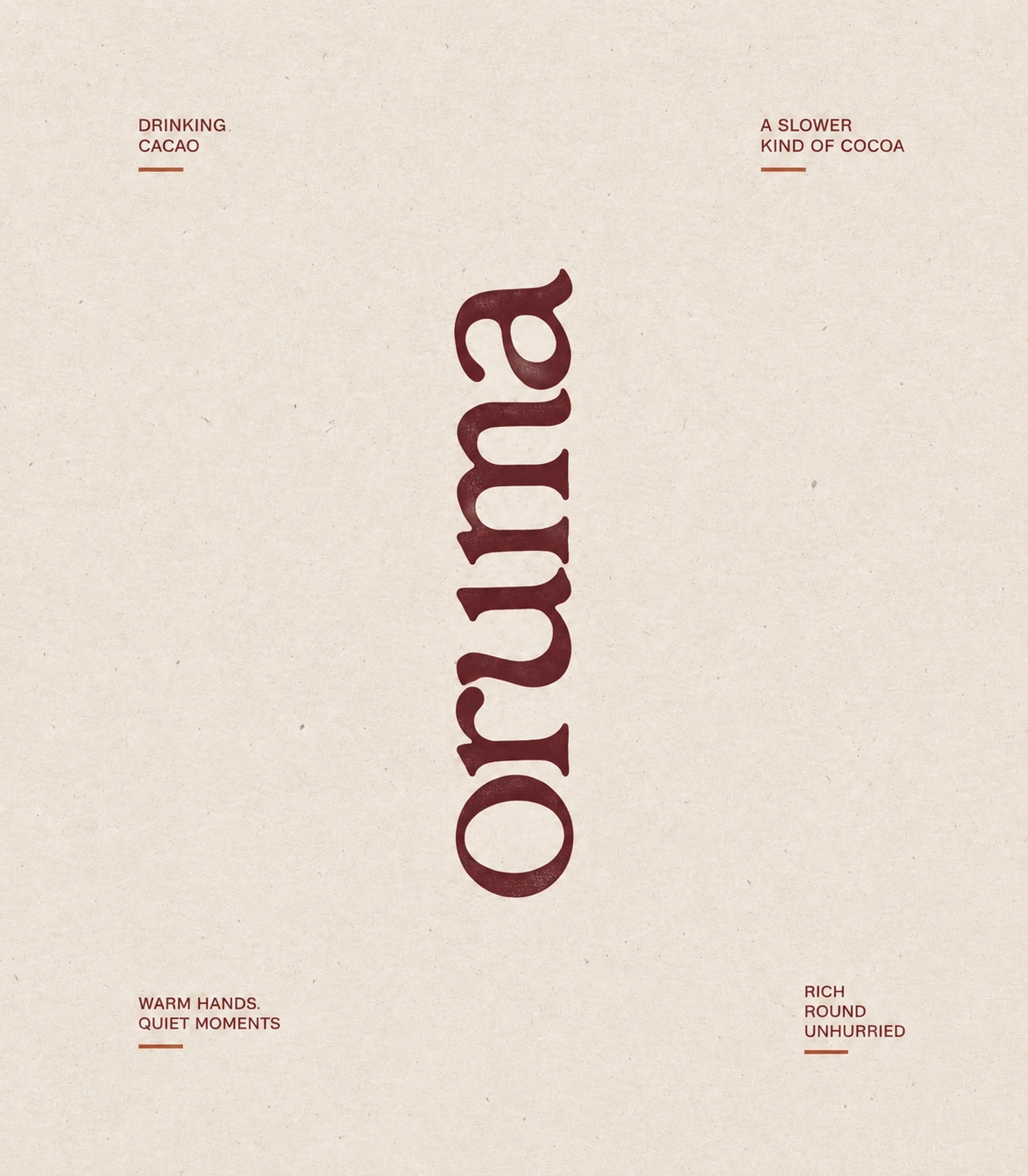
The Challenge
Cocoa brands usually lean on childhood nostalgia or flat, generic “healthy” cues. Oruma needed to sit somewhere more grown-up: artisanal and calm, but still inviting. The identity had to feel crafted by hand, suit a natural product and work across kraft pouches, printed labels and premium paper.
The Concept: A Slower Kind of Cocoa
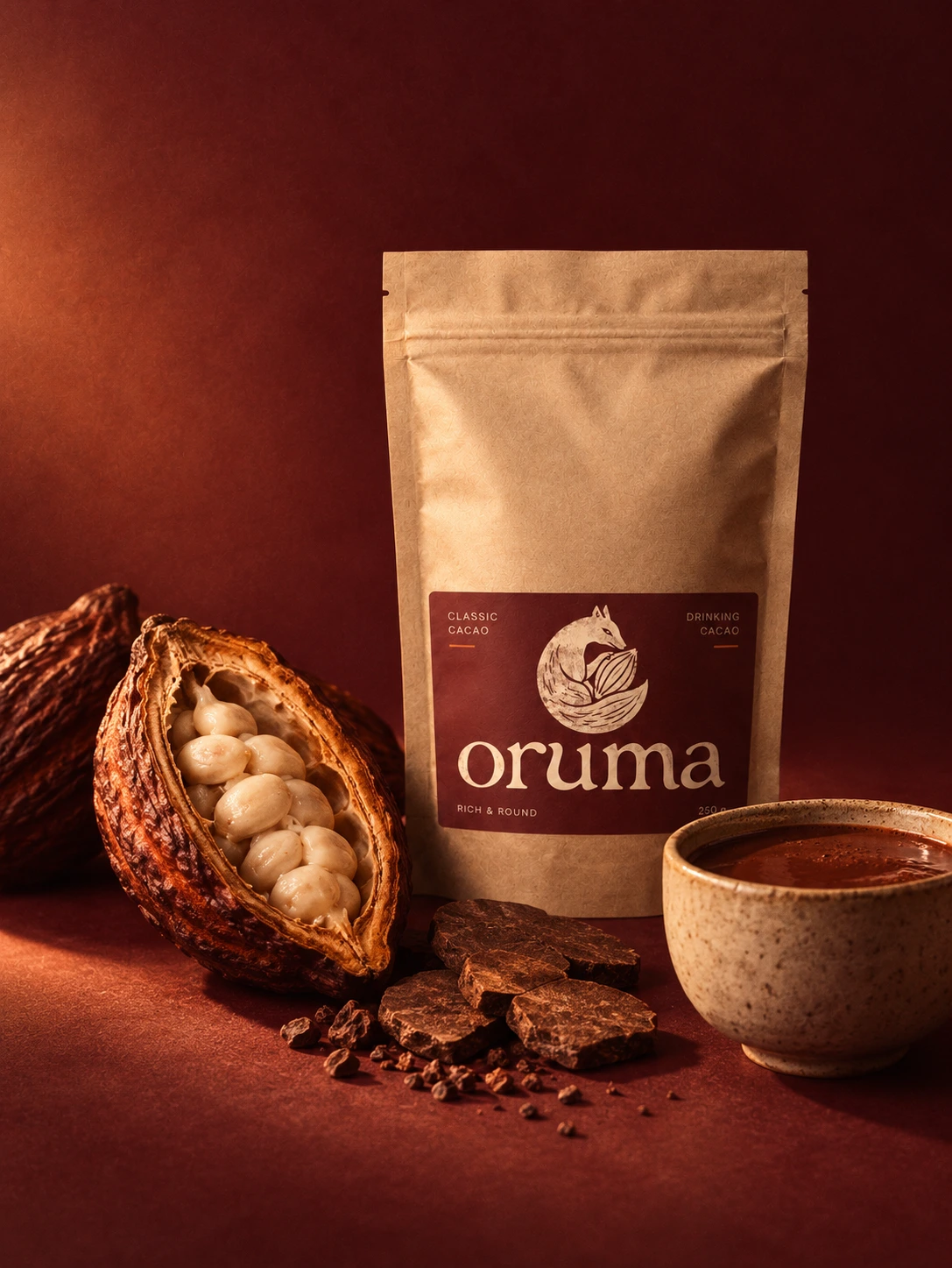
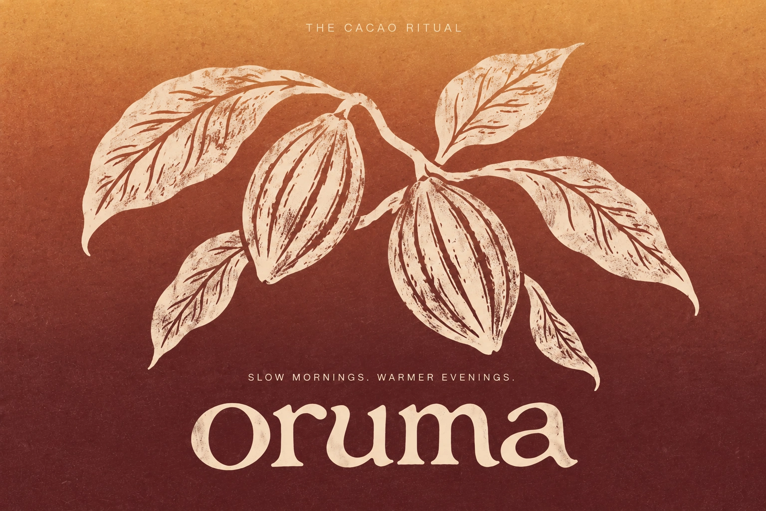
The brand idea is slowness as a pleasure. Drinking cacao is something you prepare, pour and sit with, and every design choice supports that pace. Warm, deep colour, tactile texture and generous space make the brand feel like a pause in the day.
The Symbol: Fox & Cacao Pod
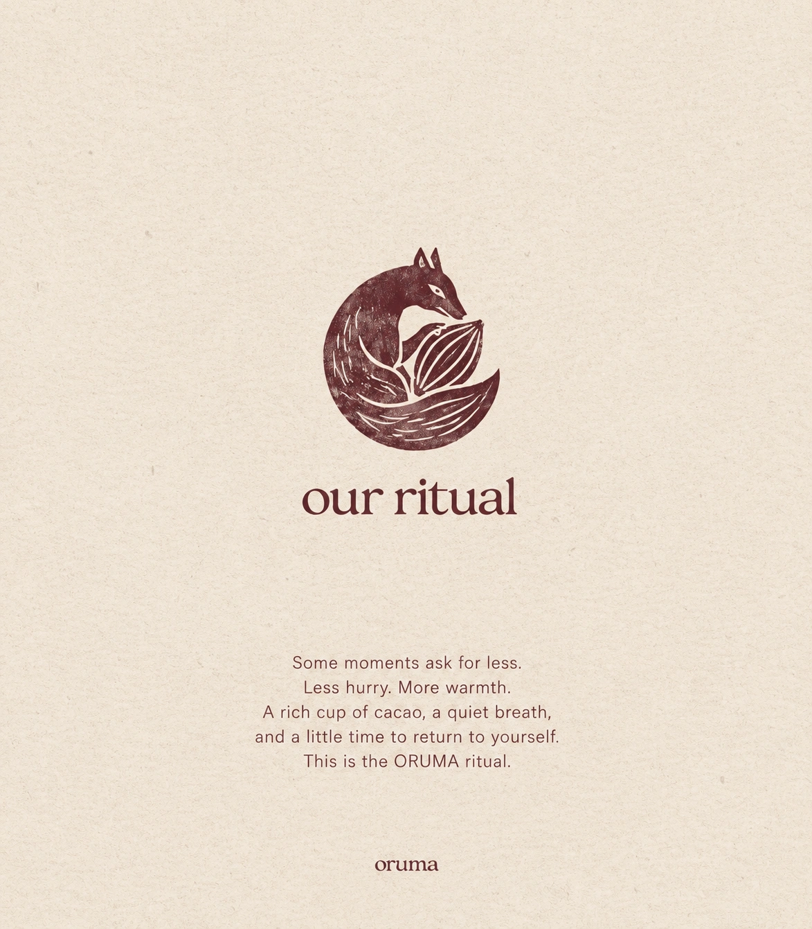
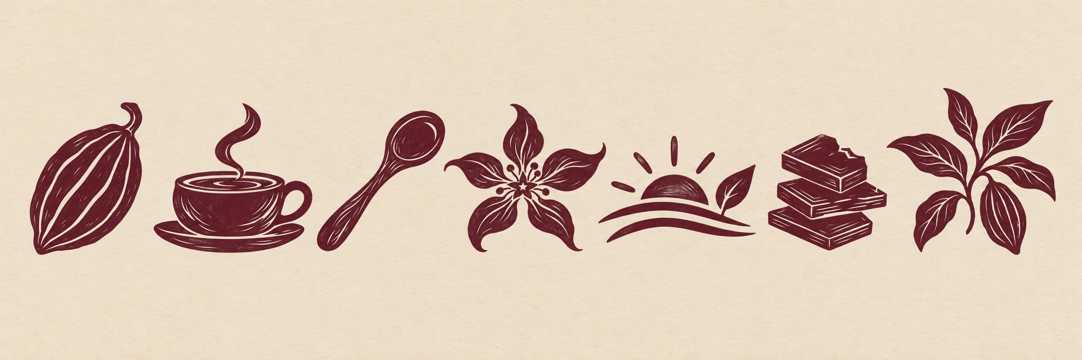
At the centre of the identity is a fox curled into a circle, nose resting against a cacao pod, tail wrapped around it. The fox suggests warmth, instinct and quiet cleverness, and the curled form gives the mark a soft, protective feeling. The circular shape also echoes the roundness of the product itself (“rich / round / unhurried”). I rendered it in a block-print style with uneven edges and fine carved lines, so it feels hand-pressed rather than digital.
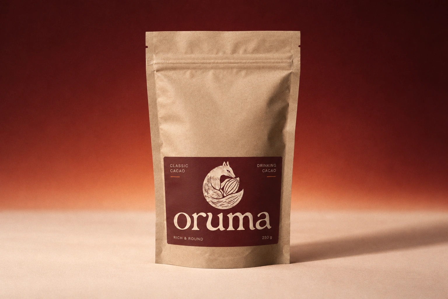
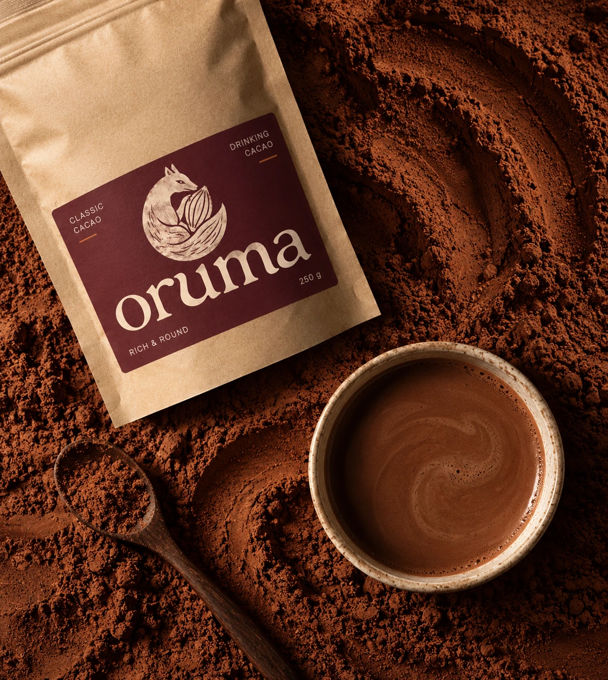
The palette is inspired by cocoa itself, from raw powder to roasted pods. Gradients from amber to maroon give flavours and surfaces a sunset-like glow.
Packaging System
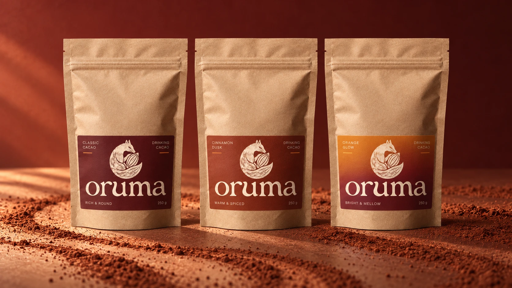
Three kraft stand-up pouches share a single label format, with the colour doing the work of telling flavours apart:
Classic Cacao (maroon): Rich & Round
Cinnamon Dusk (terracotta): Warm & Spiced
Orange Glow (amber to maroon): Bright & Mellow
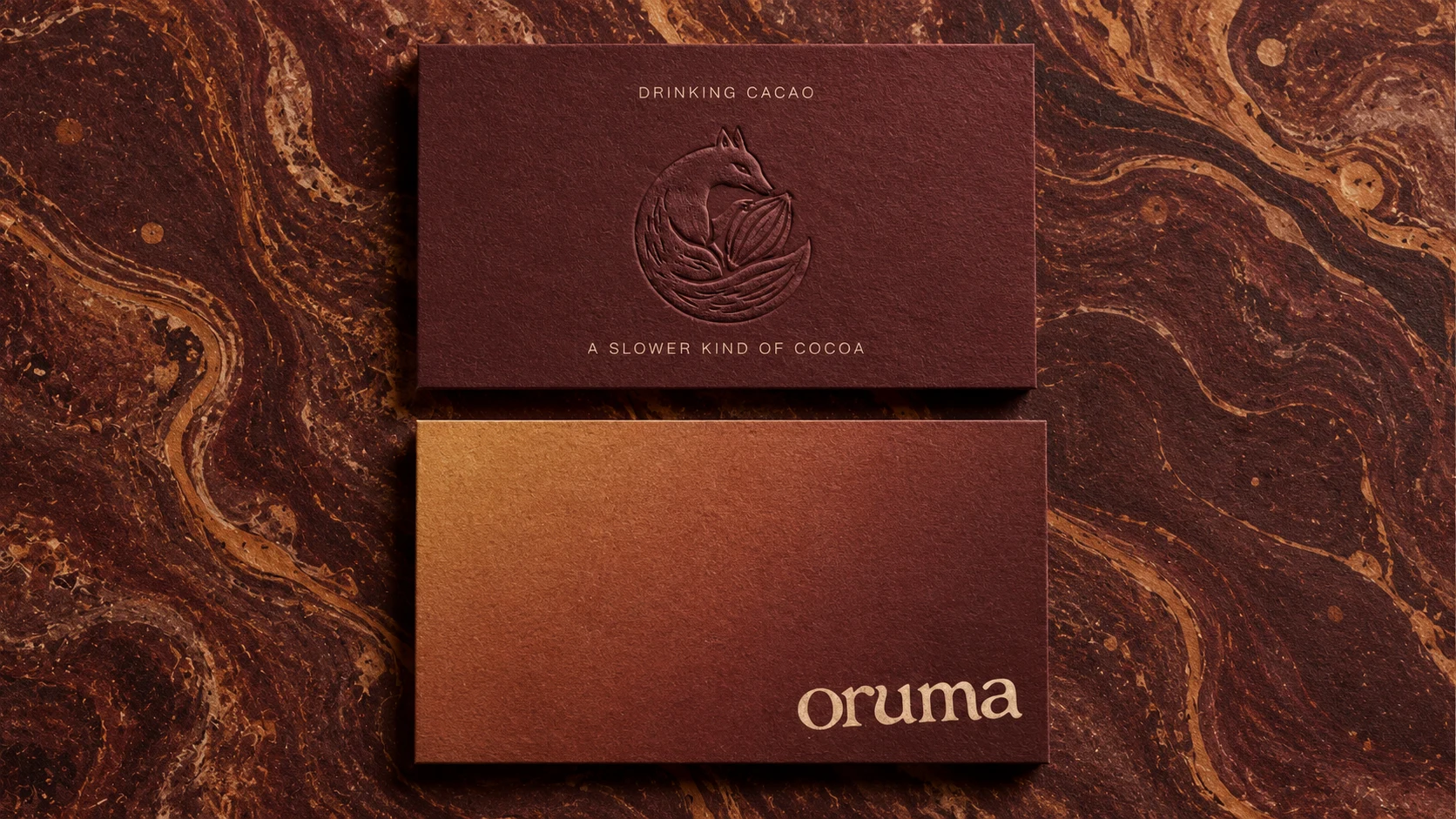
The business cards show the brand’s tactile side. One side has the fox embossed into deep maroon stock, with no ink at all, which gives a quiet, premium feel. The other has a warm amber-to-maroon gradient with the wordmark in a soft cream. Both sit against a marbled, cocoa-toned backdrop that echoes the swirl of cacao in a cup.
Outcome
Oruma has a distinctive, cohesive identity that feels artisanal and calm, with enough warmth to be inviting. The fox gives the brand a memorable character, the palette makes it feel like cacao and the system is built to grow into new flavours and products.
Services: Brand Identity · Logo & Symbol Design · Illustration · Packaging Design · Stationery · Brand Mockups
4 likes · 8 views · Oct 23, 2026
Created a calming, artisanal brand identity for Oruma cacao. From the logo and illustration to packaging and stationery looks handmade, warm quietly premium.


