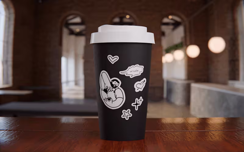
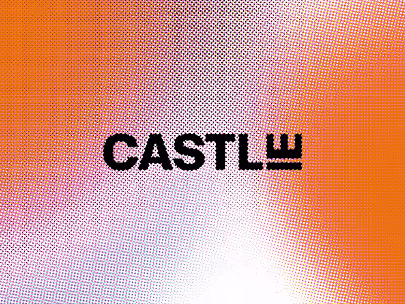
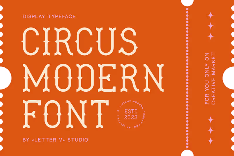
love in every line | branding and graphic design services
- 1x
- Hired
- 5.0
- Rating
- 12
- Followers
love in every line | branding and graphic design services

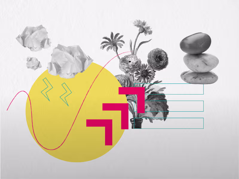
I design Identity Systems and Product Design

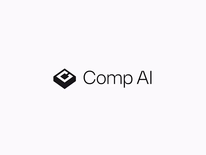
Design-Forward and Strategy-Driven
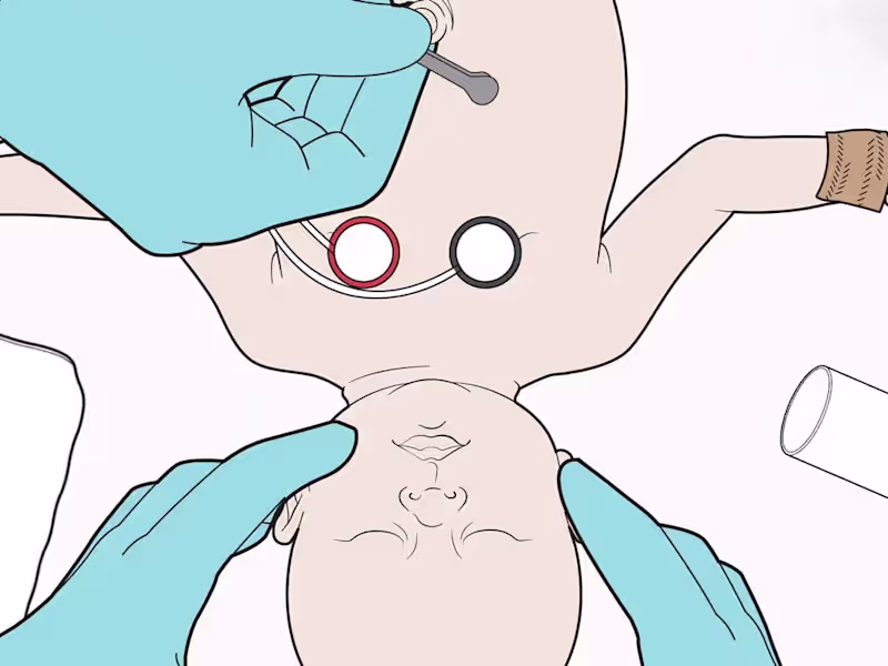
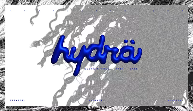
Visual Designer 🎨💻 | Storytelling for trusted brands
- 2x
- Hired
- 5.0
- Rating
- 3
- Followers
Visual Designer 🎨💻 | Storytelling for trusted brands
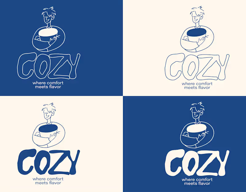
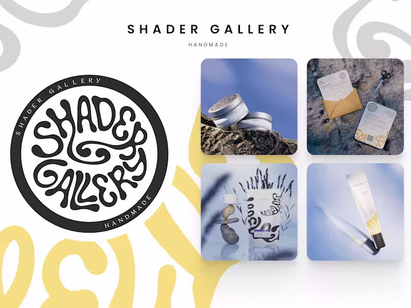
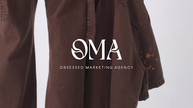
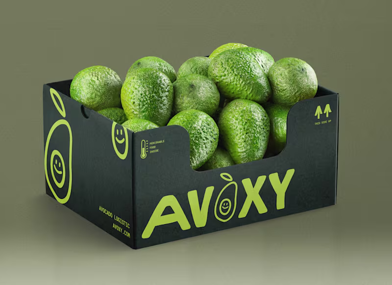
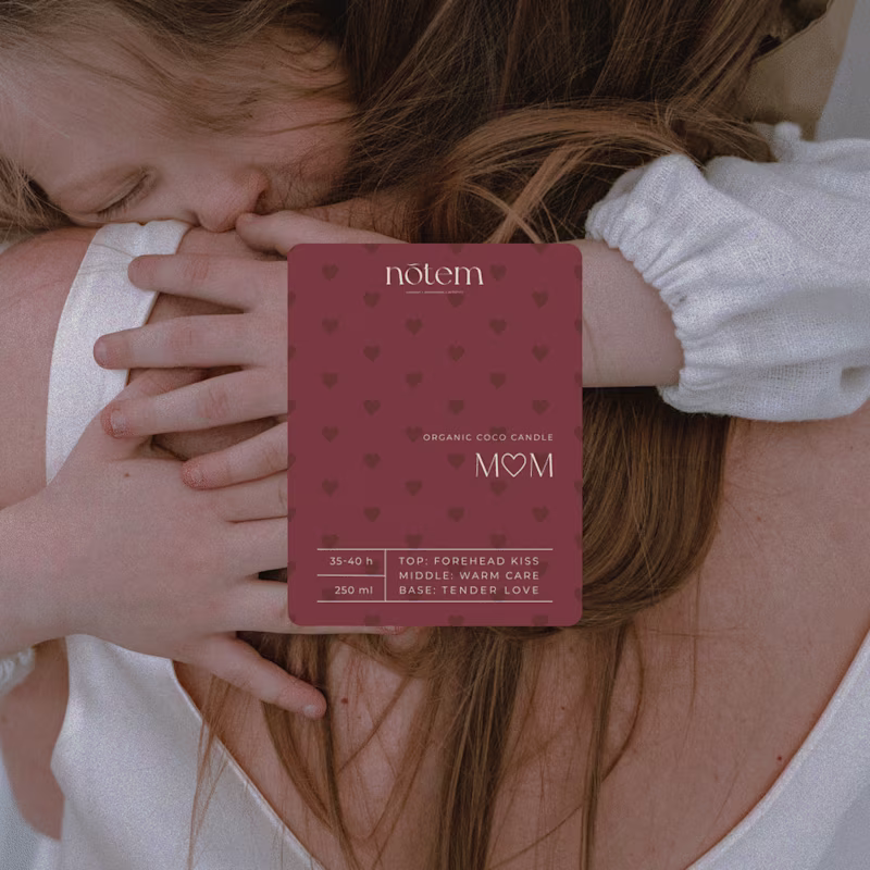
Create brand identity with meaning
Create brand identity with meaning
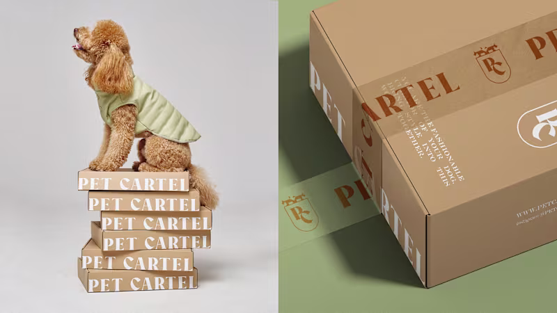
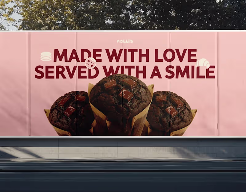
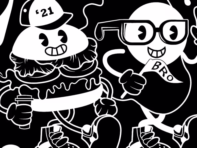
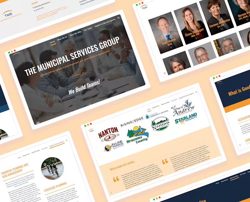
Graphic Designer ▹ Branding, Marketing, Packaging & More
Graphic Designer ▹ Branding, Marketing, Packaging & More
Brand designer helping founders build identities that scale.