The network for creativity
Join 1.25M professional creatives like you
Connect with clients, get discovered, and run your business 100% commission-free
Creatives on Contra have earned over $150M and we are just getting started
Back to feedPost

Print is not dead. It's just raising the bar.
Canvas Magazine (Summer 2026, Issue AB) is an independent editorial publication built around art, culture, style, and inspiration. The brief was clear: design a print magazine that could hold its own on a shelf next to Kinfolk and Architectural Digest — while speaking to a completely different audience.
The design direction leans into controlled chaos. Raw, expressive artwork by Art by Bart anchors the visual identity, with a high-contrast black editorial system built around it. Rather than competing with the cover art, the typography works with it — oversized masthead, bold section headers, and a tight three-color palette (white, gold, red) that gives structure without softening the energy.
Key design decisions:
Cover system: Full-bleed artwork with a layered typographic hierarchy — masthead, feature callouts, and badges coexist without crowding
Interior spreads: "Beyond the Lines" feature uses an asymmetric layout to mirror the editorial content — breaking the grid where the story calls for it
Newsstand positioning: Designed to command attention in-context, not just in isolation. The cover reads at distance and up close
The result is a magazine identity that looks like it belongs in culture, not just on a shelf.


The network for creativity
Join 1.25M professional creatives like you
Connect with clients, get discovered, and run your business 100% commission-free
Creatives on Contra have earned over $150M and we are just getting started
Related posts

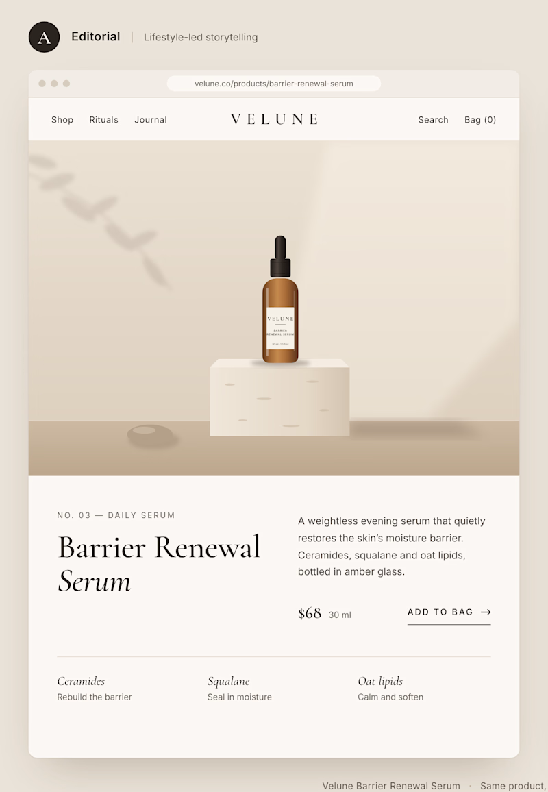
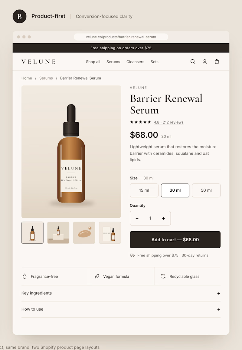
Two different approaches to the same Shopify product page.
Option A: Editorial layout. Large imagery, generous spacing, and a stronger focus on brand storytelling.
Option B: Product-first layout. Clear pricing, visible product options, and a prominent Add to Cart button.
Both can look great, but they create very different shopping experiences.
If you were building a premium DTC brand, which direction would you choose?
A or B? And why?
1 voted
11%
8 voted
89%
9 votes
Closed


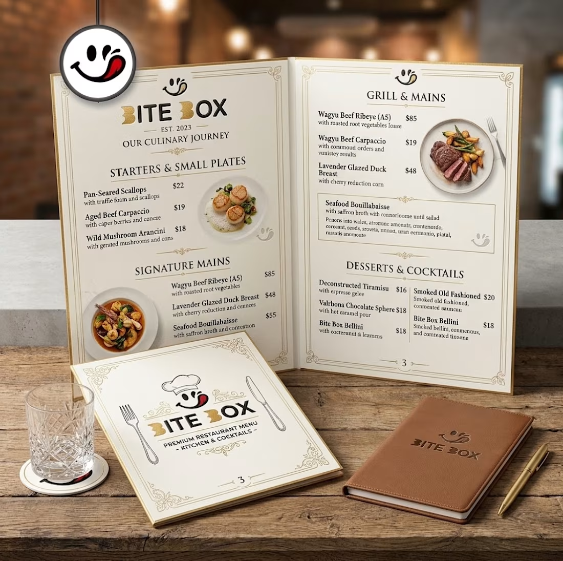
🍔 BITE BOX — Where Every Bite Brings a Smile! 🧡
A fun, fresh, and memorable logo concept designed for a modern fast-food brand. The smile icon represents happiness, while the bold typography creates a friendly and recognizable identity. 🍟✨
#LogoDesign #FoodBranding #GraphicDesign #BrandIdentity #LogoDesigner

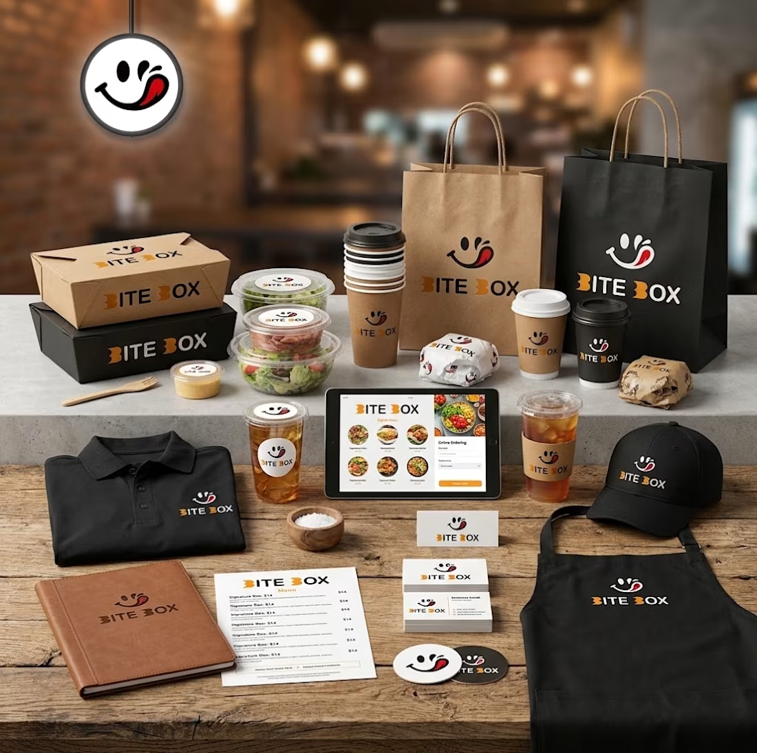
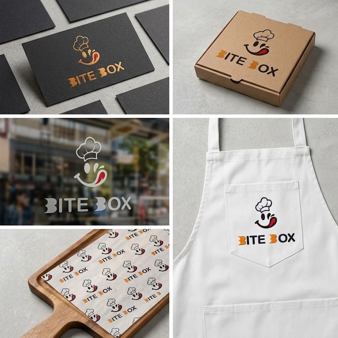
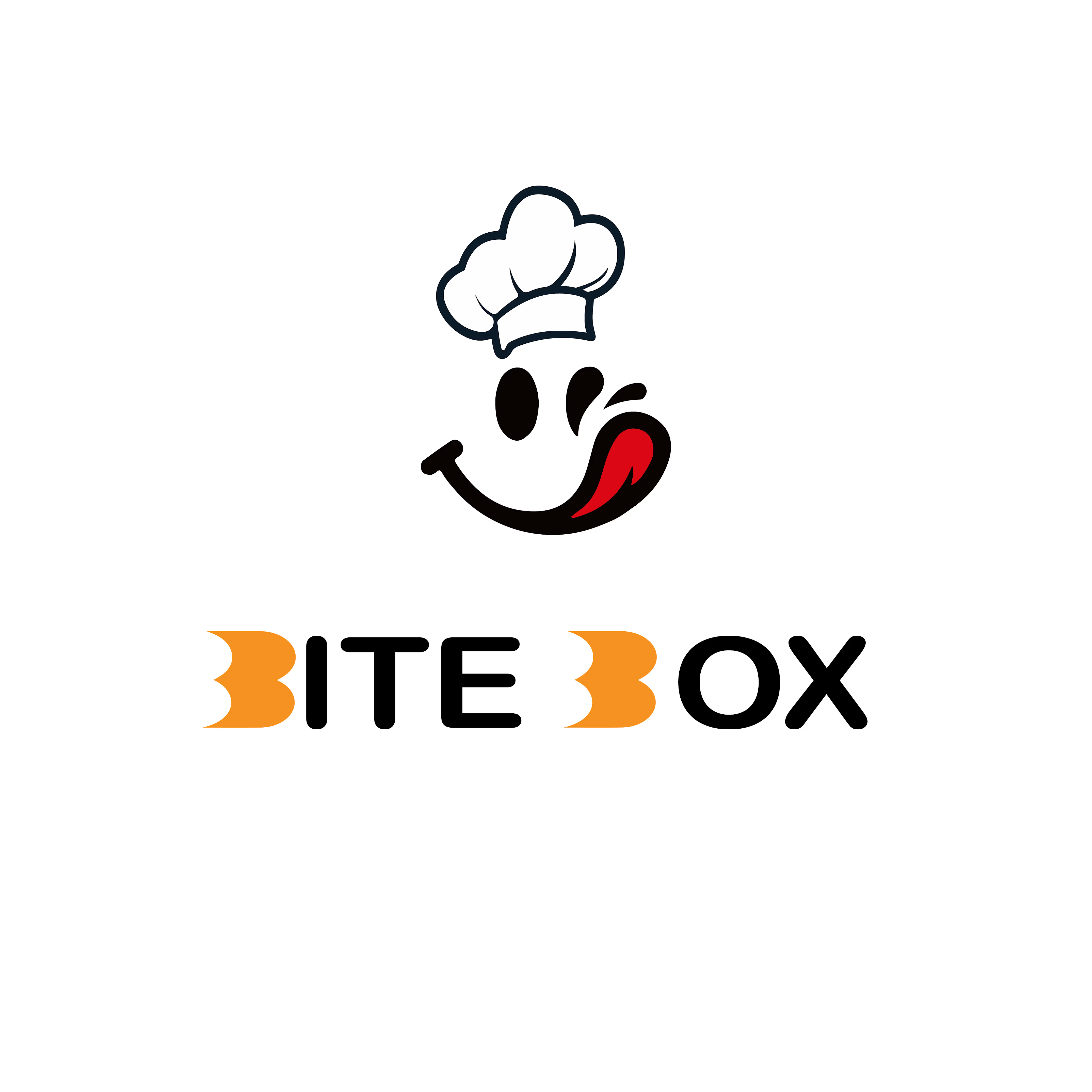


the little chef smile on the box is doing a lot of the work here


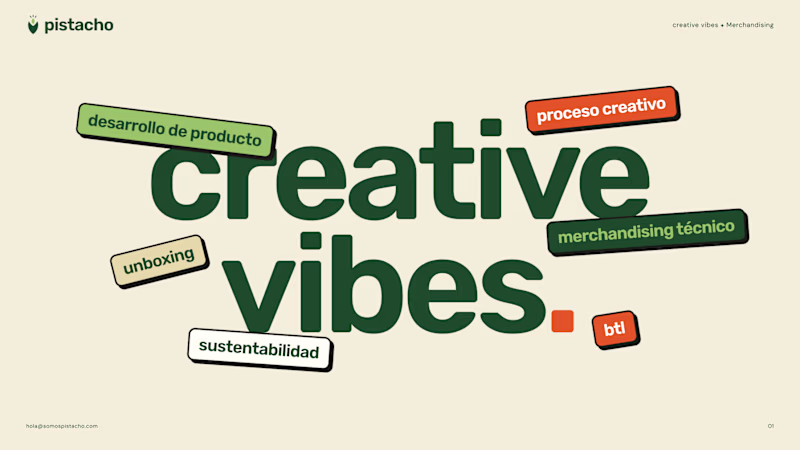
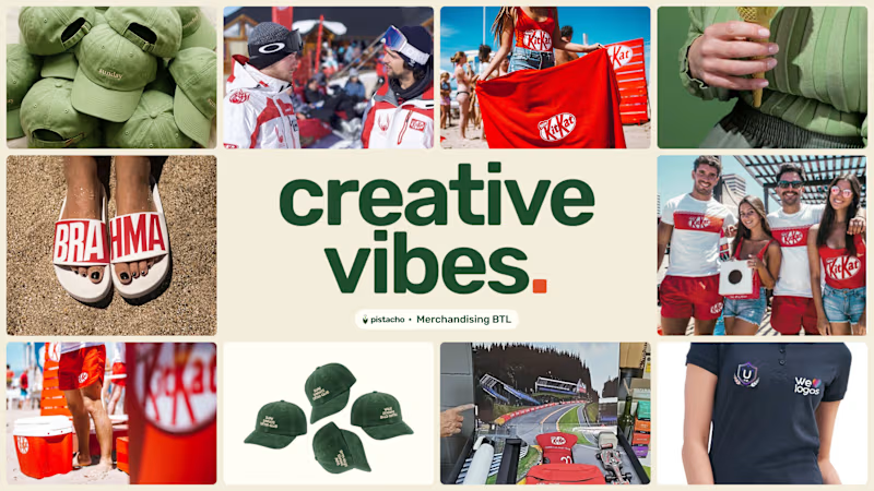
Which cover for a brochure's creative company?
8 voted
30%
19 voted
70%
27 votes
Closed

Went with A. The type does the work on its own, and B's photo grid fights with the headline.