
max
Darya Batyr ✦
Creative partner in your brand’s success
- $250k+
- Earned
- 55x
- Hired
- 4.98
- Rating
- 1K
- Followers
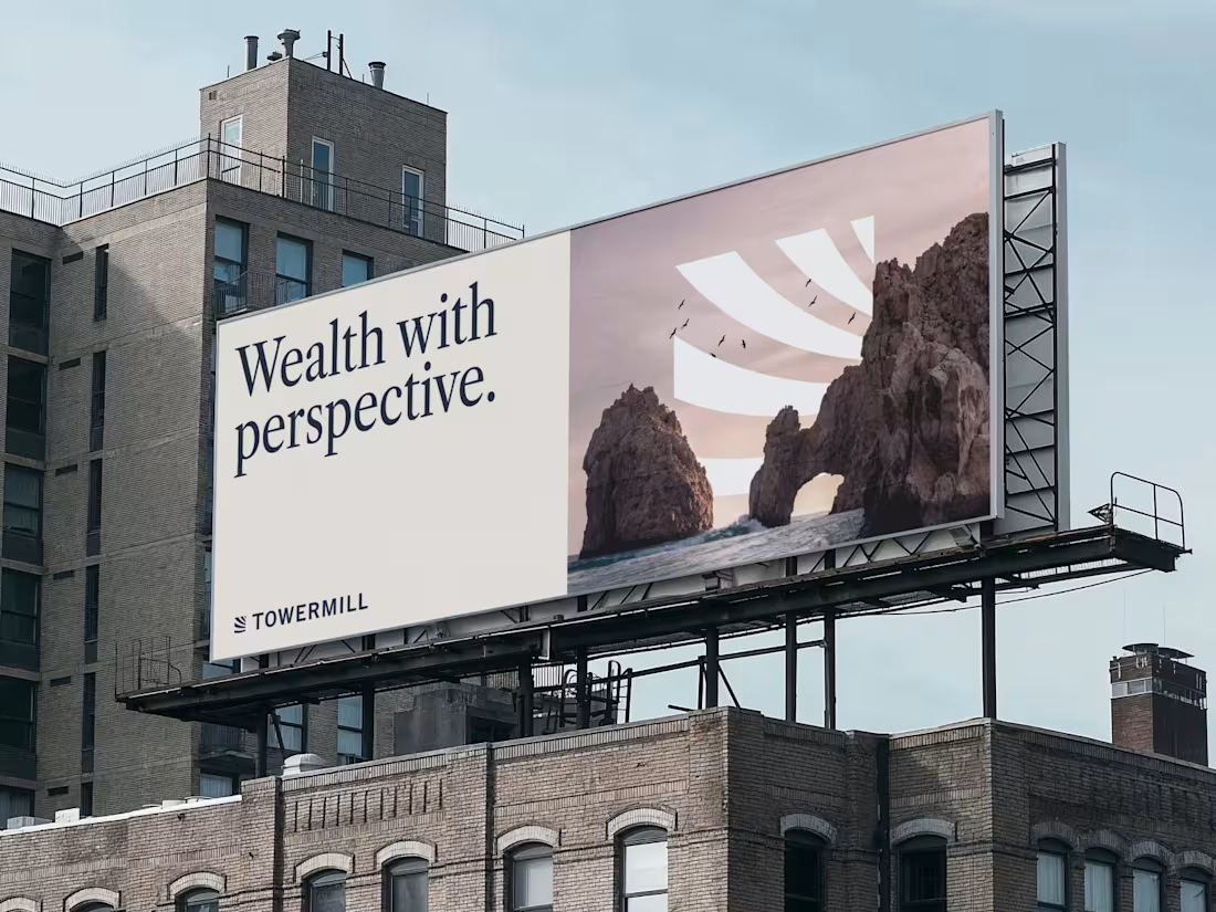
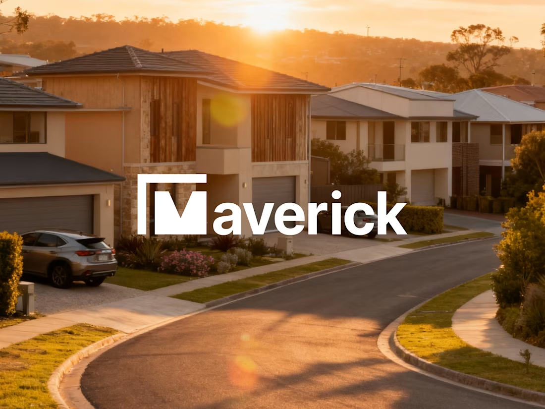
Modern Identity for a Future-Ready Investment Firm
63
1.1K
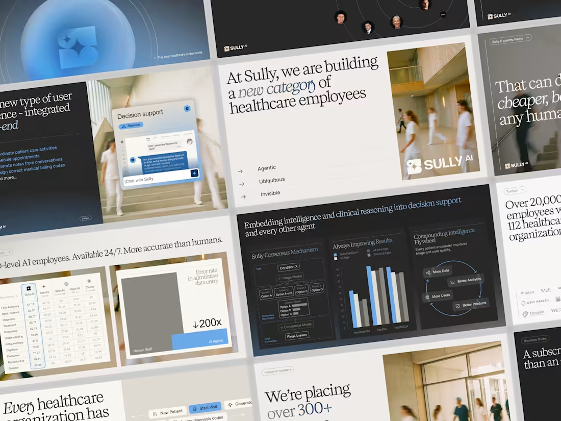
Sully.ai Series B Pitch Deck Design
35
839
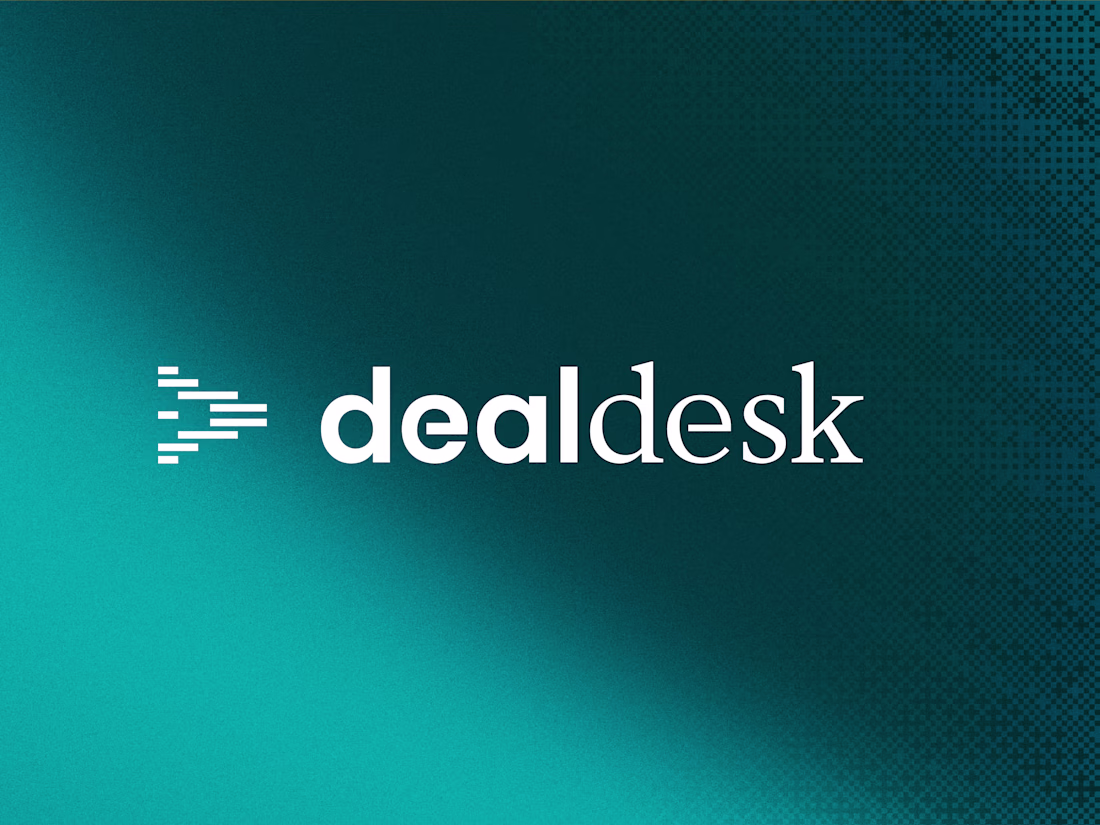
DealDesk - B2B SaaS Negotiation Brand Identity
9
224
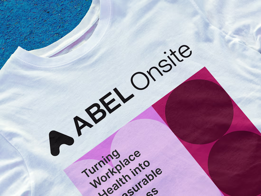
Preventive Health Brand Identity Refresh
0
36
AI-Powered Insurance Brand Identity
19
725
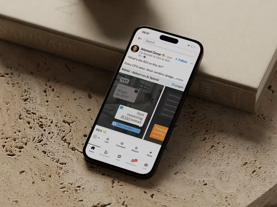
If the founder's LinkedIn looks nothing like the investor deck, while the website tells a different story, where's the credibility?
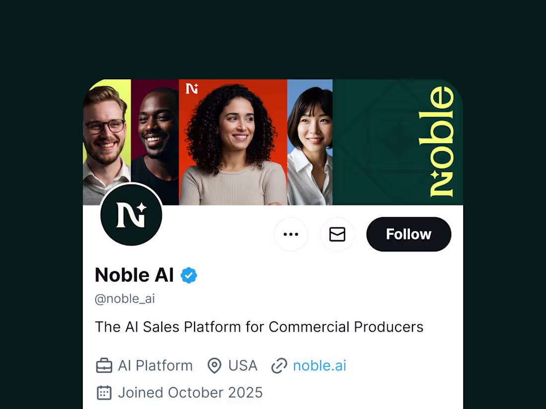
That's where long-term design support becomes essential. For Sully.ai (http://Sully.ai), I provide consistent visual support across channels: social graphics, presentation updates, whitepaper assets and more. Each piece maintains the same sophisticated AI healthcare narrative - from fundraising materials to founder content.
The result: brand coherence that builds trust across every touchpoint.
12
38
1.7K
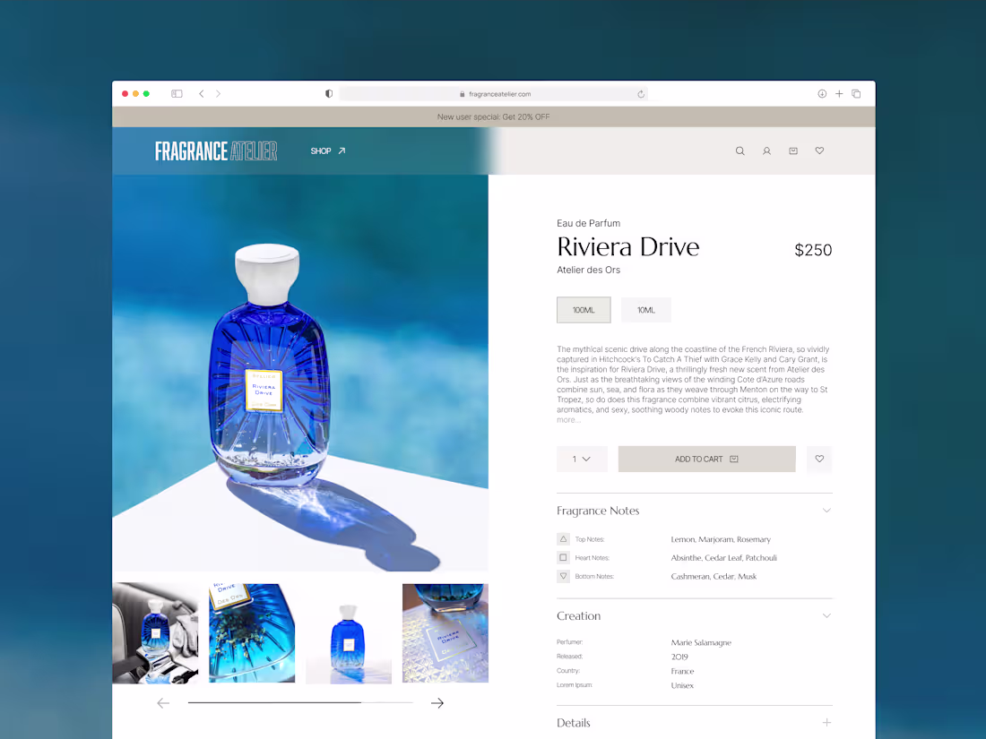
Niche fragrance e-commerce website Fragrance Atelier
2
50
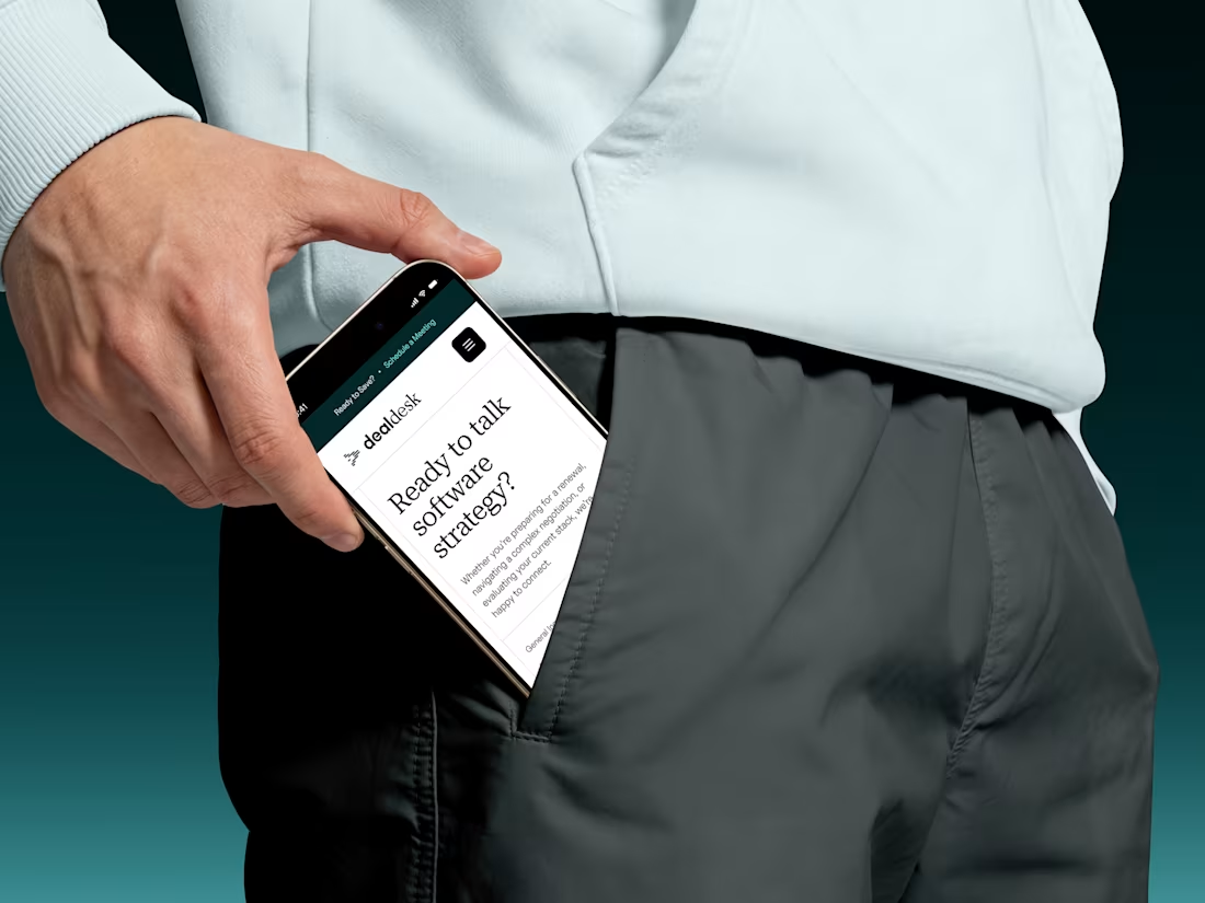
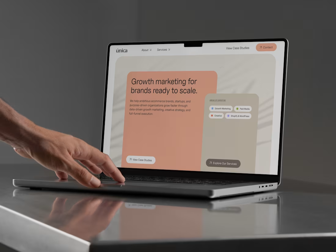
SaaS Consulting Website Design
1
26
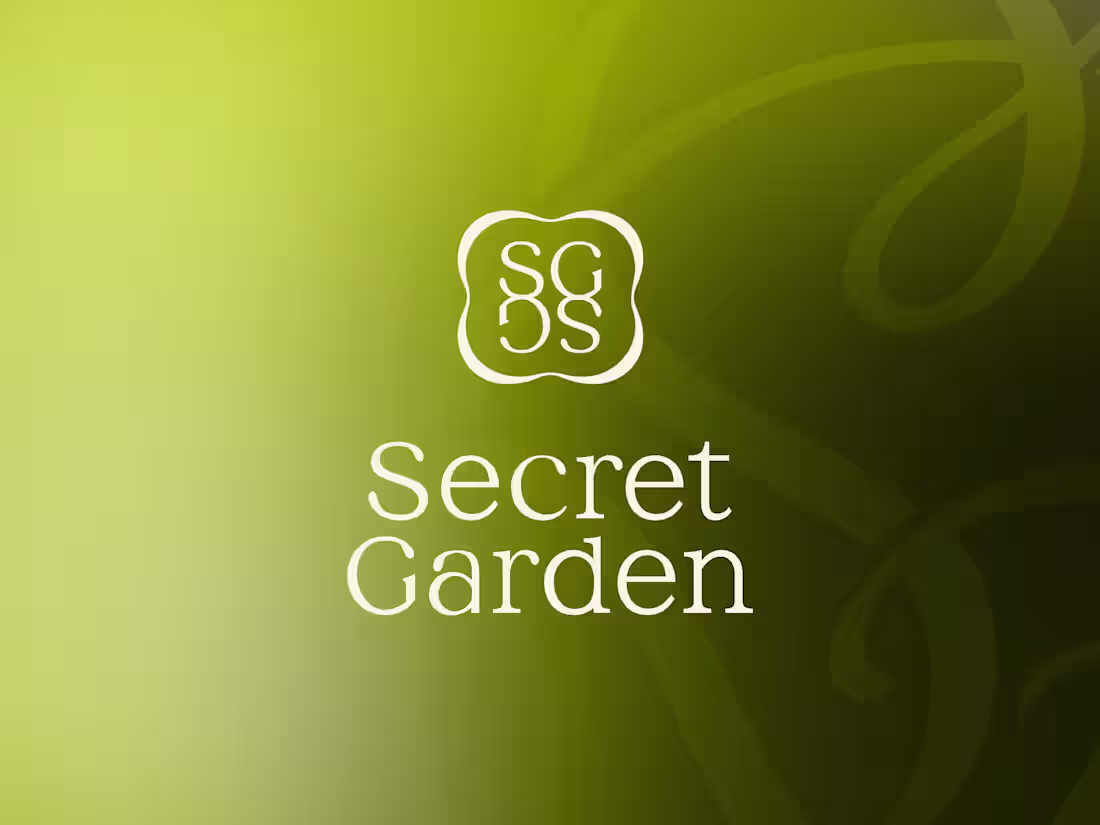
Brand Identity for a Design Led Florist
0
21
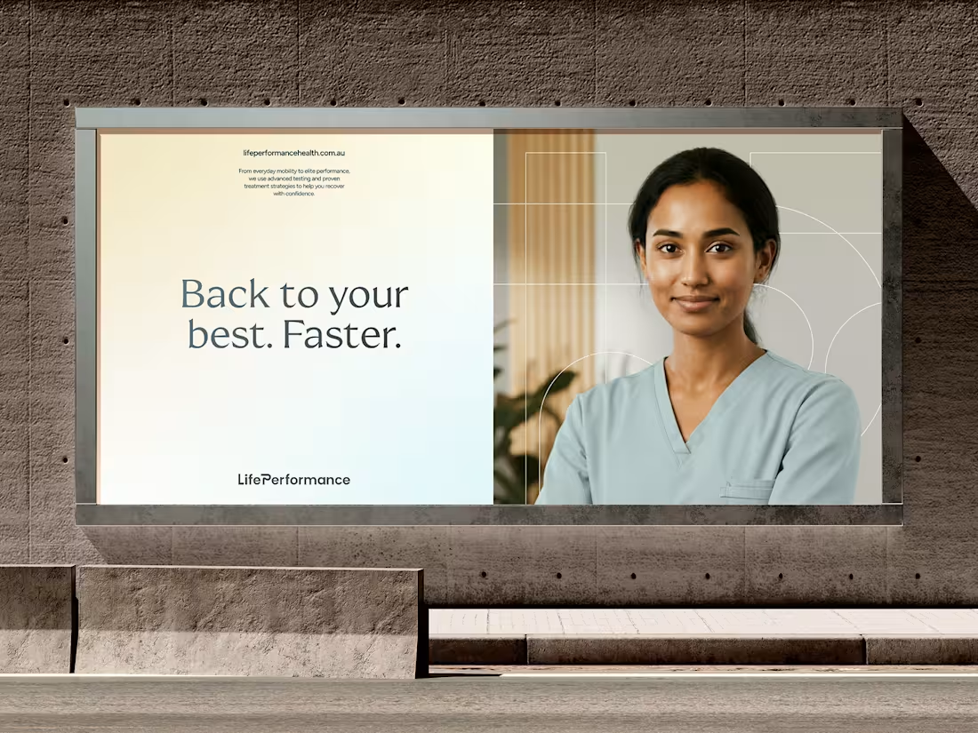
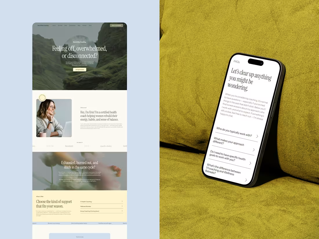
LP - Ecosystem Brand Design for Healthcare
21
316
1
1
21
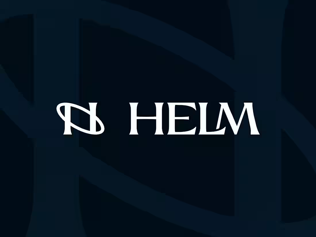
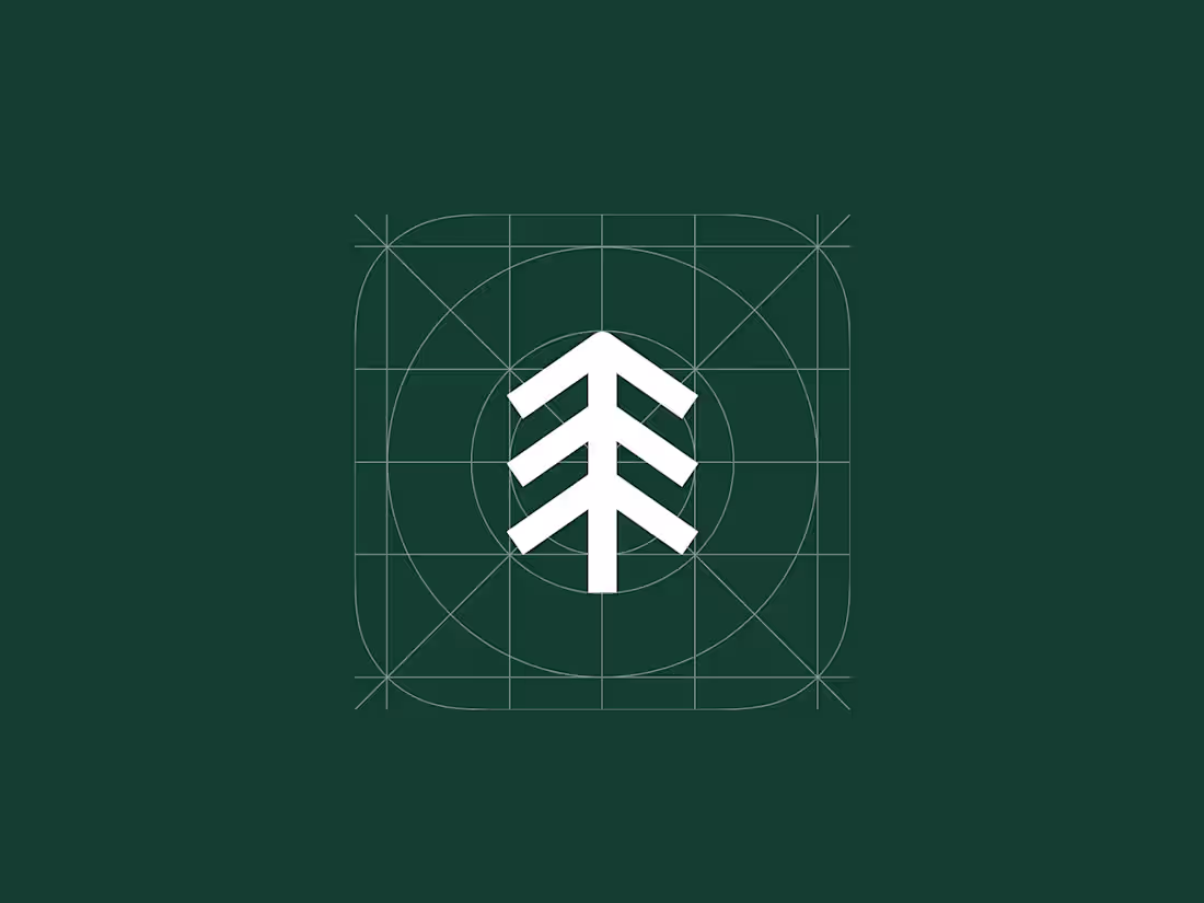
Brand Sprint for Helm
34
664
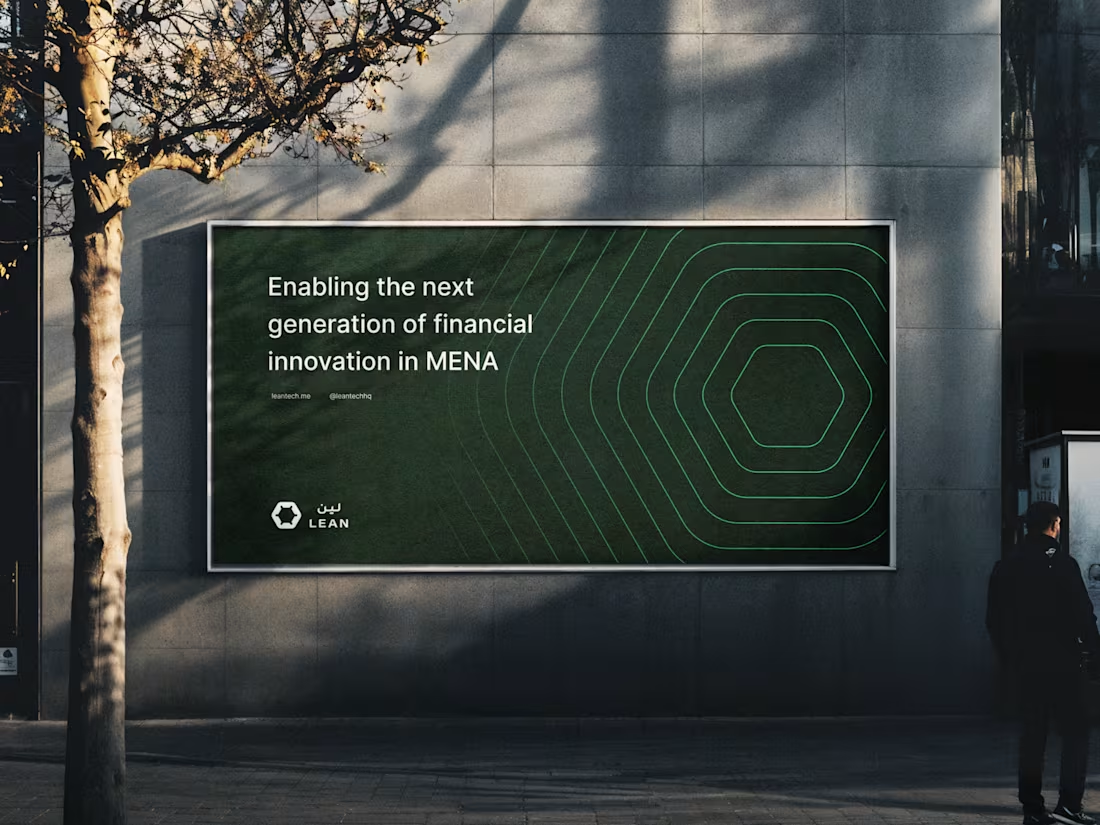
Scalable Rebrand for Lean
48
629
1
5
34
4K
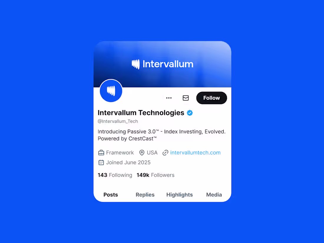
Digital-First Brand Design for Intervallum Technologies
15
224
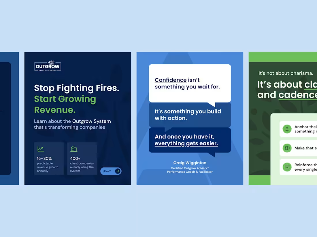
LinkedIn & Blog Visuals for Executive Coach
3
101
1
11
243
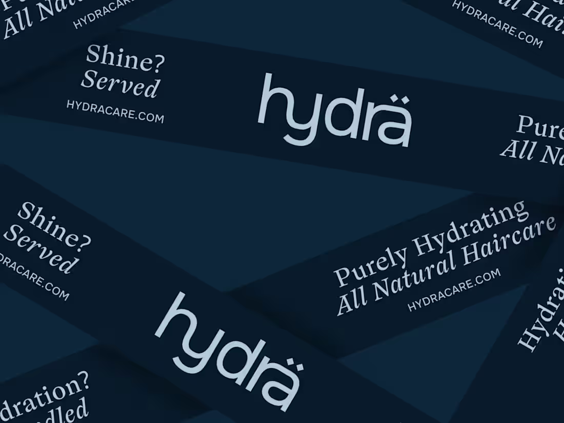
Brand Identity for Eco-Conscious hair care| Hydrä
19
479
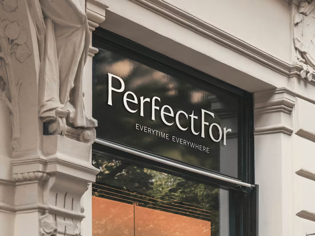
Editorial Brand Identity for PerfectFor
30
408
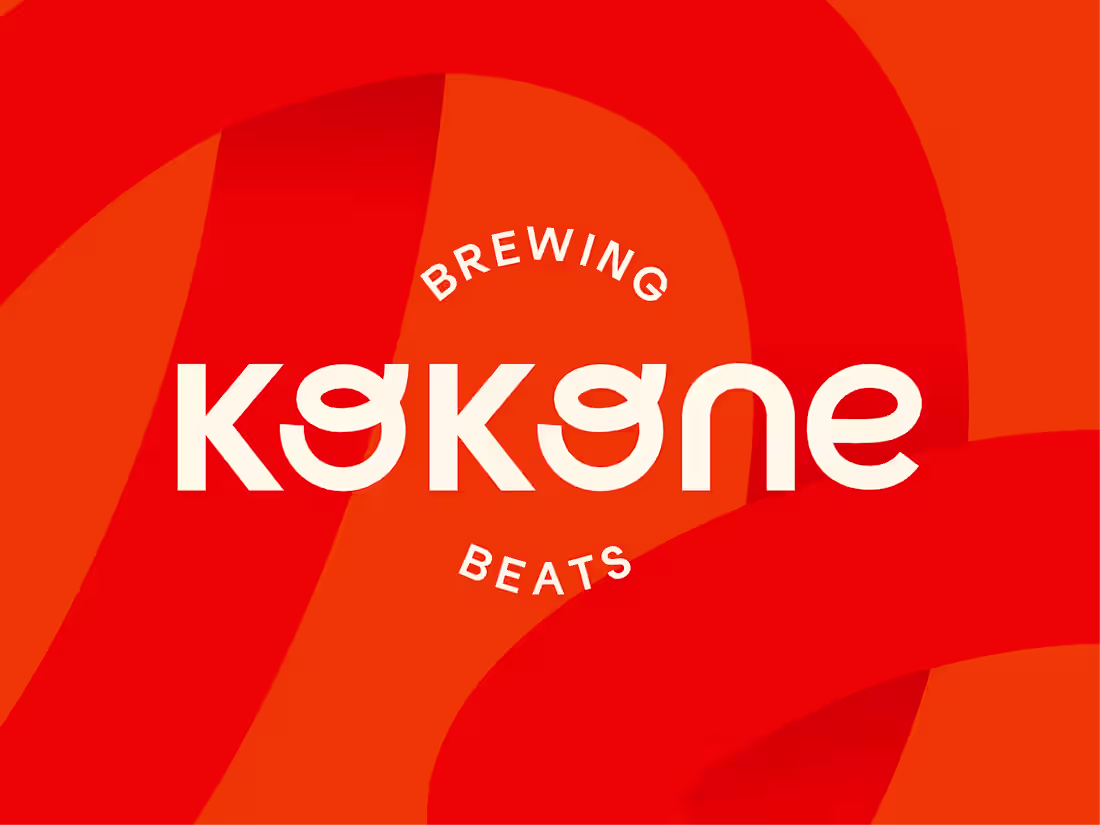
Brand Identiy for a vibrant cafe Kokone
48
712
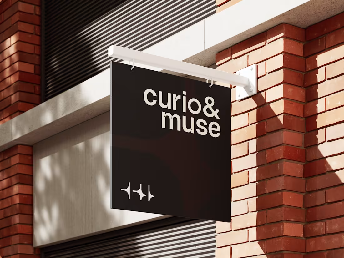
Brand Identity for Digital Publishing | Curio & Muse
19
278
Designing Trust and Clarity in the Garage Door Industry
5
51
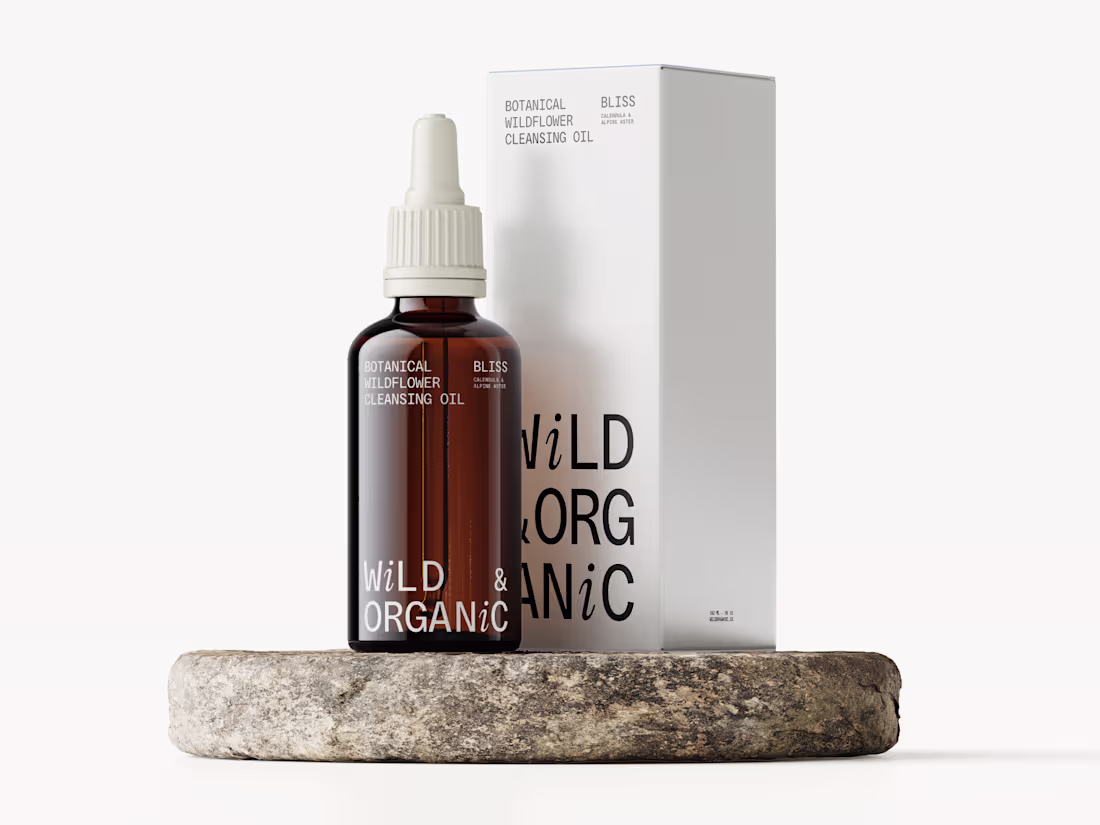
Brand Identity & Packaging | Wild & Organic
23
446
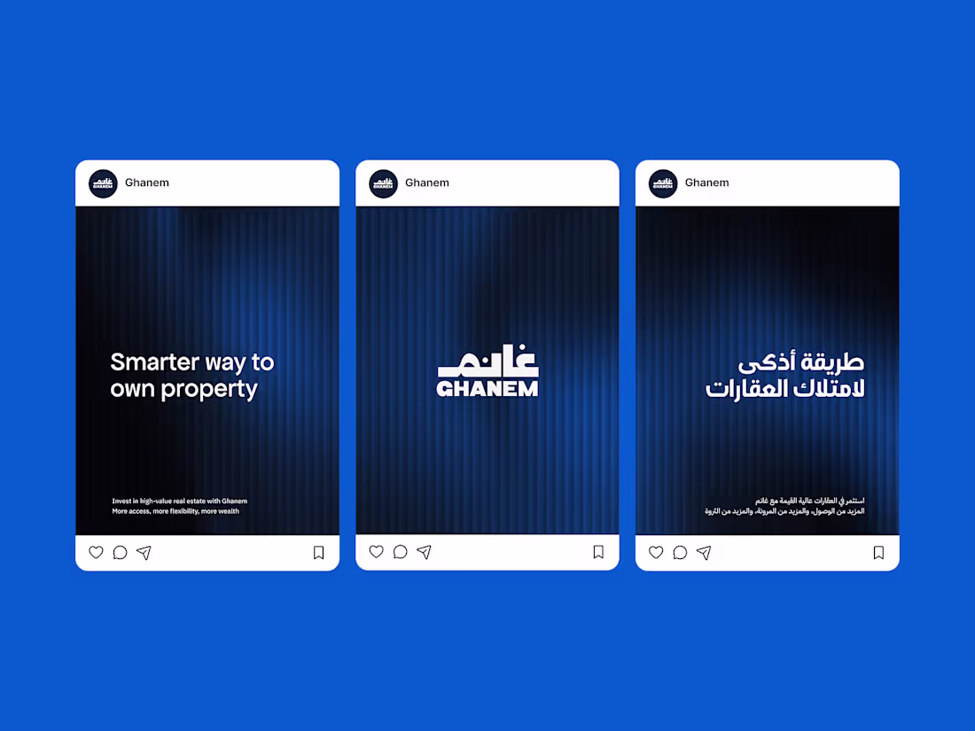
Design Support for a Real Estate Investment Platfrom
4
100
1
3
79
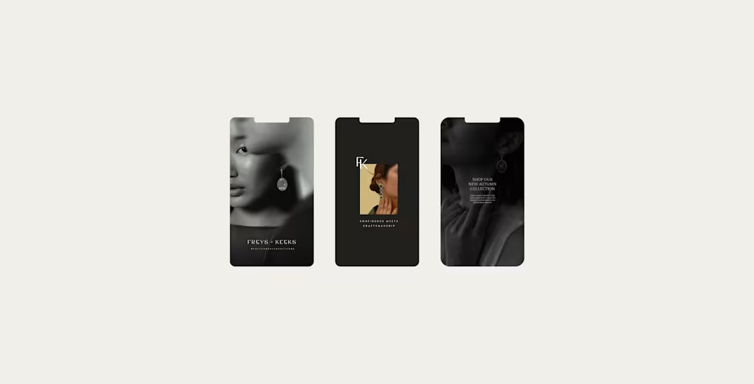
Instagram Templates for a hand-made jewellery brand
24
577
Brand Sprint for SEA Galeri
13
248
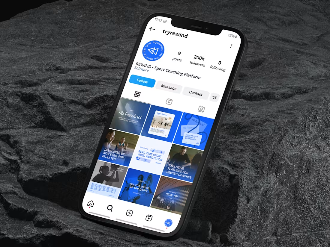
Brand Identity & Social Media for a Sports Coaching App | Rewind
32
396
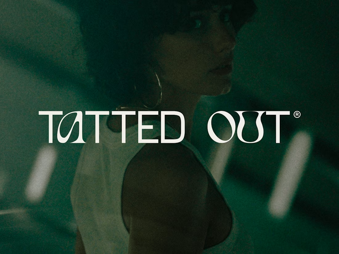
Brand Identity & Social media templates | Tatted Out
10
232