The network for creativity
Join 1.25M professional creatives like you
Connect with clients, get discovered, and run your business 100% commission-free
Creatives on Contra have earned over $150M and we are just getting started
Back to feedPost
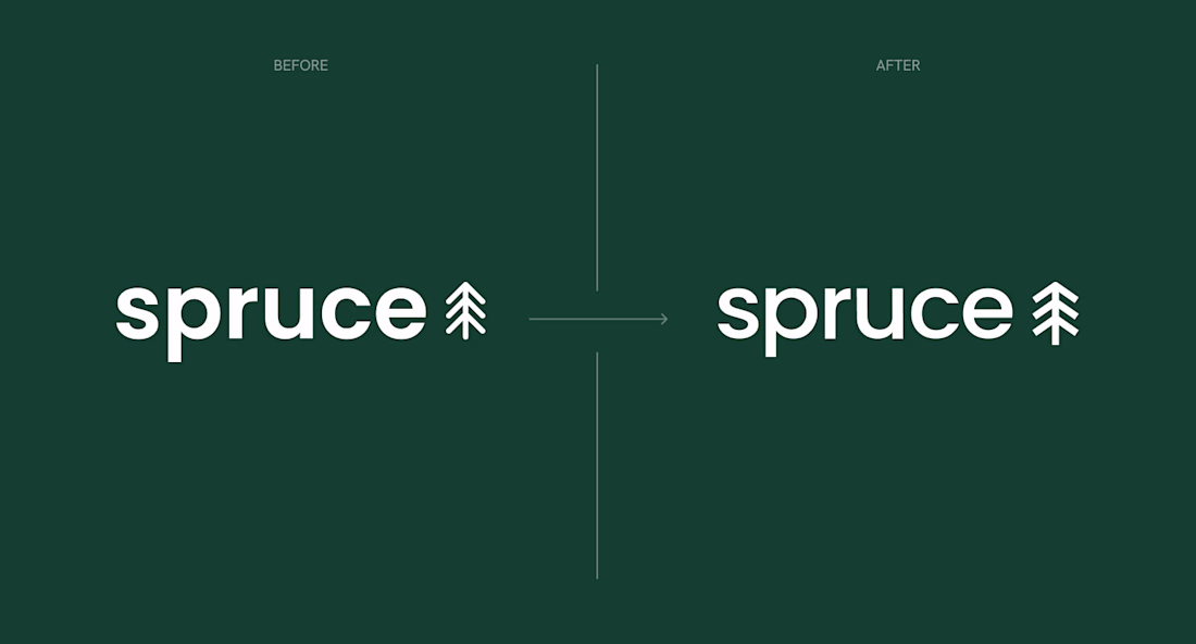
Throwback to earlier this year when Spruce Eco reached out to… well, spruce up their logo (yes, I’ve been saving that one since starting the project).
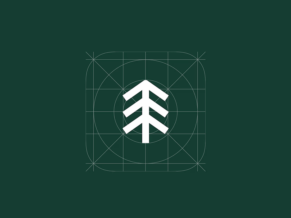
They already had a strong visual identity in place but felt a subtle imbalance in their logo - something that just didn’t feel quite right between the wordmark and submark.
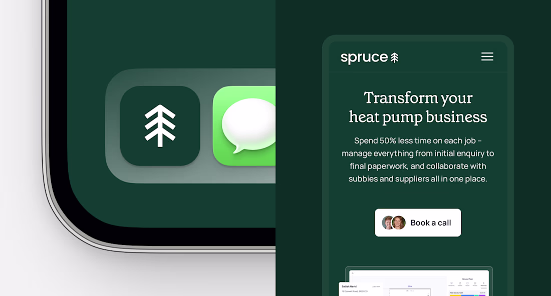
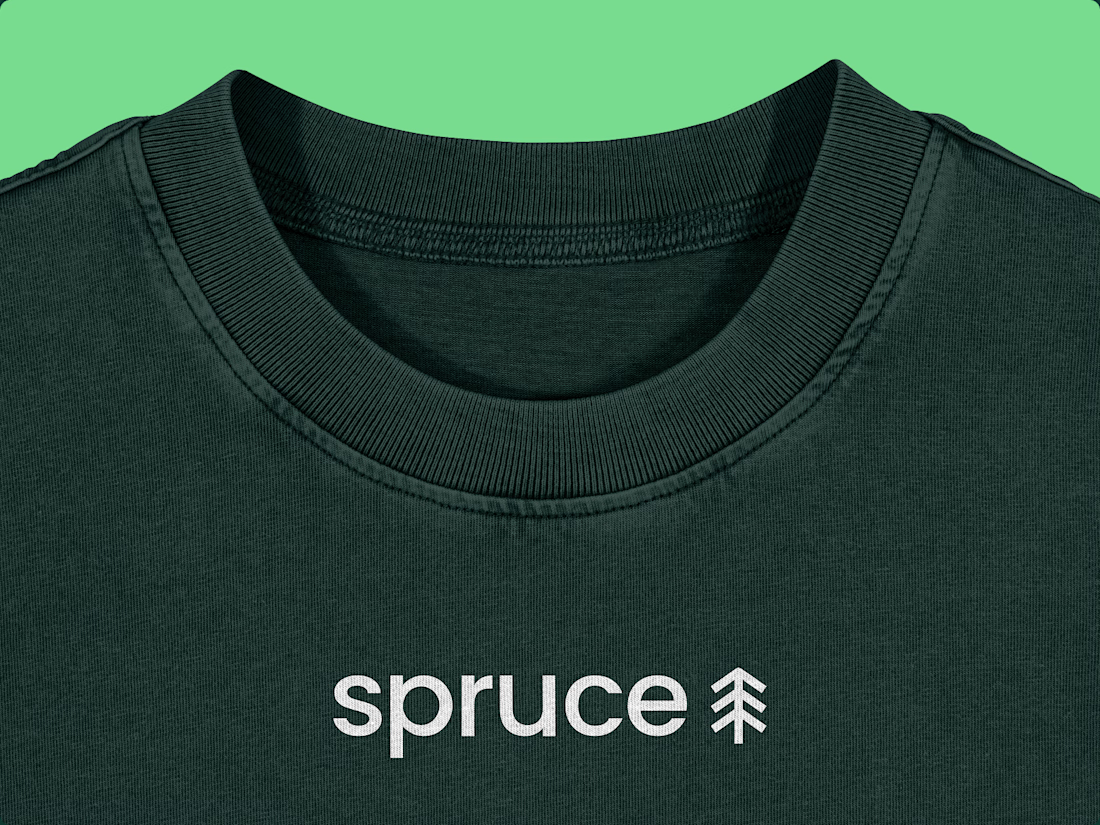
A few tweaks later - balanced proportions & a more defined submark - and the brand instantly felt more confident, cohesive and use-ready.
Just a reminder: sometimes the smallest adjustments make the biggest difference ✨
shareyourworkbranddesignerlogoGraphic DesignAdobe SuiteFigmaAdobe IllustratorLogo DesignBrand Design
@Darya Batyr ✦ Such a clean refinement ✨ Amazing how subtle tweaks can change the whole feel :)
@Darya Batyr ✦ Nice work 🚀
@Darya Batyr ✦ Cool!
@Darya Batyr ✦ you nailed it!
Thanks @Dan Marek! Pleasure working with you on this :)
The network for creativity
Join 1.25M professional creatives like you
Connect with clients, get discovered, and run your business 100% commission-free
Creatives on Contra have earned over $150M and we are just getting started
Trending
Claude
Claude has entered the design space. How are you using Claude Design?
Contra University
Learn from expert creatives how to earn more using next-gen AI tools.
creativeaiflow
Creative AI workflows are evolving. What tools do you use, and what are their strengths and weaknesses?
freelancerlife
Freelancer life is wins, pivots, and everything in between. What’s yours right now?