Modern Identity for a Future-Ready Investment Firm
Darya Batyr ✦
Verified

Modern identity for a disciplined investment firm
Towermill Capital is a private investment firm operating at the intersection of disciplined investing and enduring value creation. The company sought to refine its existing identity - bringing greater clarity, cohesion, and distinction to its brand system while staying true to its recognizable core wordmark.
The challenge lay in balancing institutional credibility with a modern digital edge - creating a visual language that transitions seamlessly from investor reports and printed materials to presentations, web platforms, and market communications.
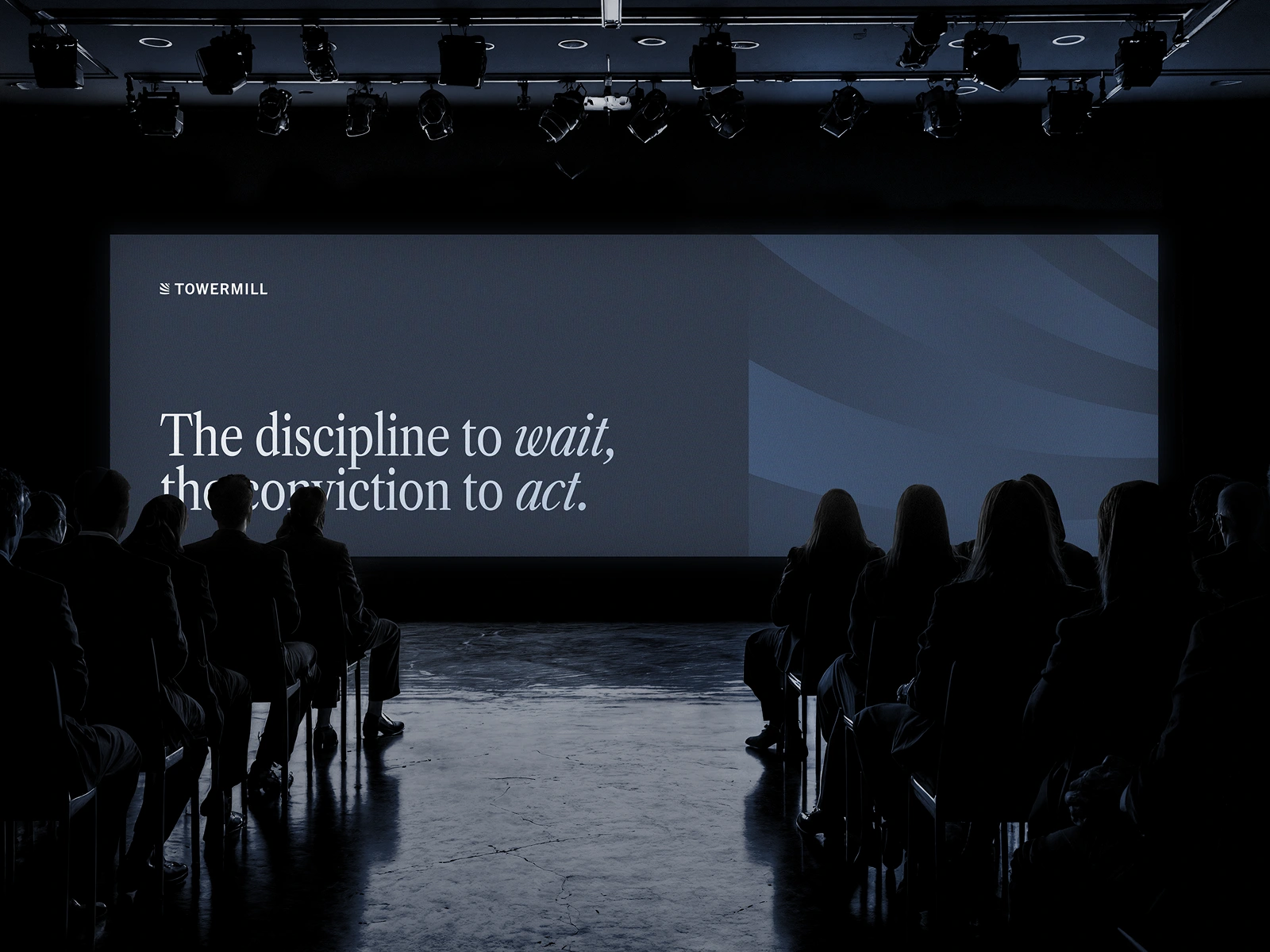
Our goal was to build a system that felt as considered and disciplined as the firm’s investment philosophy - modern, refined, and enduring.
Approach
We reimagined the identity around Towermill’s defining duality: professional yet human, timeless yet digitally fluent. Every design decision - typography, color, structure, and imagery - was guided by the brand’s values of discipline, clarity, and long-term perspective.
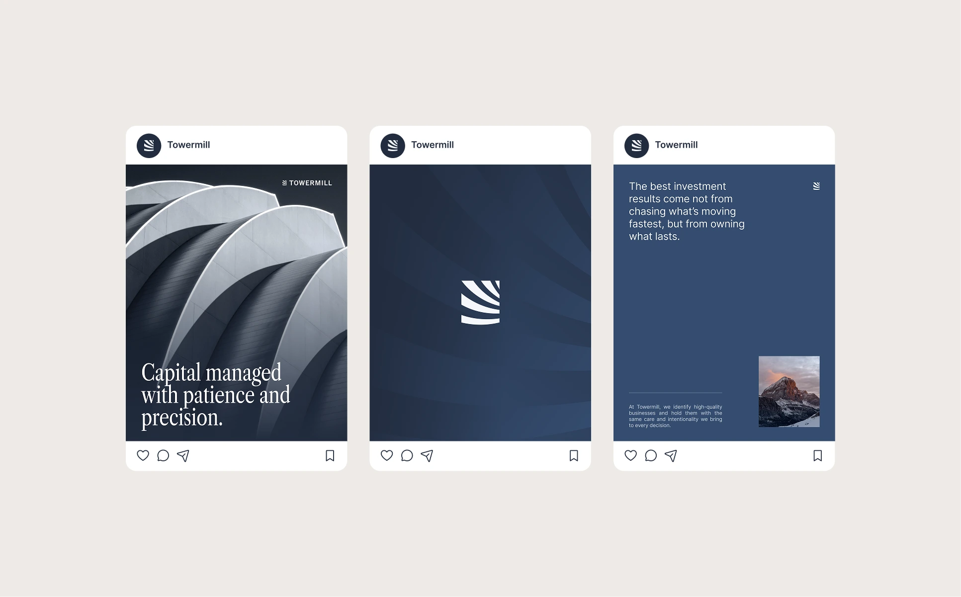
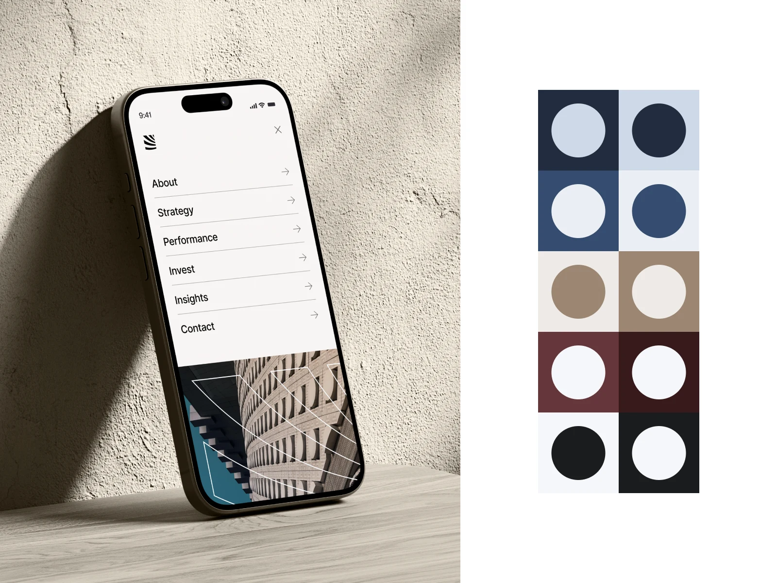
Visual Identity
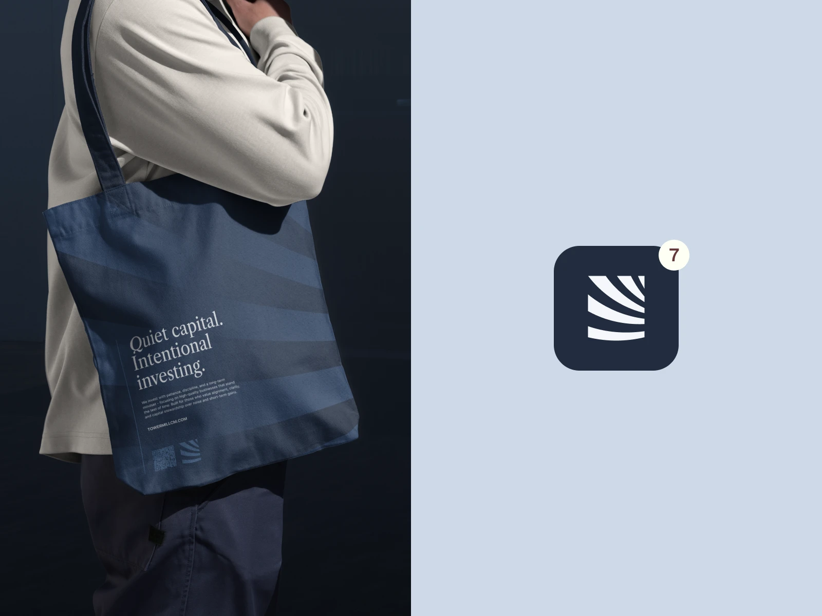
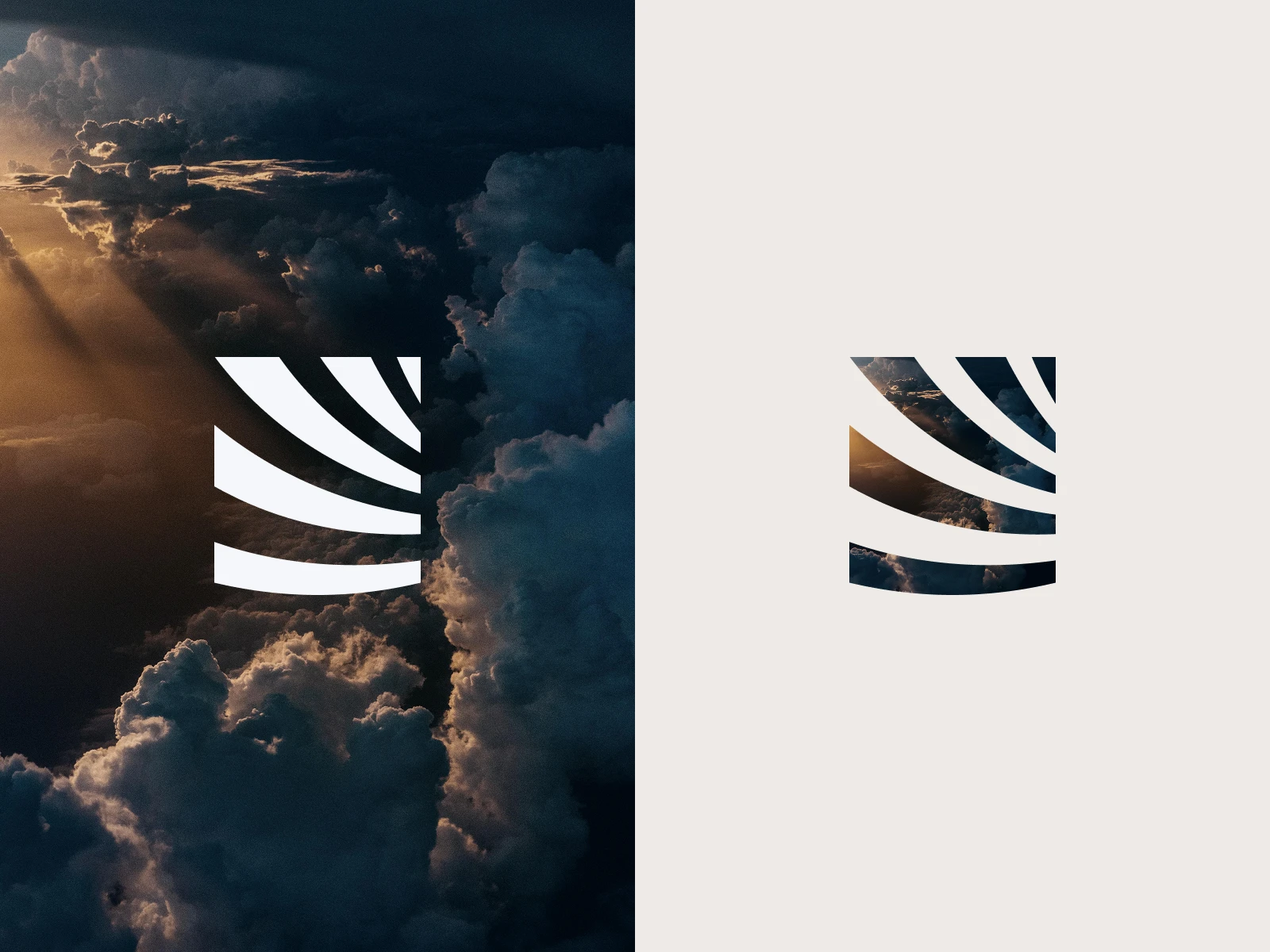
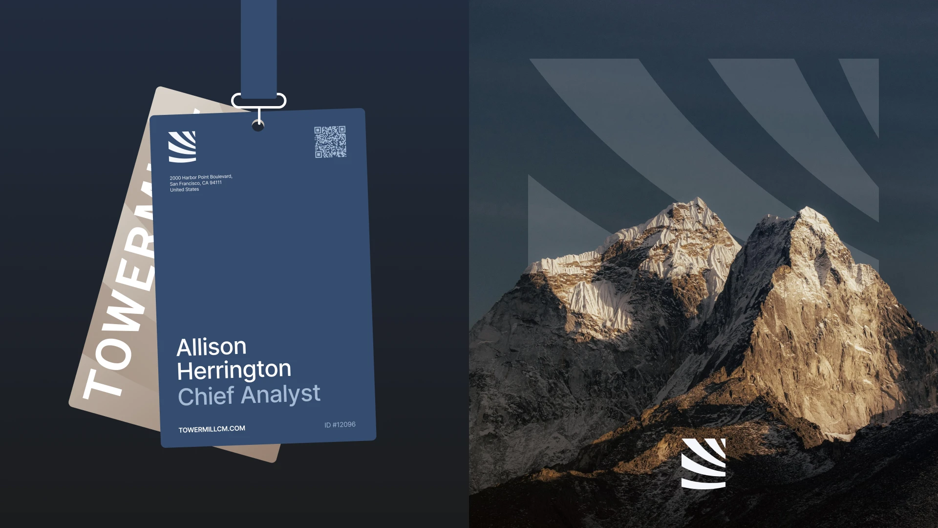
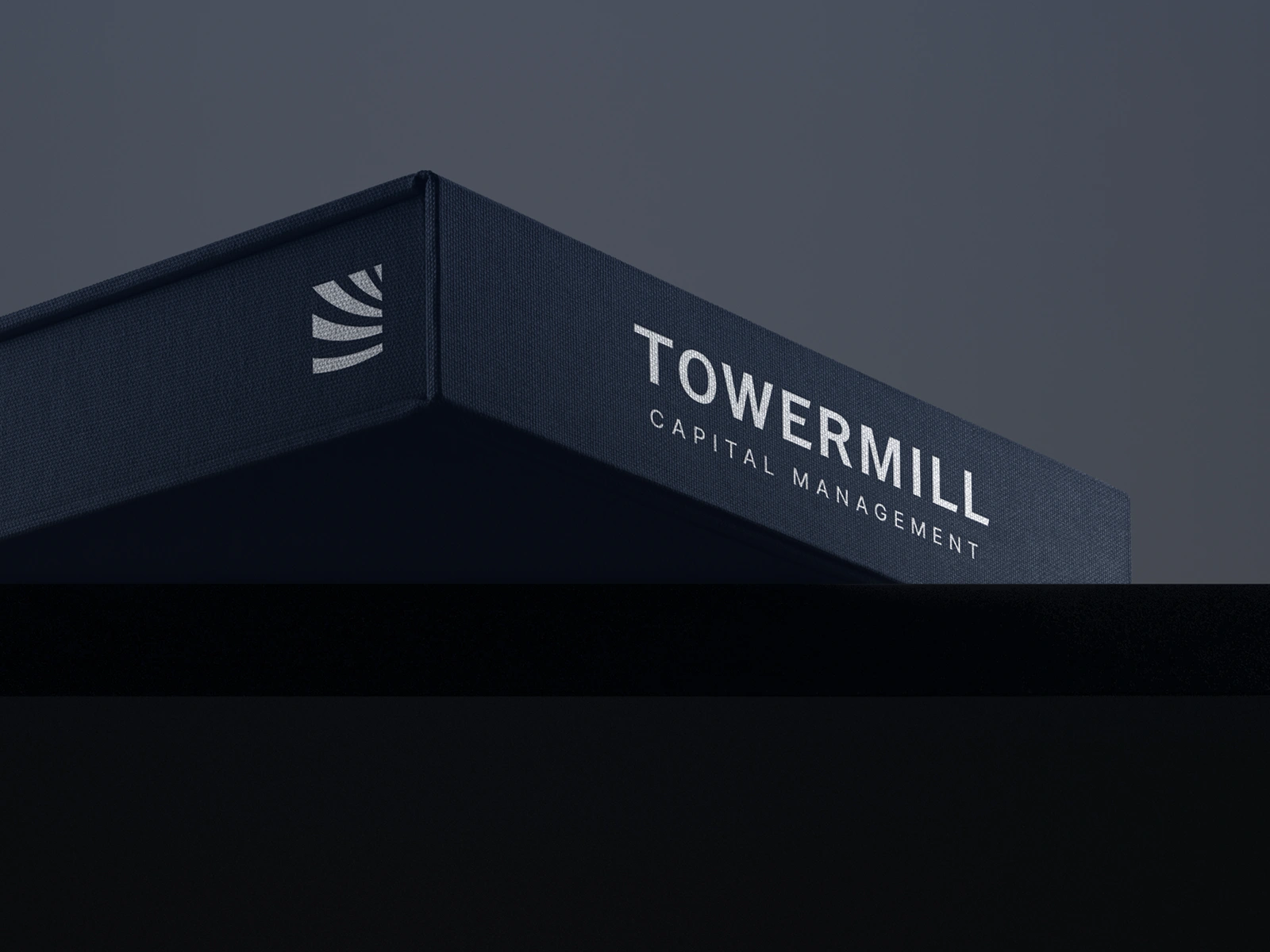
The updated wordmark was built with geometric precision and balanced proportions, reflecting the firm’s methodical approach to capital management.
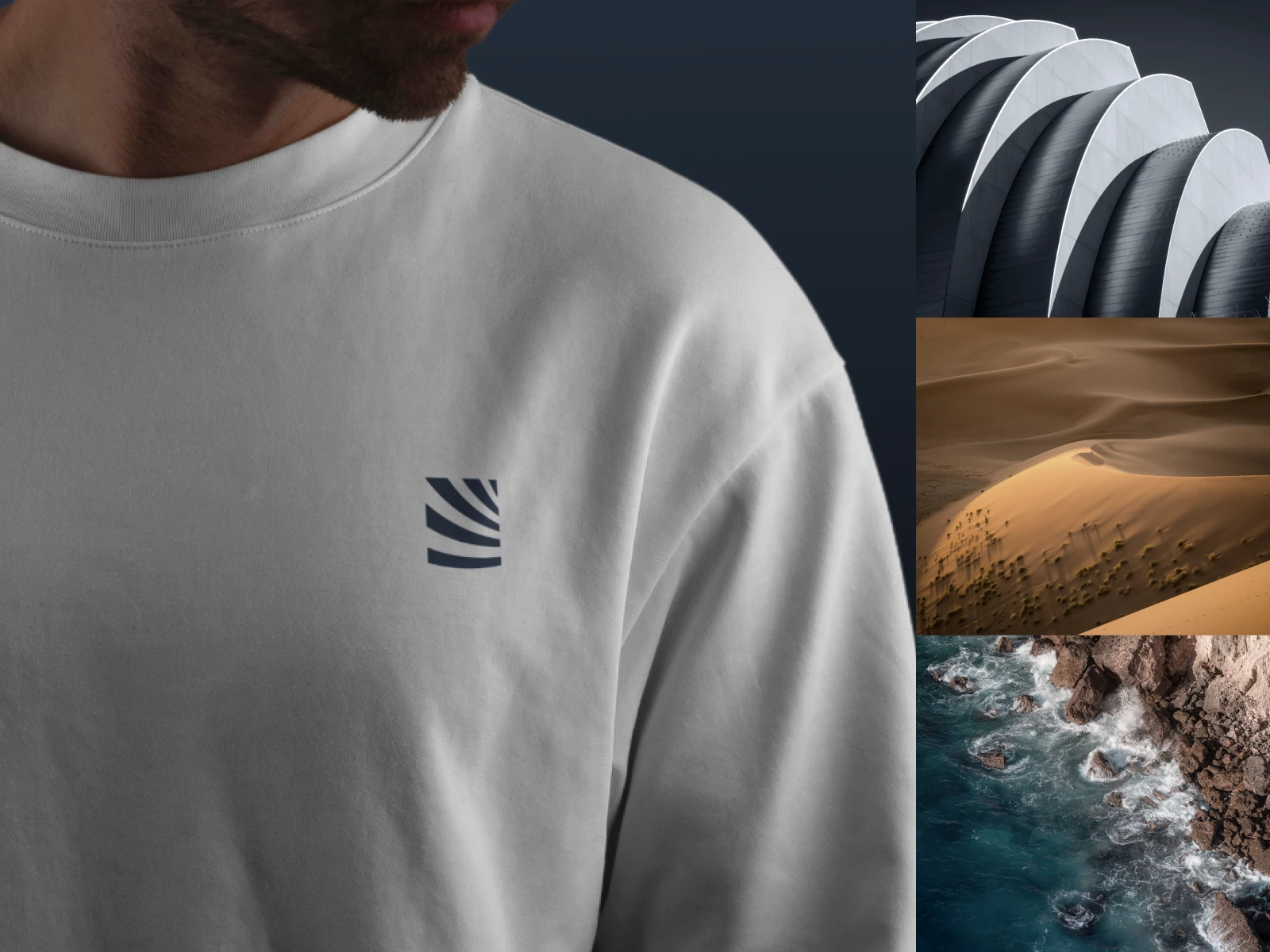
A new submark introduces dynamic circular lines - inspired by millstone etchings - symbolizing movement and focused momentum.
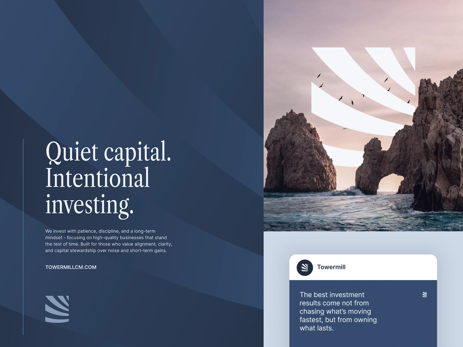
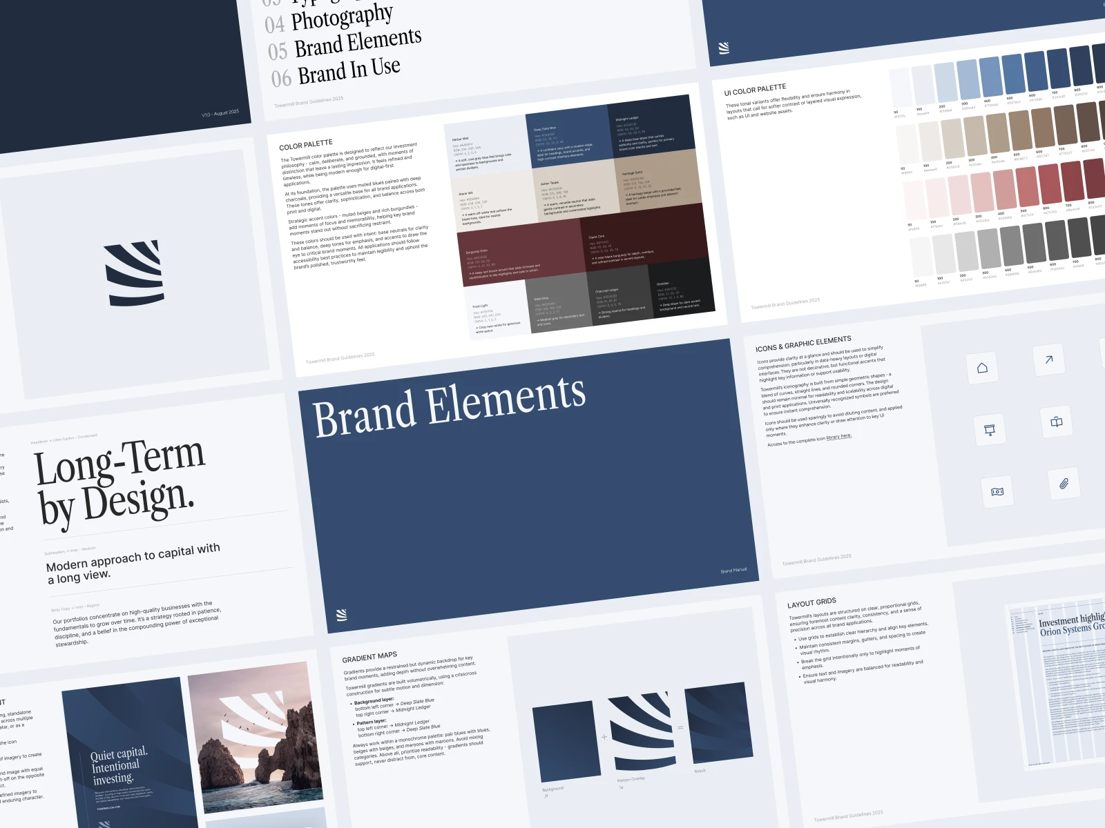
Typography system bridges tradition and modernity, while the color palette embodies Towermill’s ethos - calm, deliberate, and grounded. Muted blues and deep charcoals form a foundation of stability, while subtle accents of beige and burgundy bring distinction and warmth.
Photography & Brand Elements
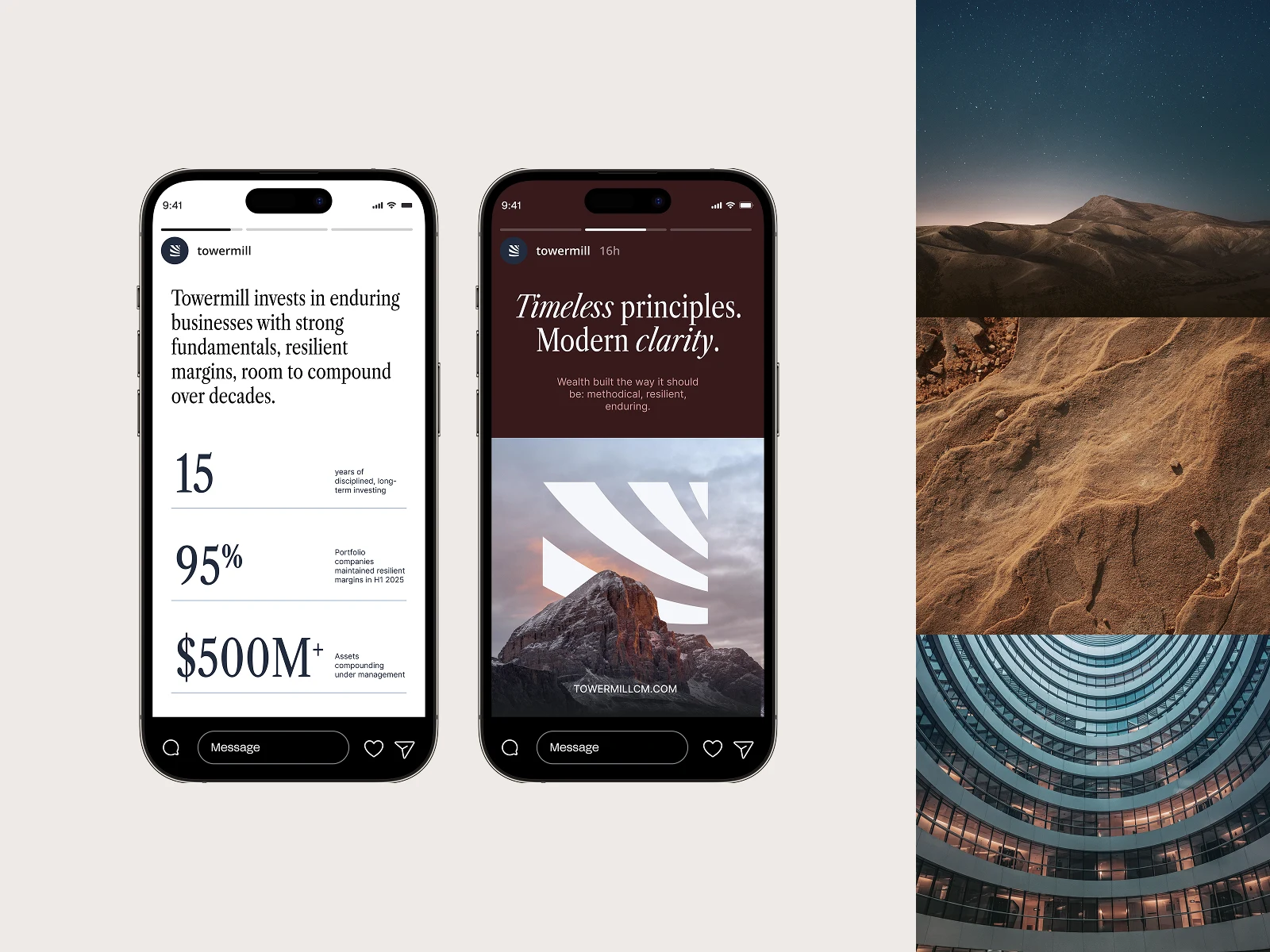
An extensive brand imagery deck was curated to unify the visual language across all applications. The photography direction emphasizes clarity, discipline, and perspective - pairing architectural minimalism with expansive natural landscapes to communicate scale and confidence.
Two core categories define the system:
Architectural Textures & Natural Patterns – refined backdrops for reports, decks, and layouts.
Inspiring Hero Imagery – expressive visuals conveying permanence, trust, and forward motion.
The identity was codified into a comprehensive brand guideline suite, detailing:
Appropriate use of the logo suite, color palette and typography system
Layout grids and proportional systems for visual balance in documentation and print assets
Layered submark usage across layers and media as a recognisable brand element
Volumetric gradient systems for digital depth
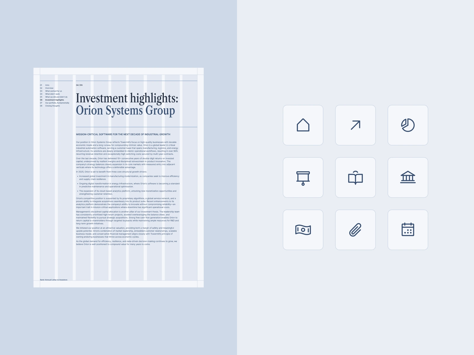
Curated icon library for consistent, effective visual communication
Each element was designed with clarity, scalability, and longevity in mind, empowering the brand to evolve with confidence.


The Outcome
The resulting identity system gives Towermill Capital a cohesive, elevated, and enduring visual presence that communicates with authority across every platform.
From investor reports and fund documentation to digital platforms, the refreshed brand projects stability, trust, and forward-looking sophistication - positioning Towermill as a modern investment leader with a legacy mindset.
Like this project
Posted Oct 18, 2025
Comprehensive brand identity redesign, translating investment expertise into a scalable brand system that merges timeless credibility with modern simplicity
Likes
61
Views
1.1K
Timeline
Jul 31, 2025 - Aug 28, 2025
Clients
Towermil Capital Management