The network for creativity
Join 1.25M professional creatives like you
Connect with clients, get discovered, and run your business 100% commission-free
Creatives on Contra have earned over $150M and we are just getting started
Back to feedPost
Taste Test

Two hero section directions for a client site- same headline, different visual approach. which one lands better?
.
.
More of this over on X, in real time ideas, questions, and the people building cool stuff https://x.com/rightnextstep?s=11


27 voted
51%
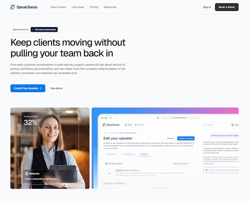
26 voted
49%
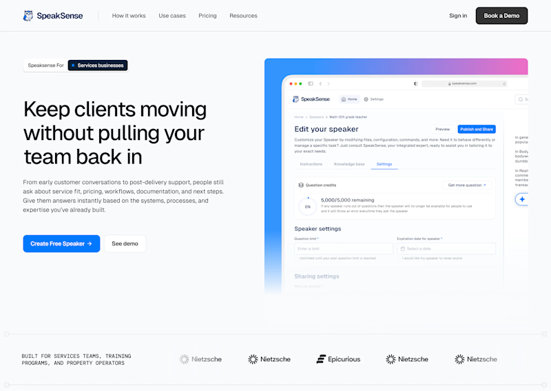
53 votes
Closed

Hero 2, is better for if you're aiming for direct conversion and overall layout is way more cleaner, Hero 1 maybe center it beacuse its too much white space on the right, and play around with the 2 images on the bottom. Hero 2 is the winner for me nice work there.
Thanks, the interpretation is on point. Appreciate the input.

The reason I chose Hero 1 is that the design style feels fresh and modern. I also think the image beneath the hero text complements the message really well, which makes the whole section feel more cohesive. That’s my perspective.
Thanks, appreciate you sharing the perspective.
It's my pleasure, Anush

It feels hero 2 its lets busy than the other other, which the picture deviates my attention
Thanks, appreciate the input.

Going with hero 1
Thanks, appreciate the input.

I will pick 2nd one
Thanks

I would choose Hero 2. Solid layout, great for building instant trust.
Thanks

Hero 2 is better!
Thanks

I will gi with hero 1 nice one👍
Thanks, appreciate your input.

hero 1. the space to the right makes it easier on the eyes
Thanks.


Awesome design !
Thanks.

Thanks, appreciate the suggestion. I will try it out.

Both look great. Hero 1 feels more human but Hero 2 is much clearer for a software product.
Thanks, appreciate the input.

Hero 2
Thanks, appreciate the input.

My vote goes to Hero 1. It feels more memorable thanks to the stronger visual direction.
Thanks, appreciate the input.

the personal touch of a face alway's gets me, personally
Thank you, appreciate that perspective.

Hero 2 looks clean and professional compared to Hero 1
Thanks, appreciate the input.


Excellent execution. Thanks for sharing!
Thanks.

I voted Hero 1: pairing a human face with a hard number like 32 percent puts proof above the fold, which is exactly what this services headline is promising. Hero 2 is cleaner but reads as generic SaaS, so the emotional signal tips it for me.
Thanks, appreciate the perspective.

Hero 1 got my vote
Thanks

The first option looks livelier thanks to the girl and the surrounding mockup; to me, it provides more context regarding the app's audience and purpose. Have you considered centering the text and buttons?
Thanks, i can explore that suggestion.


Testing two distinct visual directions against the exact same headline is such a great way to align on brand tone early! It’s fascinating how layout contrast changes the weight and perception of the message.
Thanks


Hero 1

Hero 1 all the way in
The network for creativity
Join 1.25M professional creatives like you
Connect with clients, get discovered, and run your business 100% commission-free
Creatives on Contra have earned over $150M and we are just getting started

Challenges
View all


Related posts

SENE car rental Website Projects
A car rental website shouldn't make people think too much. It should help them find the right car, understand the price, trust the service, and book with confidence.
I designed SENE around exactly that principle.
Need a website that turns visitors into customers?
I help businesses create modern, conversion-focused websites that look premium and make the user journey easier.
Available for website design & redesign projects.
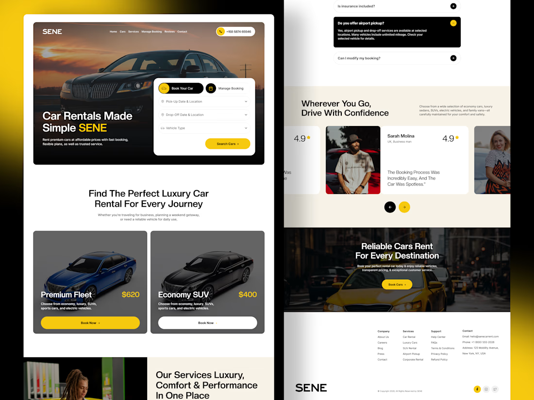

The yellow and black colour palette, strong typography, and layout create a professional automotive experience. 🔥

We're stuck 😅
Which one feels more premium and unique to you?
Comment 01 or 02 below your opinion will genuinely help us lock this in.
7 voted
33%
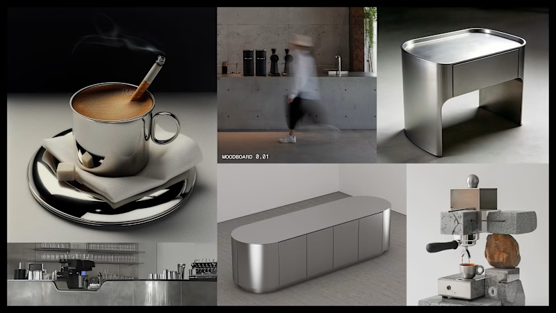
14 voted
67%
21 votes
Closed


did some home cleaning - works page is now my homepage
i've lost over 50% of traffic because people dropped off on my previous homepage (about now) that didn't give any value
check it out yourself: https://seb-astian.com

looking great! i love that loading animation.