

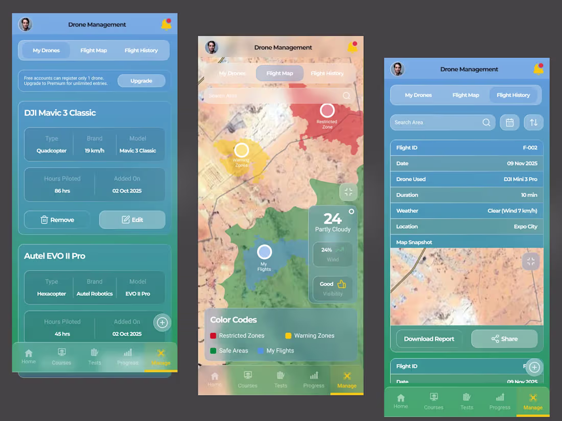
Drone Management & Flight Zone Map – Aviation App UI
A flight companion experience for drone pilots.
Beyond training, the app allows users to manage their drones and visualize flight zones.
Features:
• Drone inventory management
• Flight hours tracking
• Airspace color coding (Restricted, Warning, Safe Areas)
• Weather overlay integration
• Flight history logging
• Downloadable flight reports
The focus was on clarity, safety awareness, and structured data presentation.
0
52
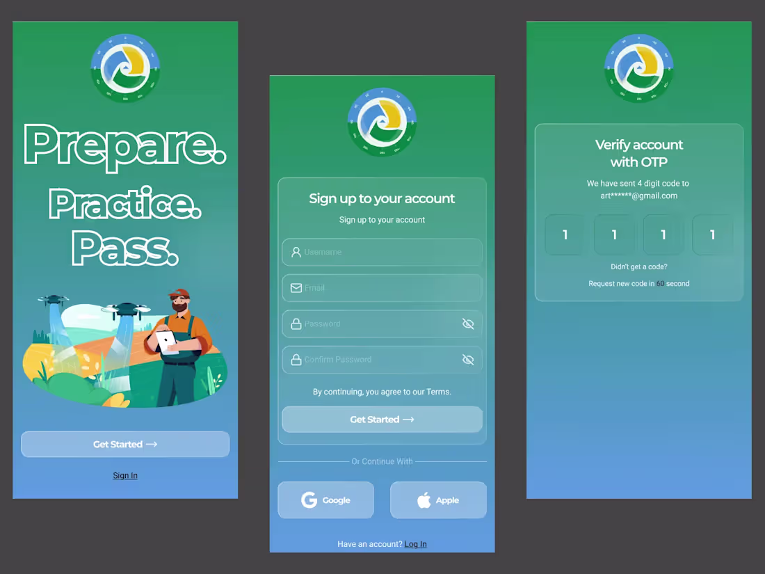
Drone Training App – Onboarding & Authentication UI
First impressions matter. This onboarding and authentication flow was designed to immediately communicate clarity, safety, and professionalism.
The goal was to make drone training feel approachable not technical or intimidating.
Features:
• Bold hero onboarding with strong brand messaging
• Clean sign-up & login flow
• OTP verification for secure access
• Social login integration
• Soft gradient system for aviation-inspired feel
The experience focuses on reducing friction while building trust from the first interaction.
0
52
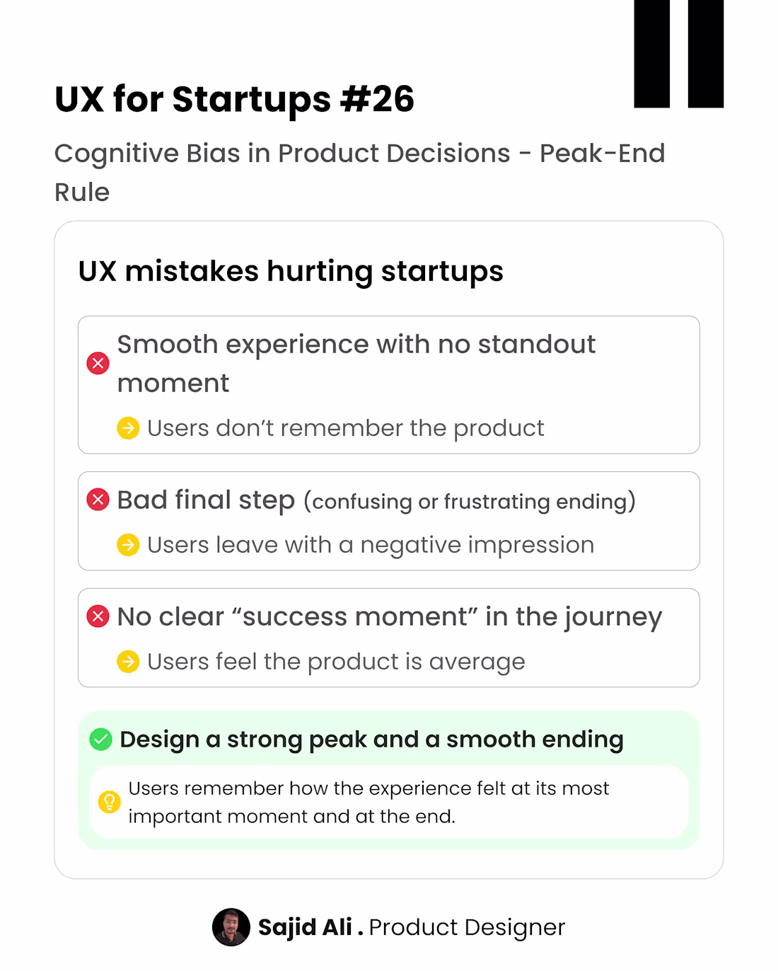
Users don’t remember every step of a product experience. They remember the most impactful moment (peak) and the final moment (end) If onboarding or user flow is boring throughout or frustrating at the end users leave with a weak memory of the product.
But if you create a clear “win” moment and a smooth final step users remember the experience more positively.
Good UX is not just about the journey it’s about how the journey is remembered.
I help startups design product experiences that improve user activation and retention through behavioral psychology.
DMs open for product design collaborations.
0
70
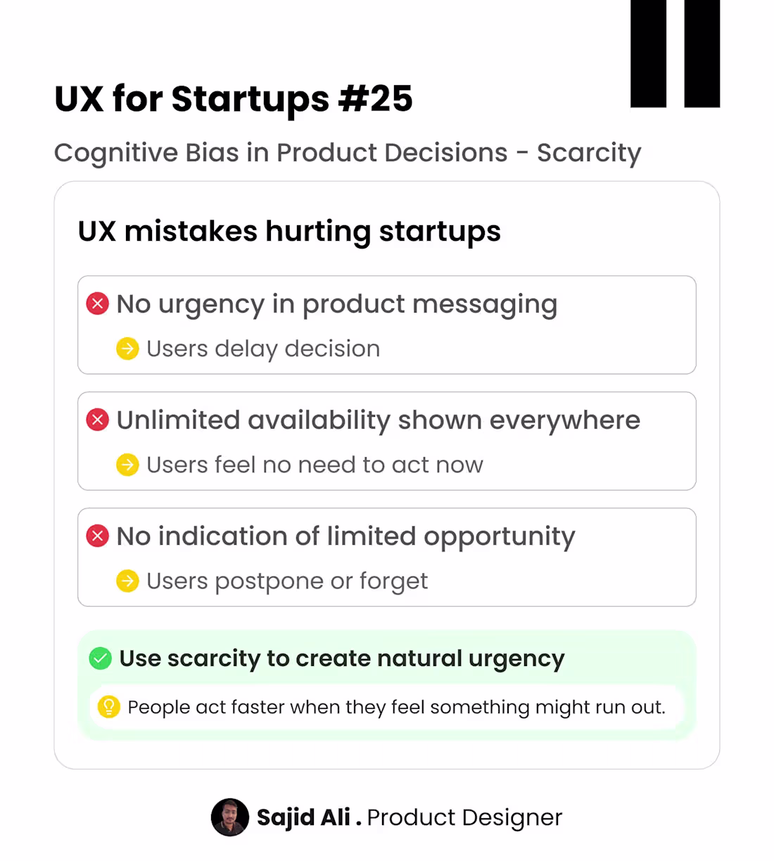
Users don’t always delay because they are not interested. They delay because there is no urgency. When everything feels unlimited time, access, availability users assume they can come back later… and often never do.
0
66
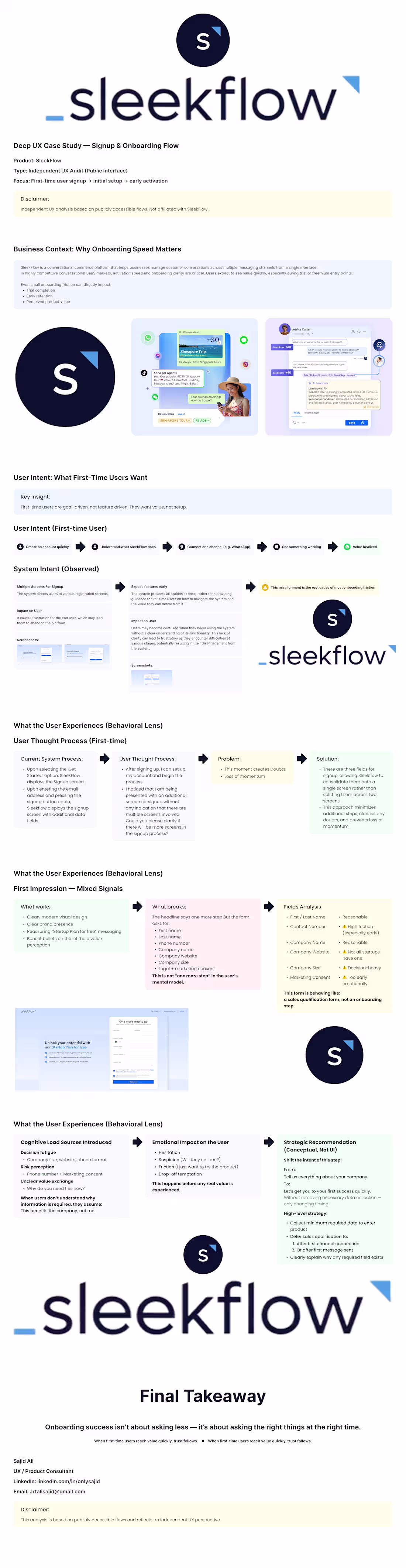
I recently conducted an independent UX analysis of a conversational SaaS product’s signup & onboarding flow, focusing on first-time user experience and early activation.
One insight stood out clearly:
First-time users are goal-driven, not feature-driven.
They want value quickly — not setup complexity.
In this case study, I explore:
• What first-time users are actually trying to achieve
• Where system intent diverges from user intent
• How early over-qualification increases cognitive load
• Why timing (not fewer fields) is often the real UX problem
This analysis is based on publicly accessible flows only and reflects an independent UX perspective — not affiliated with the product.
Sharing this as a learning exercise and conversation starter.
Happy to hear other perspectives
1
76
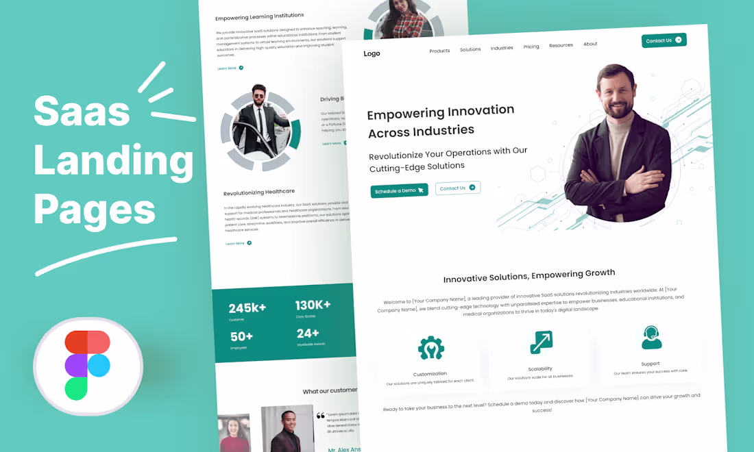
SaaS Landing Page
0
4
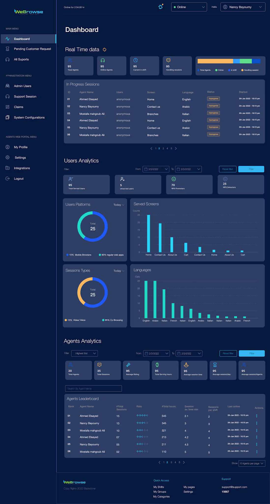
WeBrowse: Collaborative Browsing Platform
0
4
Innovative Video Recruitment Platform
0
2
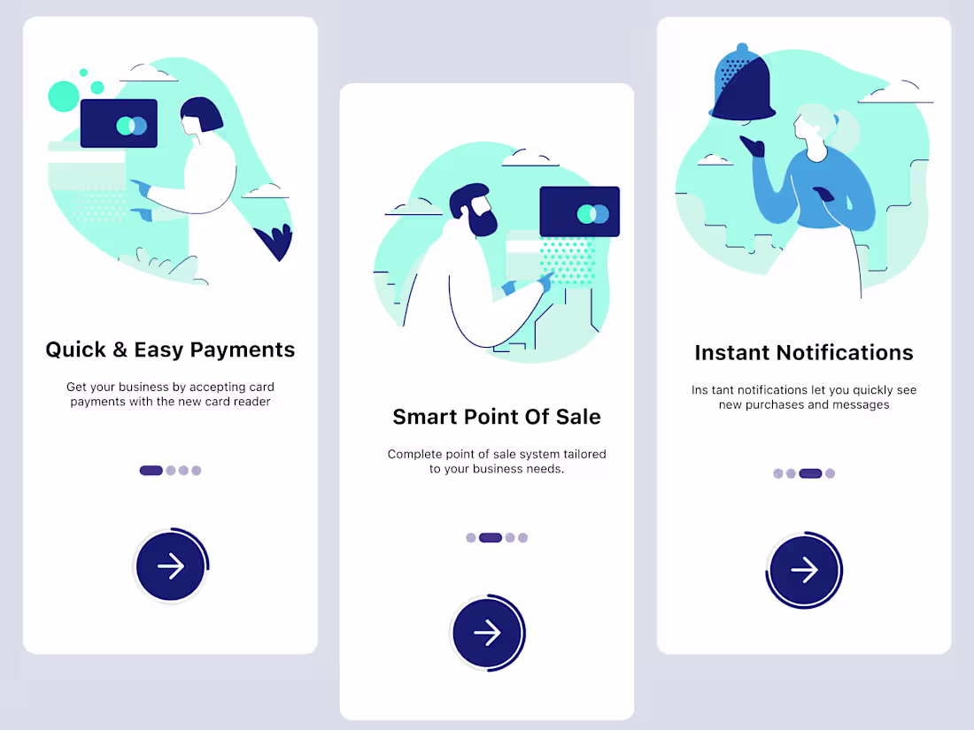
Onboarding
0
0
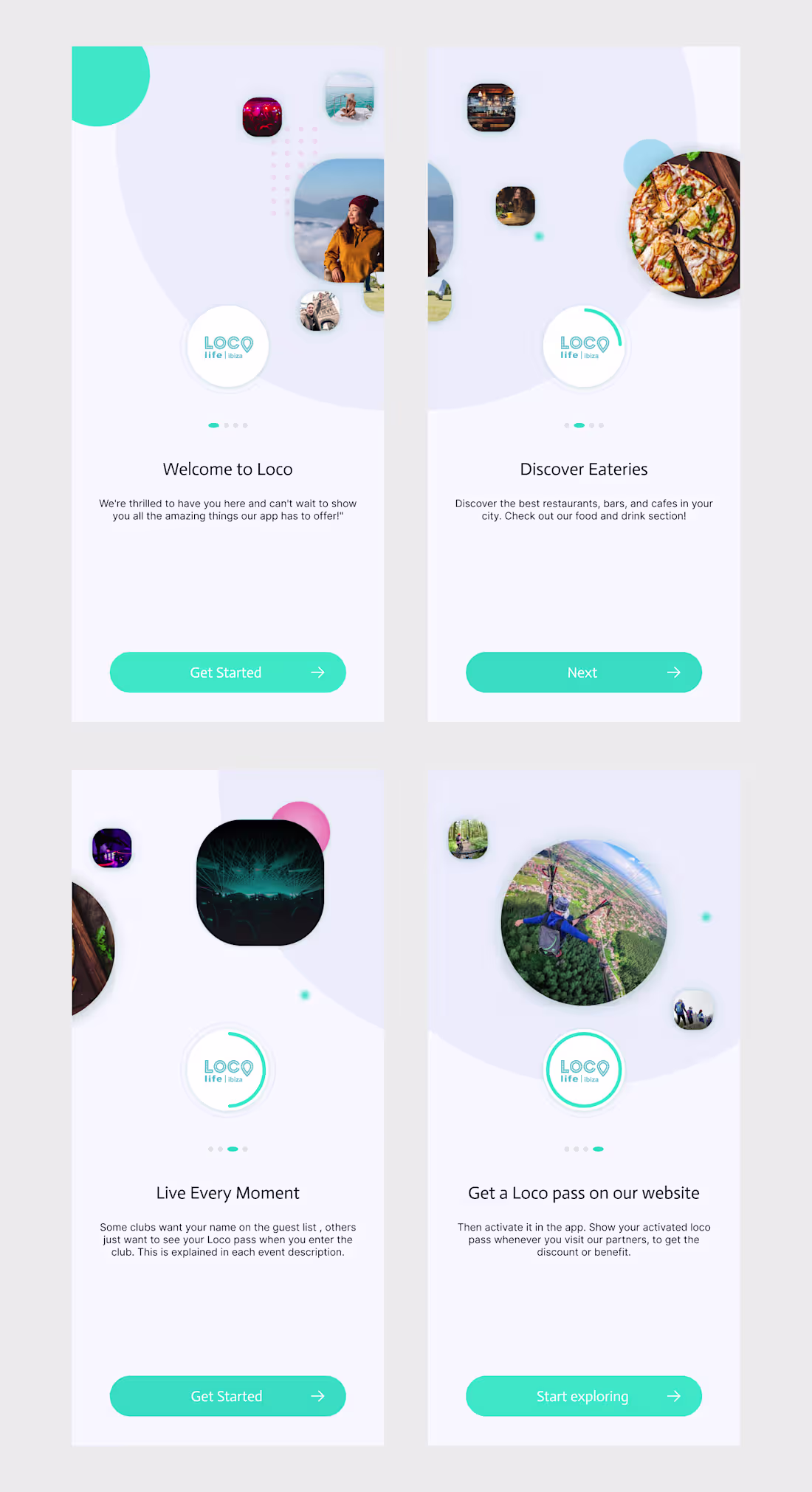
Onboarding Screens UI Design
0
1
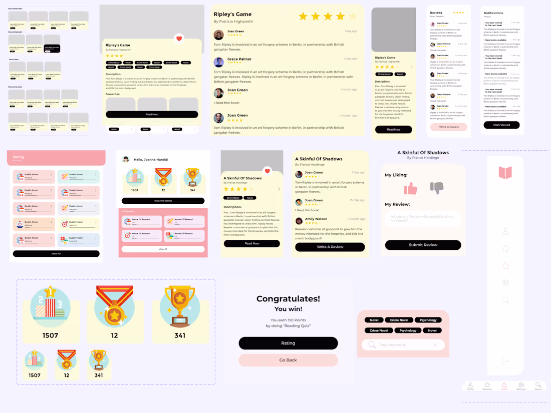
Membership app design
0
0
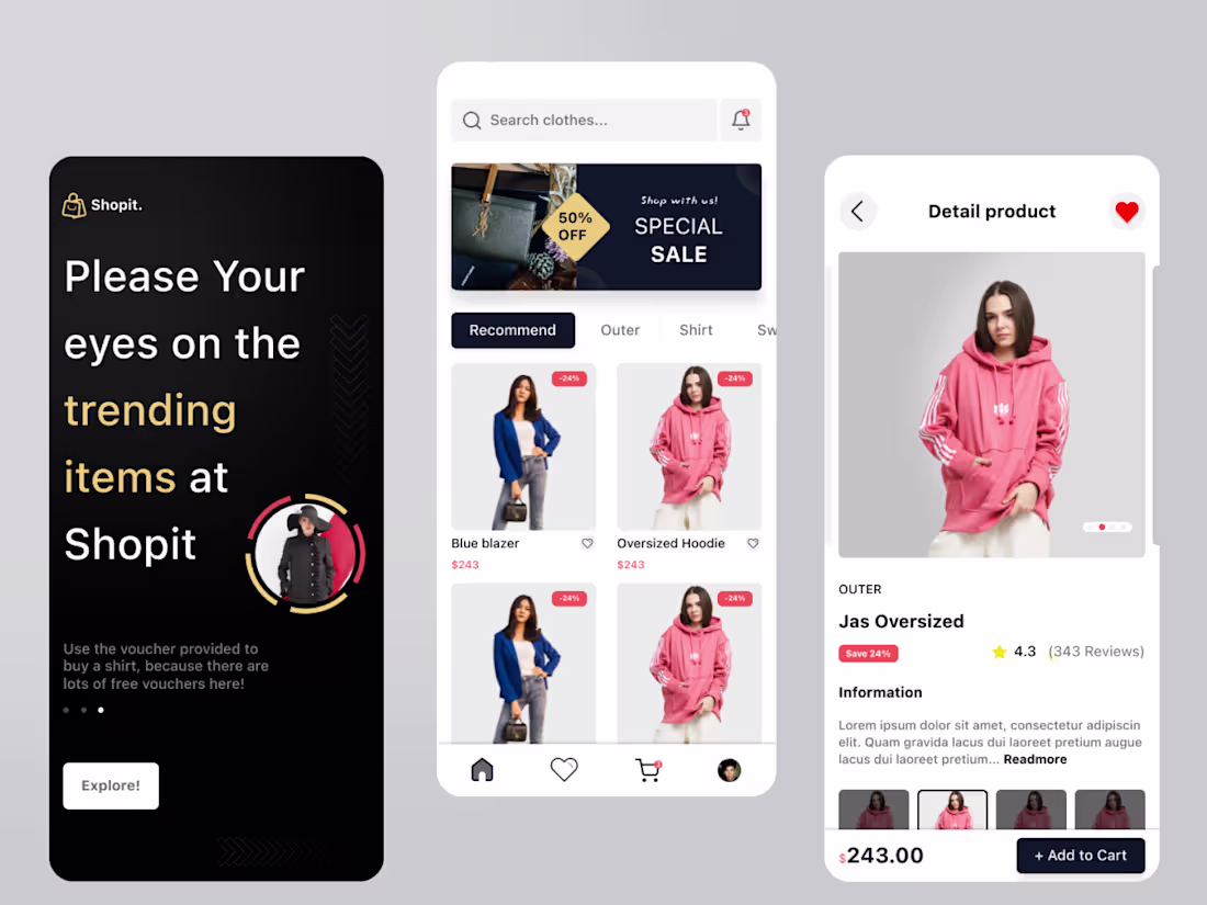
Shopit - Mobile e-commerce
0
2
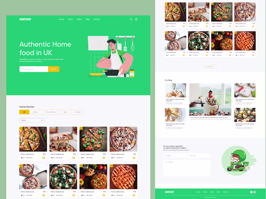
Food ordering landing page design.
1
2
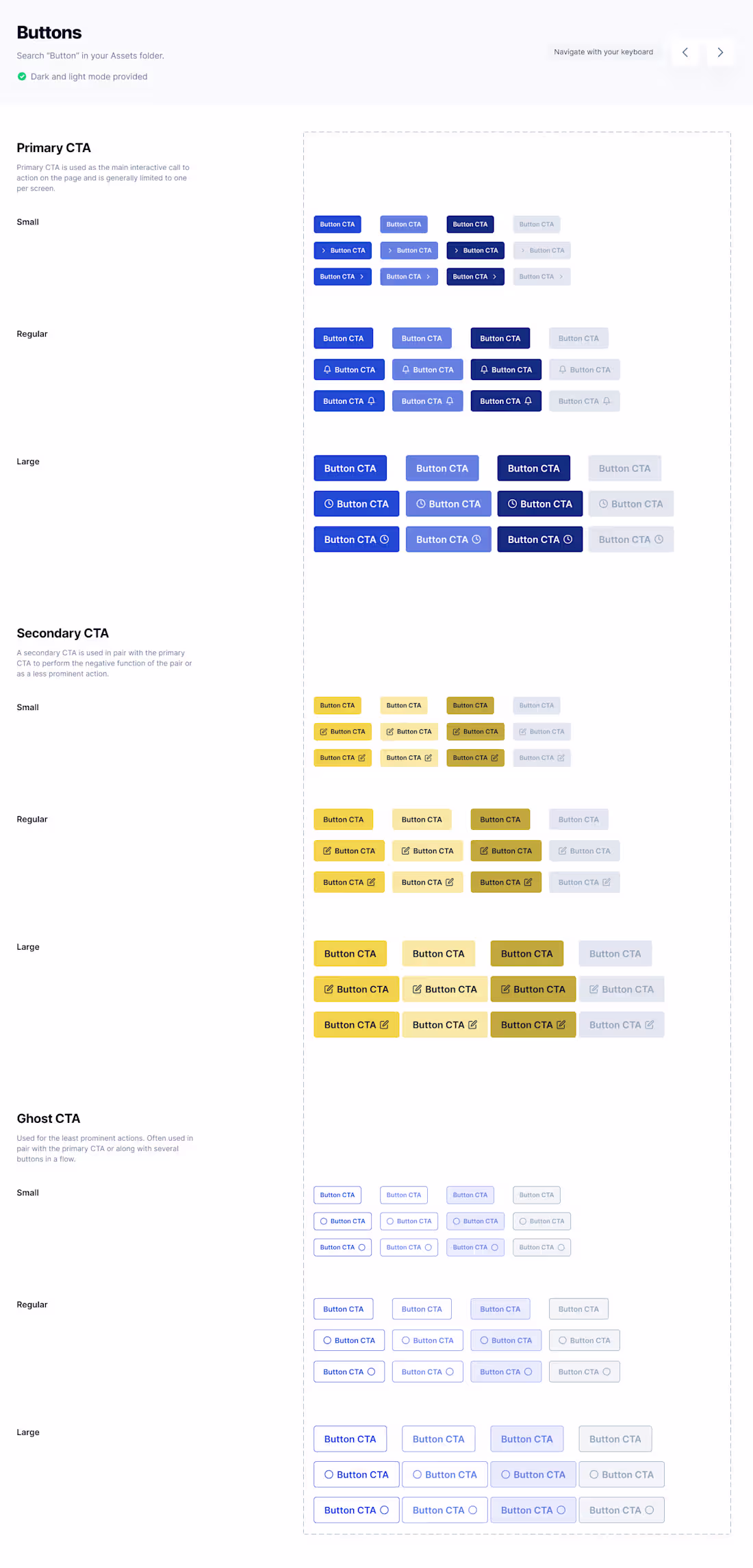
Buttons - Design System
0
1
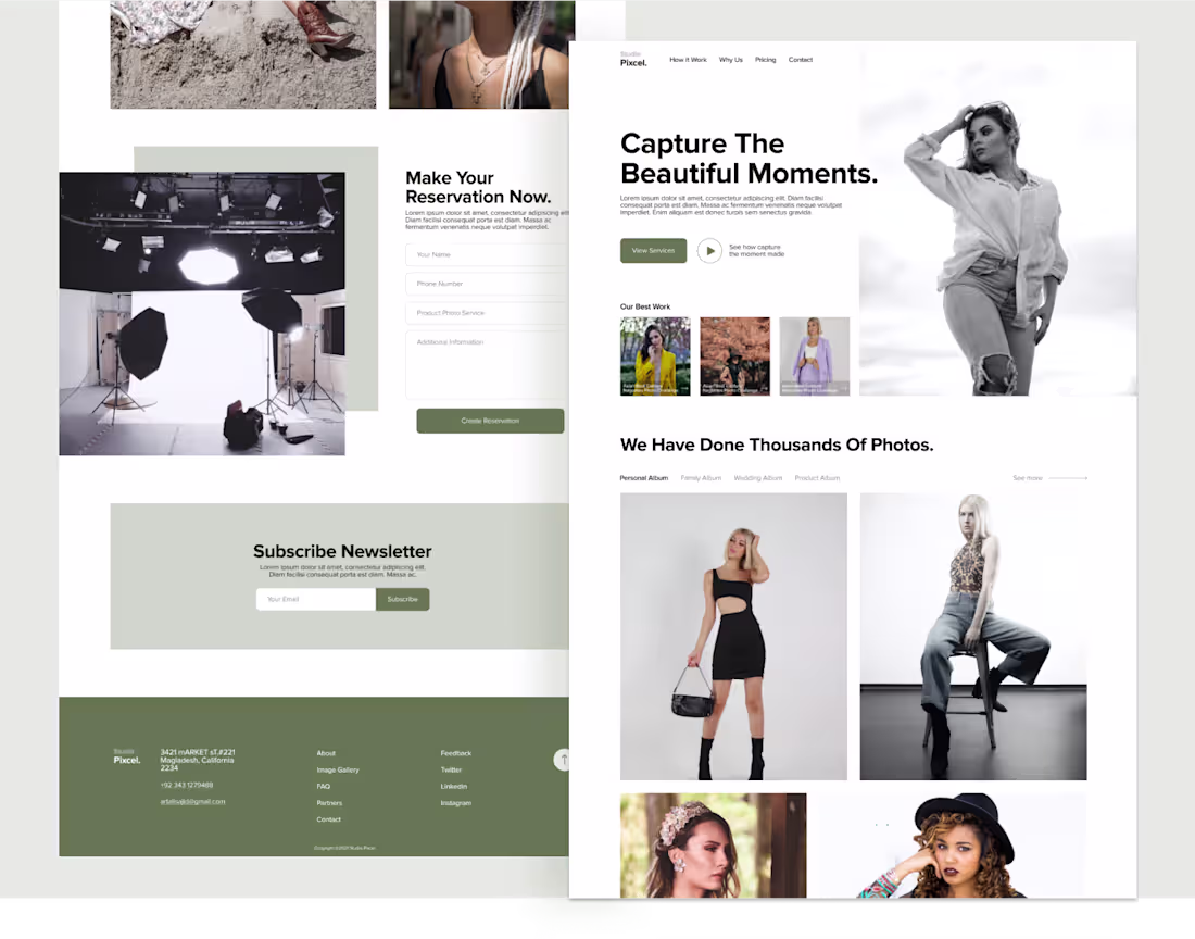
Studio Photography Landing Page
0
1
Some UI components
0
0
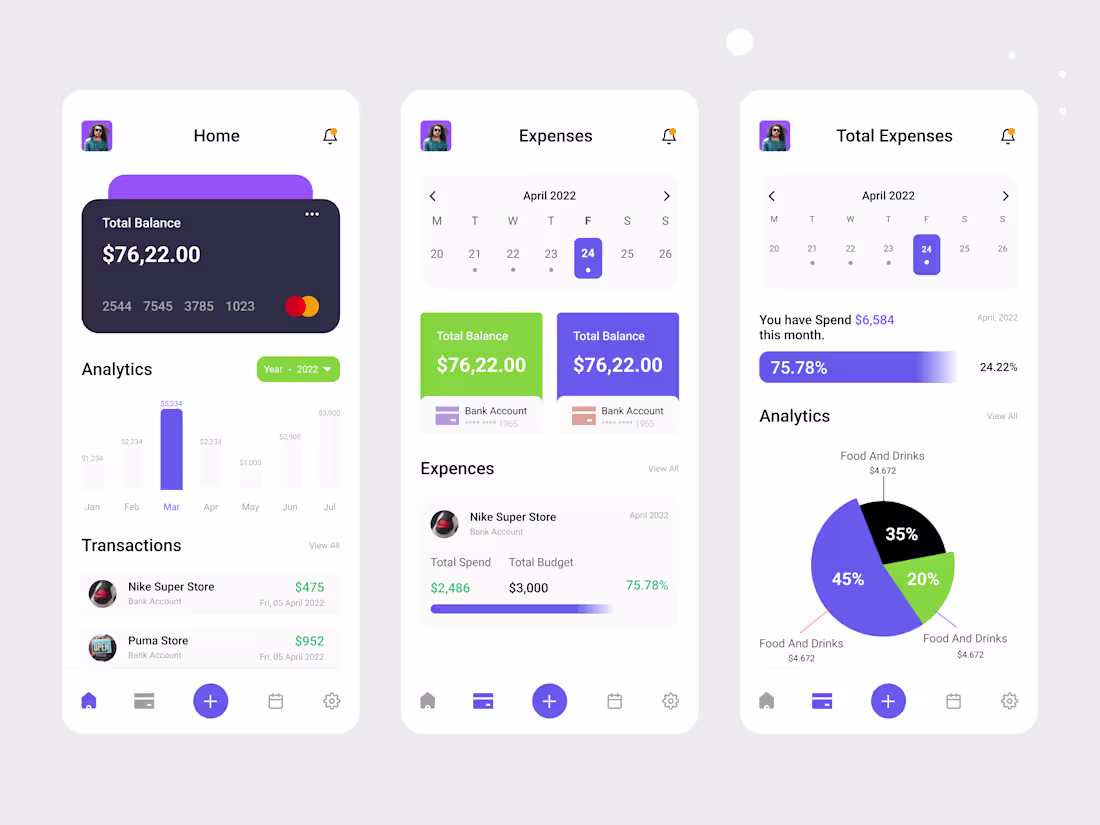
Expense Tracker UI Design
1
4
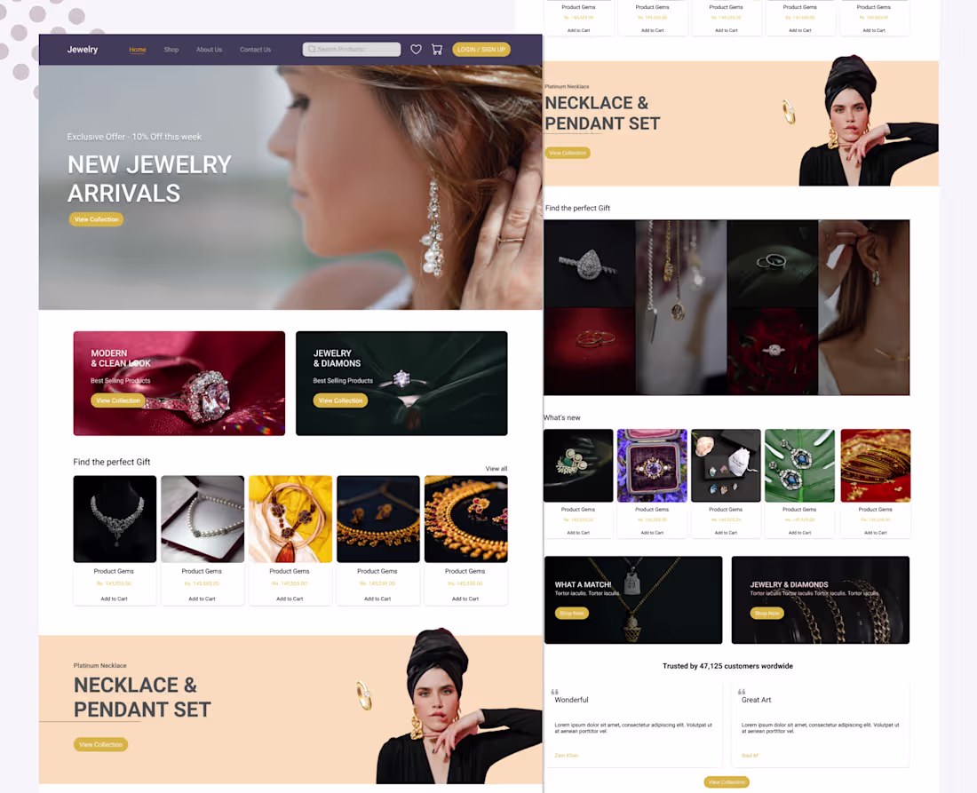
Jewellery Website Design
0
4
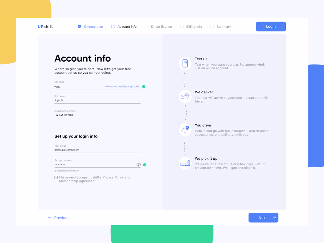
User Onboarding Account info
0
6
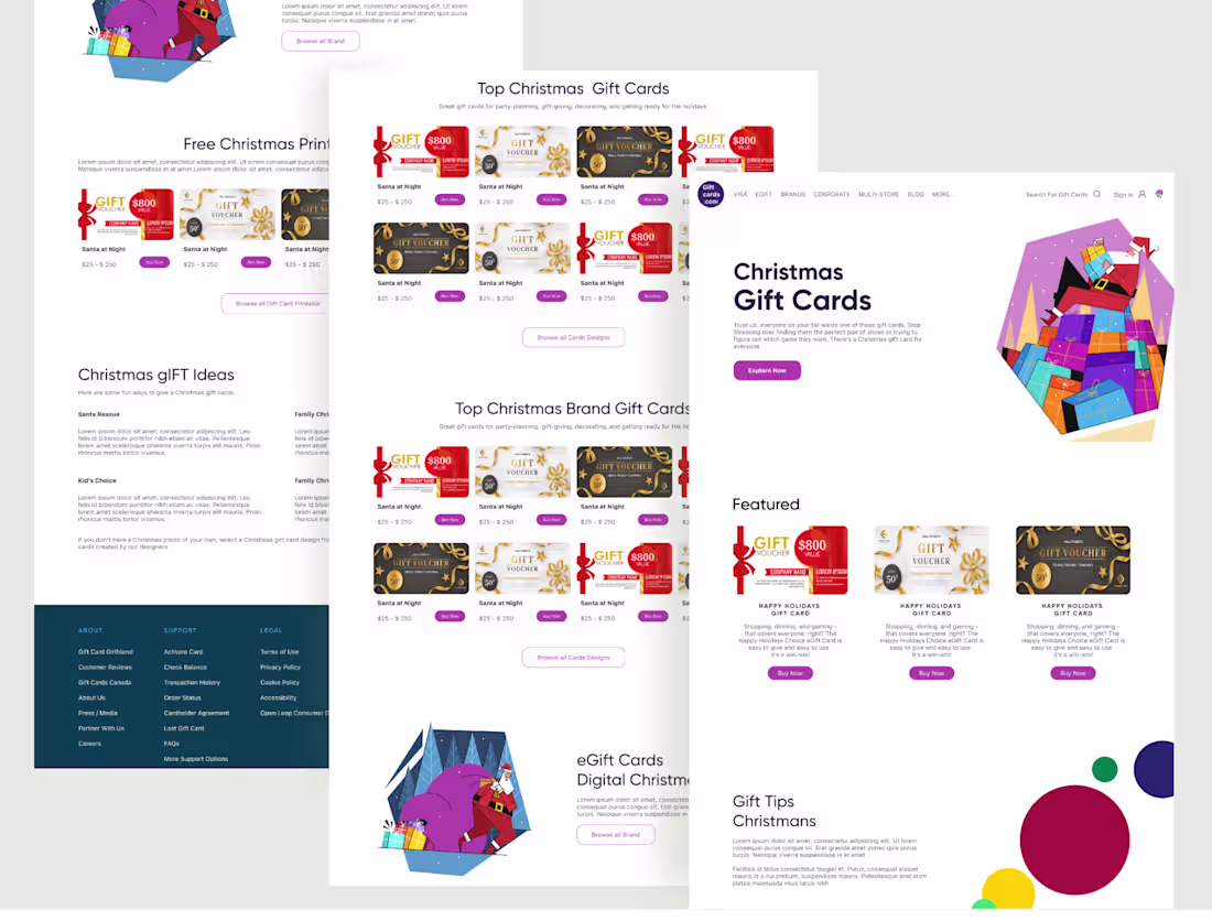
Christmas Gift Website Design Concept
0
2
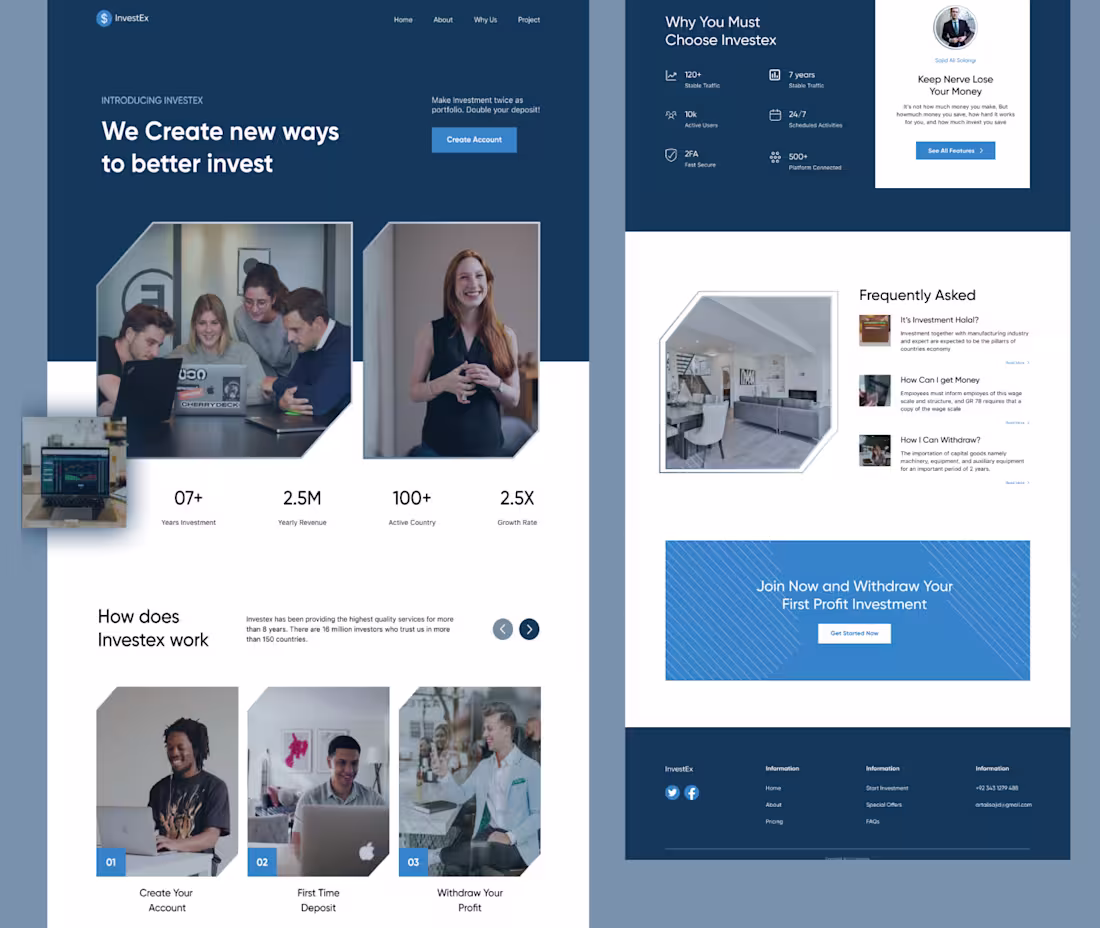
Investment website Landing page design concept
0
1
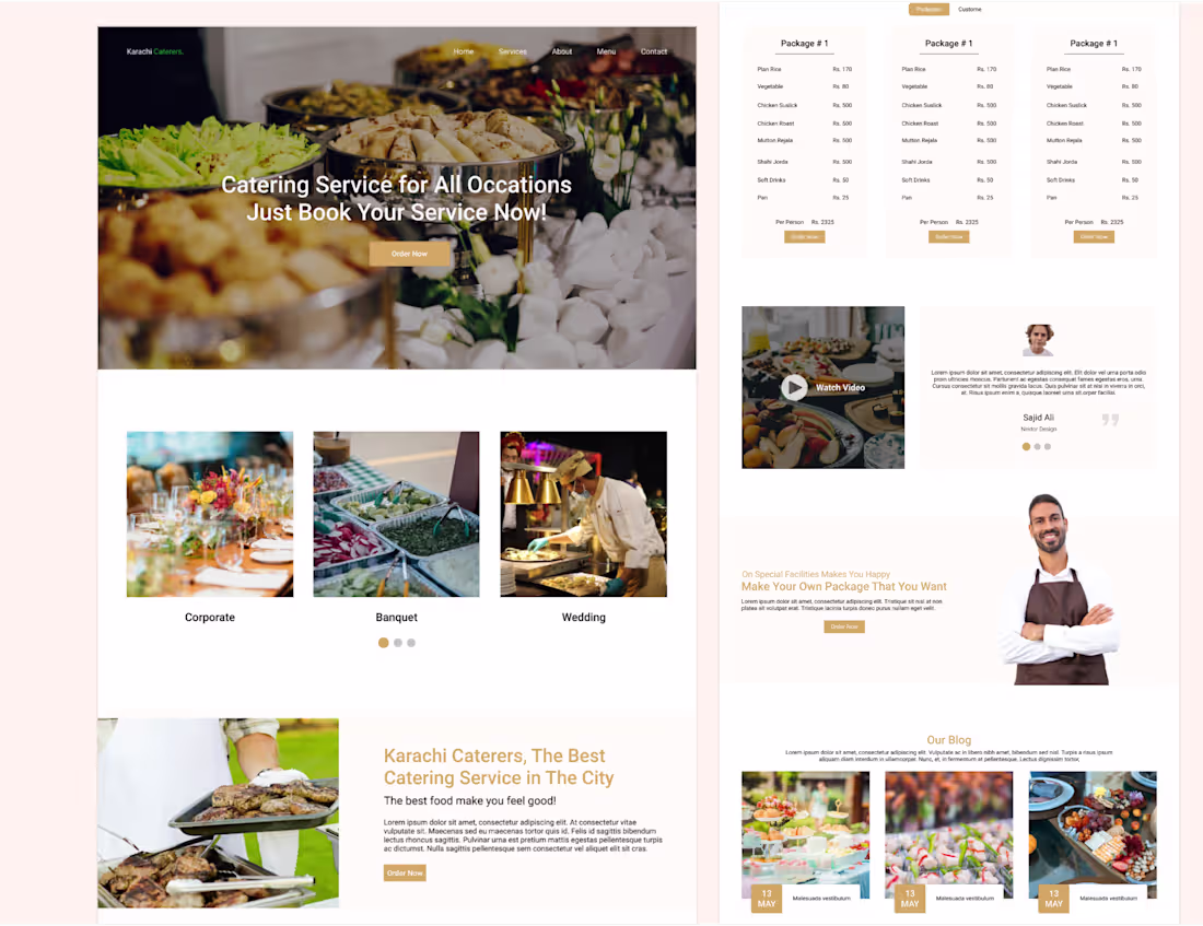
Food Catering Service Website Design
0
0
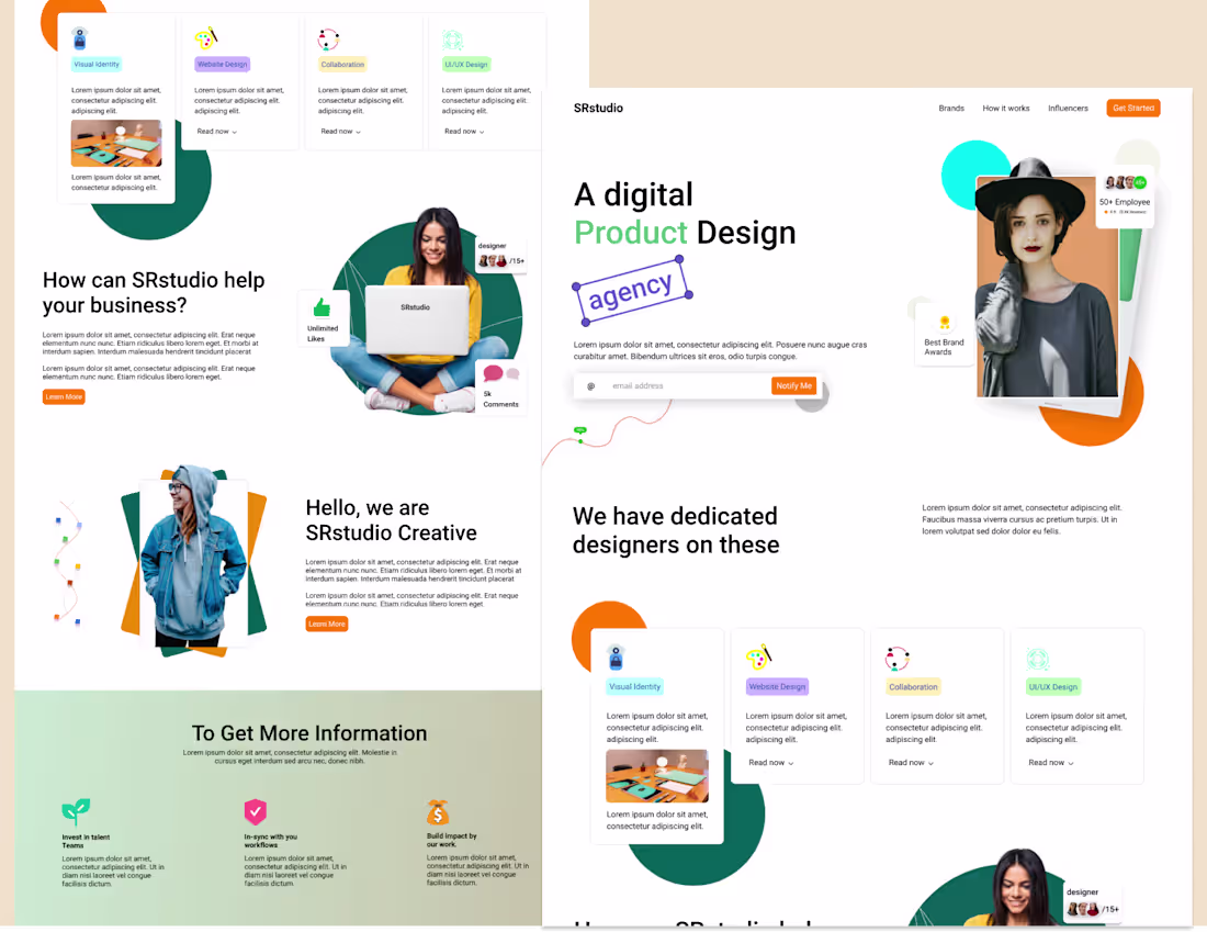
Digital Agency Landing Page Design
1
2
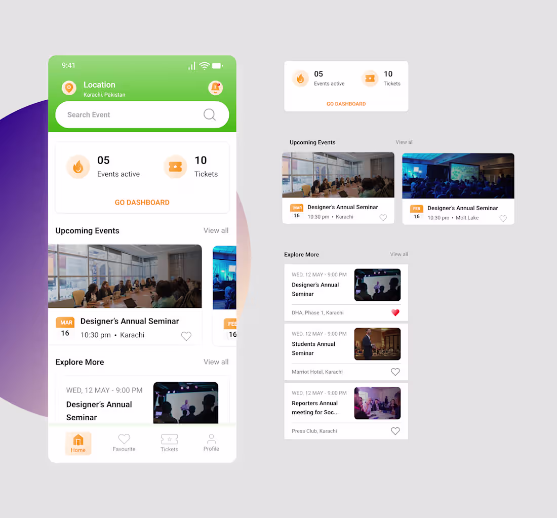
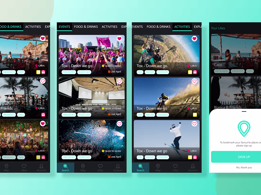
Event App Design
0
0
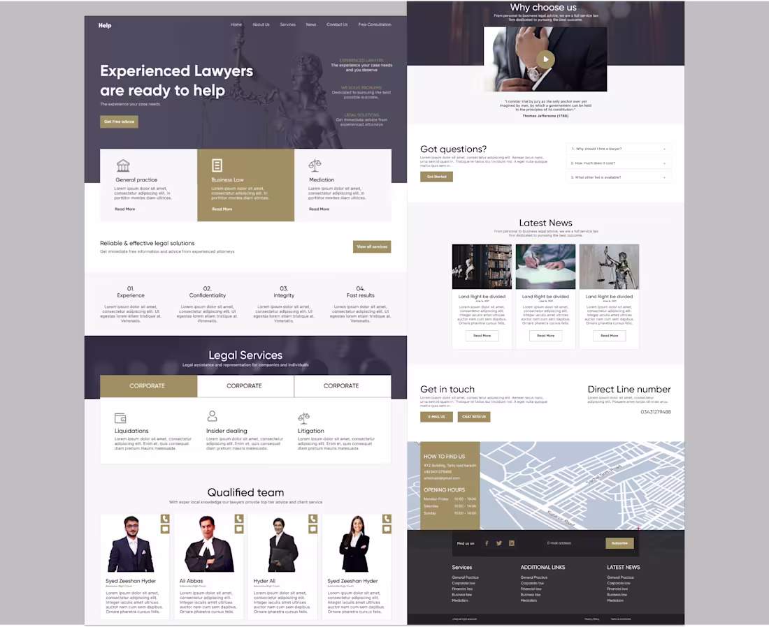
Legal Services Website design
0
0
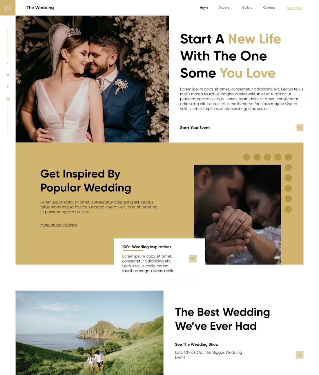
Wedding Website UI Design
1
2