




Today I explored LinkedIn’s post character-limit feedback.
The current composer prevents publishing once the limit is exceeded, but the error only says:
“You have exceeded the maximum character limit.”
The user still has to figure out how much content needs to be removed.
In my design exploration, I made the constraint more actionable by showing:
“Your post is 100 characters over the 3,000-character limit.”
A small copy change, but it gives the user:
the actual limit
the exact overage
a clear editing target
This is especially relevant when someone writes externally or pastes a long draft into LinkedIn and crosses the limit instantly.
Business hypothesis: More actionable character-limit feedback could reduce editing friction, shorten recovery from invalid posts, and help users complete publishing with less rework.
This is an independent design exploration based on LinkedIn’s visible experience, not a claim that the current solution is wrong.
Would you rather see the exact over-limit count or just a general warning?
0
19

Today I explored an Uber ride-request status component with one question:
When the driver is still completing another trip, does the interface clearly explain what is happening and when the rider should expect them to arrive?
In the current experience, “Mateus is on the way” can sound like the driver is already heading directly to the rider, while other information shows he is still completing a nearby trip. The 3-minute ETA is visible, but its meaning is explained elsewhere.
In my design exploration, I:
made the driver’s current state explicit
connected the ETA directly with “Estimated arrival to you”
grouped current activity, expected arrival, and ETA into one persistent feedback block
The goal was to reduce interpretation during a waiting moment and make the system response easier to understand at a glance.
Business hypothesis: clearer ride-status feedback could reduce rider confusion, improve trust in the system, and make the waiting experience feel more predictable.
This is an independent design exploration based on the visible Uber experience, not a claim that the current solution is wrong. Real impact would need validation through rider behavior, support data, cancellation patterns, and product metrics.
When you’re waiting for a ride, what matters most to you: what the driver is doing, the ETA, or where they are on the map?
0
33
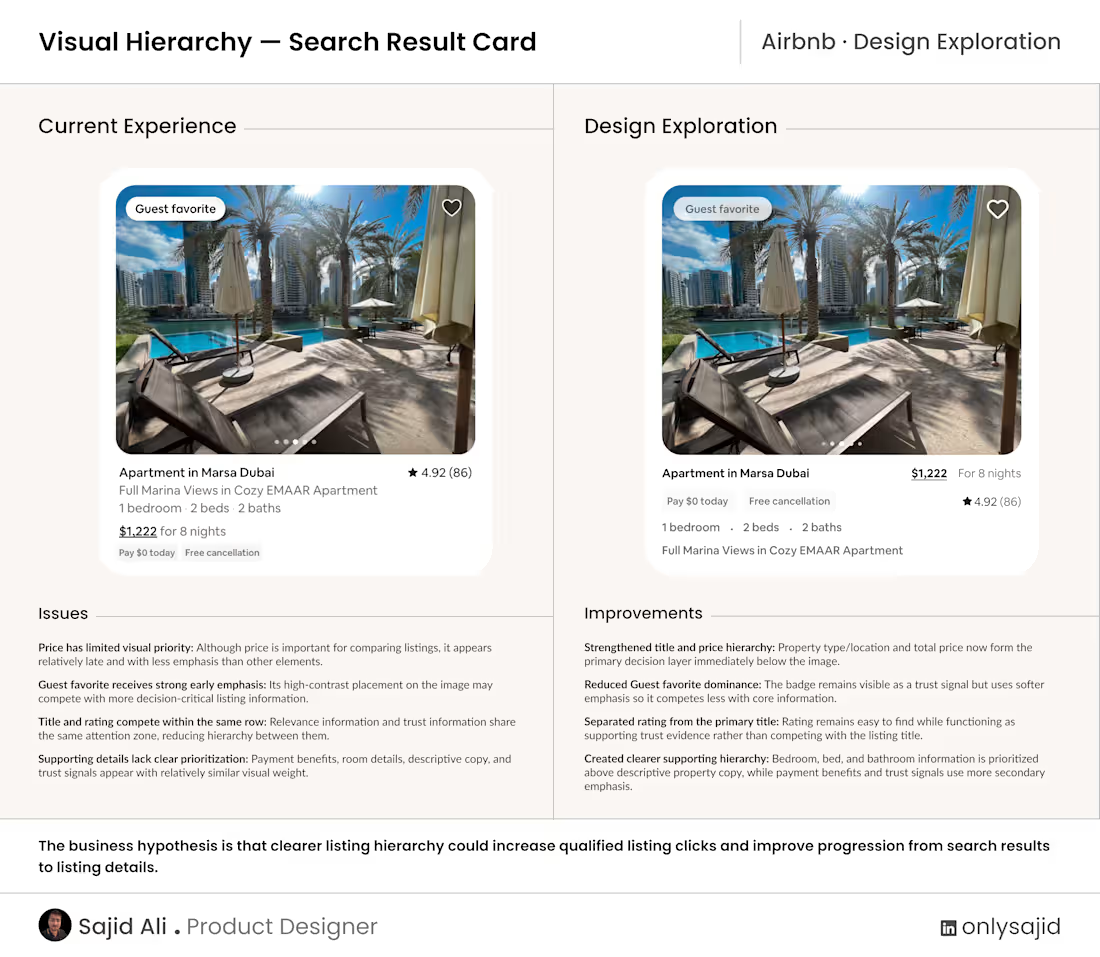
Today I explored an Airbnb search-result card with one question:
When users scan multiple listings, does the card visually prioritize the information that helps them decide what is worth opening?
In the current experience, the Guest favorite badge receives strong early attention, while price competes with other information and rating sits in the same visual zone as the listing title.
In my design exploration, I:
strengthened the title and price hierarchy
reduced the dominance of the Guest favorite badge
separated rating from the primary title
prioritized bedroom, bed, and bathroom details above descriptive property copy
The goal was not to remove information, but to make the decision hierarchy easier to perceive at a glance.
Business hypothesis: clearer listing hierarchy could increase qualified listing clicks and improve progression from search results to listing details.
This is an independent design exploration based on the visible Airbnb experience, not a claim that the current solution is wrong. Real impact would need validation through user behavior, comparison tasks, and product metrics.
When you scan accommodation results, what do you look at first: image, location, price, capacity, or rating?
0
46
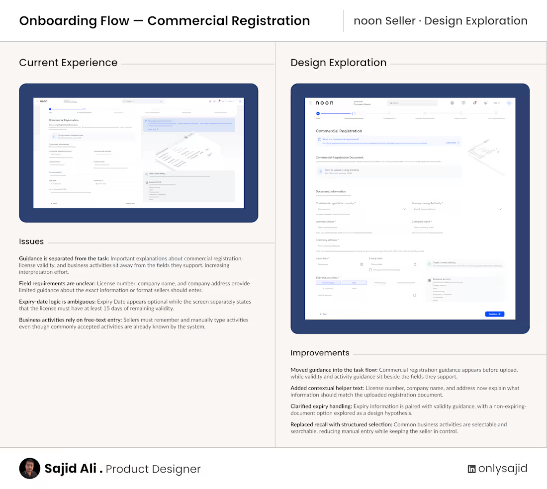
I explored noon Seller’s Commercial Registration onboarding step with one question in mind: Can the seller understand what’s required, complete the step confidently, and know what to do next without searching around the screen?
The current experience contains the necessary information, but some guidance sits away from the fields it supports, sEcommerceputs need more context, and business activities rely on manual entry.
In this design exploration, I moved guidance closer to the task, added contextual helper text, clarified the expiry-date logic, and replaced free-text business activities with a structured searchable selection.
The goal wasn’t to make the form shorter. It was to reduce interpretation effort and make each requirement easier to understand at the moment it matters.
The non-expiring registration option is a design hypothesis and would need validation against noon’s actual compliance rules.
This is an independent exploration based on the publicly visible experience, not a claim that the current solution is wrong.
Which part of seller onboarding usually creates the most uncertainty for you?
0
53