Buttons - Design System

Sajid Ali

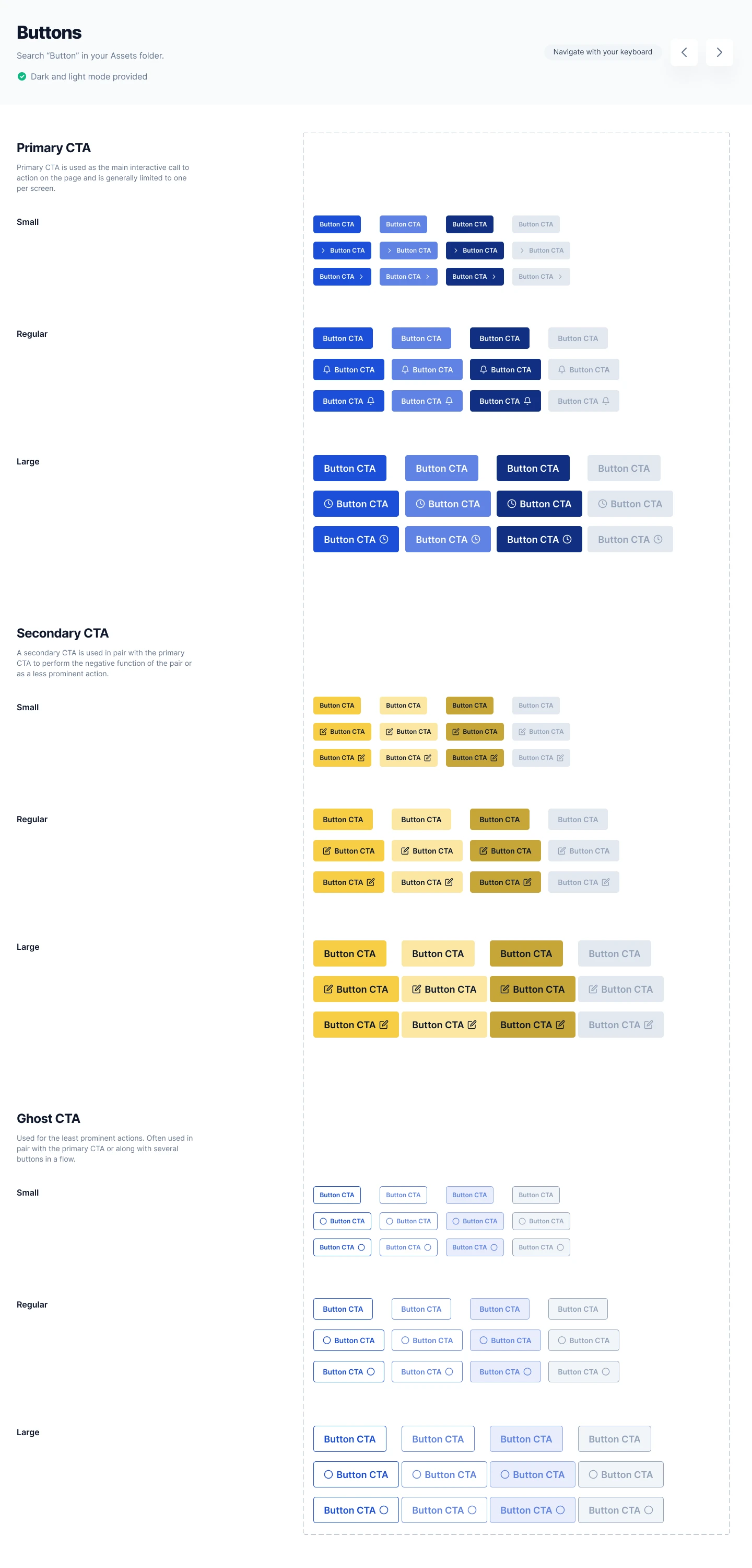
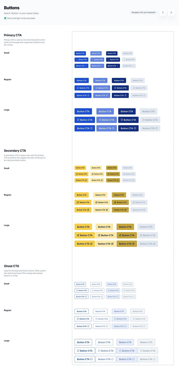
Design System - Button Components Library
Overview
This project showcases a scalable button component library designed in Figma as part of a broader design system. The goal was to create a consistent set of reusable button patterns that improve design efficiency, maintain visual consistency, and support product scalability across multiple interfaces.
The library includes primary, secondary, and ghost button variants in multiple sizes and states, making it easier for teams to build products using standardized UI components.
Challenge
As products grow, inconsistent button styles can create usability issues and increase design and development effort. Teams often struggle to maintain consistency across different screens and workflows.
The challenge was to create a flexible button system that supports various use cases while remaining easy to implement and maintain.
My Approach
I focused on creating reusable components that balance usability, accessibility, and scalability.
The design emphasizes:
• Consistent interaction patterns
• Reusable design components
• Clear visual hierarchy
• Scalable design system foundations
• Easy handoff for development teams
Design Process
Defined button hierarchy and usage guidelines.
Created Primary, Secondary, and Ghost button variants.
Designed multiple sizes for different interface needs.
Added icon and non-icon variations.
Structured components for scalability and consistency.
Key Features
• Design System Components
• Button Component Library
• Primary CTA Buttons
• Secondary CTA Buttons
• Ghost Buttons
• Multiple Size Variants
• Icon & Text Variations
• Scalable UI Components
• Design System Documentation
Tools Used
• Figma
Outcome
The final button library provides a structured foundation for building consistent interfaces while improving design efficiency and component reuse across products.
Looking for a Product Designer?
I help startups and businesses build scalable design systems, SaaS platforms, dashboards, and digital products that improve consistency and usability.
Like this project
Posted Jul 4, 2025
A scalable button component library designed in Figma featuring primary, secondary, and ghost button variants for consistent product experiences.
Likes
0
Views
7