The network for creativity
Join 1.25M professional creatives like you
Connect with clients, get discovered, and run your business 100% commission-free
Creatives on Contra have earned over $150M and we are just getting started
Back to feedPost
Taste Test

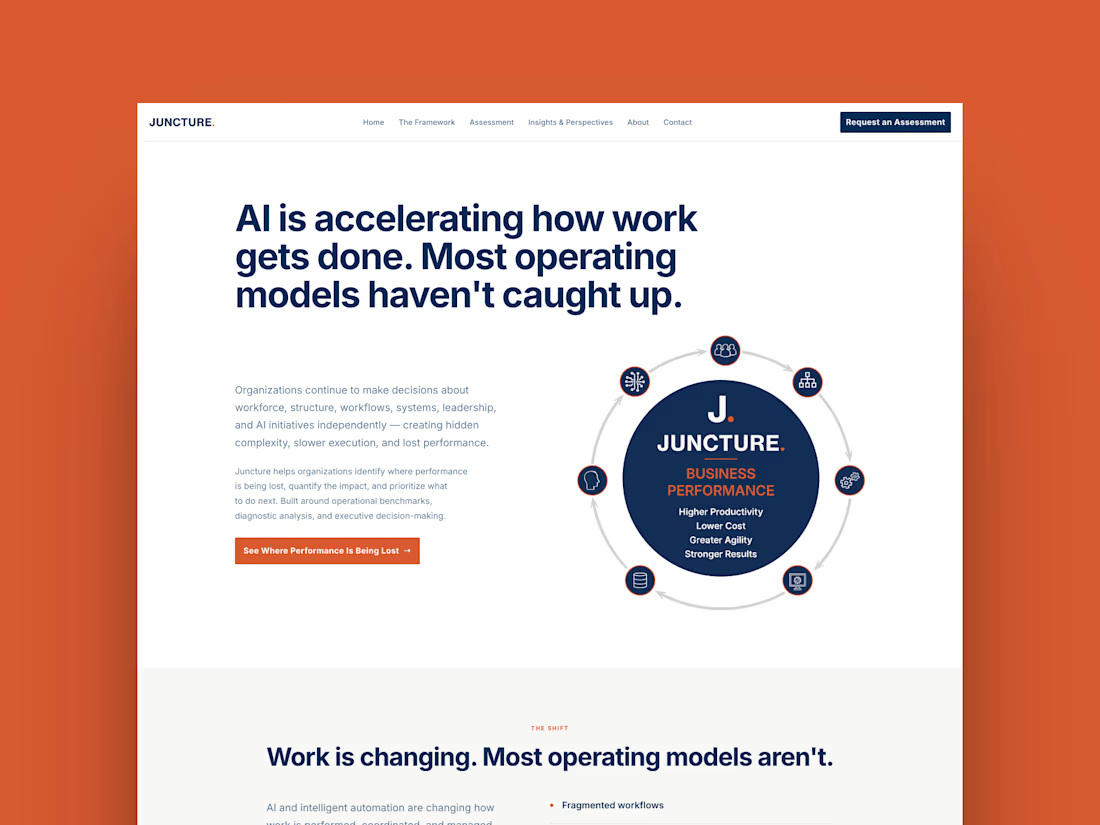
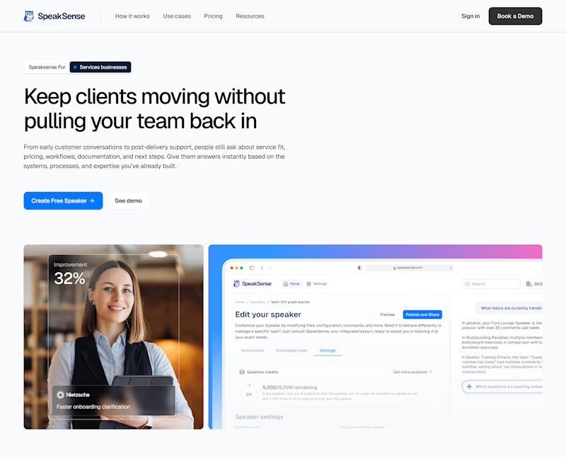
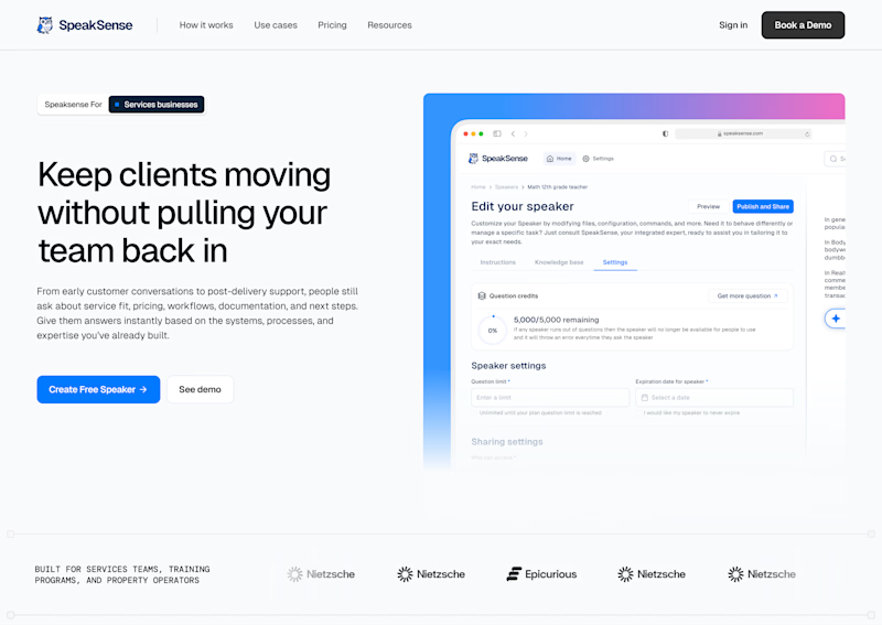
Two hero section directions for a client site- same headline, different visual approach. which one lands better?
.
.
More of this over on X, in real time ideas, questions, and the people building cool stuff https://x.com/rightnextstep?s=11


19 votes
Ends in 1d

Going with hero 1

Hero 2, is better for if you're aiming for direct conversion and overall layout is way more cleaner, Hero 1 maybe center it beacuse its too much white space on the right, and play around with the 2 images on the bottom. Hero 2 is the winner for me nice work there.

The reason I chose Hero 1 is that the design style feels fresh and modern. I also think the image beneath the hero text complements the message really well, which makes the whole section feel more cohesive. That’s my perspective.

It feels hero 2 its lets busy than the other other, which the picture deviates my attention

Looks great

I will pick 2nd one

I would choose Hero 2. Solid layout, great for building instant trust.

Hero 2 is better!
The network for creativity
Join 1.25M professional creatives like you
Connect with clients, get discovered, and run your business 100% commission-free
Creatives on Contra have earned over $150M and we are just getting started
Trending

Claude
Claude has entered the design space. How are you using it?

Contra University
Learn from expert creatives how to earn more using next-gen AI tools.
Brand Design
The best brand designers are on Contra. Scroll to see what's trending in brand design. What are you building?
creativeaiflow
Creative AI workflows are evolving. What tools do you use, and what are their strengths and weaknesses?
freelancerlife
Freelancer life is wins, pivots, and everything in between. What’s yours right now?



Related posts


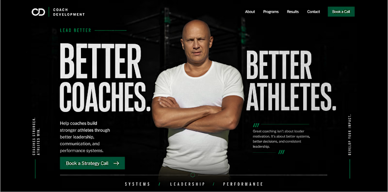
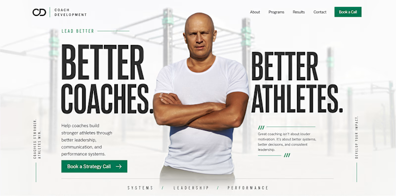
Light and dark themes can create completely different impressions of the same brand.
The light version feels more open, clear, and approachable. It creates a sense of trust, accessibility, and calm.
The dark version feels more focused, powerful, and premium. It adds intensity, authority, and a stronger sense of expertise.
The content and structure remain the same, but the emotional perception changes.
For a sports psychology coach working with athletes and coaches, which theme feels more suitable to you: light or dark?

99 voted
69%
44 voted
31%
143 votes
Closed

I always prefer dark mode, but I don't know why I think light mode looks good to me

If you had to choose one option to present your brand without actually talking to the users, what would you choose?
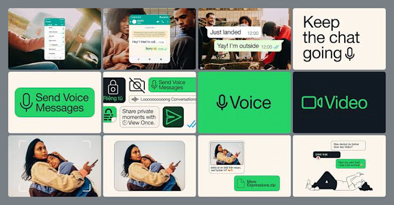
Lately, I've been pushing myself to explore what's possible with Figma Motion and see just how far I can take animations without leaving Figma.
I recently came across a really smooth WhatsApp animation and thought, why not recreate it? So I challenged myself to build it from scratch, paying close attention to the timing, easing, and micro-interactions.
It's been a fun way to learn, experiment, and sharpen my motion design skills.
How do you think it turned out? 👀
I'd love to hear your feedback!
23 voted
79%
6 voted
21%
29 votes
Closed

Animated visuals makes the user stay, while static will not attract much

Juncture just went live 🎉
Full custom Framer build for an executive advisory firm — six pages, a custom interactive framework component, and an animated scoring system built as a native code component instead of a static graphic.
Wrote up the full case study, including the two places I pushed past the original brief and why:

Beautiful