The network for creativity
Join 1.25M professional creatives like you
Connect with clients, get discovered, and run your business 100% commission-free
Creatives on Contra have earned over $150M and we are just getting started
Back to feedPost


Celvana brand identity & packaging for a red light therapy brand launching in the US.
The category is crowded with identical, unbranded panels. Celvana sells precision, so the brand had to look like medical equipment you can trust: clinical, exact and professional.
Brand identity case study
Packaging case study

This is high end branding
Thank you, Mahmudul! Doing my best 🙌
You are welcome, you left the proof here🙌🙌


Thanks! 🙌

The clinical, precise direction makes a lot of sense for this category. It’s interesting how branding can build trust before someone even tries the product.
Thank you! Branding is all about trust, gald you can recognise what truly matters 👍

Smart positioning. Going clinical in a category full of generic panels makes it stand out right away. Packaging looks sharp.
Thank you, Tabish! 🙌

Creative & modern work! 💕


Wow absolutely love this!!!
Thank you for your kind words, Natalia! 🙌

Red dots on black read like an LED array, so the light therapy idea lands before anyone reads the copy.
Thank you, Supreme 🔥

Amazing work!


This looks so cool! I love how the logo turns into a pattern that flows across the packaging as well. So much can be explored with the mark.
Thank you, Shama! Absolutely, the mark can be the foundation for a whole new world of graphic assets that could be used across all brand touchpoints.
This is an example for the 'just a logo' projects. How one logo mark can build you an entire system 😁

so cool!

Wow, circles are one of my favourites.

The clinical, medical-equipment positioning is exactly what this crowded red-light category needs — most panels feel like unbranded gadgets, so making Celvana read as precision and trust is a strong differentiator. Curious whether the packaging's 3D treatment was built to read...

This is a really great design challenge to take on. Combining clinical trust with a modern brand identity is not easy, but this direction looks incredibly strong. I would love to see the full packaging.

Very clean design
Thank you, Patrick 🙌

Smart move to borrow from medical equipment. Most red light panels look like gaming gear, so the clinical feel stands out right away.

Woow, this project is 🔥from the thinking to the iconmark, down to the packaging. Your good💯

Awesome work
Thank you, Sofiia! 🙌


The spec column on the side of the XT1500 box is what sells "medical equipment" for me. It reads like a device data sheet instead of a wellness promise, which is exactly how you stand out from the unbranded panels. Did those specs come straight from the client's real device sheet?
Thanks! Yeah, the content was from the client. I just made it look good 😂

Designing a red light brand to look like medical equipment in a category of identical, unbranded panels is the right strategic read, and the dot-perforated panel on a red glow with a quiet XT1500 box is clean. Since the replies are mostly praise, here is the counterpoint:...
The network for creativity
Join 1.25M professional creatives like you
Connect with clients, get discovered, and run your business 100% commission-free
Creatives on Contra have earned over $150M and we are just getting started





Related posts


New case study is up on my profile! A fun passion project I worked on earlier this year🚲


super cool project! the typographic work is impeccable and super interesting


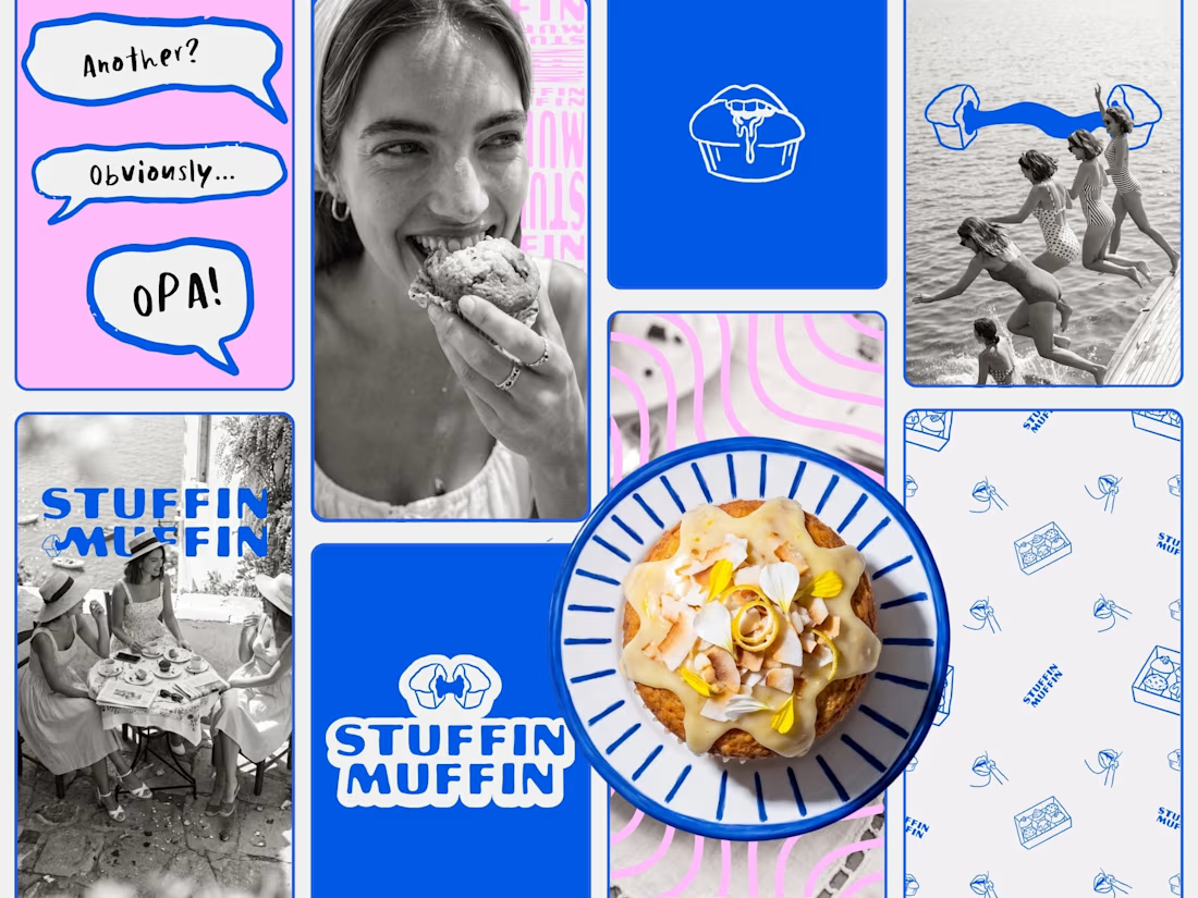
Just closed out on this fun project. Can't wait to see it all come together in store!

Super vibrant branding! That bold cobalt blue paired with the quirky illustrations looks so clean. Great project wrap-up

What happens when a brand’s best idea is a hole?
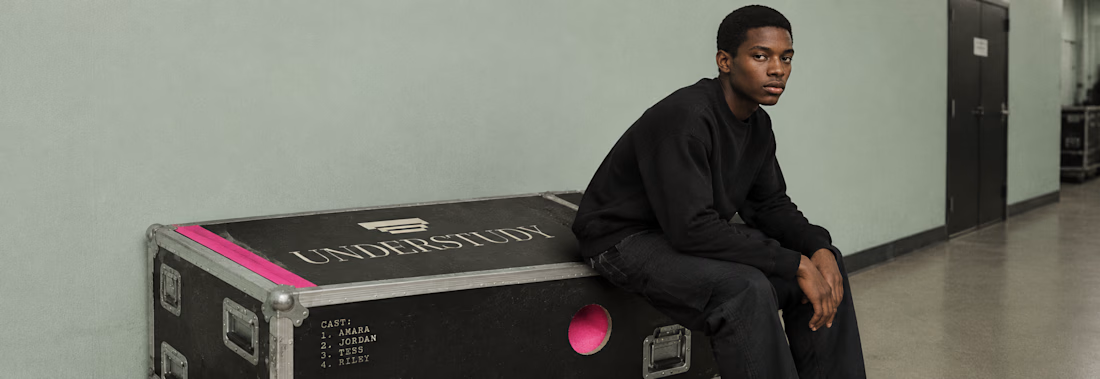
UNDERSTUDY is a theatre identity that opens circles onto doubled eyes, black voids and displaced cheeks, in hot pink Didone on pale sage, with the cast list as texture.
One cut, applied everywhere. Case study live Now.