Brand Identity Creation for Stuffin Muffin

Jasmine Sotiropoulos


STUFFIN MUFFIN
Industry: Food + Beverage
Location: Melbourne, Australia
Scope: Brand Identity, Creative Direction + Brand Assets
Project Type: New Brand Launch
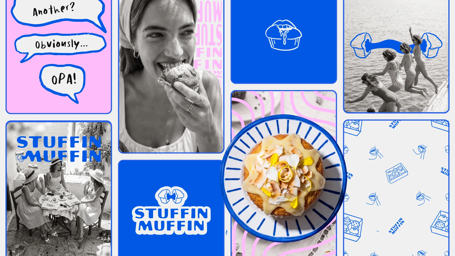
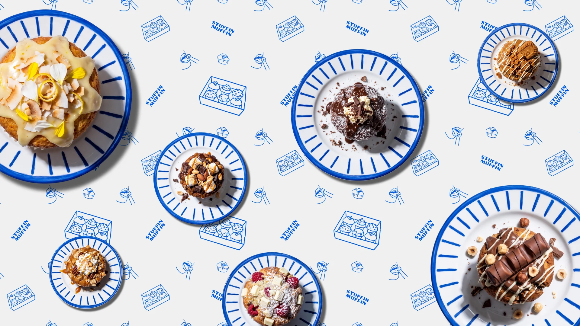
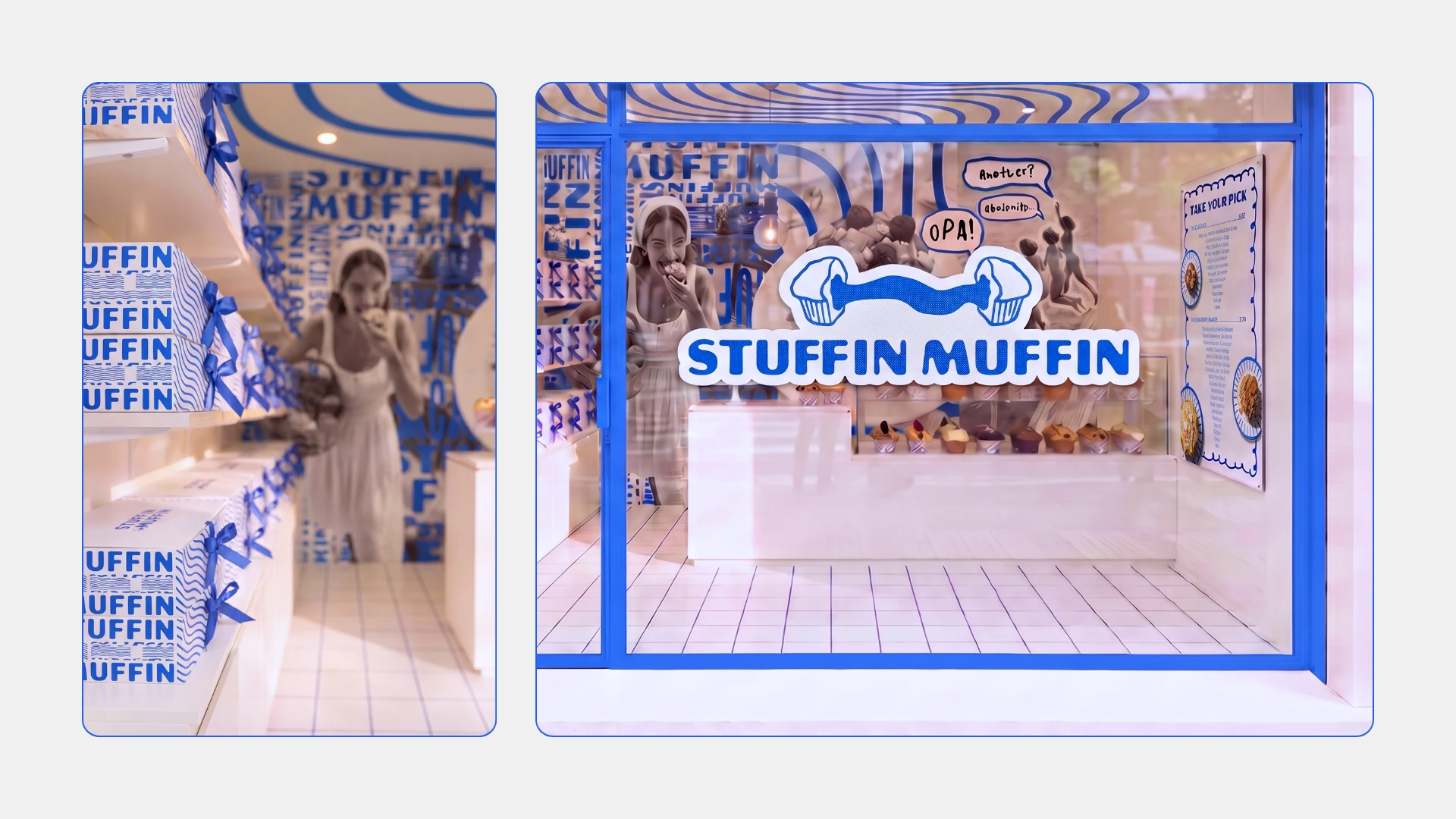
Stuffin Muffin is a new Melbourne food brand built around taking the humble muffin and making it exciting again through bold flavours and stuffed fillings. The project focused on creating a distinctive visual identity and brand world inspired by nostalgic European summers, combining playful illustration, retro photography and a fresh Mediterranean colour palette to give the brand a look that feels cheeky, memorable and ready to grow across packaging, social, cafés and future locations.
OVERVIEW
Stuffin Muffin came to me with a really simple product idea: take something everyone already knows, the humble muffin, and make it exciting again by stuffing it with proper fillings. The opportunity for me wasn’t just to design a logo around that, it was to work out what world this product should live in. I didn’t want it to fall into the obvious bakery space of warm neutrals, rustic fonts and food photography everywhere, and I also didn’t want it to feel childish or gimmicky. The owner is Greek, so I pulled from the feeling of European summer rather than anything stereotypically Greek: old cafés, seaside towns, black and white holiday photos, striped swimsuits, early morning streets and that feeling of smelling something freshly baked before you even know where it’s coming from. The idea was to make Stuffin Muffin feel like a little escape, something indulgent and comforting enough for winter, but visually able to transport you somewhere that feels like summer.
PROCESS
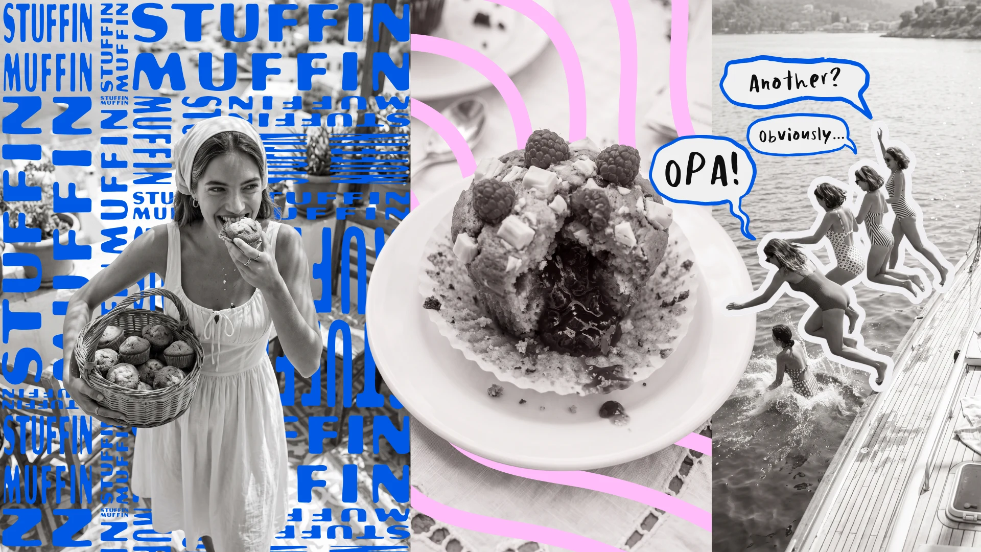
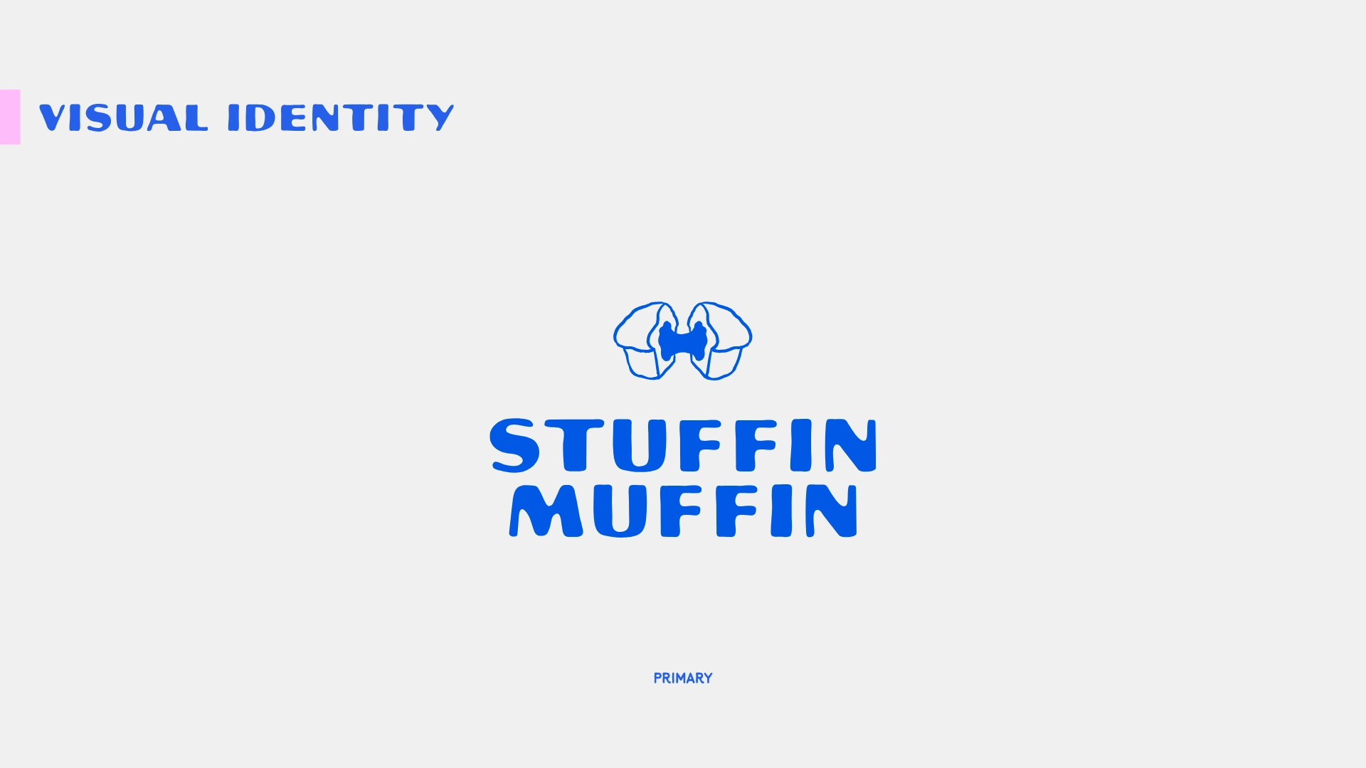
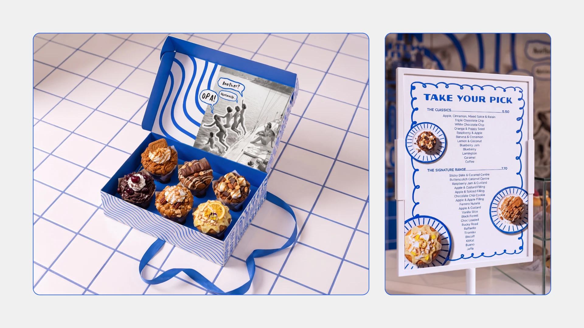
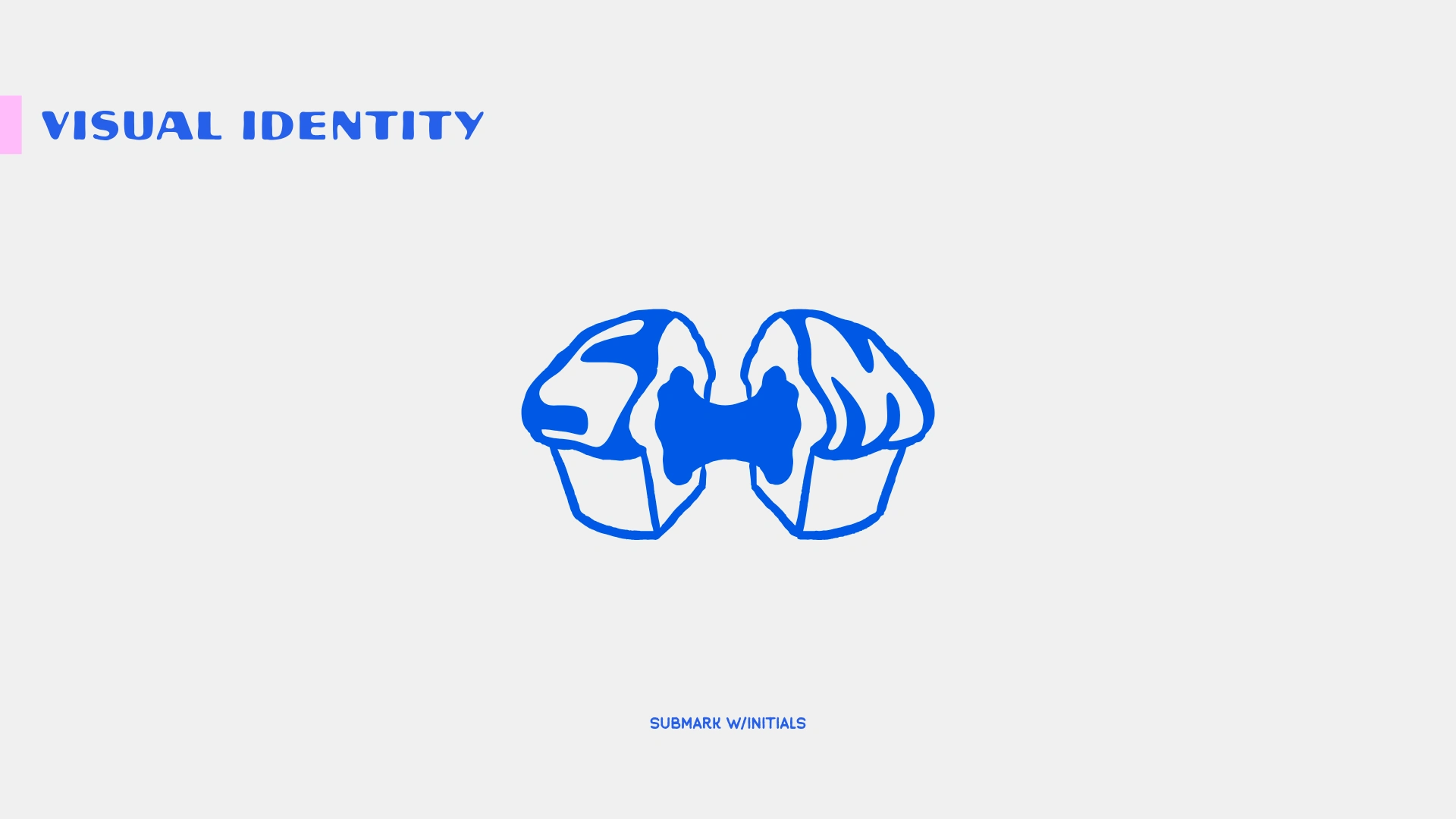
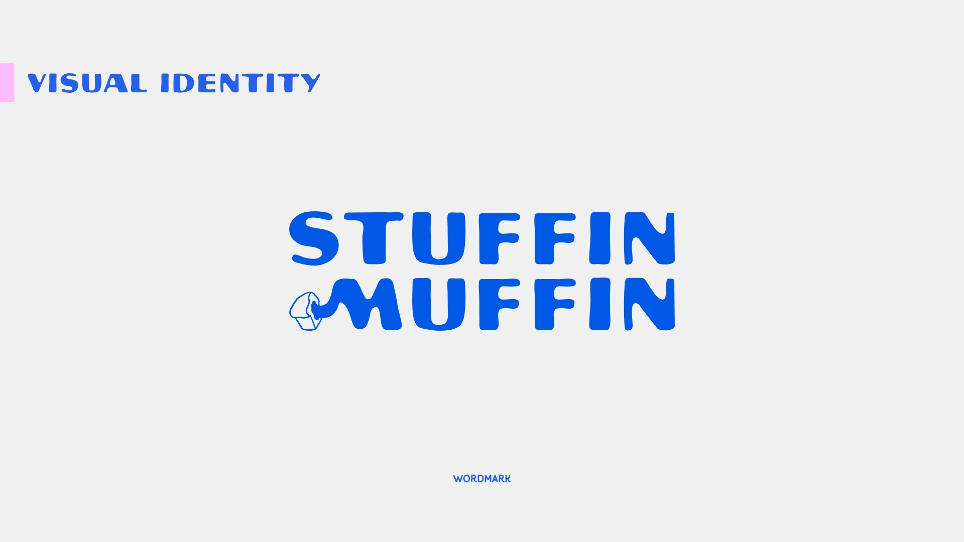
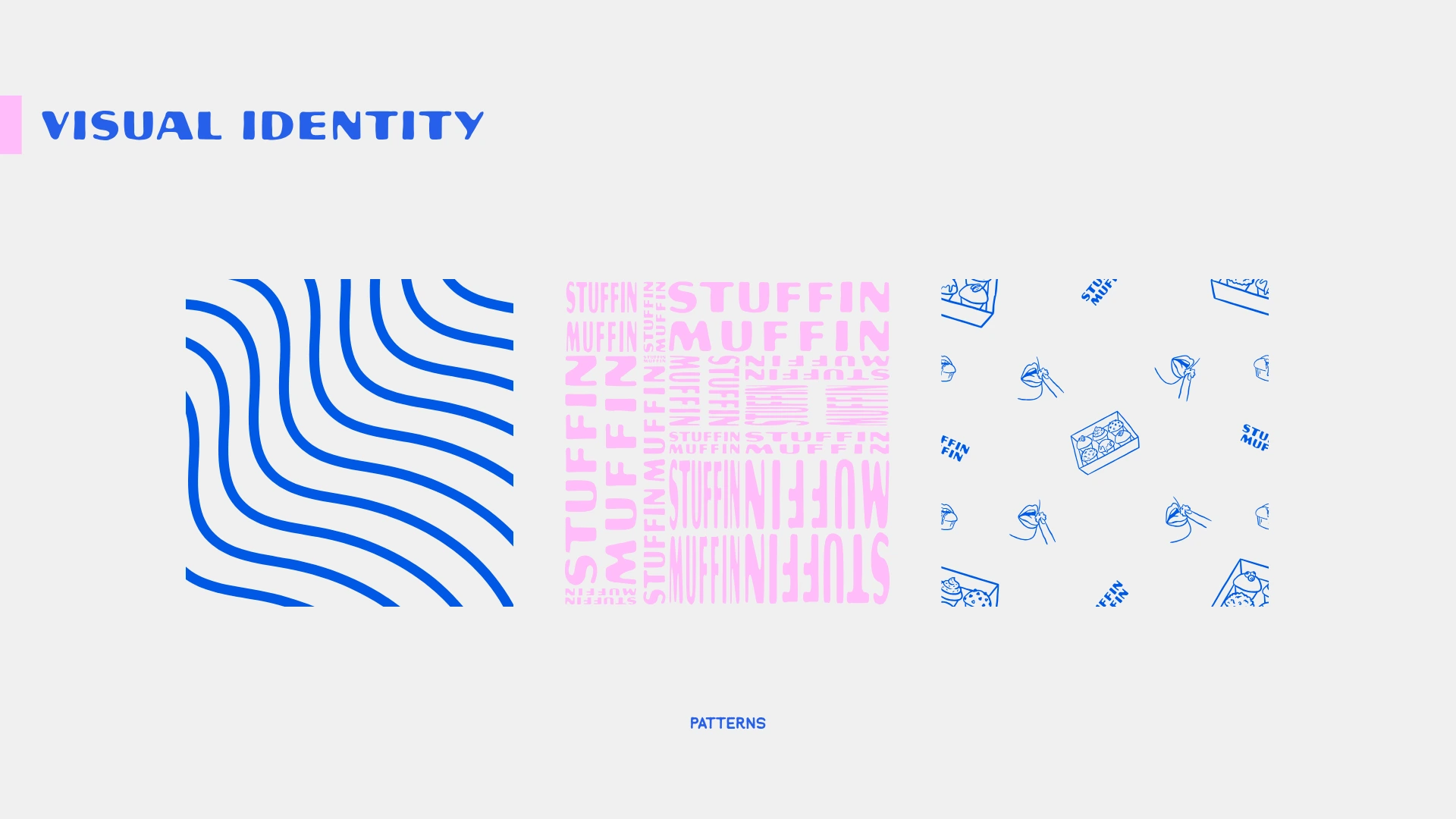
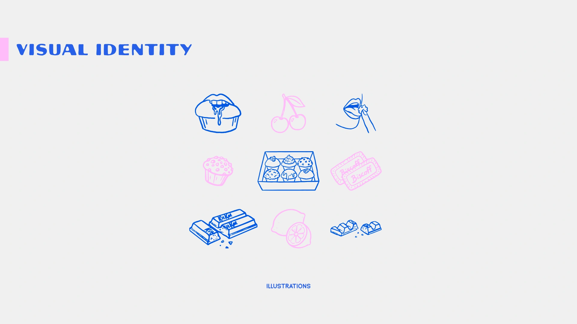
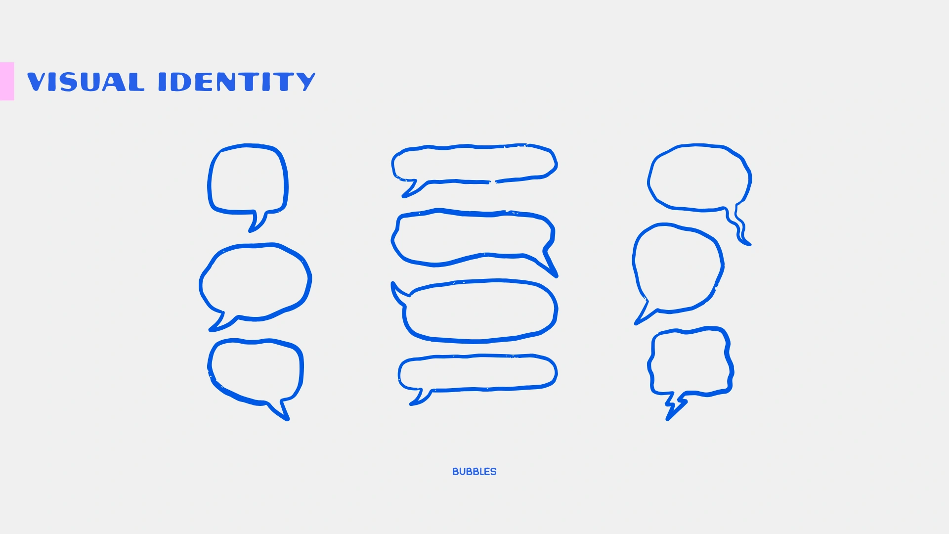
I started by thinking less about what a muffin brand should look like and more about how buying one should feel. The answer was light, fun, nostalgic, a little flirty and slightly unexpected. From there I built the whole direction around contrast. Bright Mediterranean blue sits against black and white photography, which creates that old-meets-new feeling. The photography feels more like memories than advertising, while the illustrations, speech bubbles and graphic elements interrupt those moments with humour. That balance was really important because too much nostalgia starts to feel dated, too much humour starts to feel cheap, and too much Greek influence starts to feel themed. The logo followed the same thinking, using two muffins pulling apart with the filling stretching through the middle so the product difference is understood without needing to explain it. The typography, supporting illustrations and speech bubbles were then built around that same idea, giving the brand enough personality to feel playful and recognisable without making every touchpoint loud or overworked.
OUTCOME
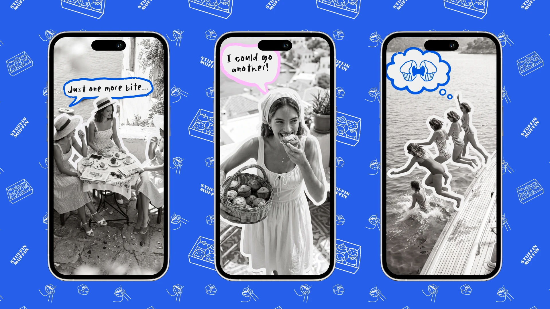
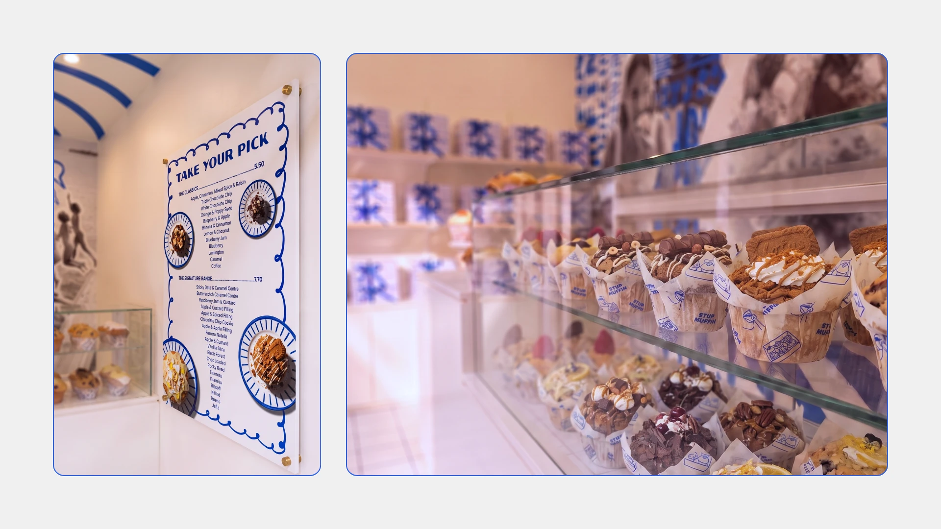
The final identity gives Stuffin Muffin much more than a logo, it gives the brand a whole world to live in. It feels playful without being childish, nostalgic without being old, and premium without becoming too serious. It can move across packaging, menus, social media, signage and future locations while still feeling like the same brand. More importantly, the visual direction gives people an emotional reason to connect with it. The muffin itself is the treat, but the brand turns that treat into a small moment of escape, comfort and fun in the middle of someone’s day. That’s why the direction works for me: it doesn’t just tell people that the muffins are different, it makes the whole experience around them feel different too.
Like this project
Posted Oct 21, 2026
Created a playful and nostalgic brand identity for Stuffin Muffin.