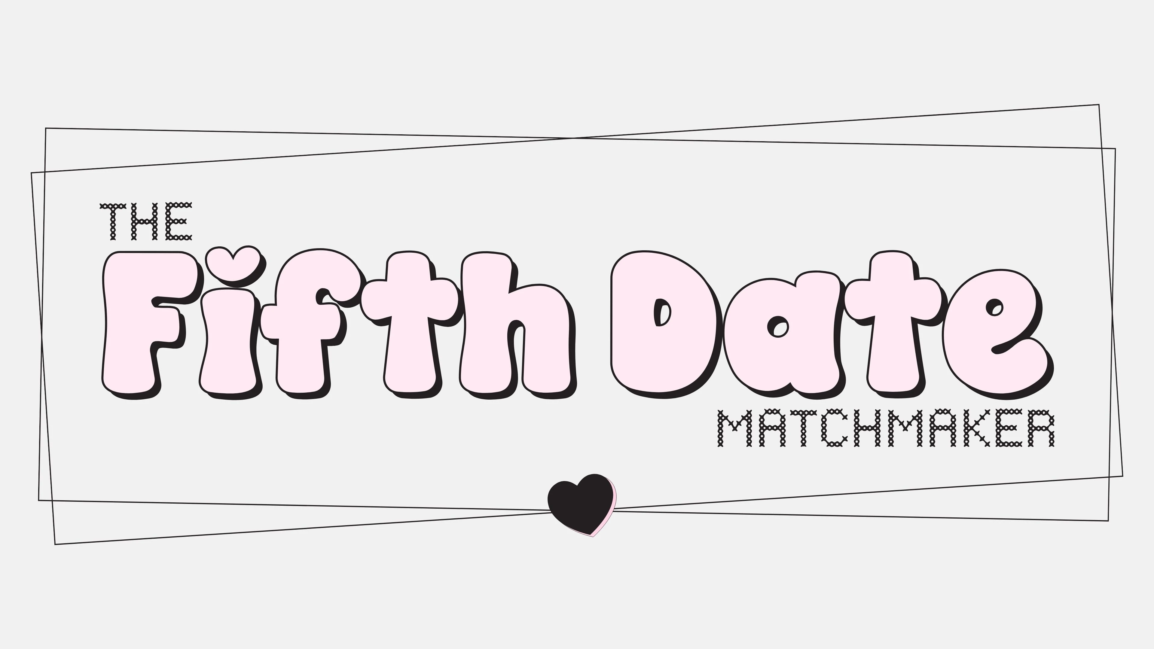
Brand Identity Development for The Fifth Date
Jasmine Sotiropoulos
PROJECT OVERVIEW
The Fifth Date had a very clear opportunity from the start. This wasn’t just about branding a matchmaking service. It was about creating a brand world around the point where dating starts to feel less performative and more real.
In a category that often leans either too polished and exclusive or too generic and app driven, I wanted this to feel more emotionally sticky. More playful. More memorable. Most of all, it needed to feel like an extension of Vivienne herself, because her warmth, confidence, and personality were already such a big part of the value.
The idea of the fifth date became the anchor for everything. Not the first impression. Not the awkward back and forth. The point where there’s enough chemistry, trust, and momentum for something real to start taking shape. That thinking shaped the messaging, identity, and overall direction from the ground up.
THE APPROACH
The real challenge was balance. This brand couldn’t afford to feel too polished and untouchable, but it also couldn’t feel throwaway or gimmicky. It needed charm, but with enough structure behind it to feel credible.
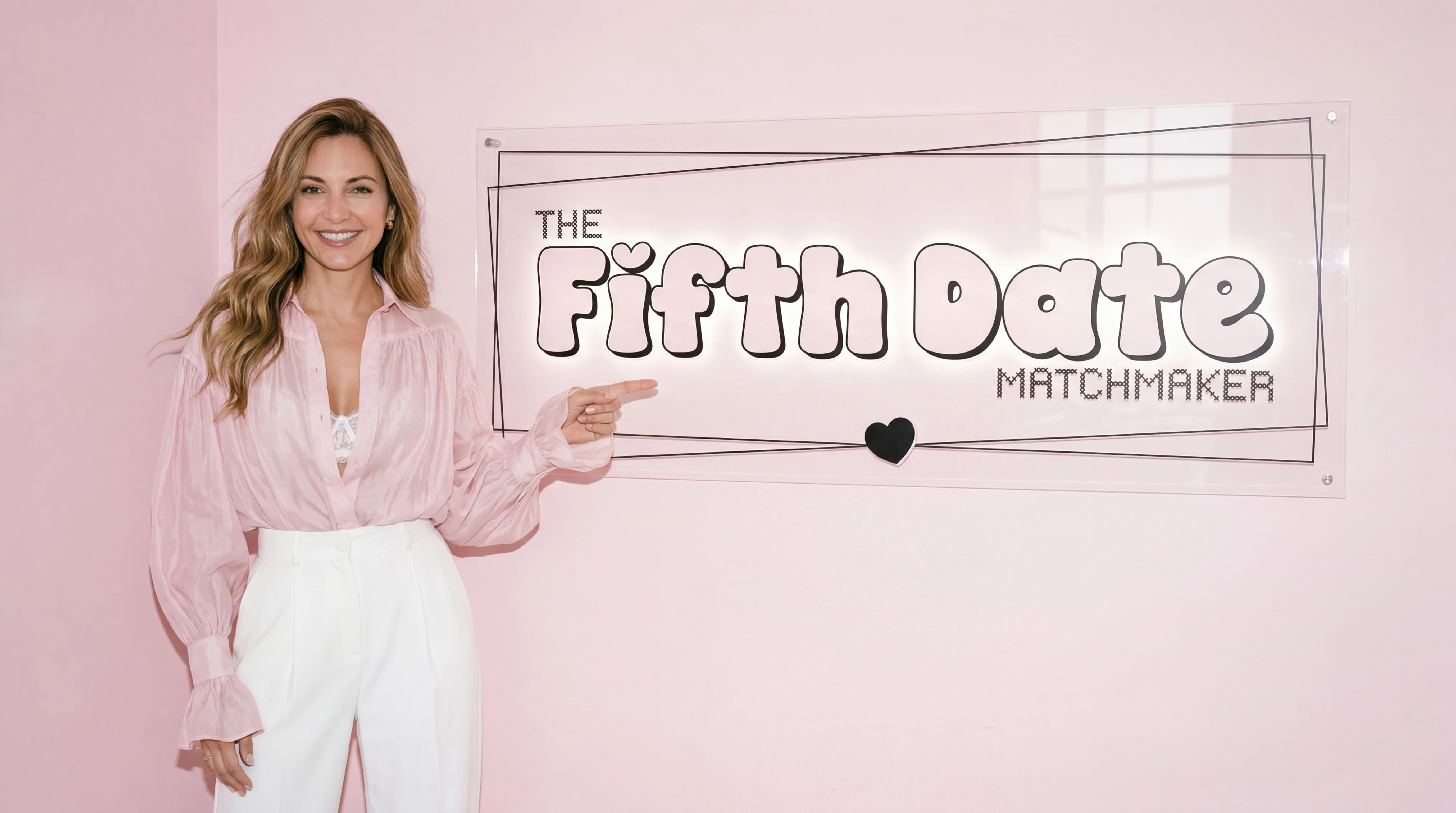
That’s where the direction started to take shape. The tone needed to feel flirtatious, confident, and self aware, without losing the care behind the service. Vivienne’s personality was a big part of that. Her warmth and energy already carried so much of the appeal, so the branding had to feel like an extension of her rather than something generic placed on top.
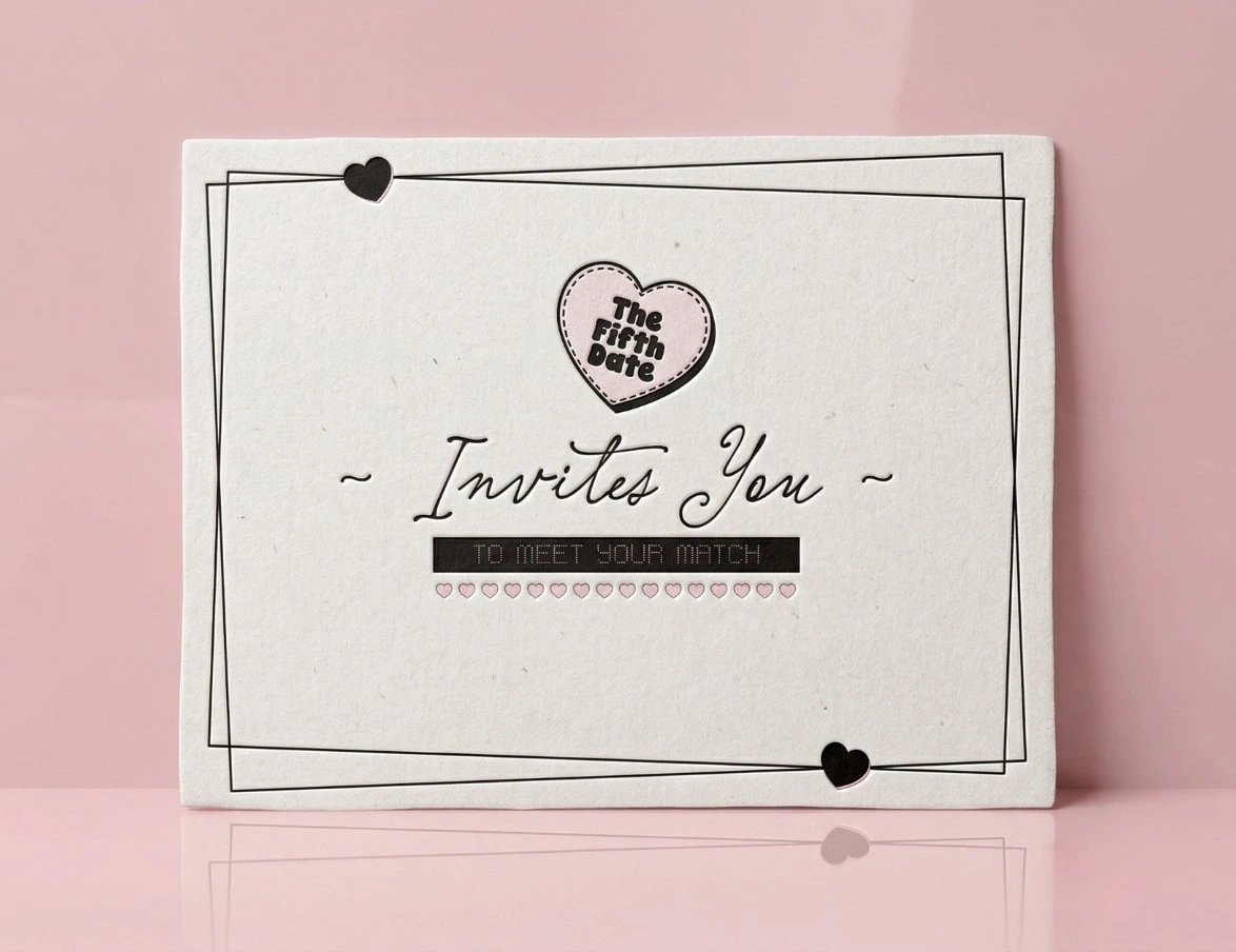
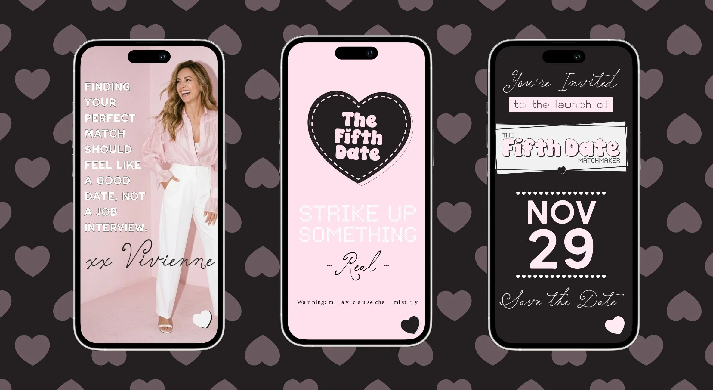
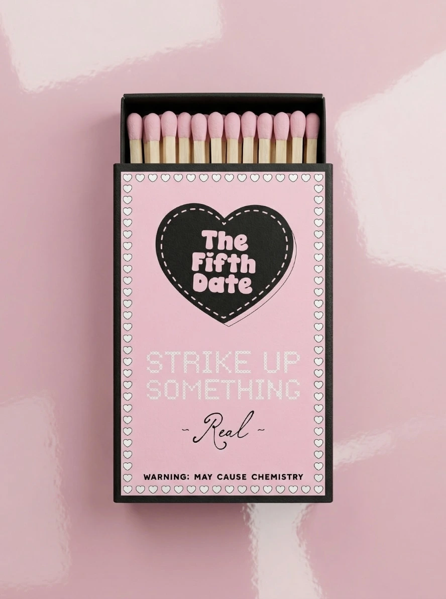
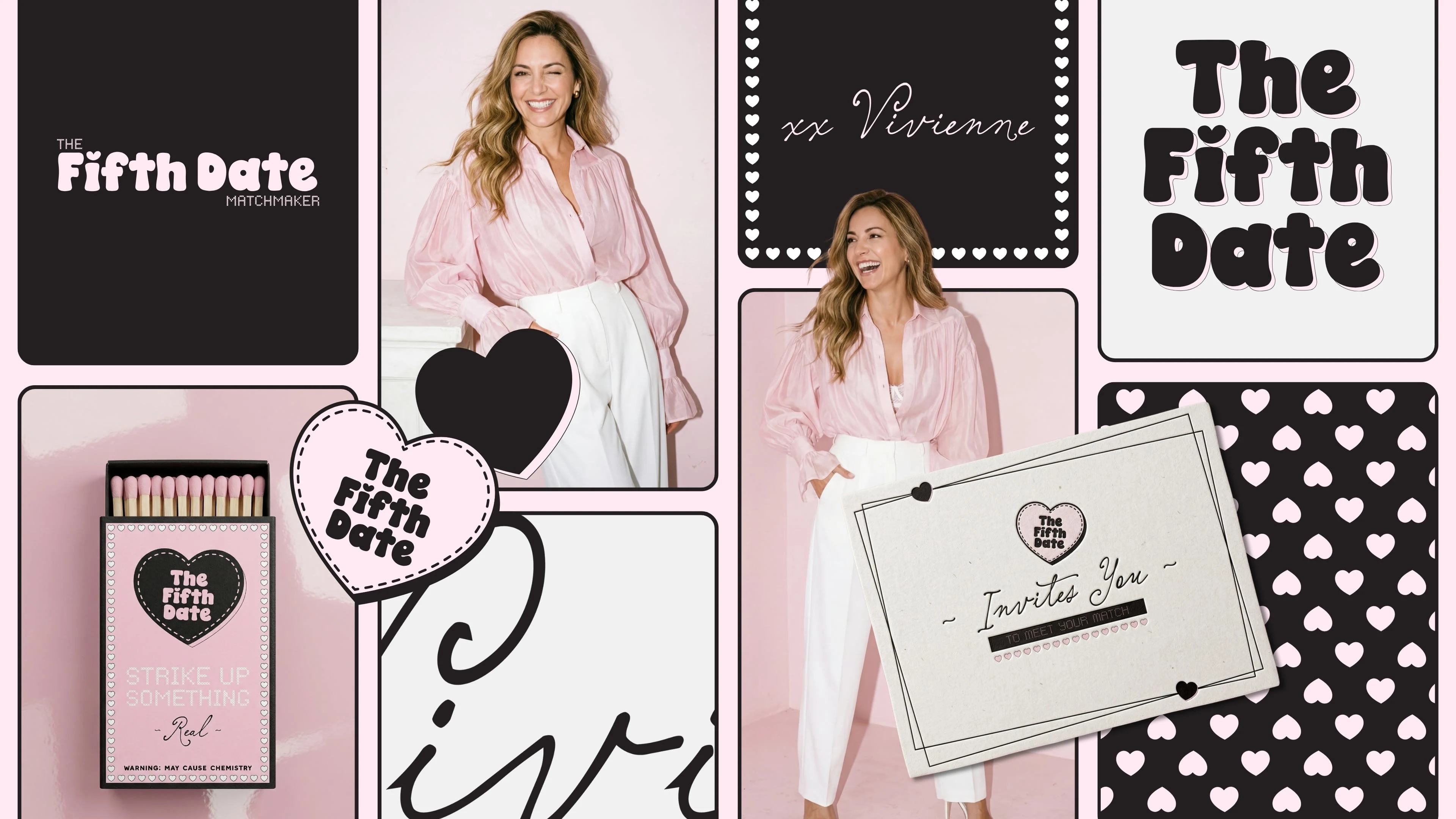
Visually, I leaned into that contrast. The soft pink gave the brand warmth and approachability, while the black framing, oversized lettering, heart details, and stitched motifs gave it edge, recognition, and a sense of play. From there, the wider asset system helped build out a more immersive world across invites, launch pieces, print details, social content, and digital touchpoints.
THE OUTCOME
The end result feels far more distinctive than the usual dating space. It doesn’t rely on predictable romance cues, and it doesn’t disappear into polished matchmaking sameness either.
There’s a clear personality to it now. The brand feels memorable, emotionally aware, and much more aligned with the experience Vivienne is actually creating. That gives the business more than just a visual identity. It gives it presence.
For me, this project is a strong example of how founder led branding can shift the way a service is perceived. It shows that trust doesn’t always have to come through seriousness. Sometimes it comes through clarity, personality, and a brand that knows exactly how it wants to make people feel.
Like this project
Posted Apr 9, 2026
Developed a distinctive and memorable brand identity for matchmaking service, The Fifth Date.