Creatrive Direction & Brand Identity Design for Talk Dirty Co
Jasmine Sotiropoulos
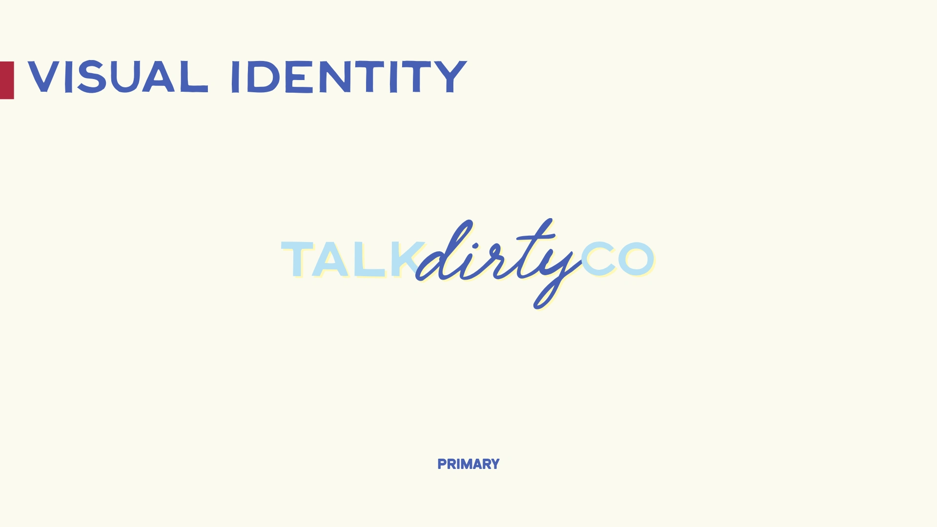
/OVERVIEW
Talk Dirty Co was created to challenge the sterile, polite world of laundry care. The category is dominated by soft pastels, eucalyptus leaves, and vague promises about “freshness.” It’s clean, yes. Memorable? Not really.
The opportunity was clear: build a brand that acknowledges real life. Wine spills. Gym socks. Kids. Chaos. A laundry product that doesn’t pretend mess is shameful, but normal. Even a little funny.
The goal wasn’t just to design packaging. It was to position Talk Dirty Co as a bold, culturally aware brand in a beige aisle. One that feels confident, self aware, and unapologetically human.
This wasn’t about being shocking for attention. It was about being honest in a category that hides behind softness.
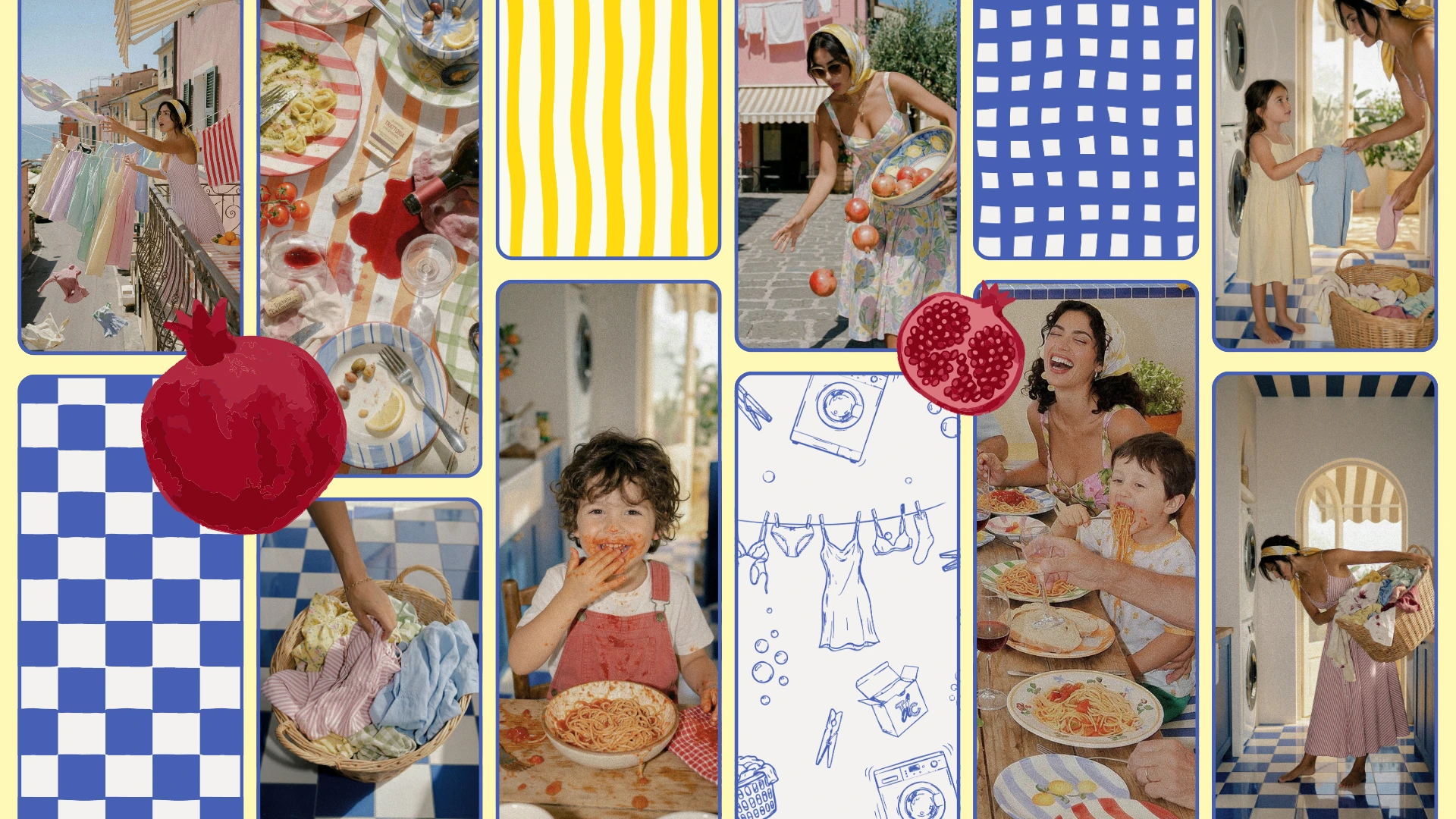
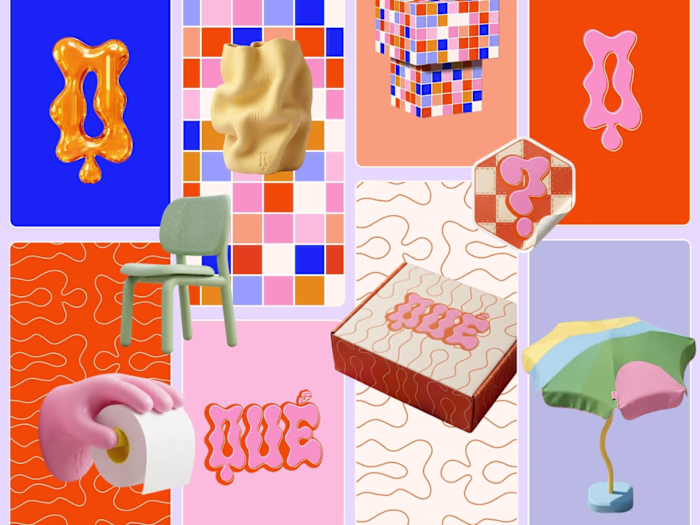
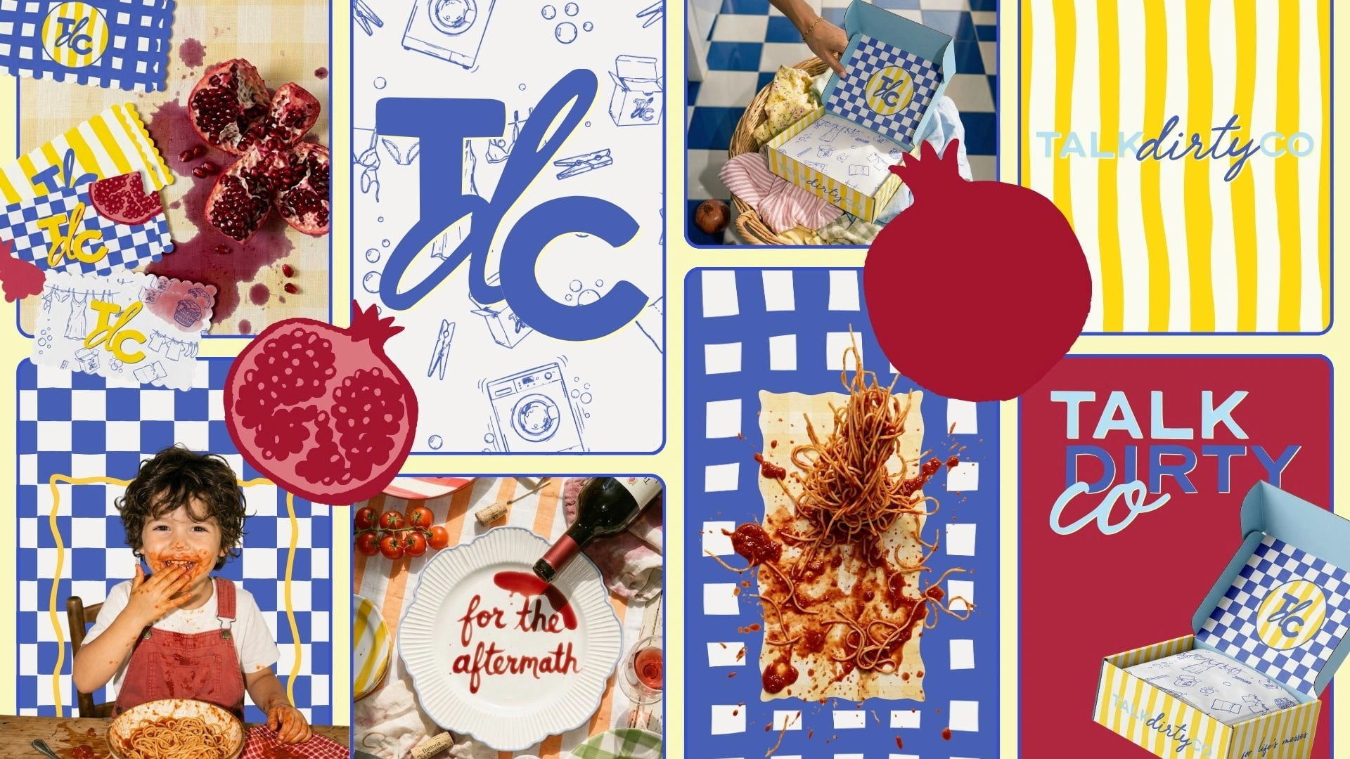
Moodboard
/THE APPROACH
We began with positioning. If everyone else whispers “gentle,” we don’t scream. We speak plainly. The strategic direction centred around one idea: real life is messy, and that’s not a problem to apologise for.
From there, the brand voice was shaped to feel playful but intelligent. Bold but not crass. Confident without being try hard. Every line had to feel like it came from a brand that knows exactly who it is.
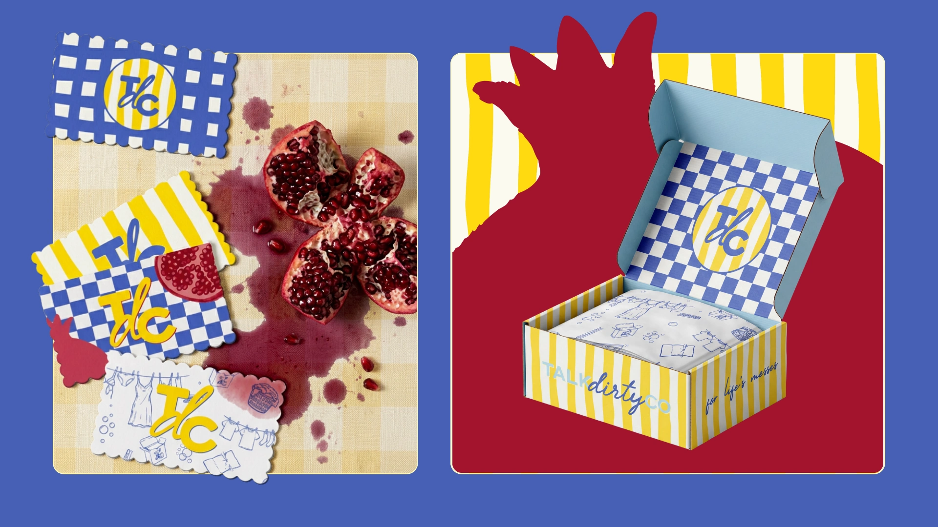
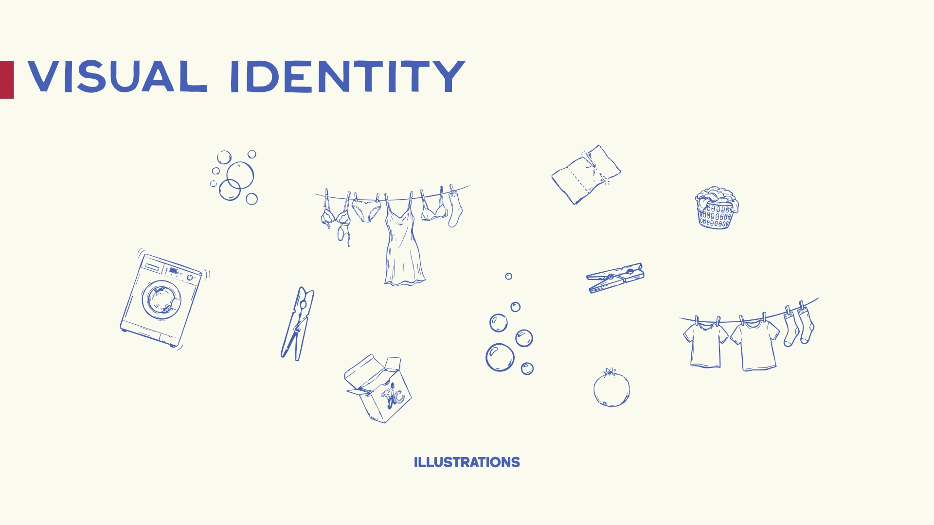
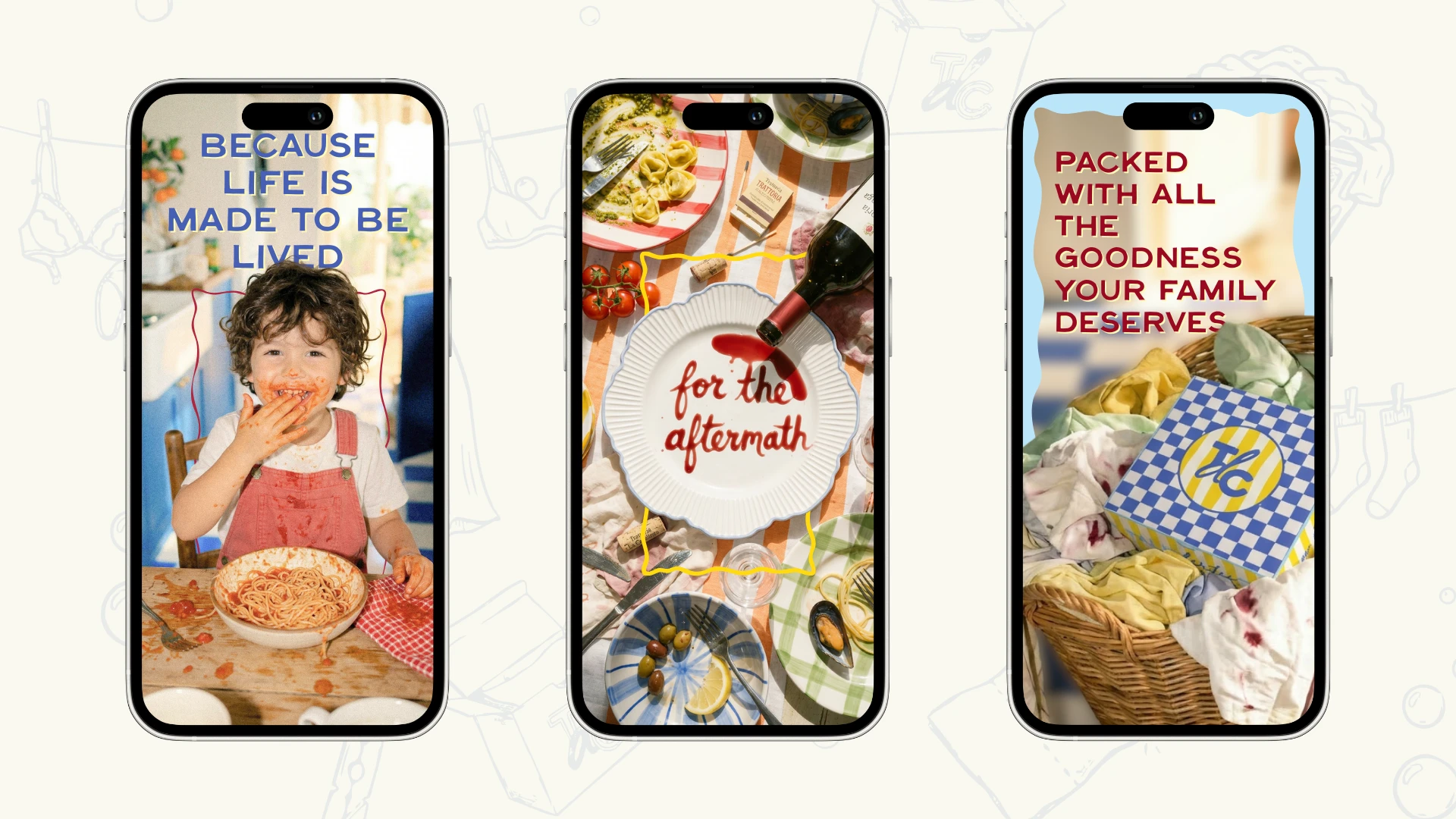
Visually, the identity rejects clinical minimalism. We leaned into high contrast colour, tactile pattern, retro inspired cues, and direct typography that holds space confidently. The logo carries weight. The supporting graphics bring movement and energy. The patterns and framing elements create a system that can flex across SKUs, campaigns, and retail without losing character.
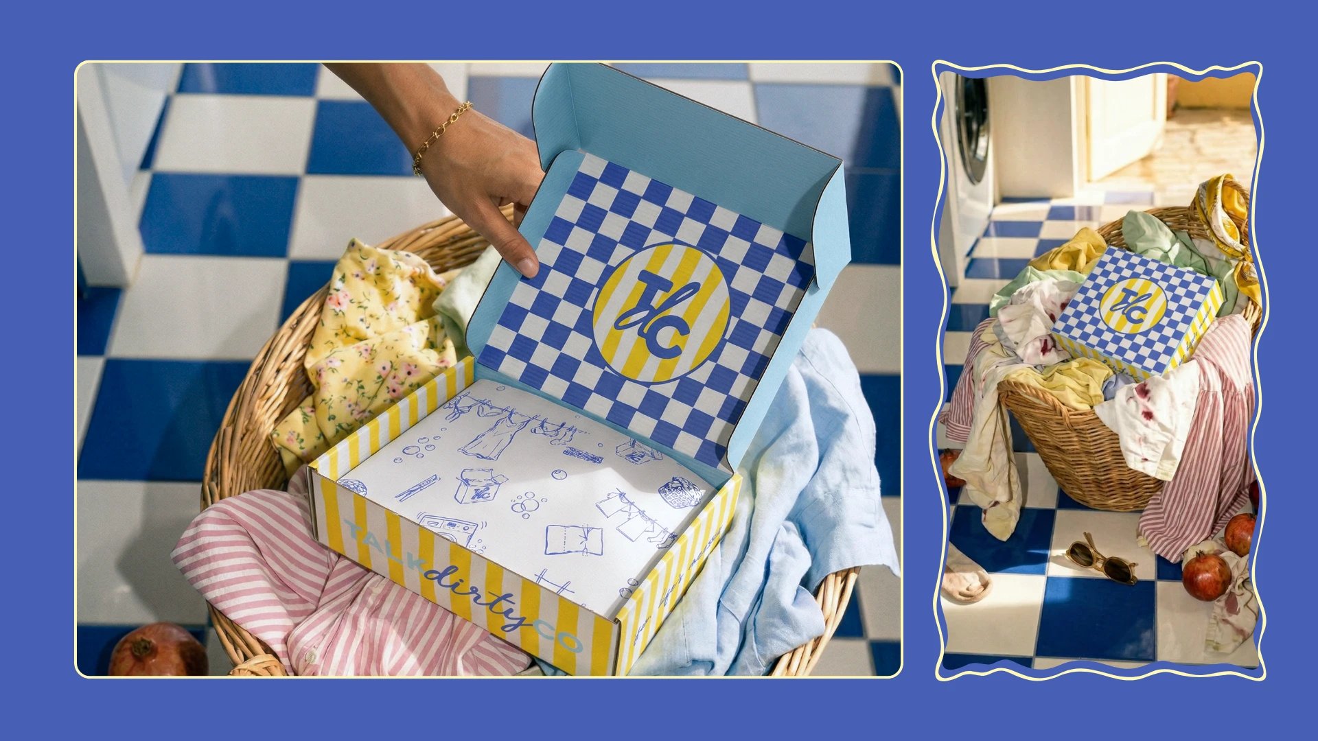
As Creative Director, the role was to ensure cohesion across every touchpoint. From box structure concepts to dispensing mechanics, to how the product is photographed in use. Even the “messy” imagery was intentional. When low quality or archival style images are used, they are treated in black and white with grain, or cut out with bold outlines, so nothing feels accidental.
The packaging structure itself was considered as part of the brand experience. A serrated tear strip. A roll format that dispenses like a household staple. A form that feels familiar yet reimagined. Function and personality working together.
/THE OUTCOME
Talk Dirty Co now stands apart instantly. On shelf, it doesn’t blend in.
Online, it doesn’t feel like another “eco laundry startup.” It feels like a brand with a point of view.
The strategic clarity makes the messaging simple and repeatable. The identity system allows for expansion without dilution. New scents, new formats, new campaigns can plug into a recognisable framework.
Most importantly, the brand feels alive. It acknowledges the reality of modern households and turns a chore into something with personality.
Talk Dirty Co proves that even in a functional category like laundry, authority and creativity can coexist. Clean clothes. Strong point of view.
Like this project
Posted Mar 7, 2026
Leaning into life's messes for the creative direction, brand identity & packaging for Talk Dirty Co. A Laundry Detergent Sheet Company.