ReWorded Rebranding Project
Jasmine Sotiropoulos
/ROLE
Brand Strategist, Designer, Copywriter, Client (yes, all of them).
This was ReWorded’s long-overdue rebrand... the project every designer promises themselves “one day.” That day finally came when we realised our own branding no longer reflected the clarity and confidence we give our clients.
/OVERVIEW
They say the shoemaker’s kids have no shoes… in our case, the designer’s brand never gets redesigned. After years of shaping other people’s visions, we finally turned the tools inward.
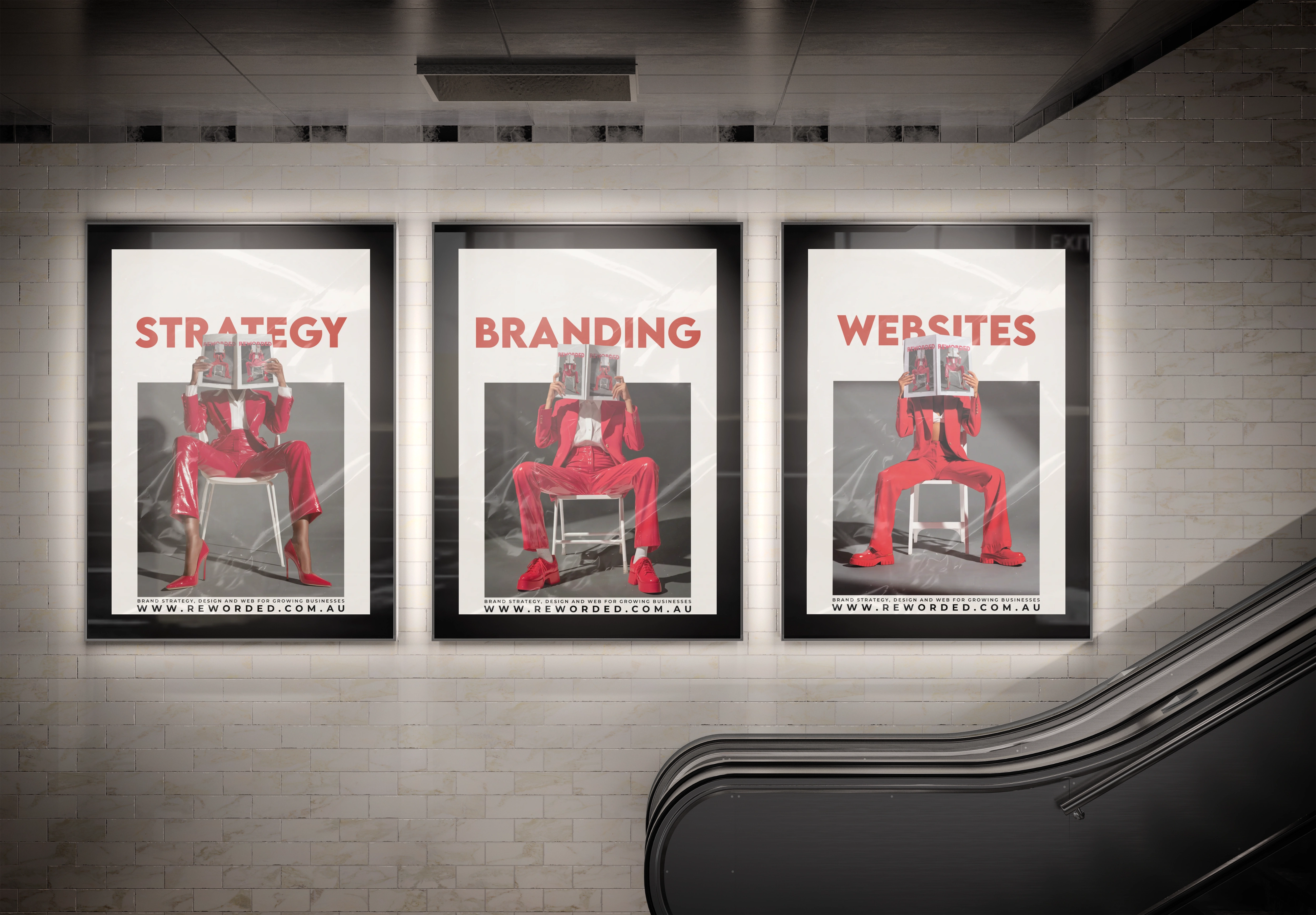
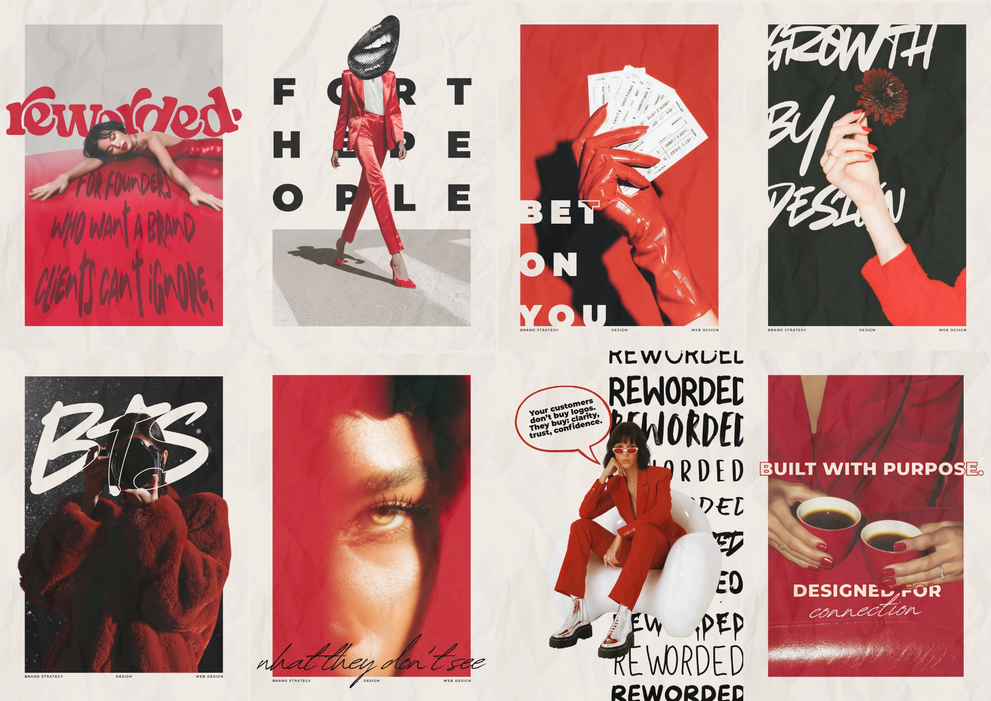
The brief from “the client” (me) was to create a brand that felt unmistakably ReWorded... bold, clean, evocative, and free from the cookie-cutter clutter that floods the design world.
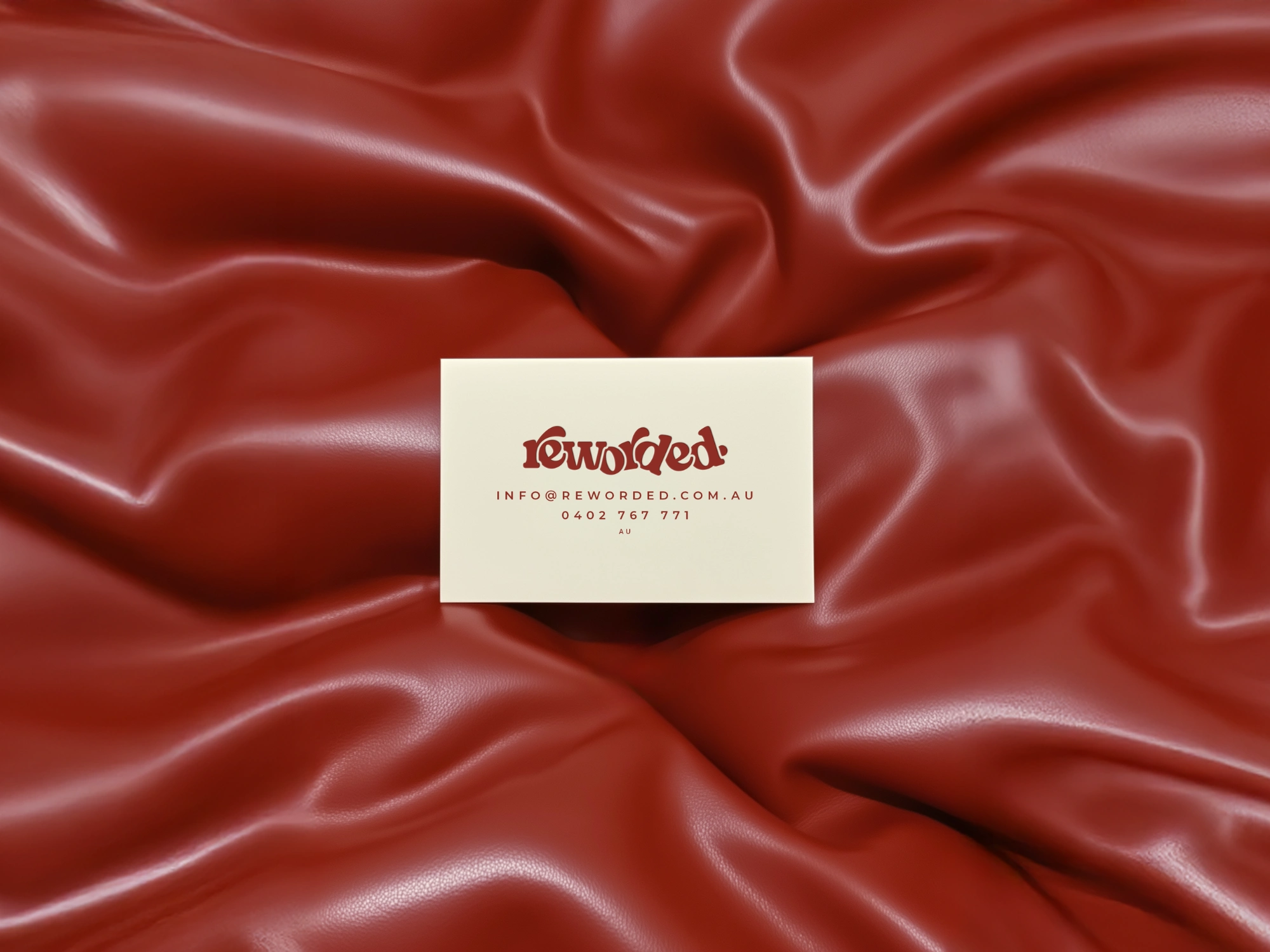
We built everything around a palette that tells our story:
a deep, confident red for passion and power,
a neutral cream for calm and clarity,
and black for timeless balance and strength.
Every element was stripped back to what mattered most... design that feels intentional, human, and intelligent. The new ReWorded identity doesn’t whisper; it speaks clearly. It shows that strategy and soul can coexist, and that sometimes the hardest brand to get right is your own.
/DELIVERABLES
Brand Strategy
Visual Identity
Typography + Colour System
Tone of Voice Development
Website Refresh
Ad Creatives
Social Contemt

Like this project
Posted Oct 11, 2025
Edgy Forward thinking Rebranding of ReWorded with a bold, clean, and evocative identity. Powerful and proud to be loud but not shout-y!
Likes
7
Views
58
Clients
ReWorded