Brand Identity Development & Art Direction
Jasmine Sotiropoulos
/Role
• Brand Strategy & Design
• Web Strategy & Design
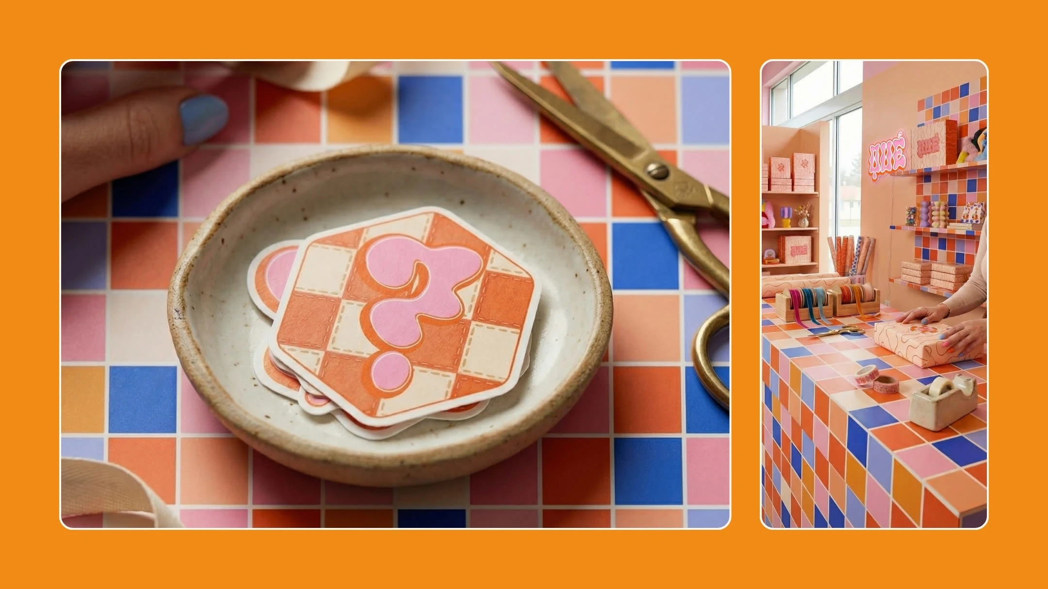
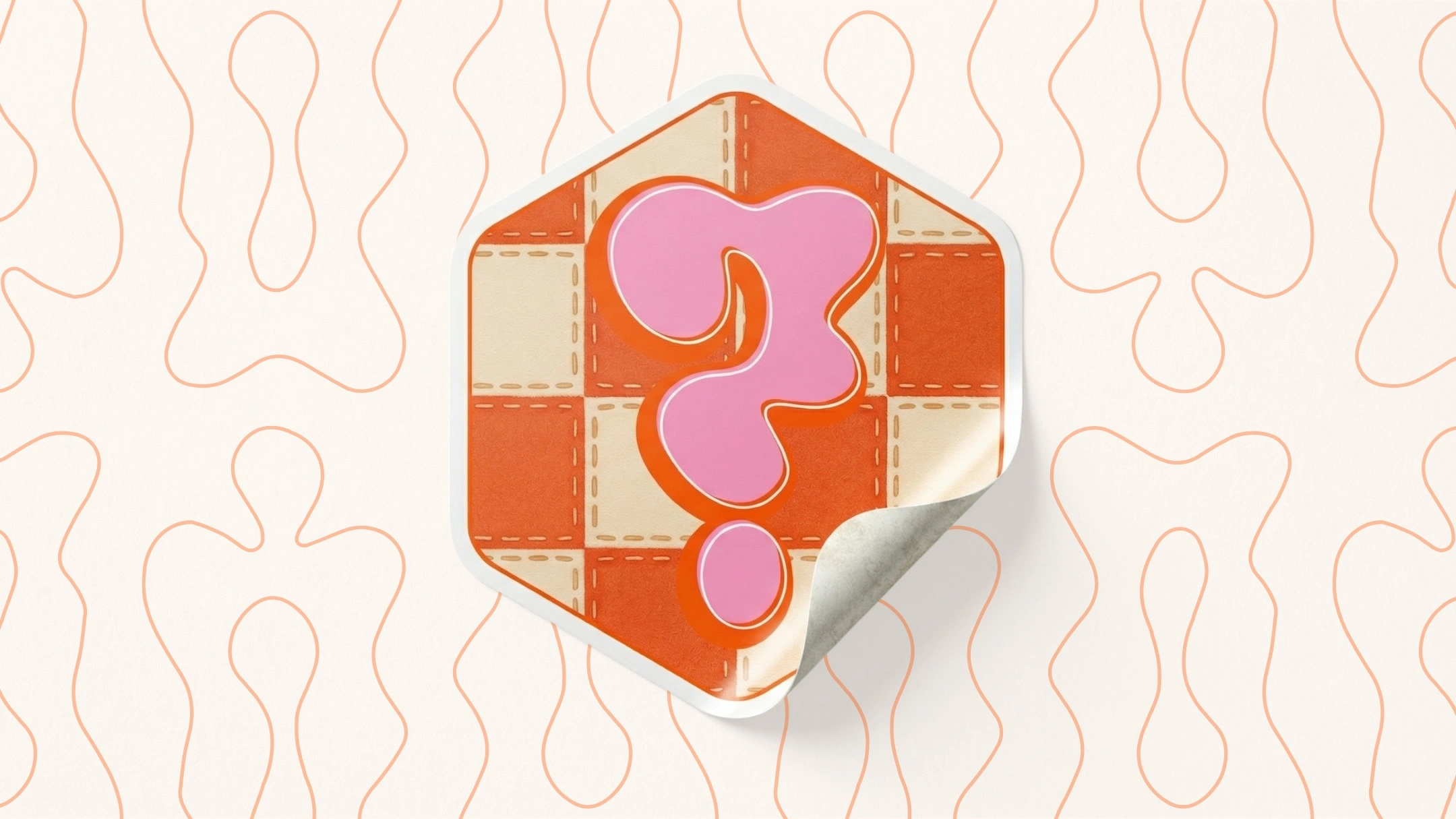
• Brand Packaging
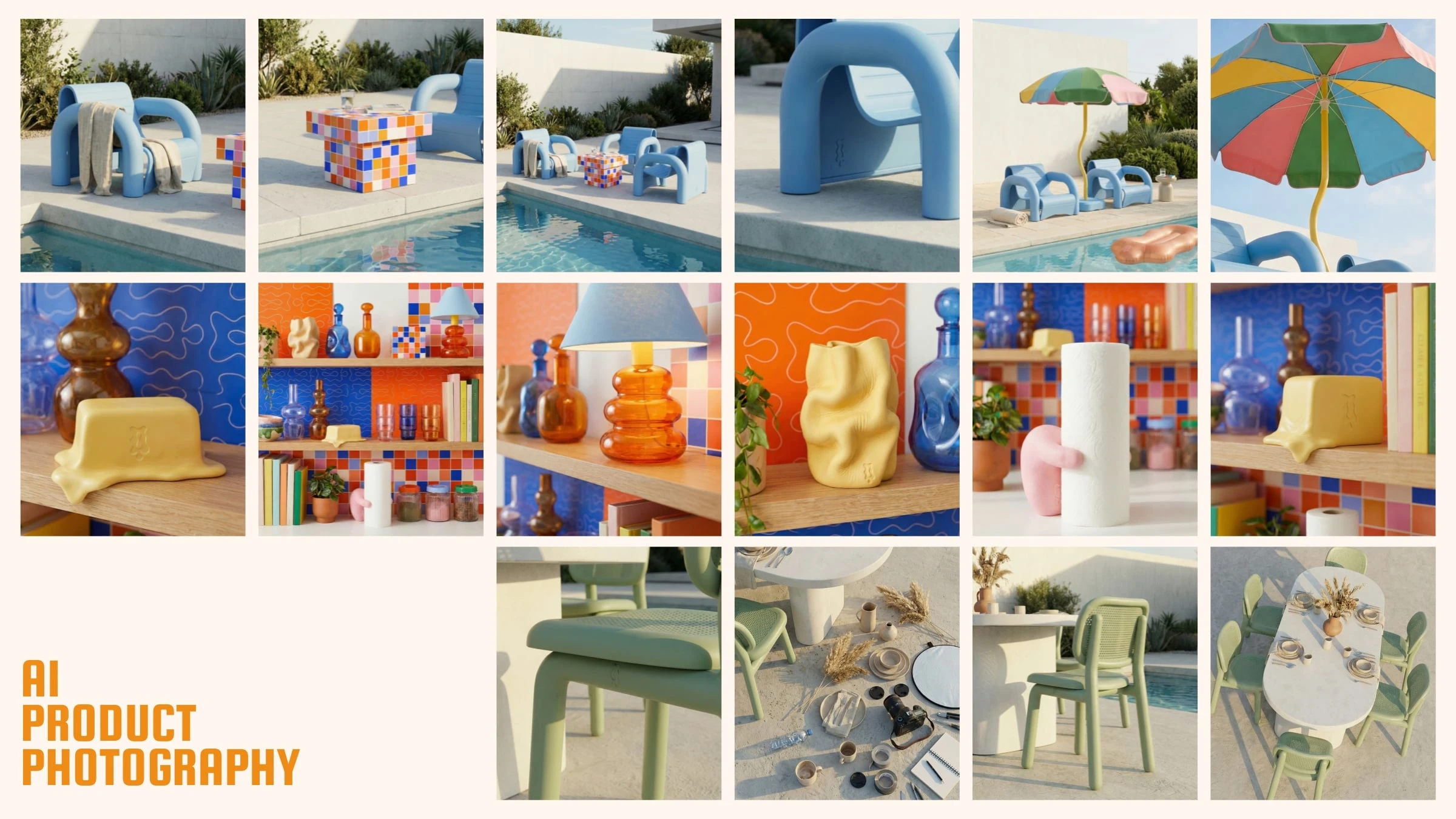
• AI Product Photography
/Project Overview
This project began as a positioning challenge, not a visual one.
The brand is based in Spain, surrounded by colour, craft, humour, and texture, but its audience is primarily English speaking and design literate. The goal wasn’t to localise or translate. It was to create a brand that could live confidently across borders without feeling diluted or generic.
From the outset, the intention was to build something that felt authored. A brand where everyday objects could be treated with the same seriousness as art or furniture, and where playfulness didn’t slip into novelty.
The brief wasn’t “make it look good”. It was “make it make sense”.
/The Approach
I led the project end to end as brand strategist, creative director, and designer, treating strategy, design, product, and imagery as one connected system rather than separate deliverables.
The approach was strategy first, restraint always.
Instead of chasing trends or visual noise, the brand was built around a clear core idea: everyday objects, elevated through confidence, context, and placement. That principle informed every decision, from naming and language to colour, form, and photography.
Because the brand is Spain-based but speaks primarily to an English-speaking audience, we deliberately chose English as the foundation language, layering in select Spanish words as cultural texture rather than translation. This allowed the brand to feel rooted without becoming insular, and international without feeling anonymous.
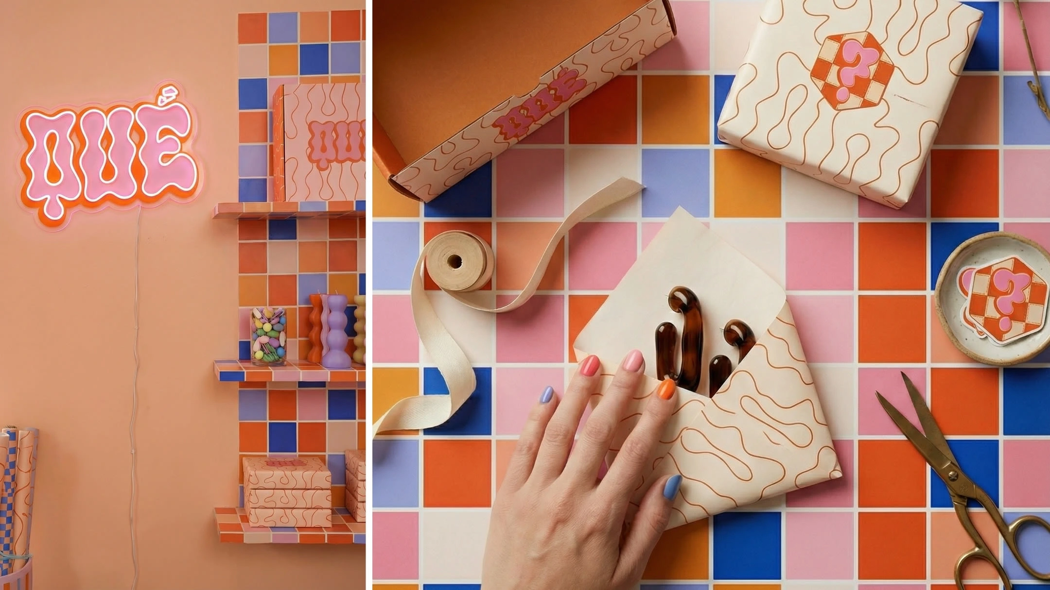
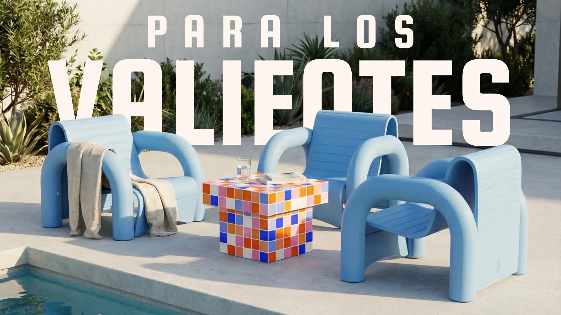
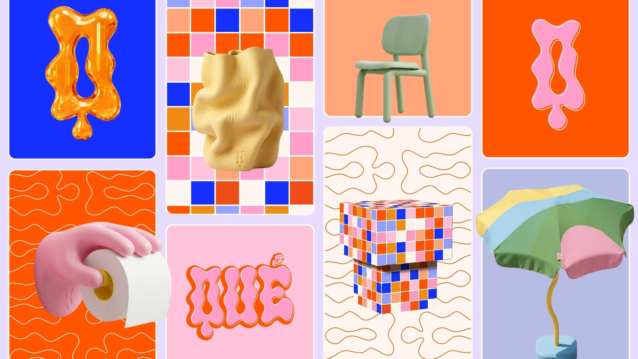
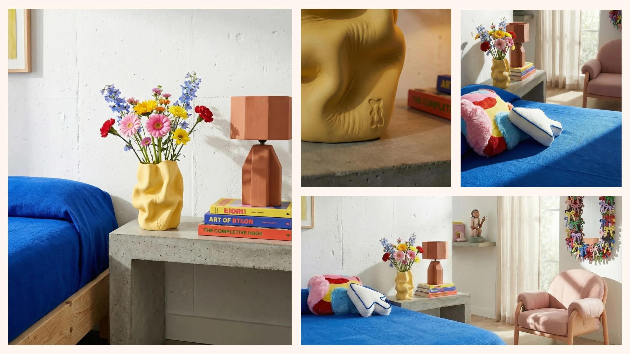
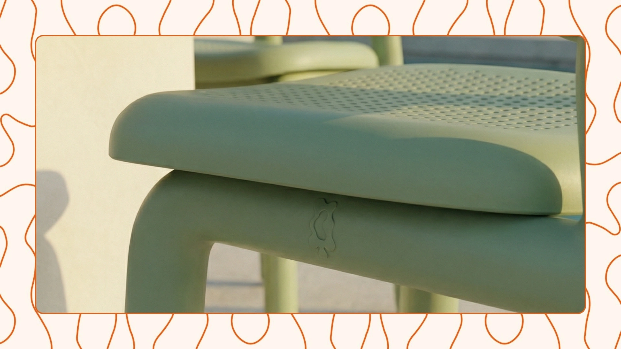
Product concepts were developed as design artefacts, not merchandise. Each object was considered in terms of scale, material, colour, and real-world use, ensuring the ideas felt playful but credible.
For imagery, AI product photography was used as a precision tool, not a shortcut. Every scene was carefully art directed. Environments were reduced, lighting was controlled, and composition was intentional. The goal was never to invent fantasy, but to place products convincingly within a world that felt calm, curated, and confident.
The website was designed to behave more like a gallery than a store. Generous space, minimal copy, and deliberate pacing allowed the work to speak without explanation. From a marketing perspective, this positions the brand as considered and design-led rather than trend-driven or transactional.
/The Outcome
The result is a cohesive brand world where strategy, visuals, products, and placement are aligned.
Playful, but not cheap. Easily International, without losing its sense of place.
From a strategic point of view, the brand now has clarity. From a marketing point of view, it has a system that can scale. And from a creative point of view, it has room to evolve without breaking its own rules.
This project demonstrates how thoughtful brand strategy, paired with disciplined use of AI and strong design direction, can create work that feels both joyful and credible.
Not just something that looks good. Something that holds together.
TL;DR
A Spain-based design brand needed a clear, confident identity to speak to an English-speaking, design-literate audience.
I led the project end to end as brand strategist, shaping the positioning, visual identity, web design, product concepts, and AI product photography as one connected system. English was used as the primary language for reach and clarity, with selective Spanish words layered in as cultural texture.
The result is a playful but credible brand world where everyday objects are treated as design artefacts. Carefully art-directed, strategically grounded, and built to scale without losing its character.
Like this project
Posted Feb 6, 2026
A contemporary lifestyle brand creating a collection of bold but clean goods for those who are eclectic but in a minimalist way.