Resonance Place Personal ReBrand

Jasmine Sotiropoulos


PROJECT OVERVIEW
Resonance Place already had something many event brands struggle to manufacture: real local knowledge, a strong creative eye, and a founder who understood both the room and everything happening behind it.
The opportunity wasn’t to make it feel like another event planning business. It was to give Brittany’s way of working a clearer position and build a brand with enough presence to match it.
The business sits in a valuable middle space. Corporate teams need events to be polished, well managed, on budget and professionally delivered. But they also want them to feel original, culturally connected and worth remembering. Resonance Place brings those two sides together, pairing event production with creative direction, supplier relationships and access to Melbourne’s artists, makers, venues and collaborators.
That became the anchor for the brand. Not just logistics. Not just styling. Resonance Place is the creative connector between corporate events and culture, with Brittany as the trusted person who can see the bigger idea and still manage the details required to bring it to life.
For this project, we worked across brand strategy, visual identity, a static Instagram feed, and the website direction, creating a brand that could feel cohesive everywhere it showed up.
THE APPROACH
The real challenge was making the brand feel creatively distinctive without losing corporate confidence. It couldn’t look like a conventional events company, but it also couldn’t feel so conceptual that the practical value disappeared. It needed to hold polish and personality at the same time.
I built the strategy around that tension. The positioning, messaging and offer structure were refined to make event production and creative liaison the clear core of the business, while giving Brittany room to lead through her taste, experience and point of view.
The brand architecture was intentionally founder led, but not founder dependent. Brittany remains the face, trusted voice and creative vision behind the work, while Resonance Place still feels like a business with its own authority, structure and room to grow.
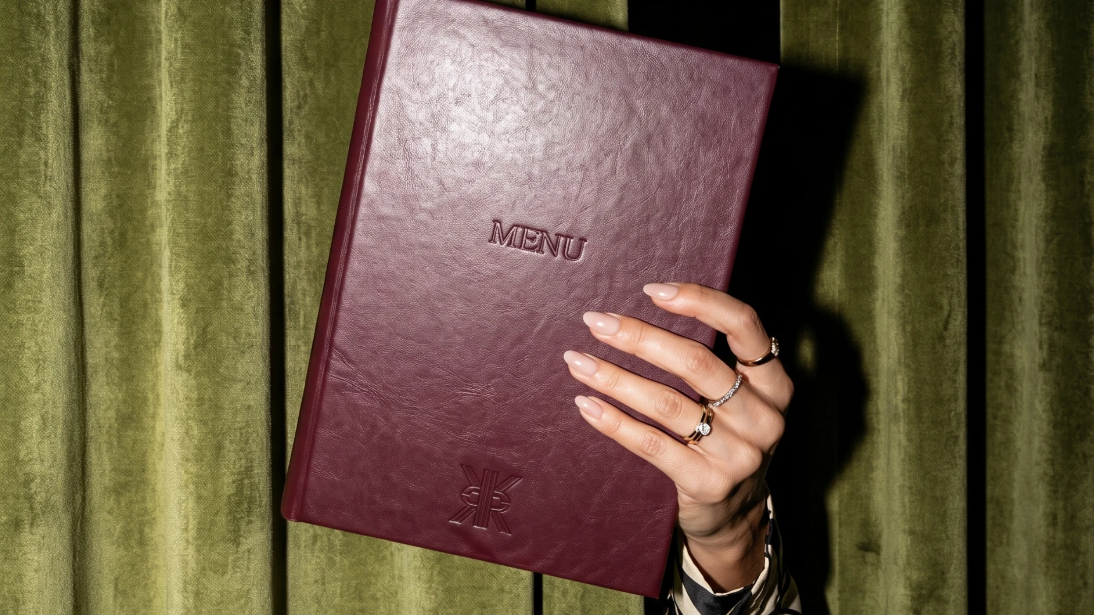
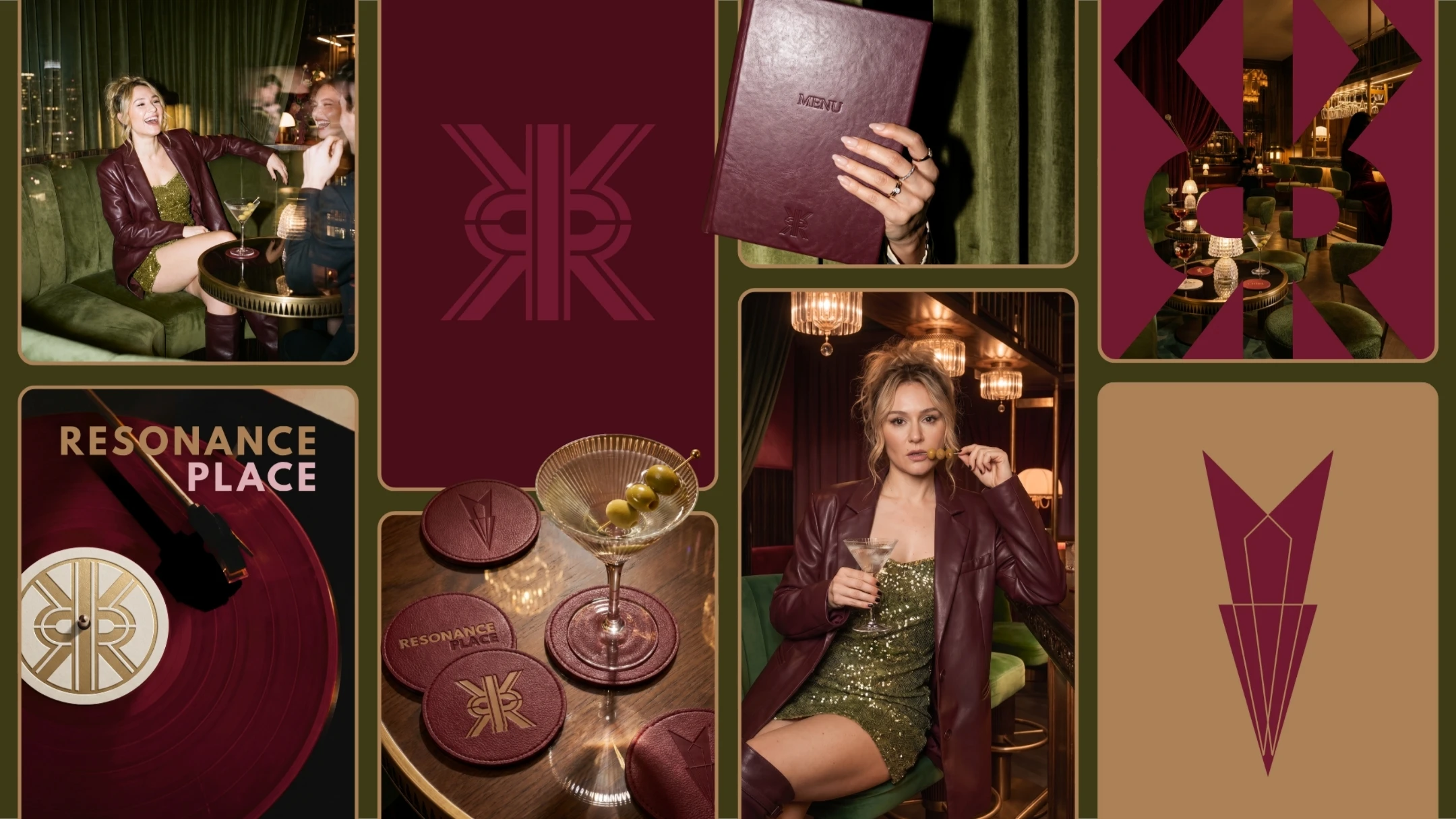
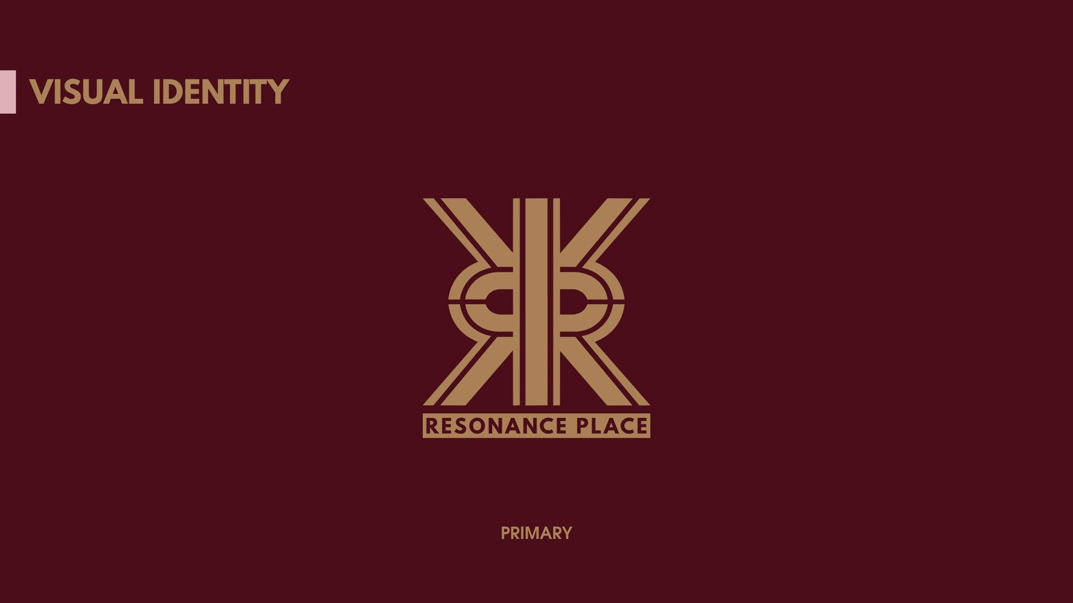
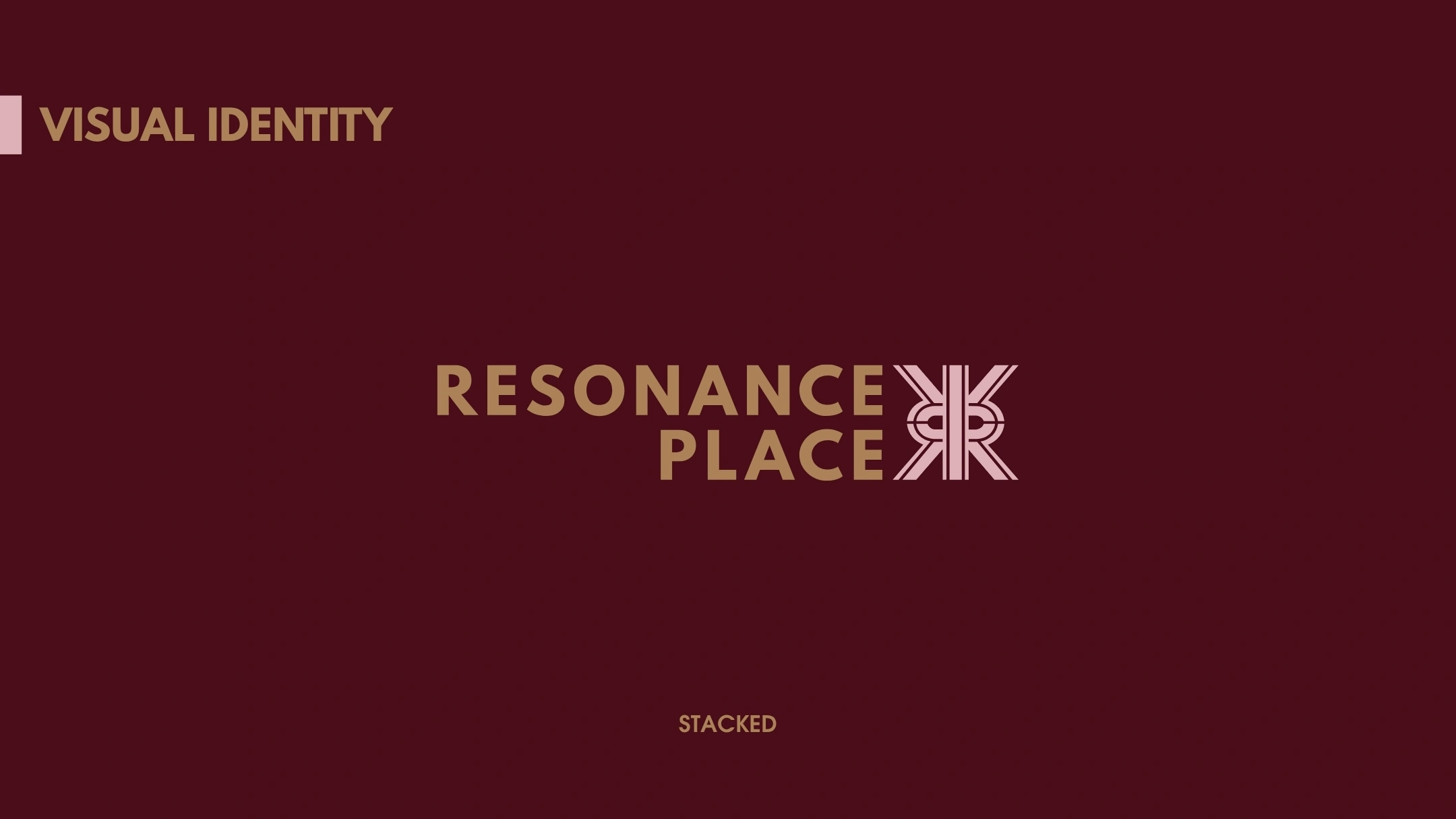
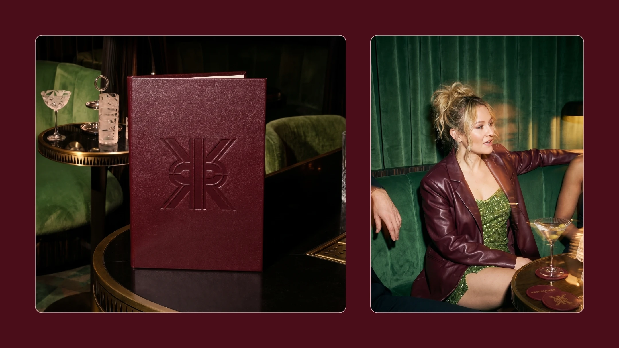
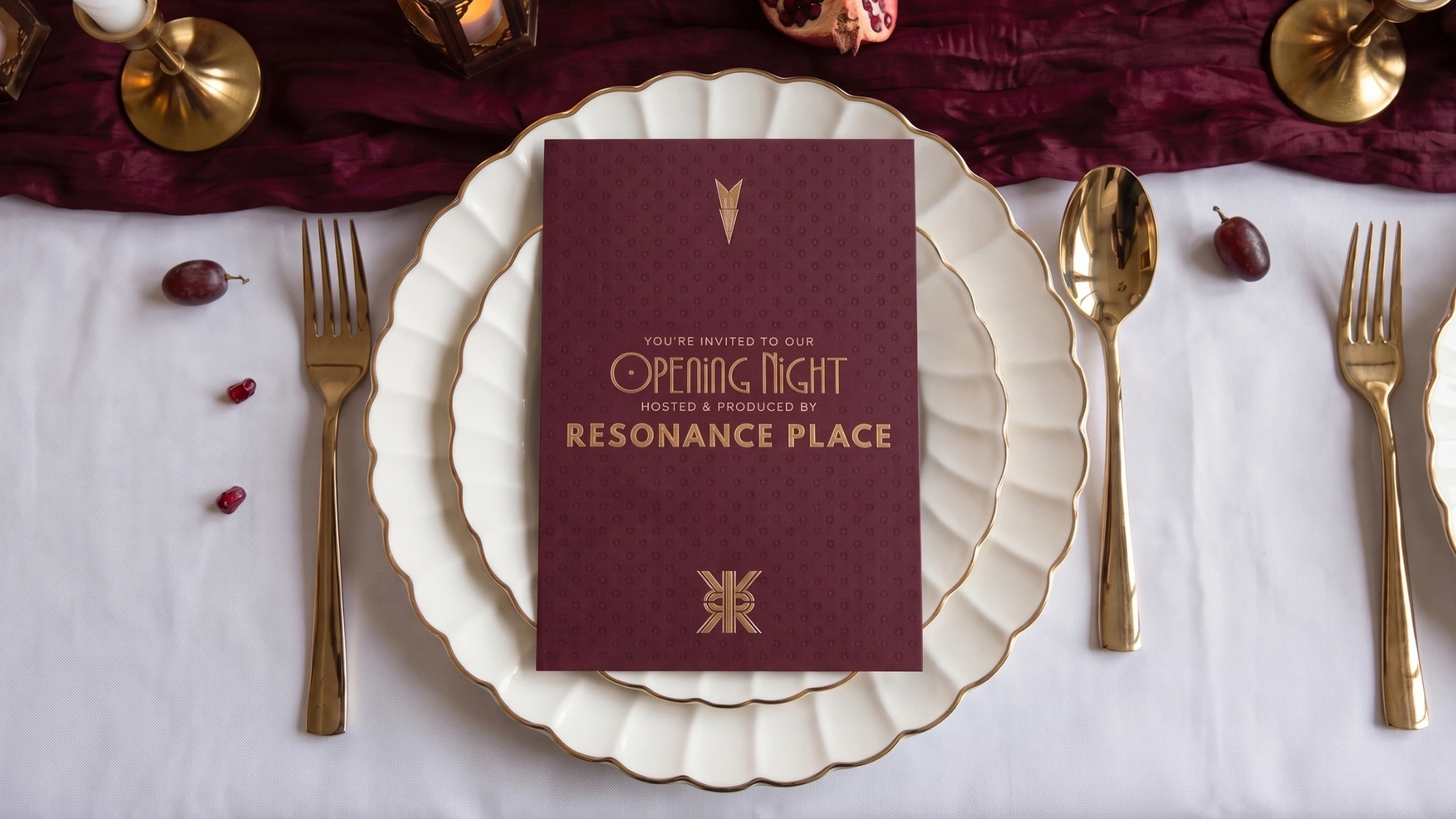
Visually, I developed the existing Art Deco influence into something bolder, cleaner and more editorial. The mirrored RP mark creates a sense of structure and movement, while the deep merlot, olive, blush, cream and caramel palette gives the brand richness without making it feel overly formal. Patterns, geometric motifs, tactile textures and image framing helped build a wider identity system that could move confidently across content, print, event touchpoints and digital spaces.
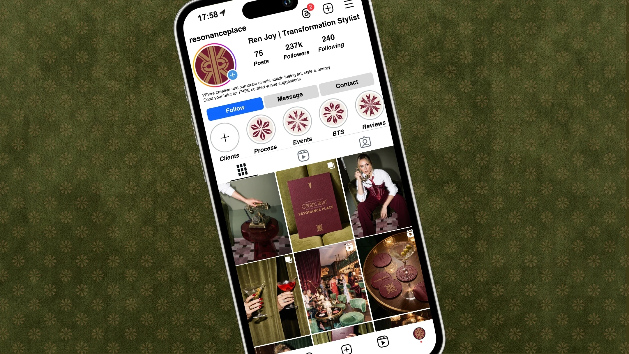
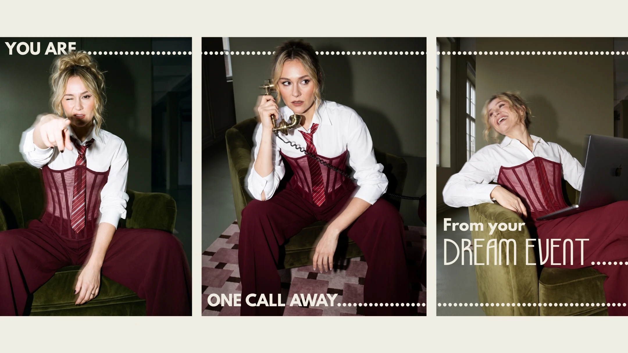
That same thinking also carried through into the static Instagram feed, which was designed to help the brand show up consistently online. Rather than creating content that felt generic or overly polished, the feed was built to reflect the same mix of creative confidence, industry credibility and founder presence that sits at the heart of the business. It gave Resonance Place a stronger social foundation, with visuals and messaging that felt aligned with the strategy rather than disconnected from it.
THE OUTCOME
The finished identity gives Resonance Place a much clearer place in the market. It feels premium without becoming stiff, creative without becoming chaotic, and founder led without relying entirely on Brittany’s personality to do the work.
There’s now a stronger connection between what the business offers and how it’s perceived. The brand communicates that Resonance Place can manage the pressure, suppliers, timelines and production details, while still bringing the creative thinking that makes an event feel distinctive.
It doesn’t just promise a well-run event. It gives clients access to better ideas, stronger local connections and a more considered experience from the beginning.
Alongside the identity, the static Instagram feed helped extend that presence into a more everyday brand touchpoint. It created a social direction that feels thoughtful and recognisable, while giving Brittany a clearer framework for how Resonance Place shows up online.
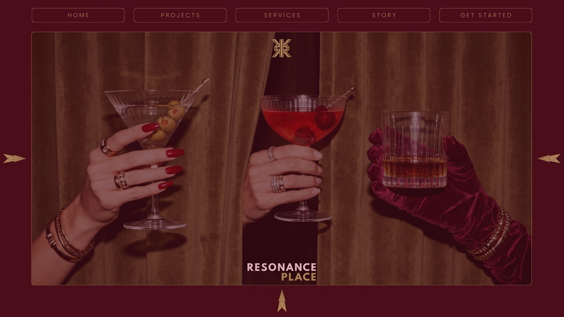
The website is now being developed to carry that same balance into the digital experience, making the offer easier to understand, the work easier to explore and the next step easier to take.
For me, this project is a strong example of what happens when a service business stops presenting itself as a list of tasks and starts owning the real value behind the work. Resonance Place doesn’t simply help events run smoothly. It connects the right people, ideas and details to create something people genuinely remember.
Like this project
Posted Aug 5, 2026
Developed brand strategy and identity for Resonance Place, enhancing market presence and social alignment.
Likes
0
Views
13