The network for creativity
Join 1.25M professional creatives like you
Connect with clients, get discovered, and run your business 100% commission-free
Creatives on Contra have earned over $150M and we are just getting started
Back to feedPost


New case study is up on my profile! A fun passion project I worked on earlier this year🚲


Common Ground is such a fitting name for an inclusive sports community. The wordmark over that cafe scene feels warm and welcoming, exactly the tone a passion project like this should have.


the wordmark over the cafe scene feels so warm. good passion project pick

wow, i really like this aesthetic... and you made it soo clean!!
thank you Ziva!😄

The sneaker crop with the wordmark sitting right over it works well. Feels active without trying too hard.

Active third spaces like these thrive when the beginner feels connected to the veteran, and I think you seriously captured that well with Common Ground's message. Excellent stuff Serena!

The wide italic wordmark already feels like it's moving, which suits a sports community, and it holds up over very different footage. Did you build the type around the imagery, or pick the footage once the mark was locked?

super cool project! the typographic work is impeccable and super interesting
thank you Anita!!


Amazing visuals 👌🏼
thanks😄

wow crazy the whole lockup looks and sit very well

Love this.


cool

The common ground wordmark sitting right on that close up portrait works so well. Feels warm and human, fits an inclusive community perfectly

Looking good!

The italic common with the upright ground, set white over a tight crop of a face and then an athlete in motion, is a flexible lockup that survives very different photos. Contrarian note: a wordmark that works this well on photography has not yet proven itself without it. For a...

This is impressive! 🤝

Great project


Goating this because your designs are always goated 🤭
The network for creativity
Join 1.25M professional creatives like you
Connect with clients, get discovered, and run your business 100% commission-free
Creatives on Contra have earned over $150M and we are just getting started





Related posts


New case study - tash.cards, a Y Combinator backed platform for investing in graded sports cards. Identity design, commissioned by baked.design
The heart of the system is a pattern language taken from security printing. Every letter of the wordmark becomes a guilloché tile, like the engraving on banknotes and certificates, and tiles combine into endless patterns.

Nice!

How do you make a construction brand feel consistent from a business card to a building site?
Brixon’s identity brings angular lettering, an assembled geometric symbol, and a lime, black, and white palette together.
I carried those elements into stationery, brand guidelines, team identification, social graphics, and site signage, then brought the system into motion with Adobe After Effects.
The connecting decision: keep the geometry and layout structure consistent while the logo details, messages, and application previews change within the animated panels.
My contribution covered brand design, graphic design, and motion design.
What draws your attention first: the wordmark, the lime palette, or the rotating symbol?
See the full Brixon case study. If you’re shaping a construction or development brand, I’m available for brand identity and motion projects.

Incomparable work!

New project! Me and @Mary Delaney helped out the folks at Balloon with a rebranding a redesign of their mascot! Check out the new appstore listing and stay tuned for much more!

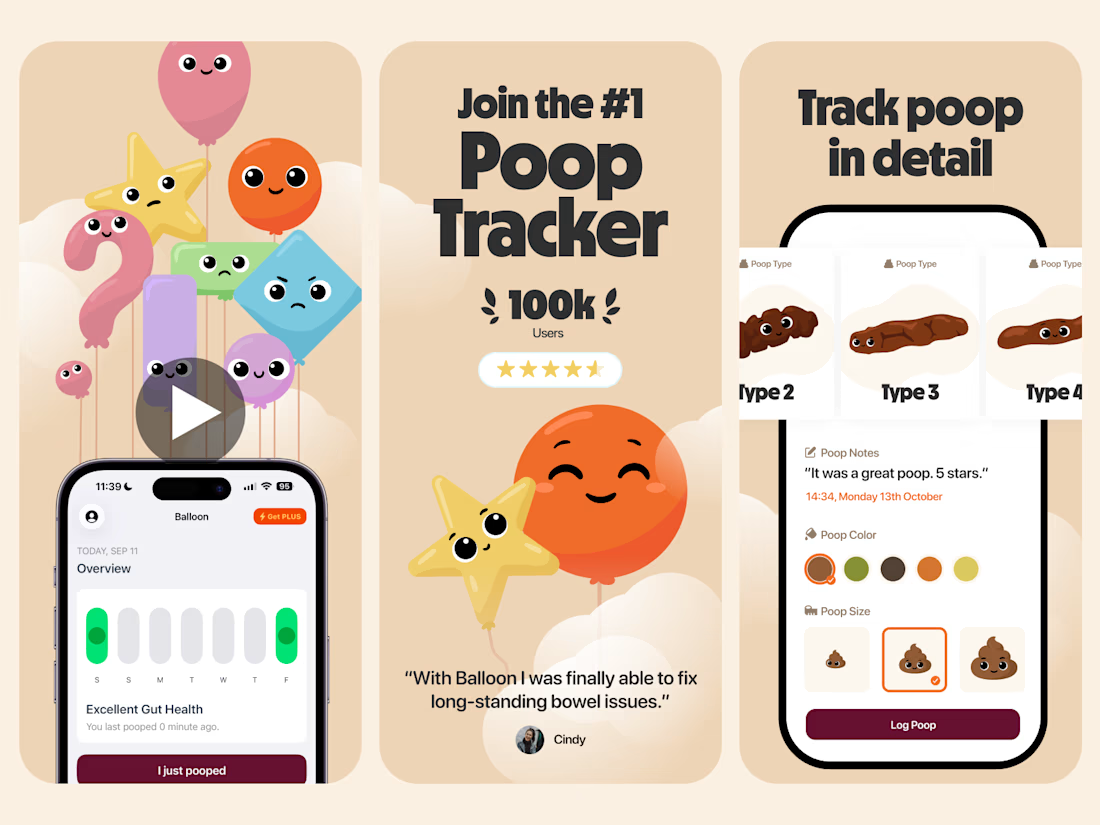

Everything has character! Good job. I like the little faces on the terds 🤣