Brixon — Construction Brand Identity & Motion Design

View completed workwww.behance.net
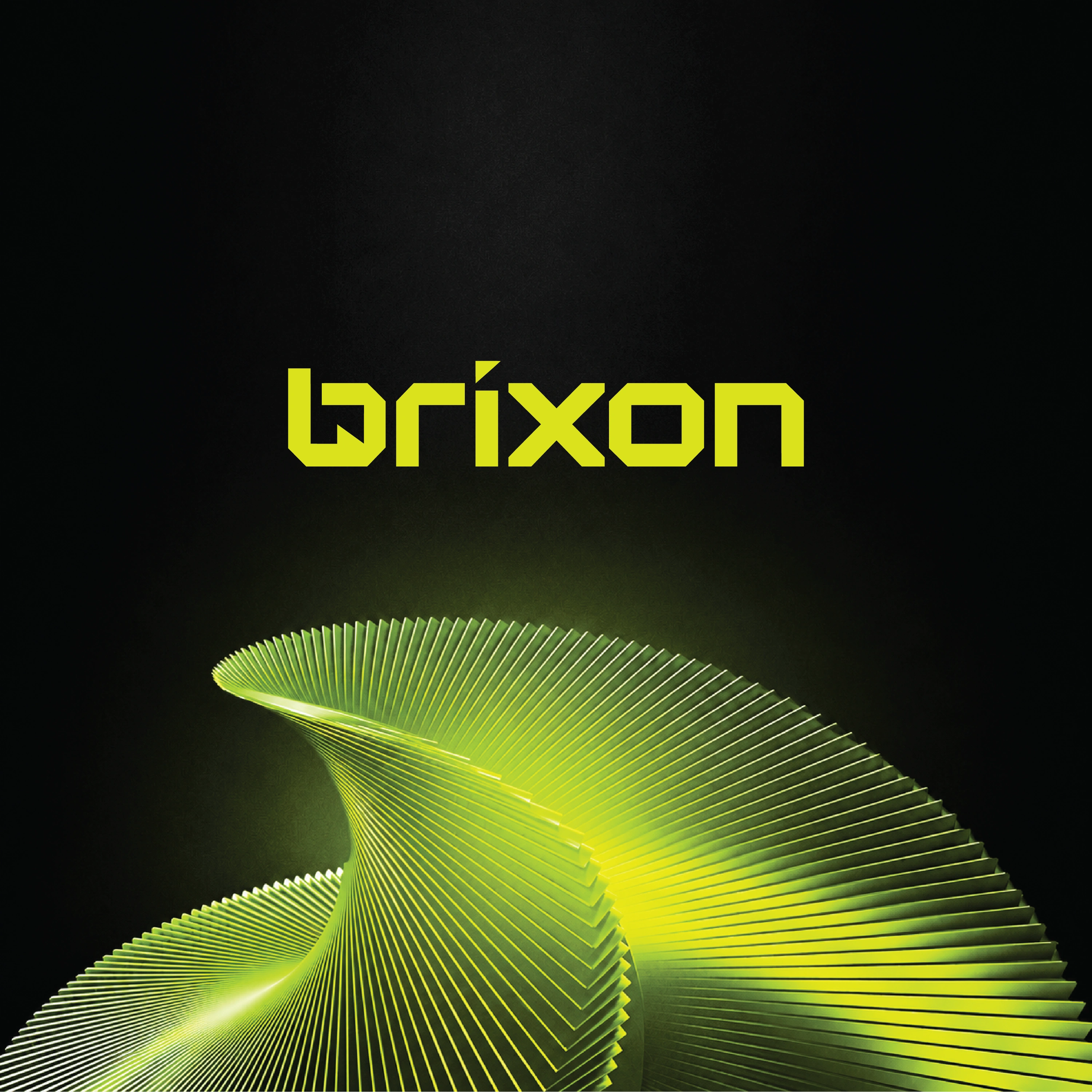
Lime Brixon wordmark and layered green form introduce the construction identity.
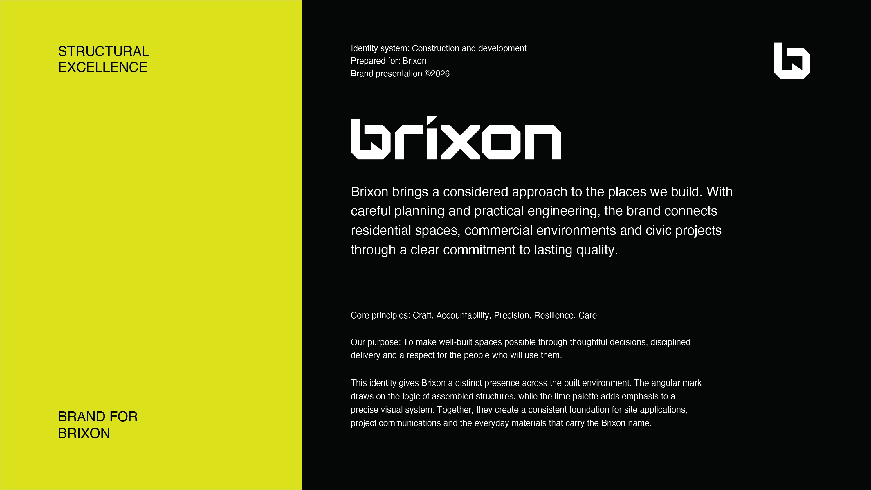
Brand positioning connects careful planning, practical engineering, and lasting quality.
Animated logo presentation explores the angular wordmark and compact symbol.
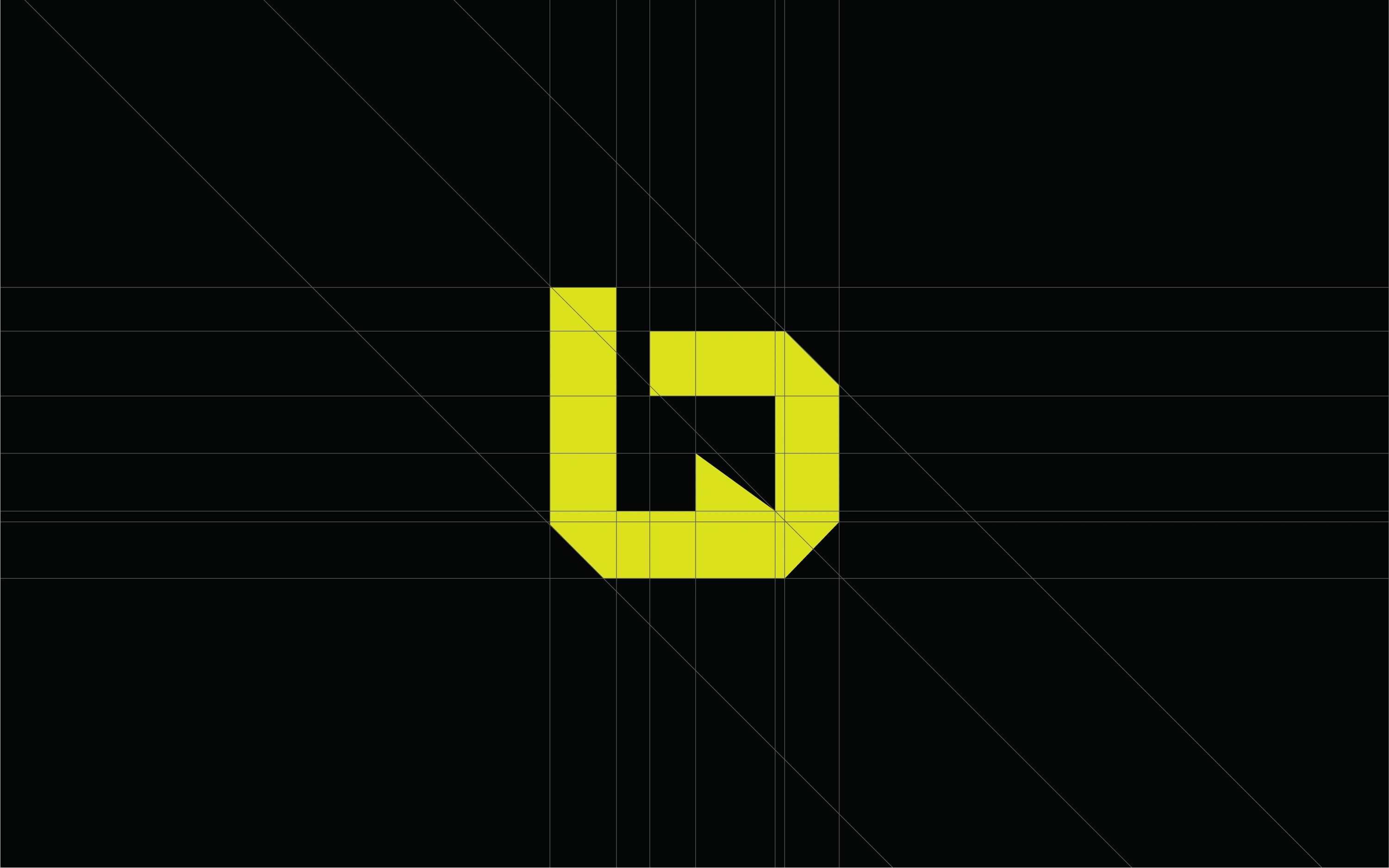
The construction grid defines the geometric symbol’s proportions.
Animated symbol variations carry the identity across lime, black, and white.
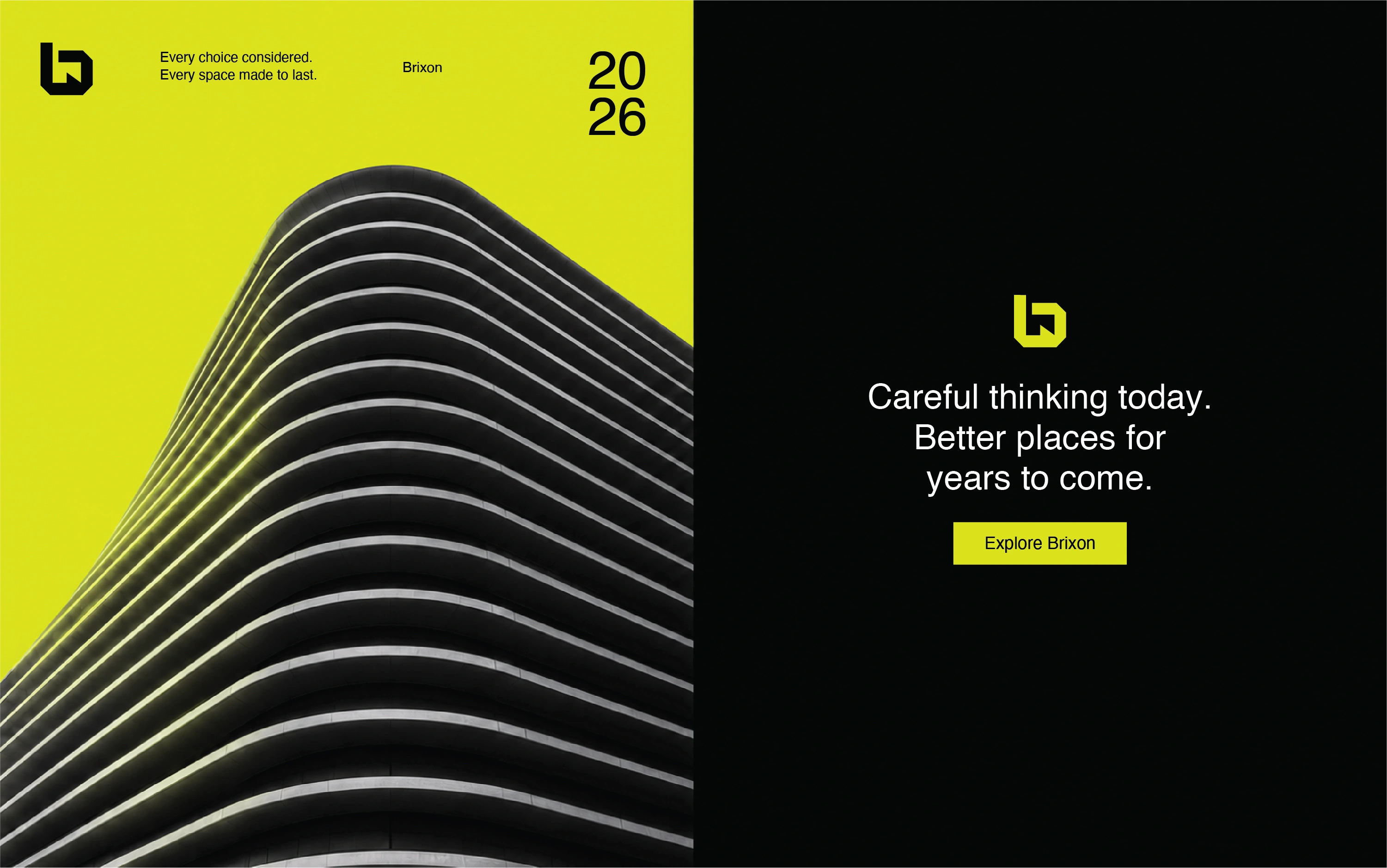
Architecture and clear hierarchy connect the visual language to the built environment.
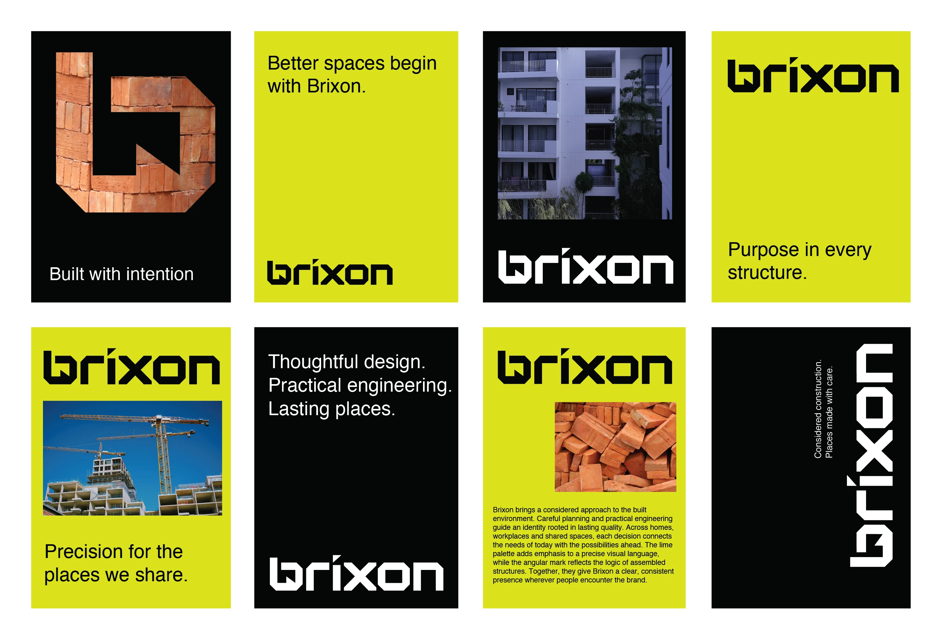
Poster layouts pair construction imagery with a consistent graphic system.
Kinetic typography brings the brand’s construction messages into motion.
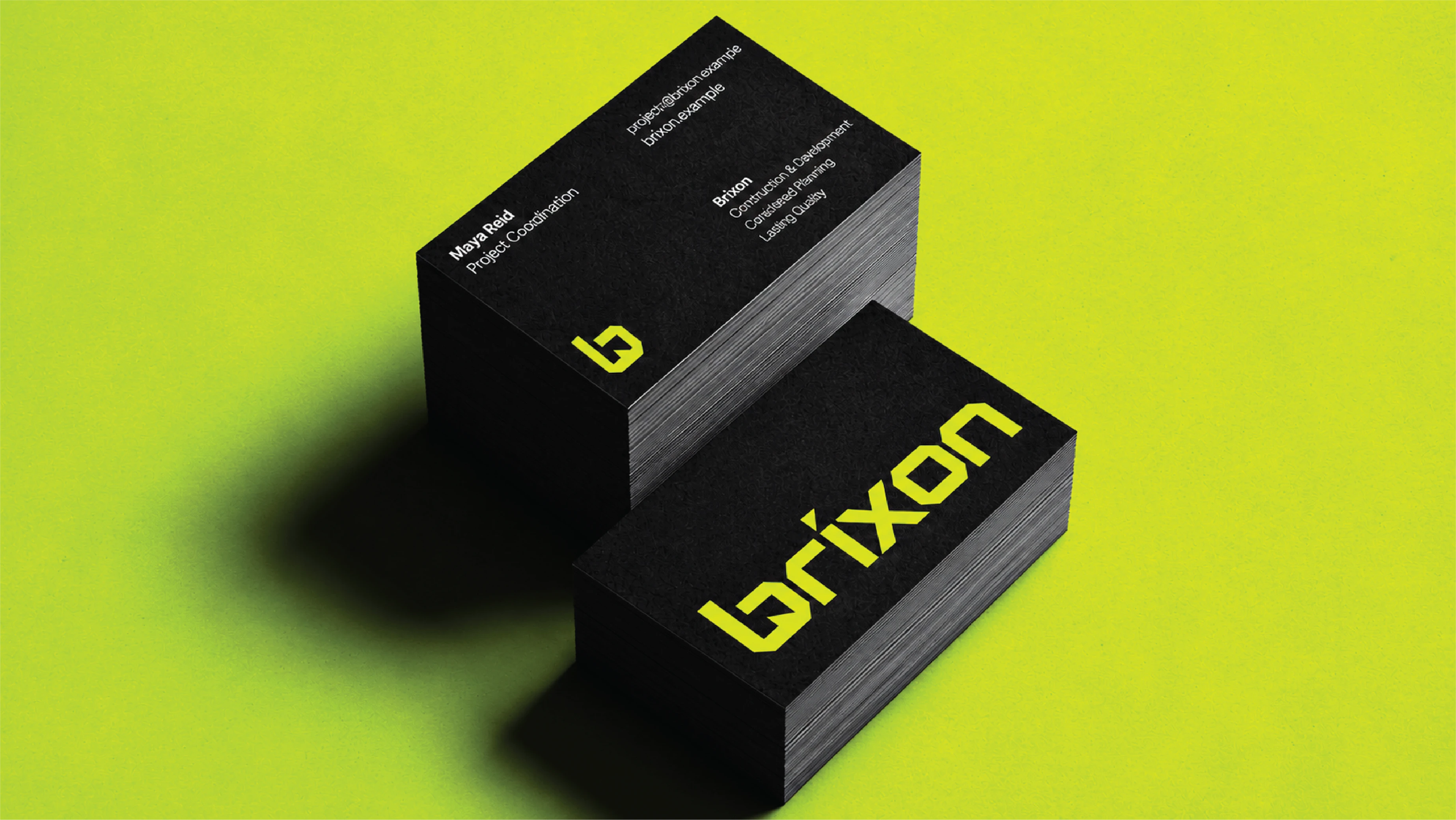
Business cards apply the lime-and-black identity at a compact scale.
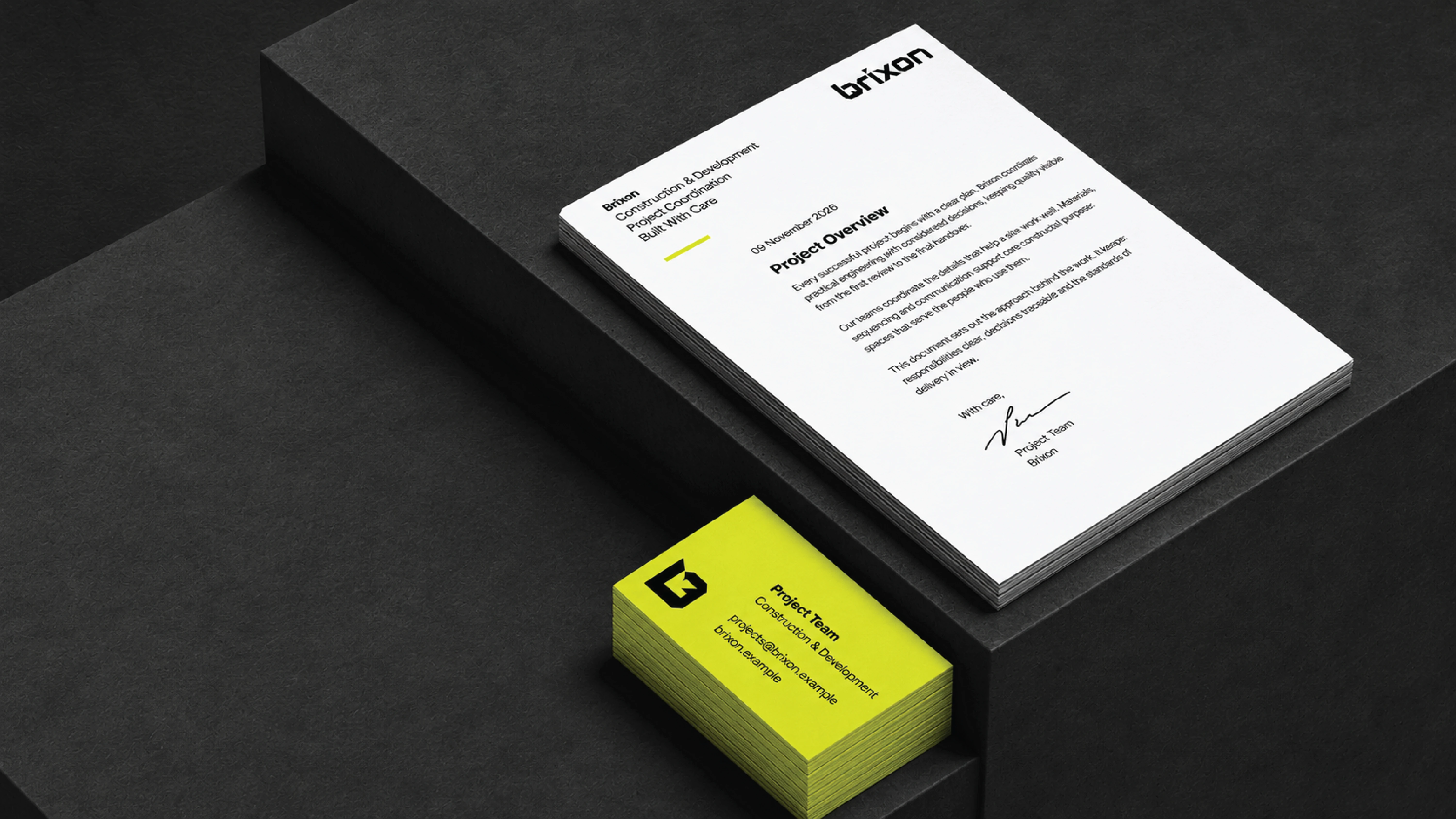
Letterhead and stationery extend the identity into formal communication.
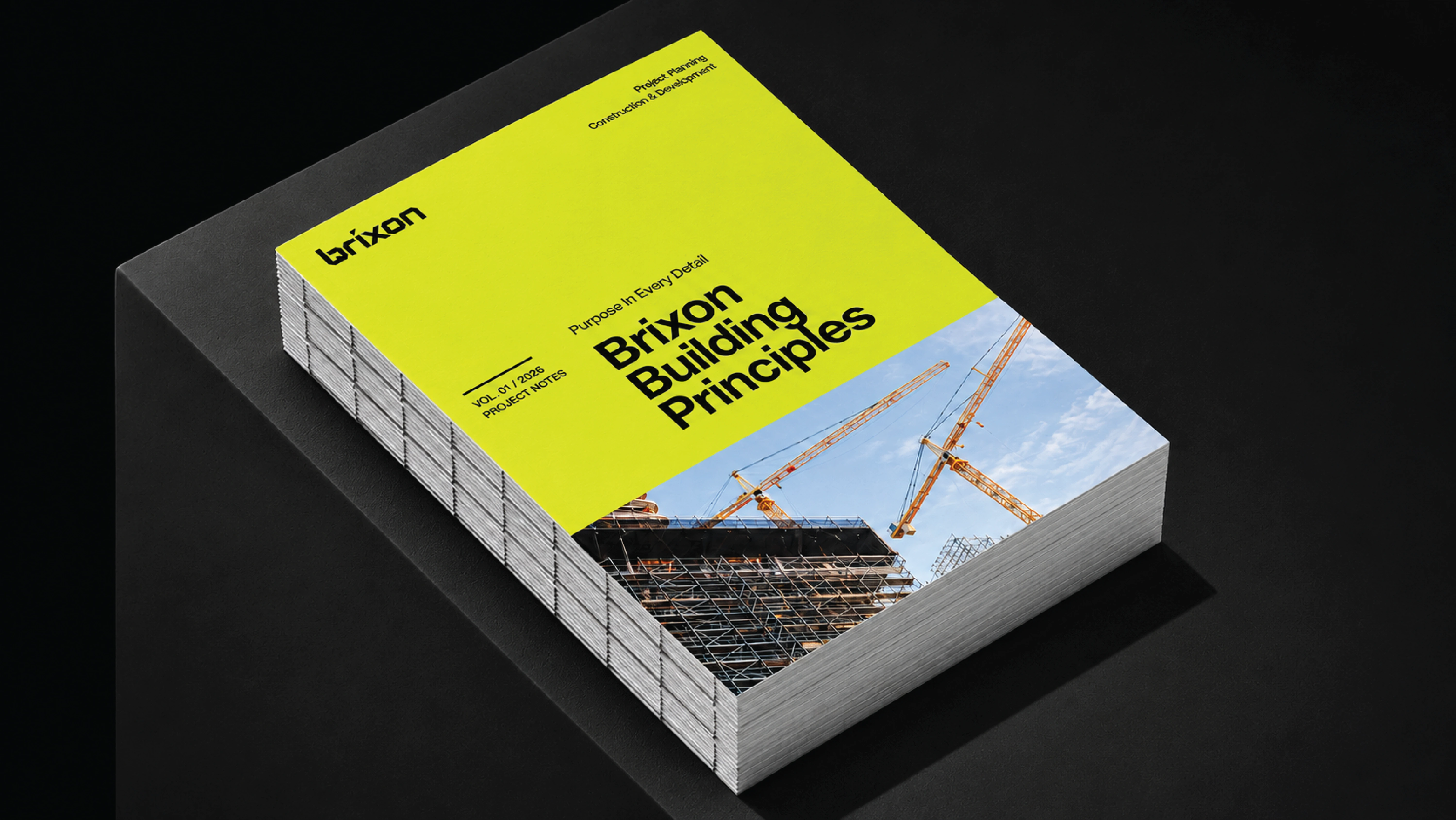
The Brixon Building Principles publication translates the system into editorial design.
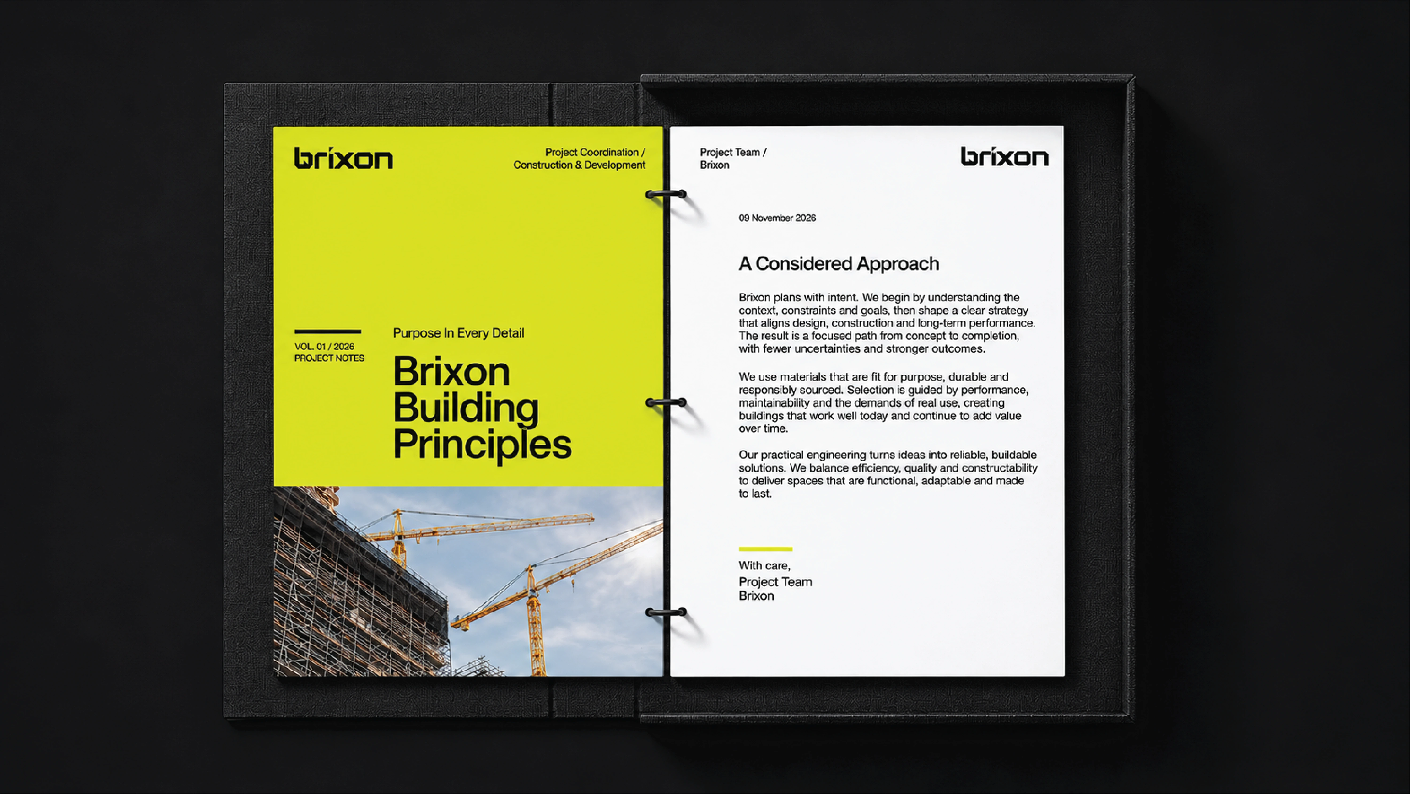
An open publication shows the relationship between cover and interior hierarchy.
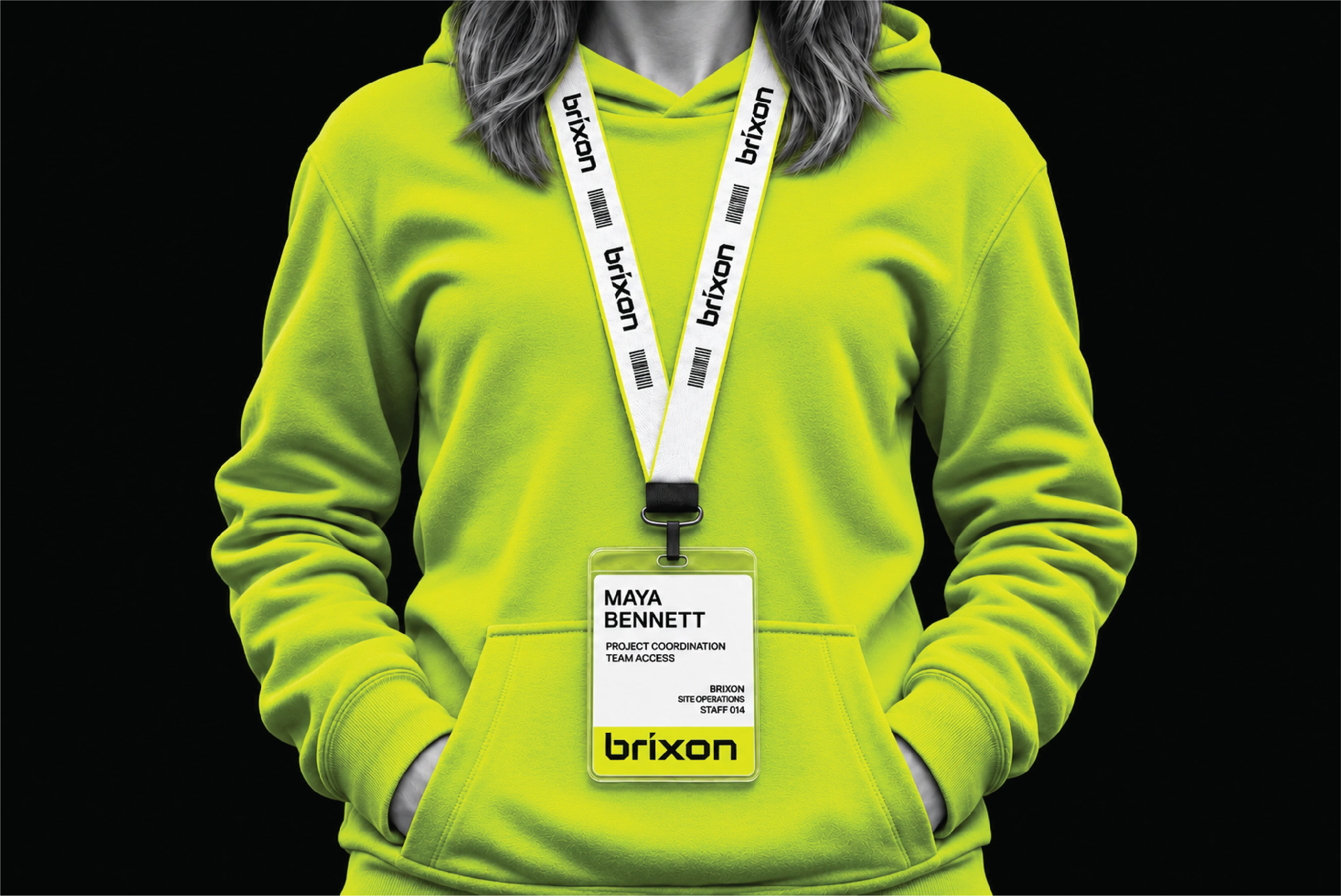
Branded clothing and identification bring the system into team applications.
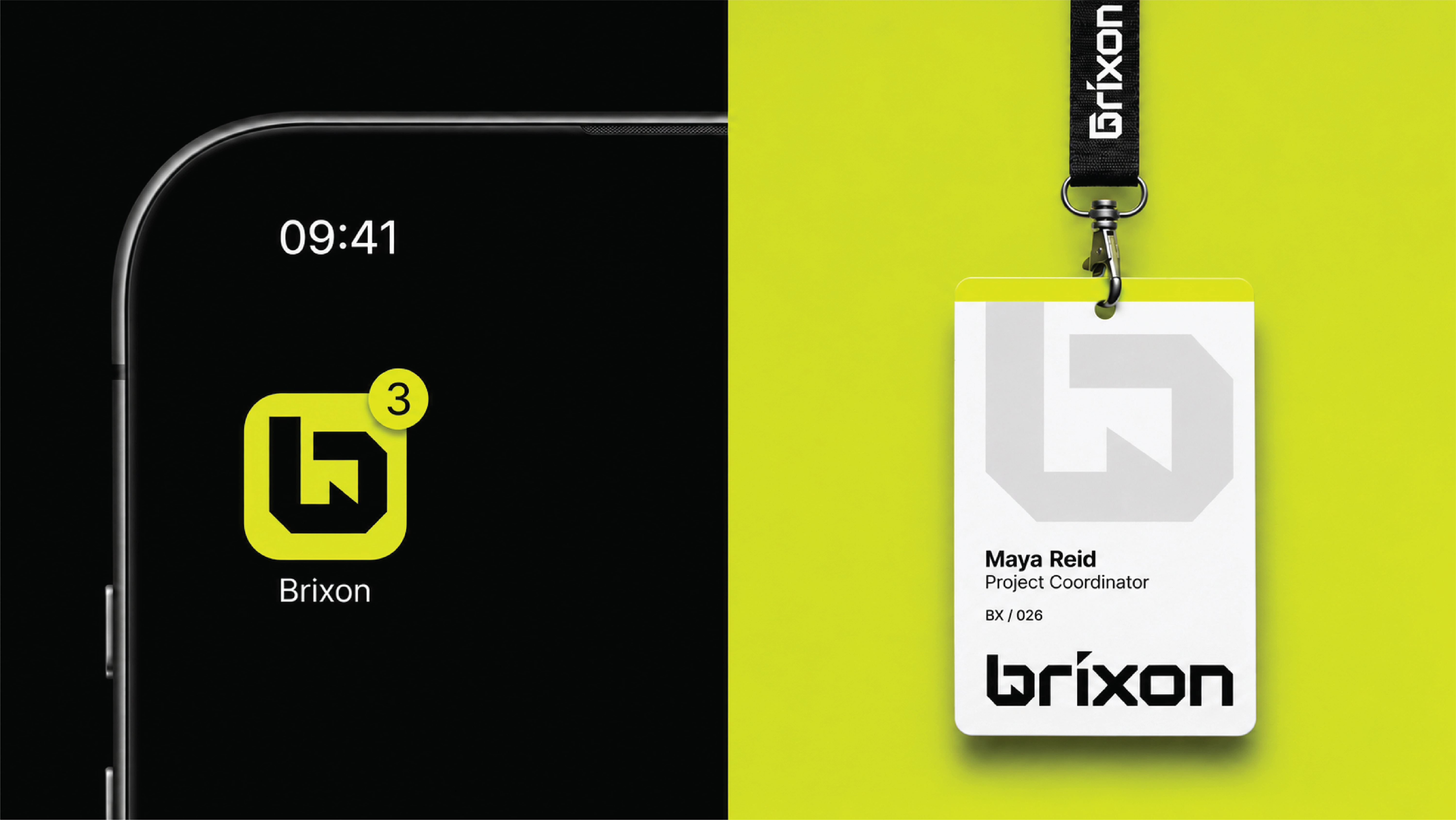
A compact app symbol and identification badge demonstrate smaller formats.
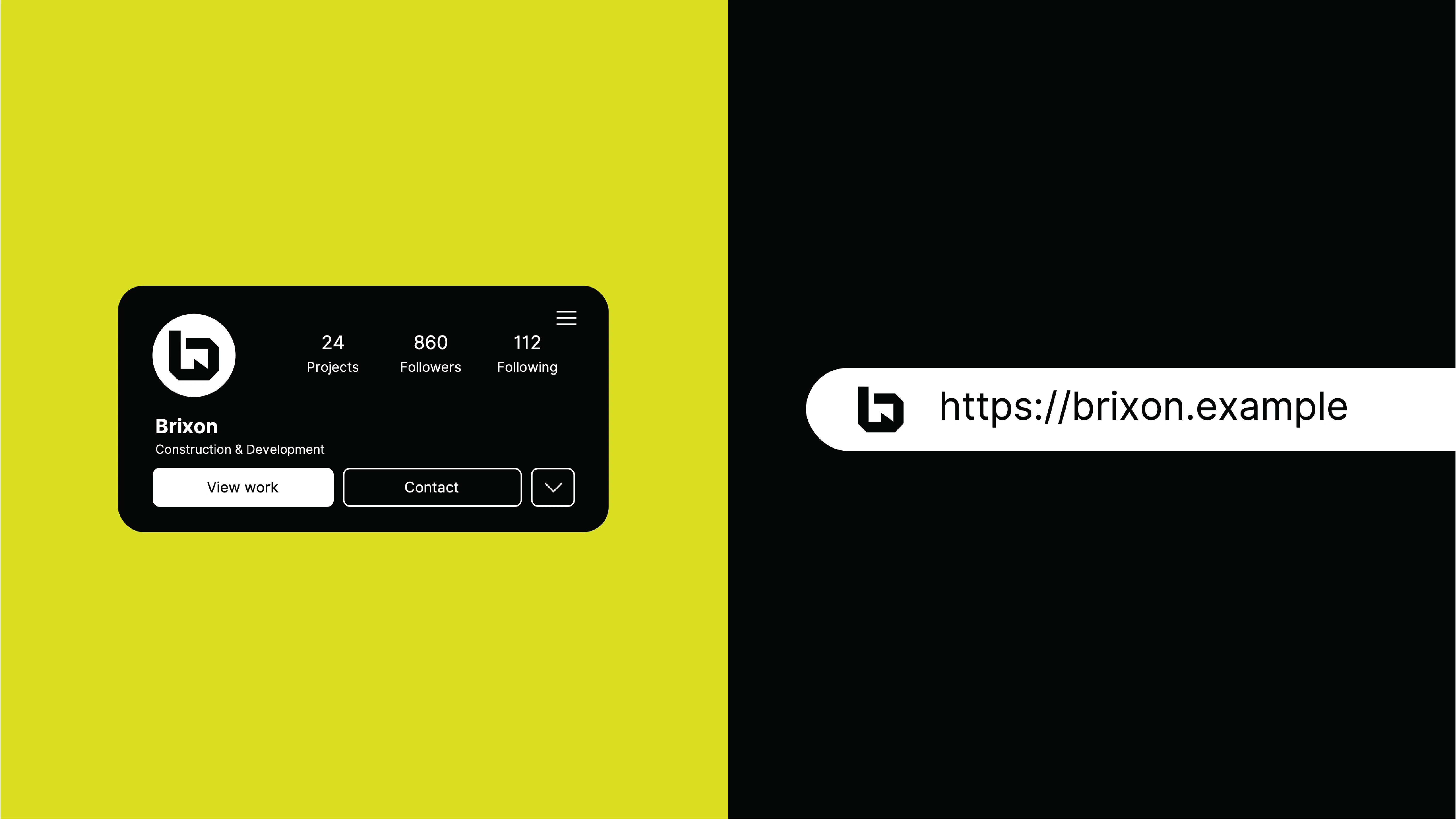
Digital profile and website-address mockups extend the identity online.
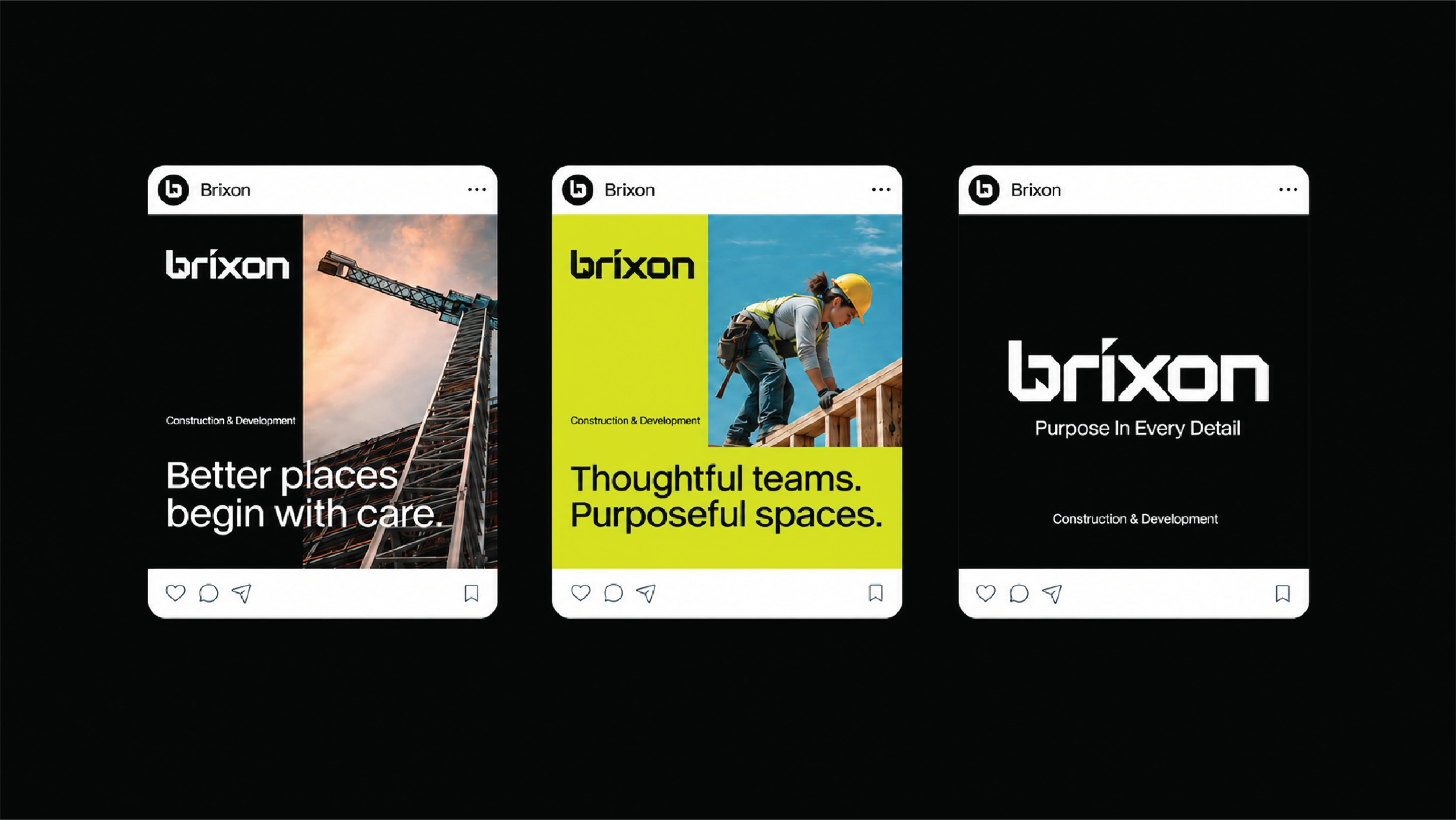
Social media layouts pair construction photography with the logo and lime palette.
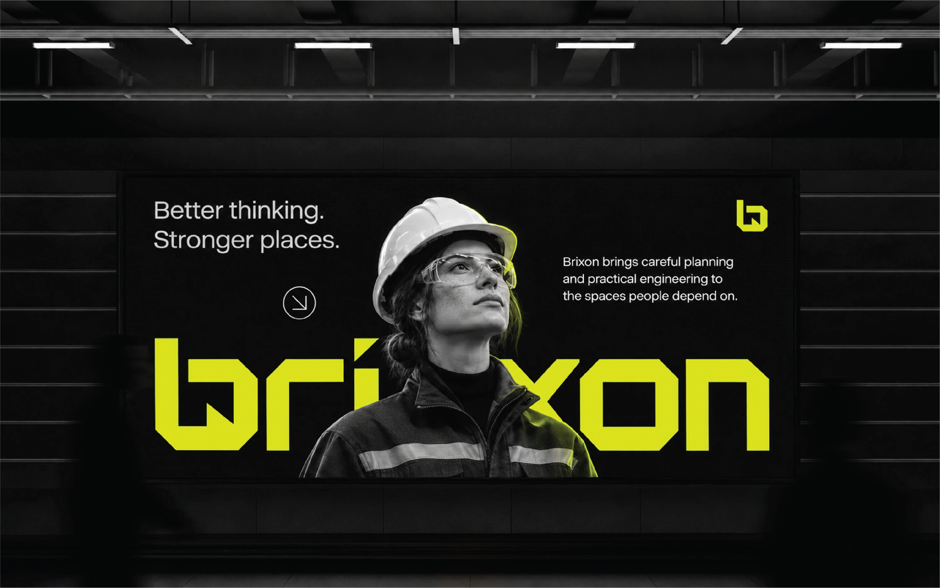
A billboard places the brand alongside construction imagery and a clear headline.
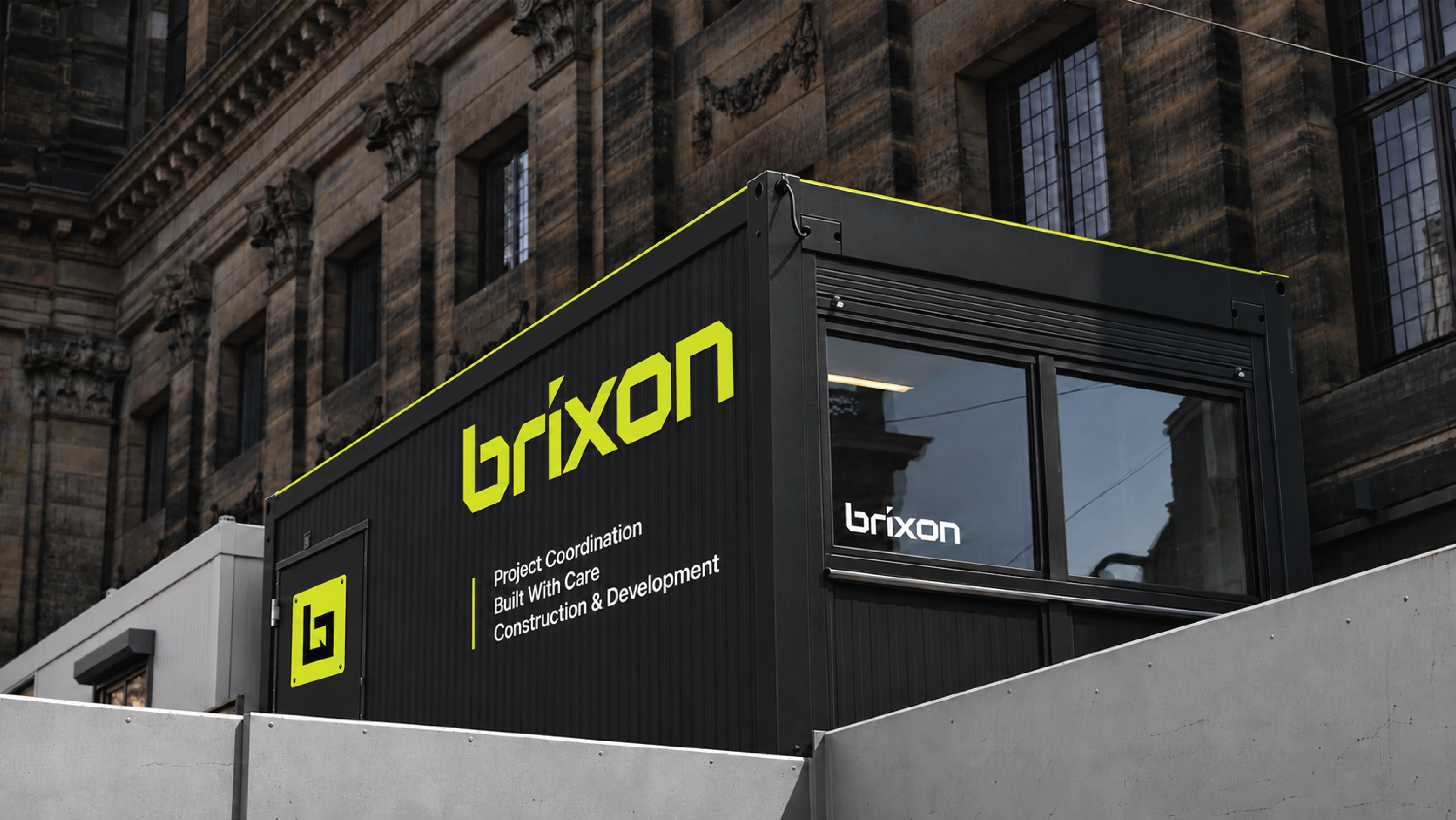
Site-office signage applies the identity within a construction environment.
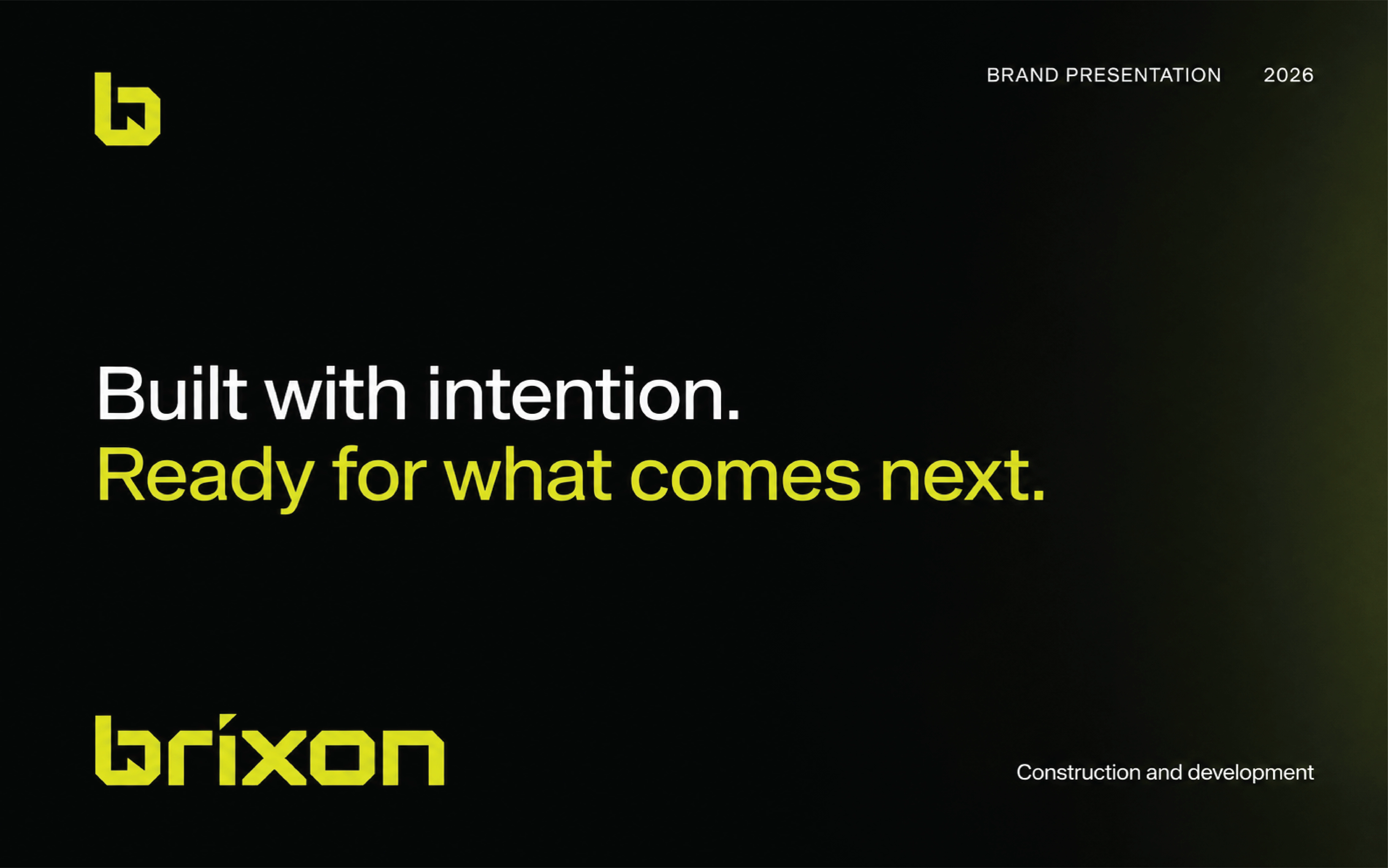
The closing brand statement returns to “Built with intention.”
Brixon: Built with intention
Brixon is a construction and development identity shaped around careful planning, practical engineering, and lasting quality. My work combines brand design, graphic design, and motion design, giving that positioning a consistent presence across residential, commercial, and civic project communications.
A mark with structural logic
The wordmark uses broad strokes, clipped corners, and sharply defined negative spaces to create an assembled, architectural character. A compact symbol carries the same geometry into smaller applications. The construction grid makes the mark’s proportions visible and connects its graphic precision with the project’s construction context.
One system across print, digital, and place
Vivid lime works with black, white, and greys to establish a recognisable visual signature. Helvetica Regular supports practical information and clear hierarchy alongside the custom lettering. Rectangular layouts, architectural imagery, and repeated logo placements connect business cards, letterhead, brand documentation, clothing, identification, social posts, and site signage.
The identity in motion
I used Adobe After Effects to bring the system together in the opening animated GIF. Its fixed panel layout holds the composition together while the logo, symbol, typography, and application previews change within it. Rotating dimensional forms and moving type add contrast to the identity’s otherwise ordered structure. At 0:03, the overview pairs the logo with a dimensional symbol; around 0:09, it brings symbol variations and application previews together. The final moments return to the shared visual language, supporting a repeatable loop. Additional motion examples extend the same system to logo presentation and brand messaging.
A consistent construction identity
The project demonstrates a connected visual system across the applications shown. The applications are shown as presentation mockups, with the outcome assessed through consistency and legibility across formats. The outcome is a distinctive construction identity built from a small, repeatable set of design decisions.
Planning a construction or development brand? Explore my complete brand identity service.
3 likes · 5 views · Nov 9, 2026
Construction brand identity with an angular logo, lime-and-black palette, brand guidelines, and animated applications for print, digital, and site signage.