Brix Construction: Brand Identity, Website Design and Brand Film

Ashar Qasmani


Project overview
Brix Construction is a construction company working across residential and commercial projects, from planning and construction to project coordination, development and renovation. I designed the company's complete brand identity, its website design, and a 61 second animated showreel that presents the whole system in motion. My role covered the full scope: logo design, complete brand identity, website design and video animation, built as one design language across print, signage, clothing, screens and film. The identity is built around one promise, stated in the brand's own words: precision in construction. Tools used across the project included Adobe After Effects, Adobe Illustrator, Figma, Adobe Photoshop and React.
The challenge
A construction brand is judged before any work begins. Clients choose a builder on trust, and trust is formed by how organised, careful and consistent the company looks. Brix needed an identity that could carry that confidence across every touchpoint, from a site sign to a phone screen, without looking generic or price led. The system had to feel premium and calm, and it had to work as hard on a hard hat as on a website hero.

Design approach
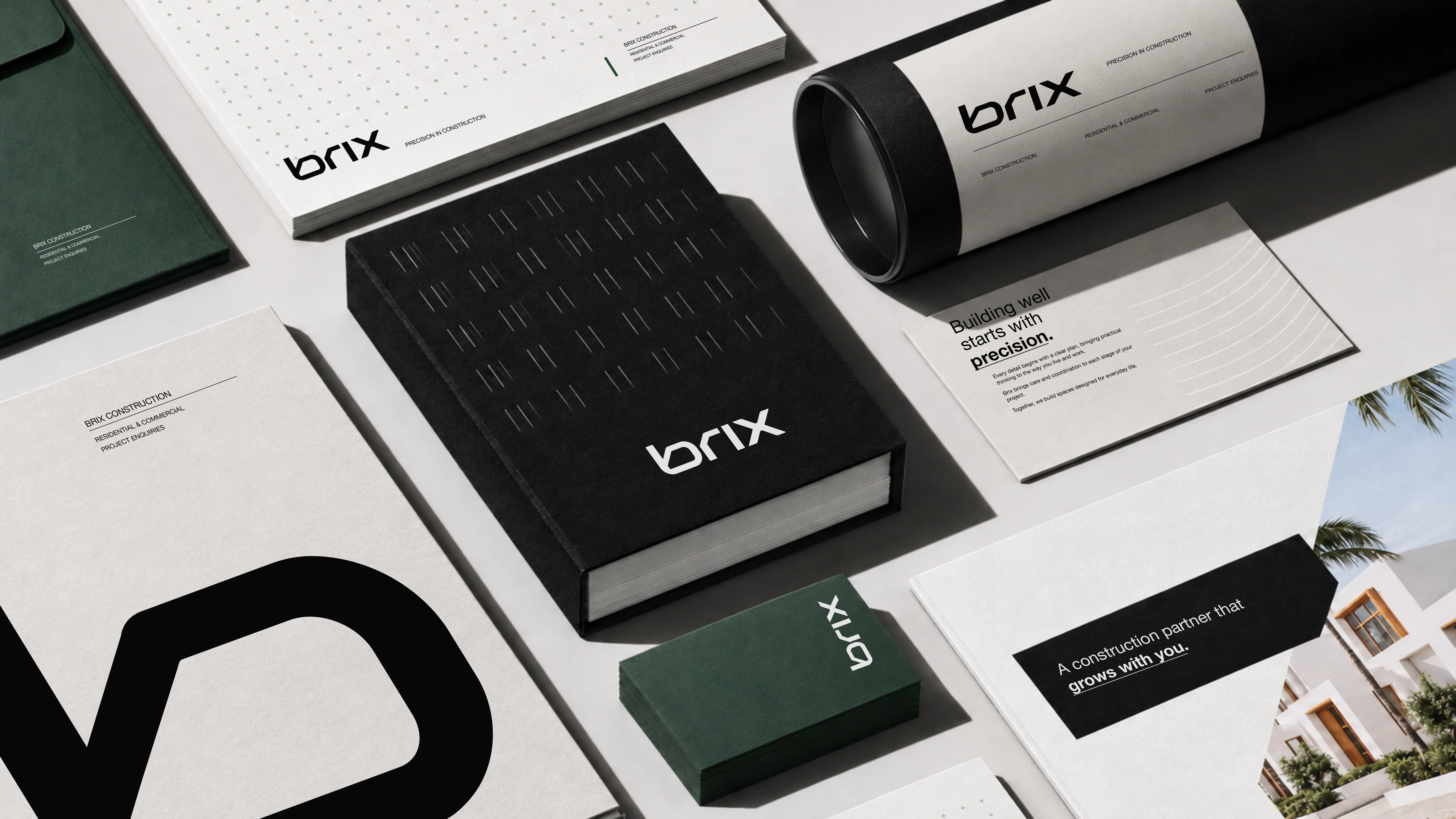
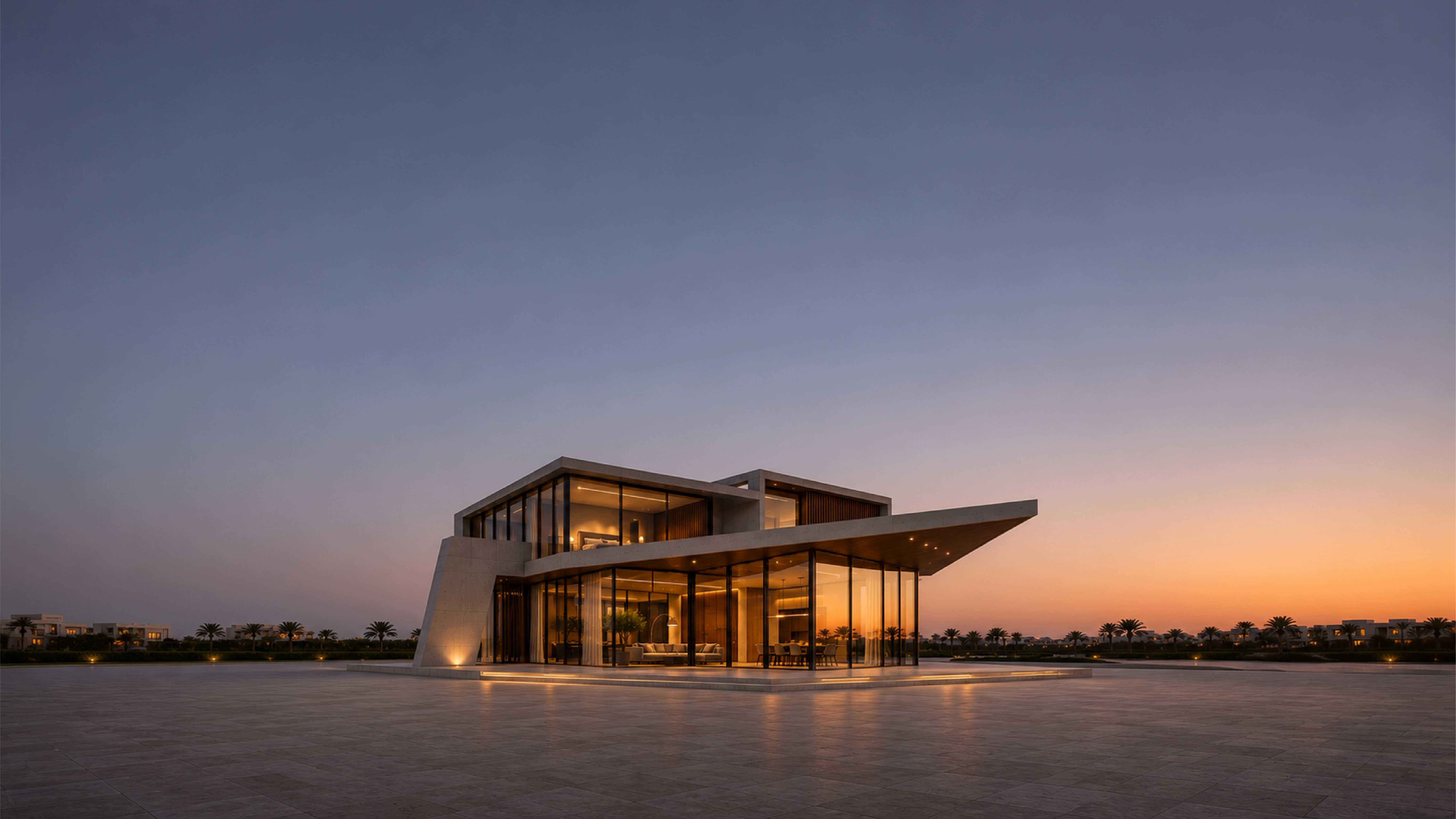
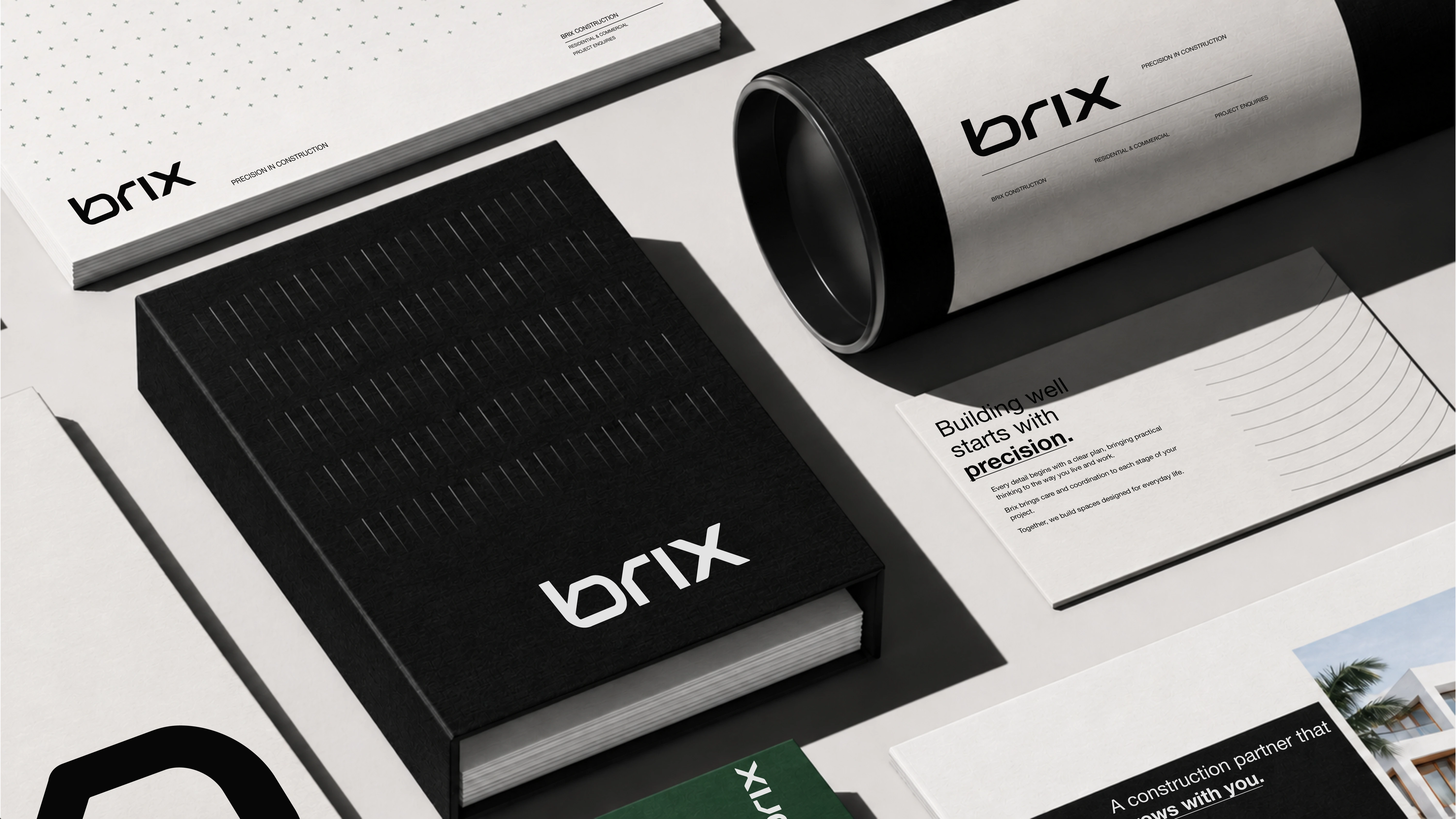
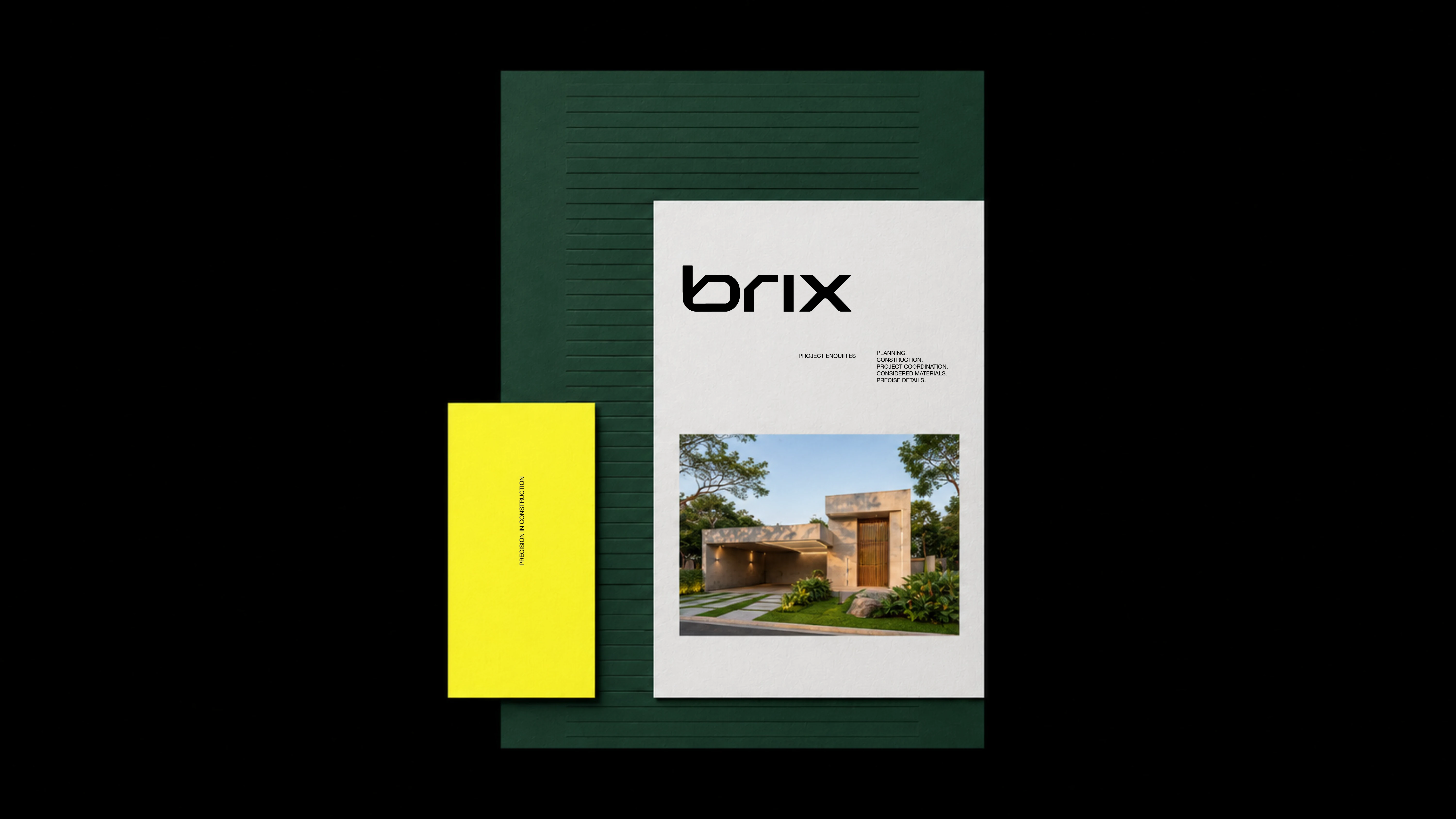
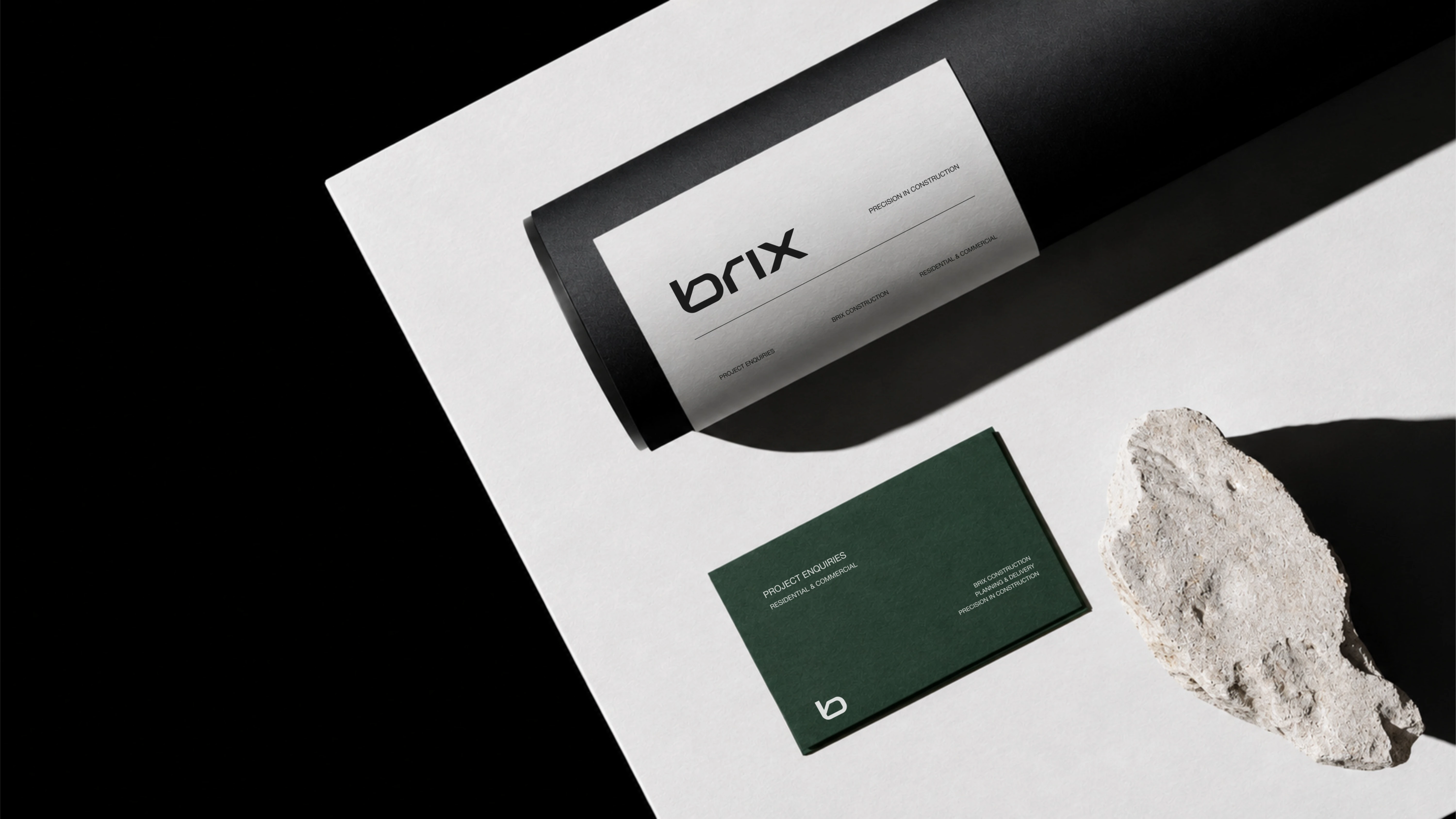
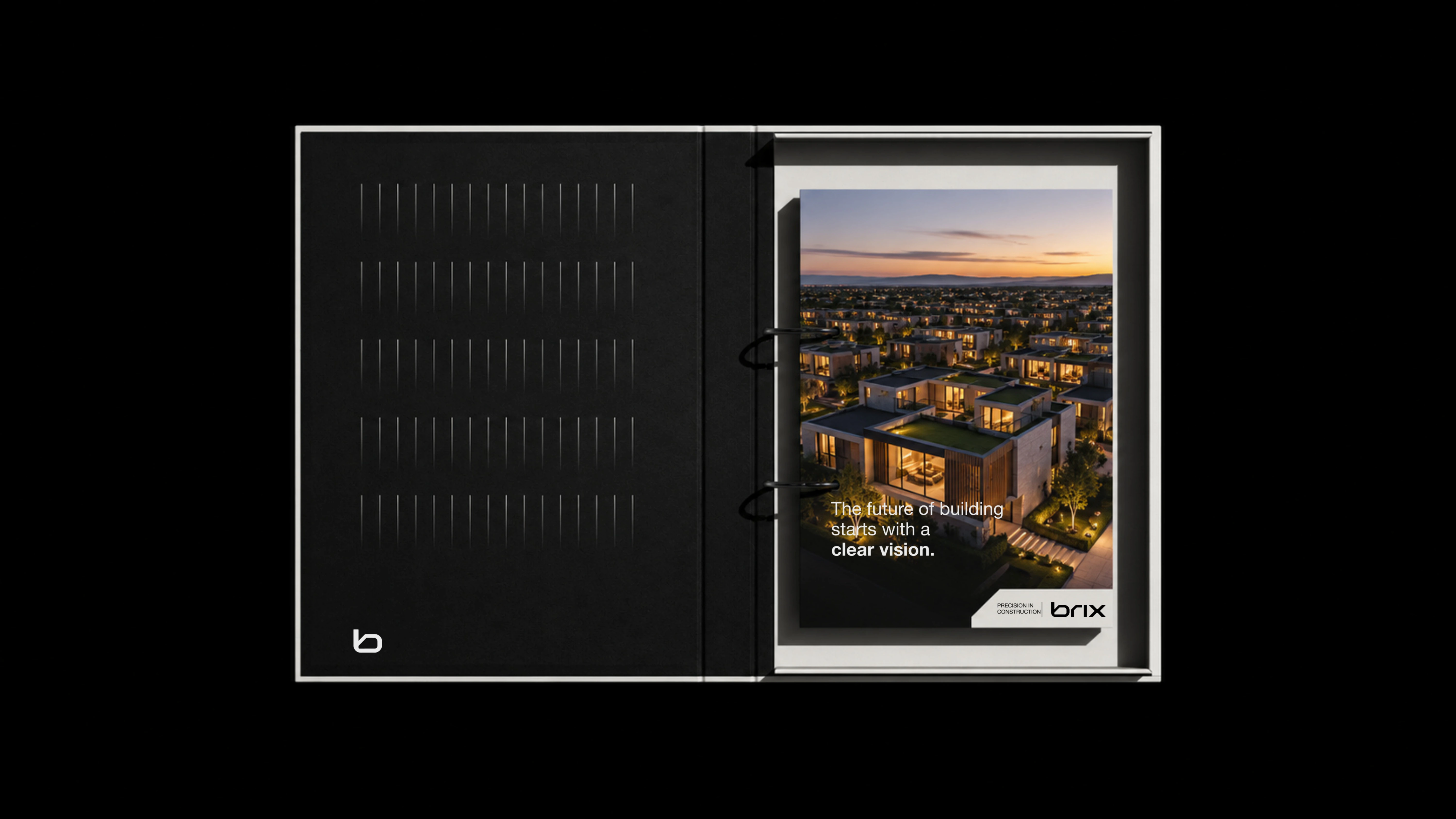
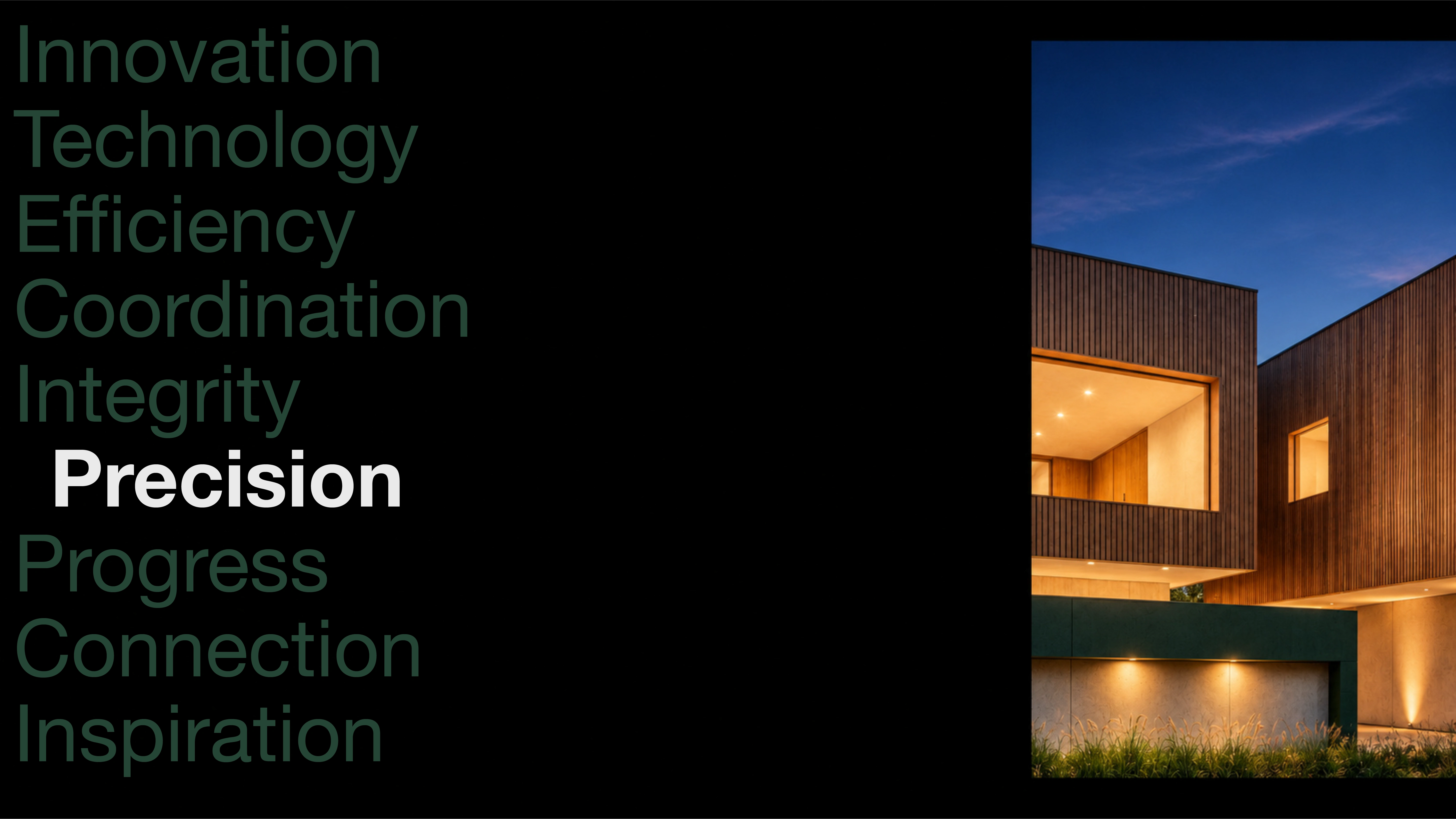
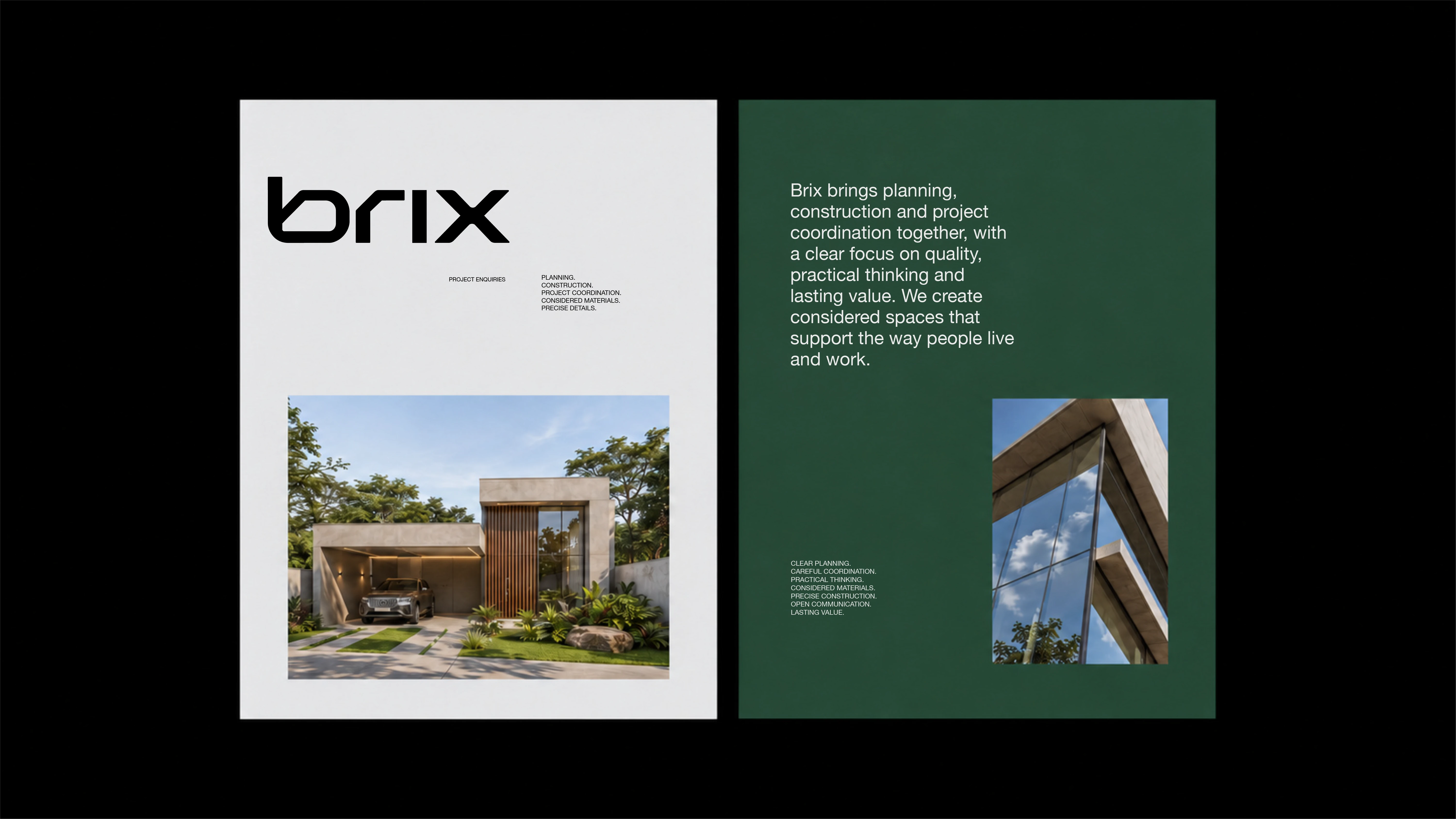
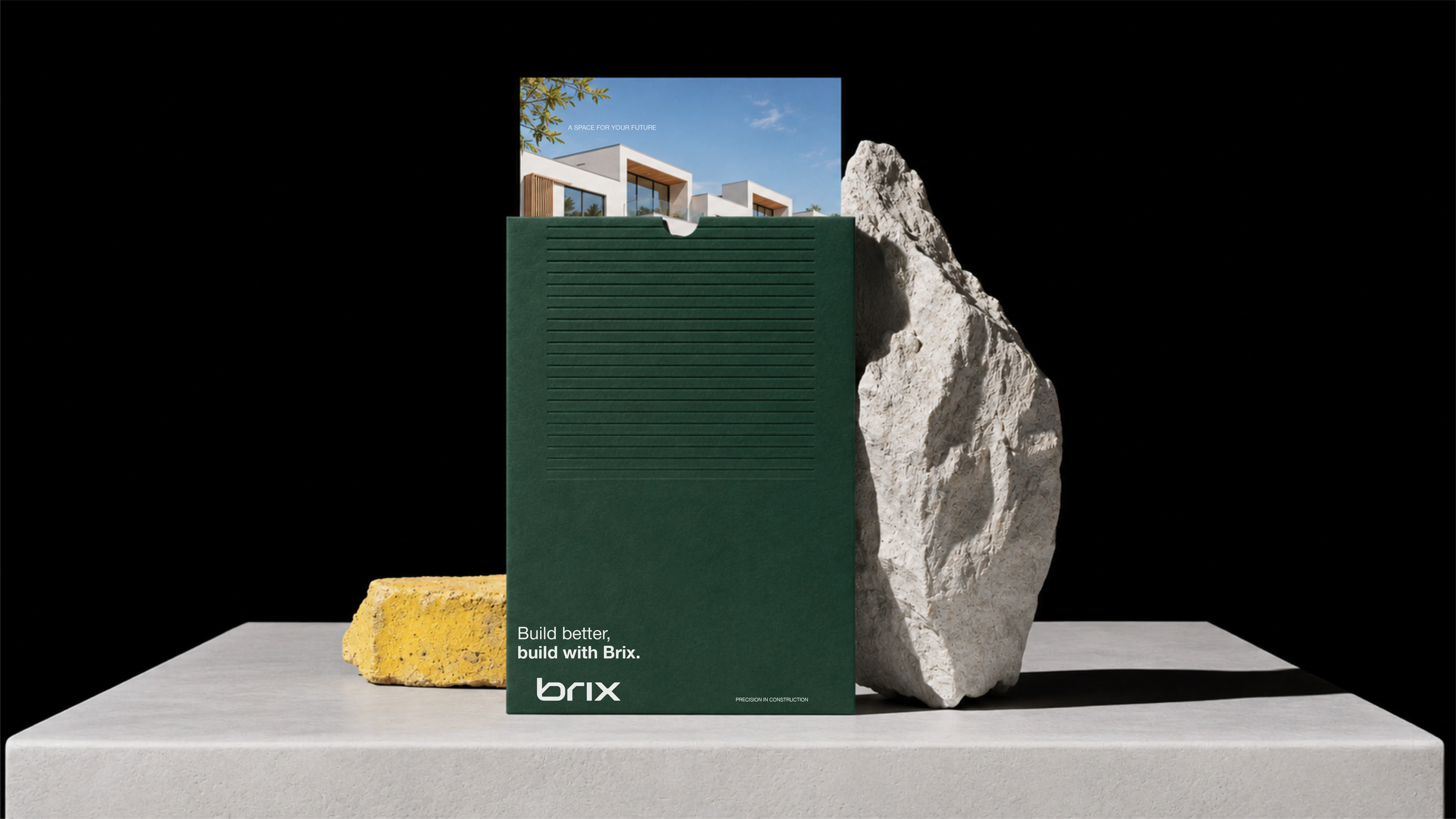
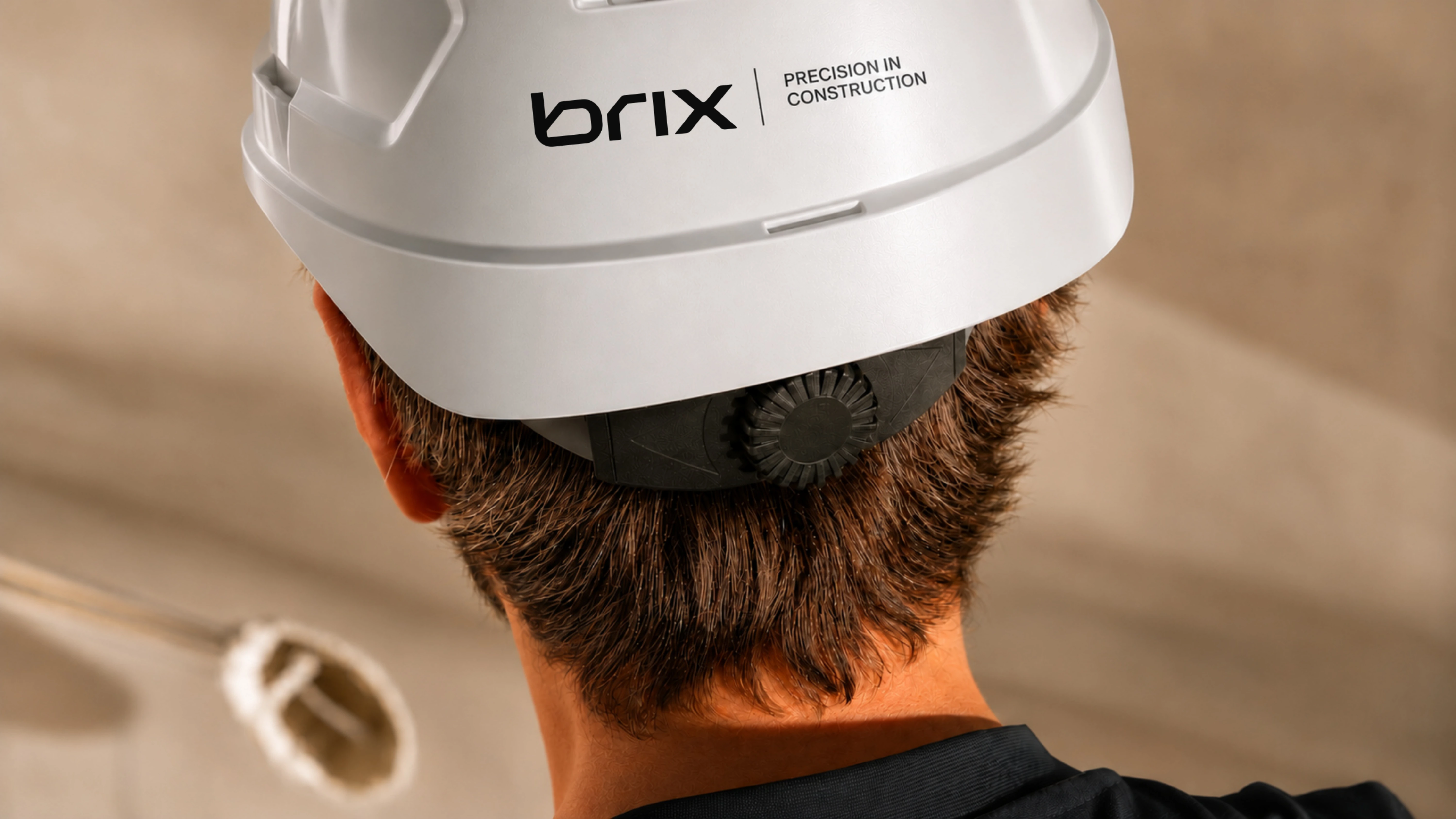
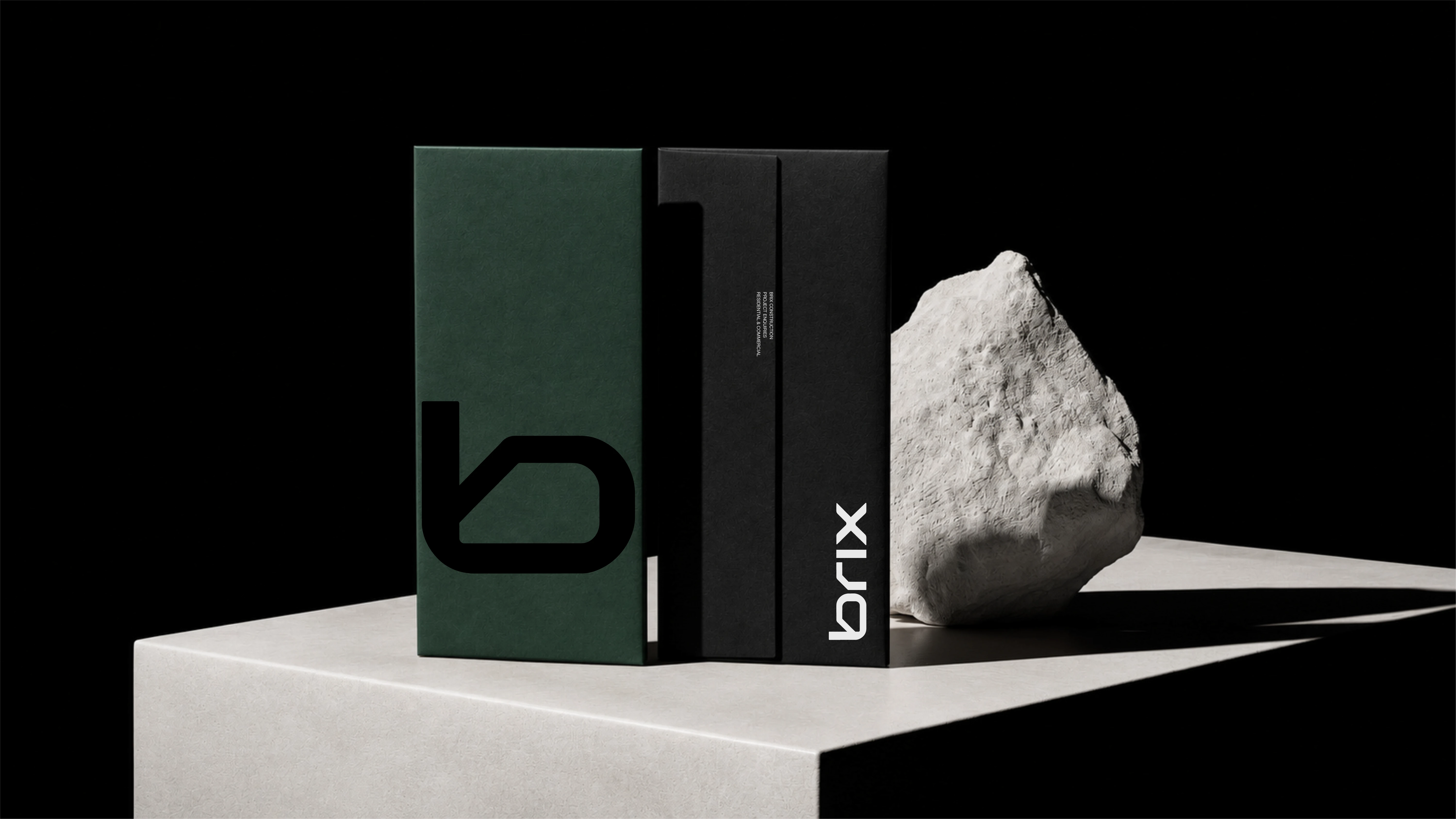
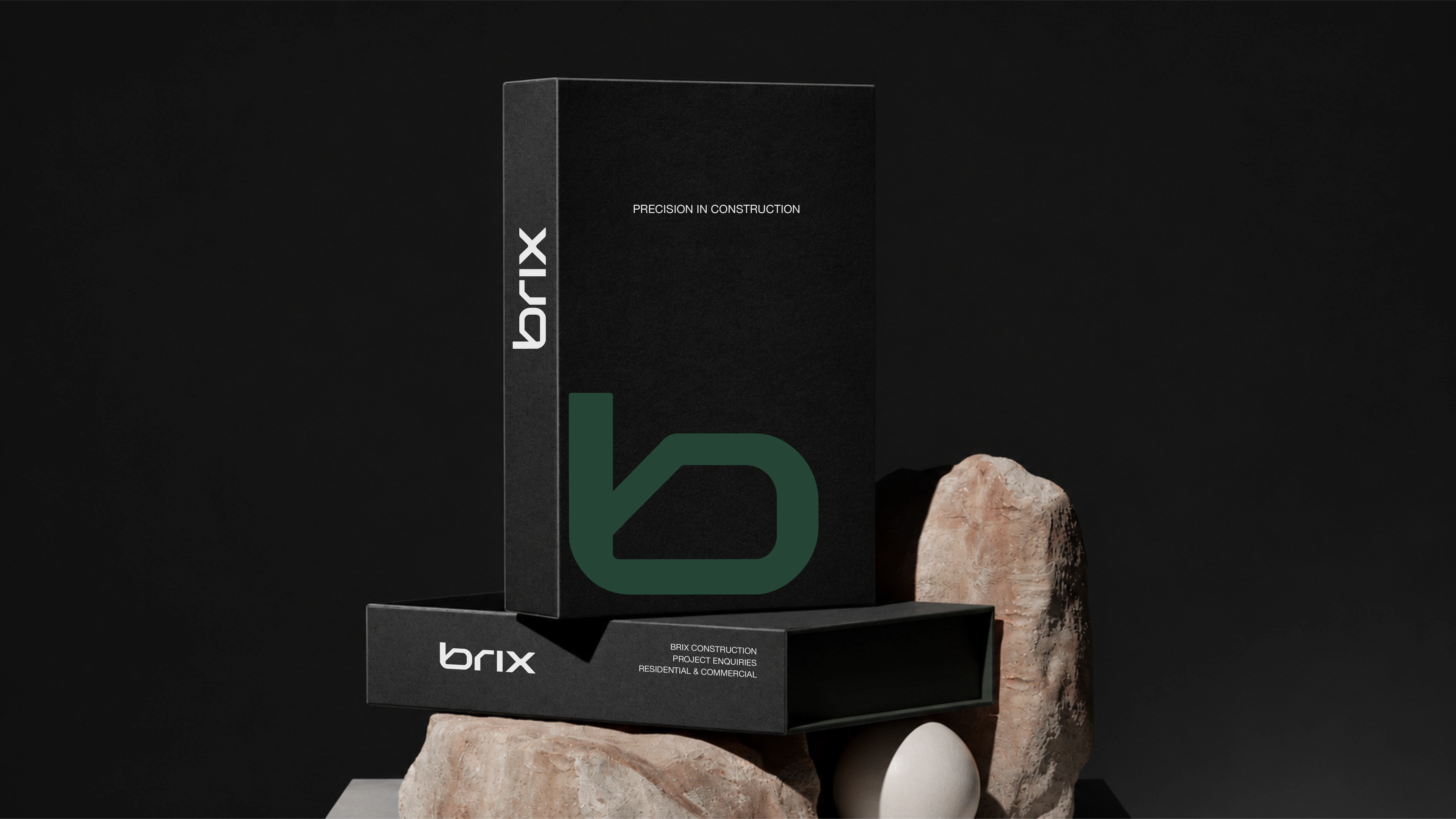
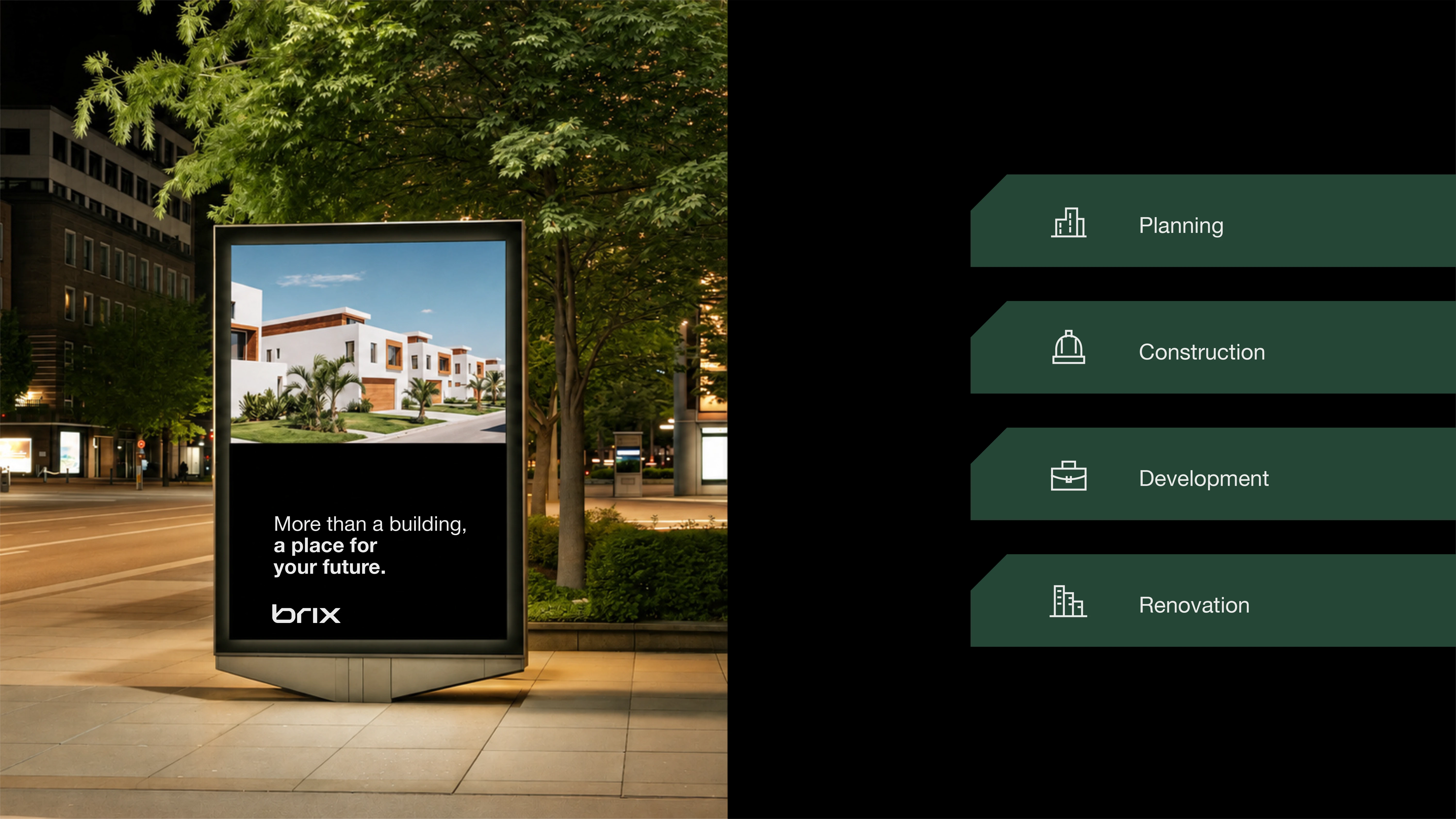
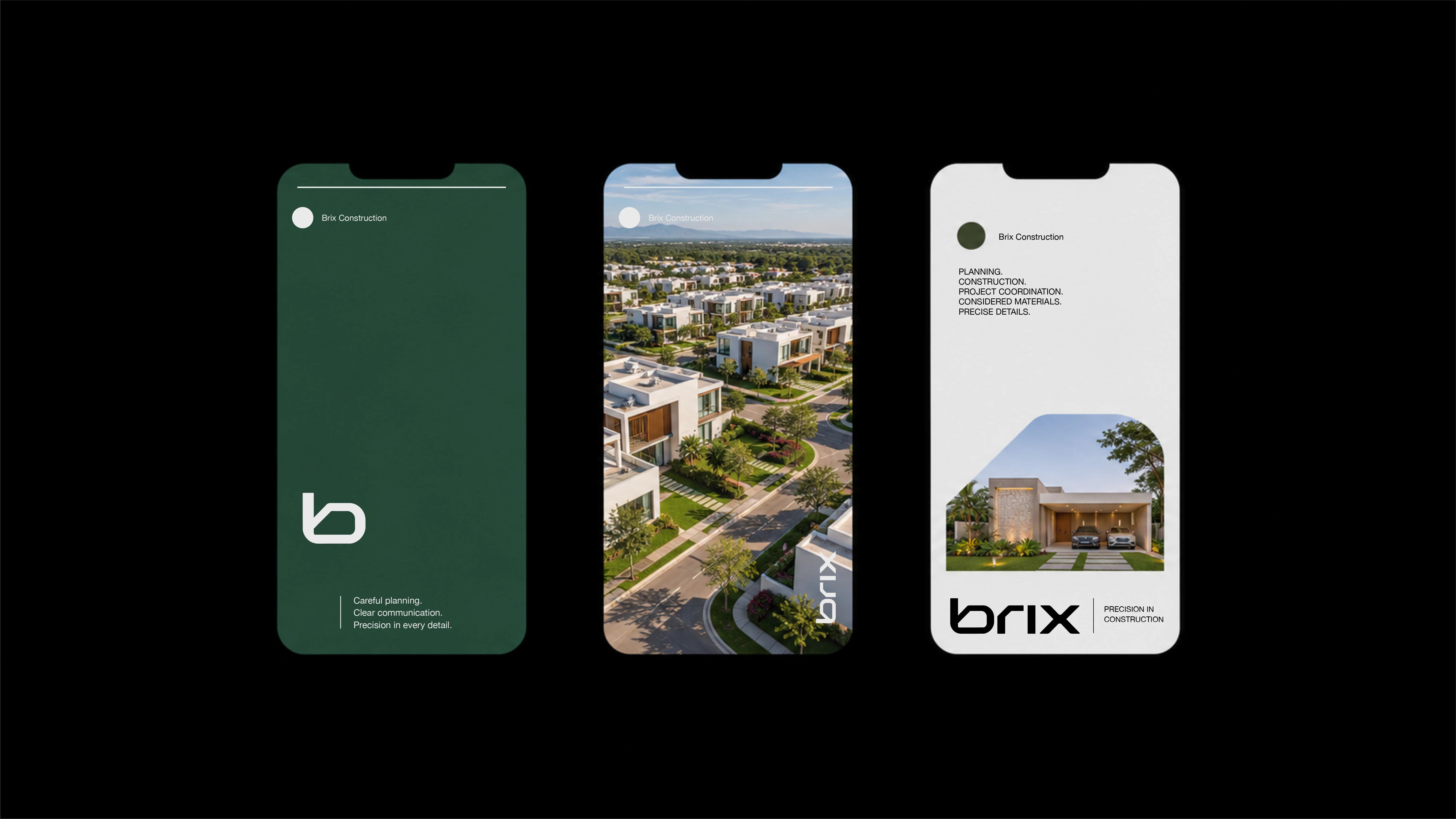
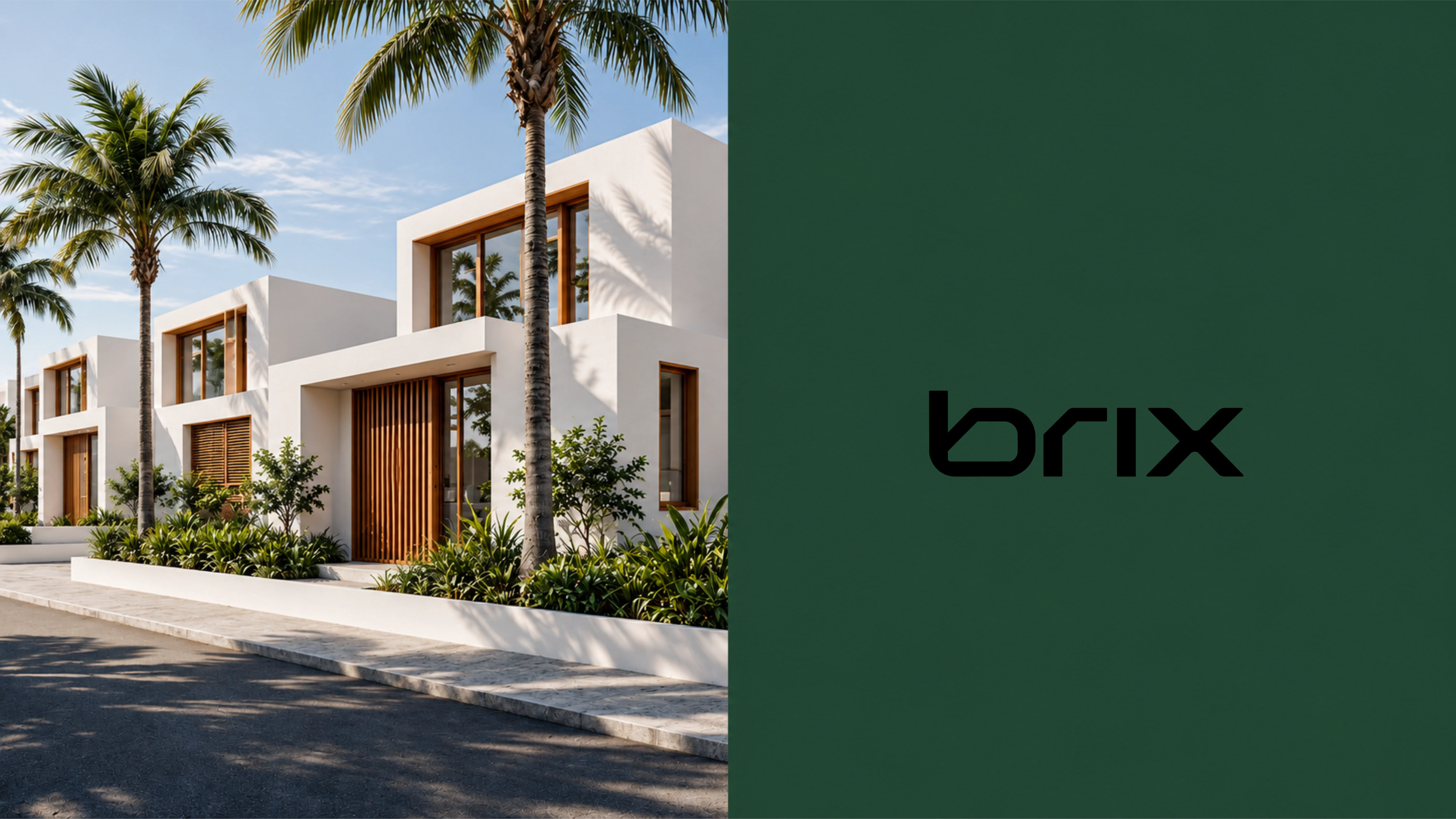
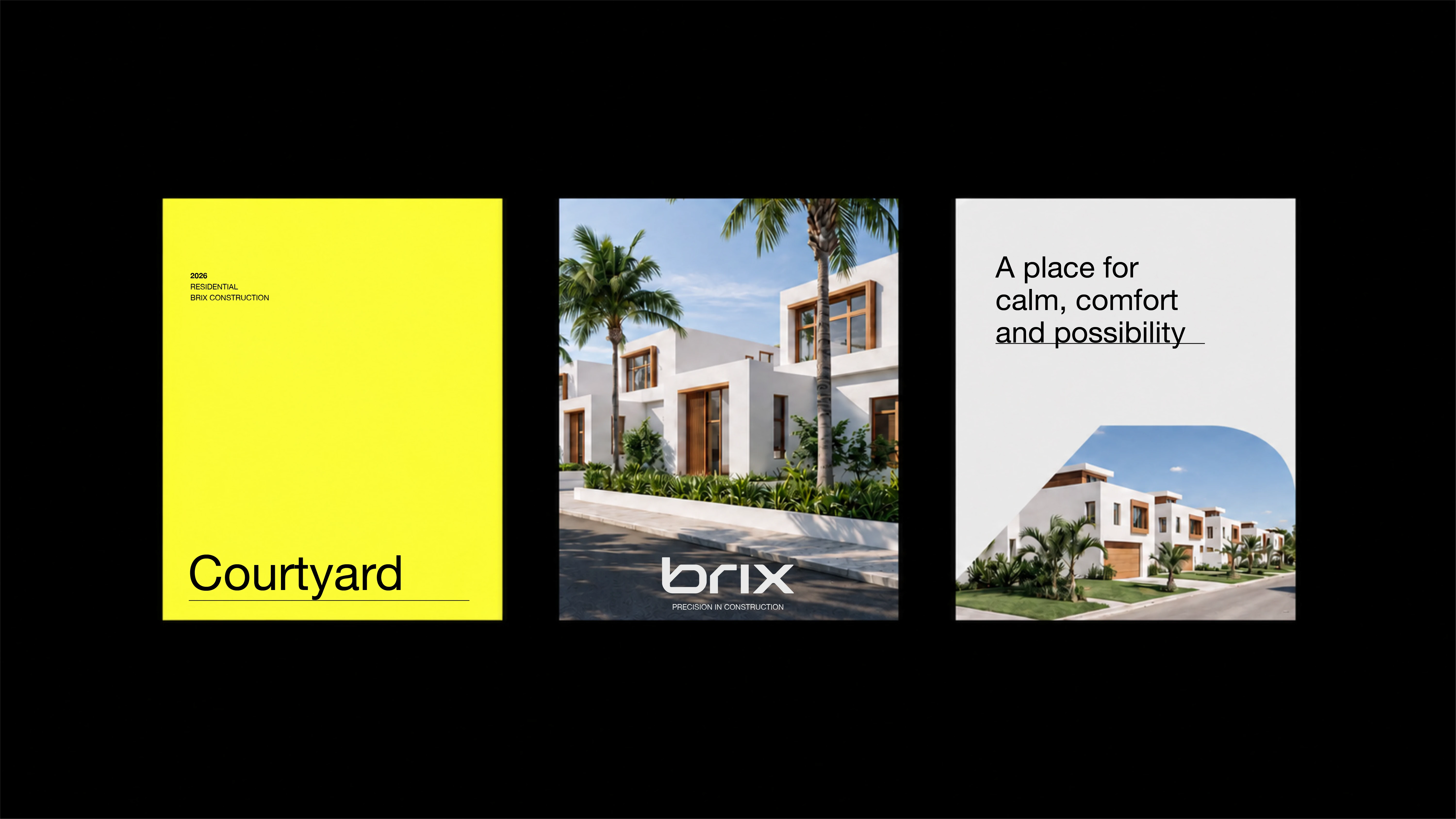
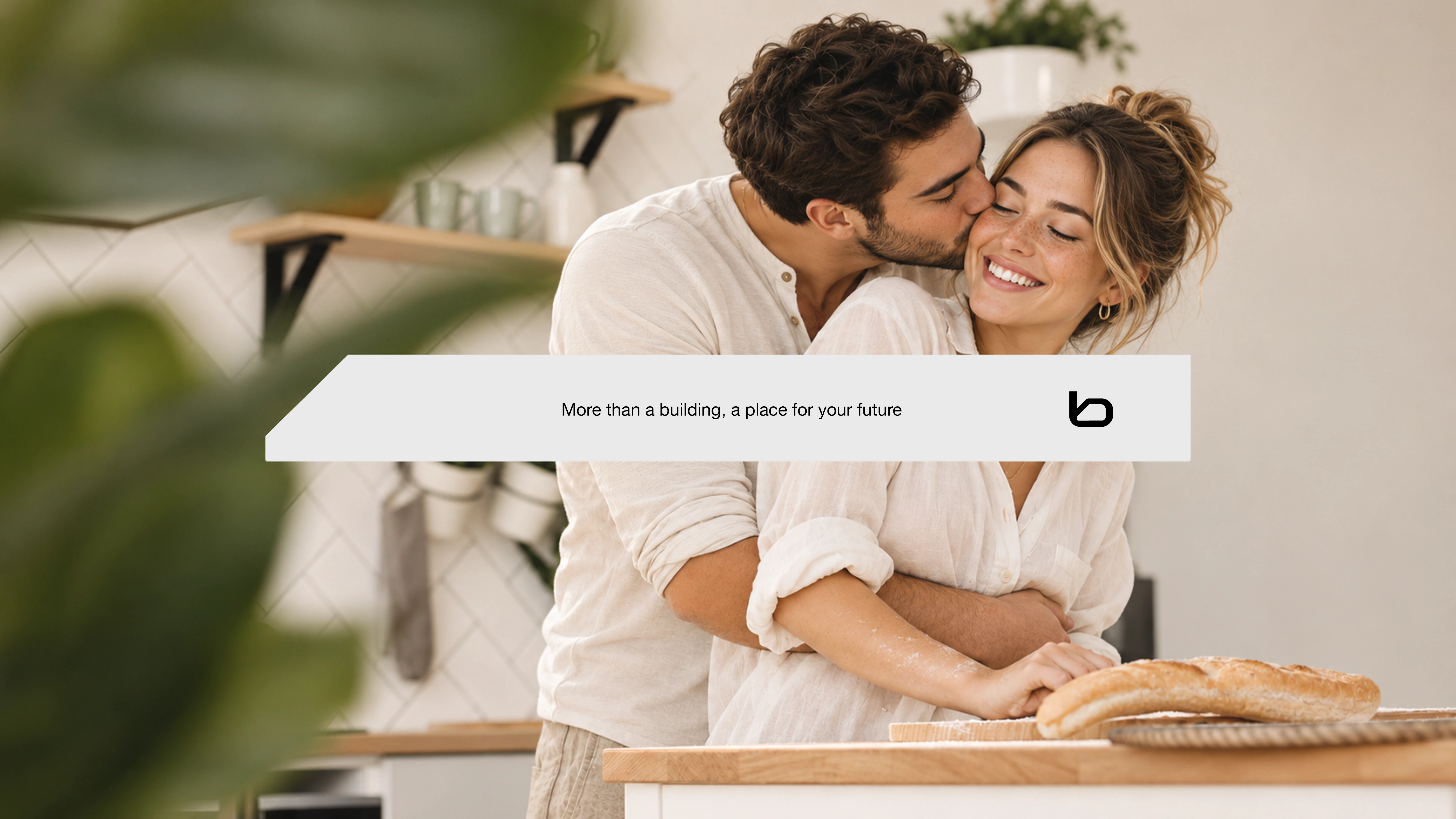
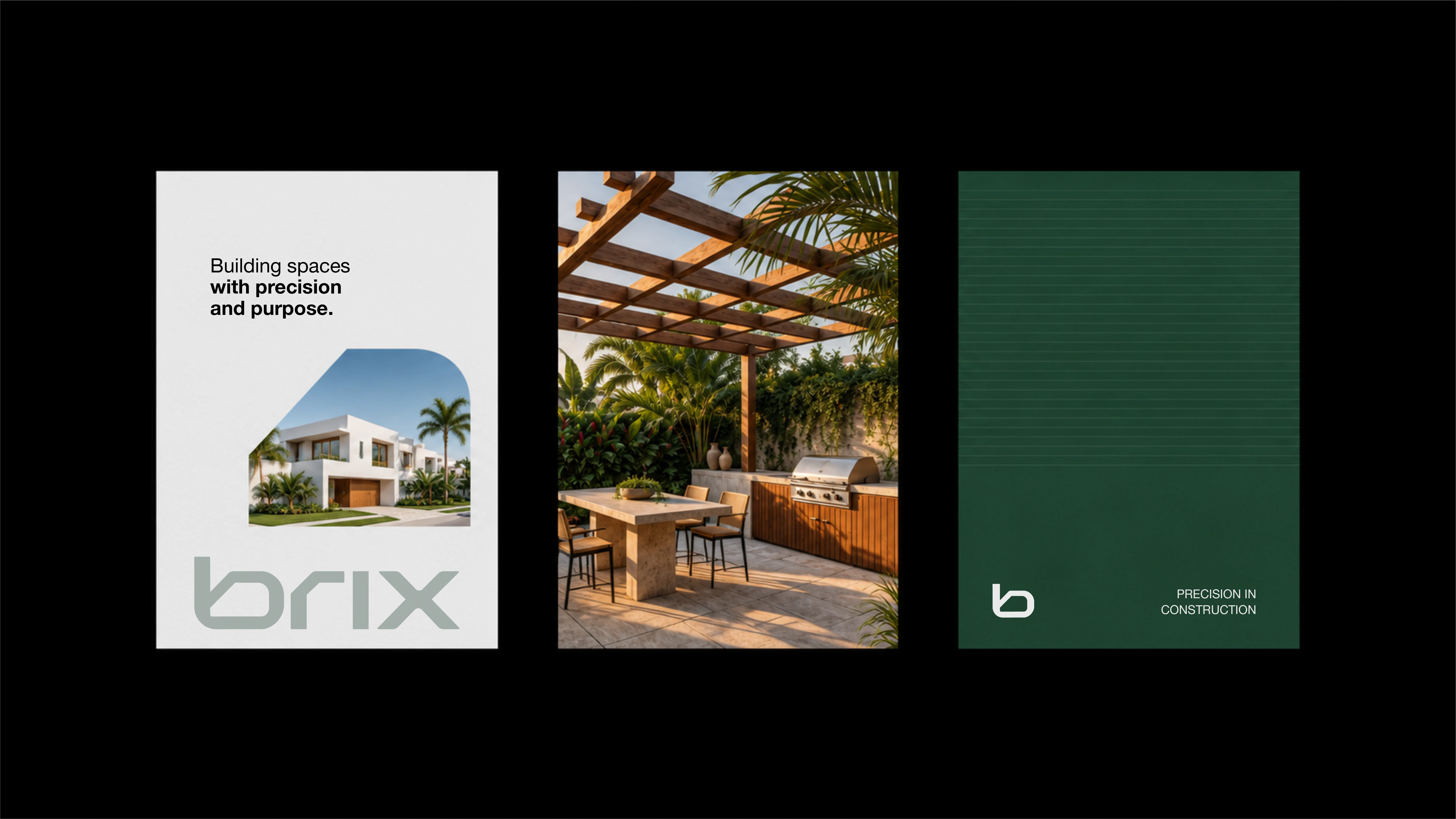
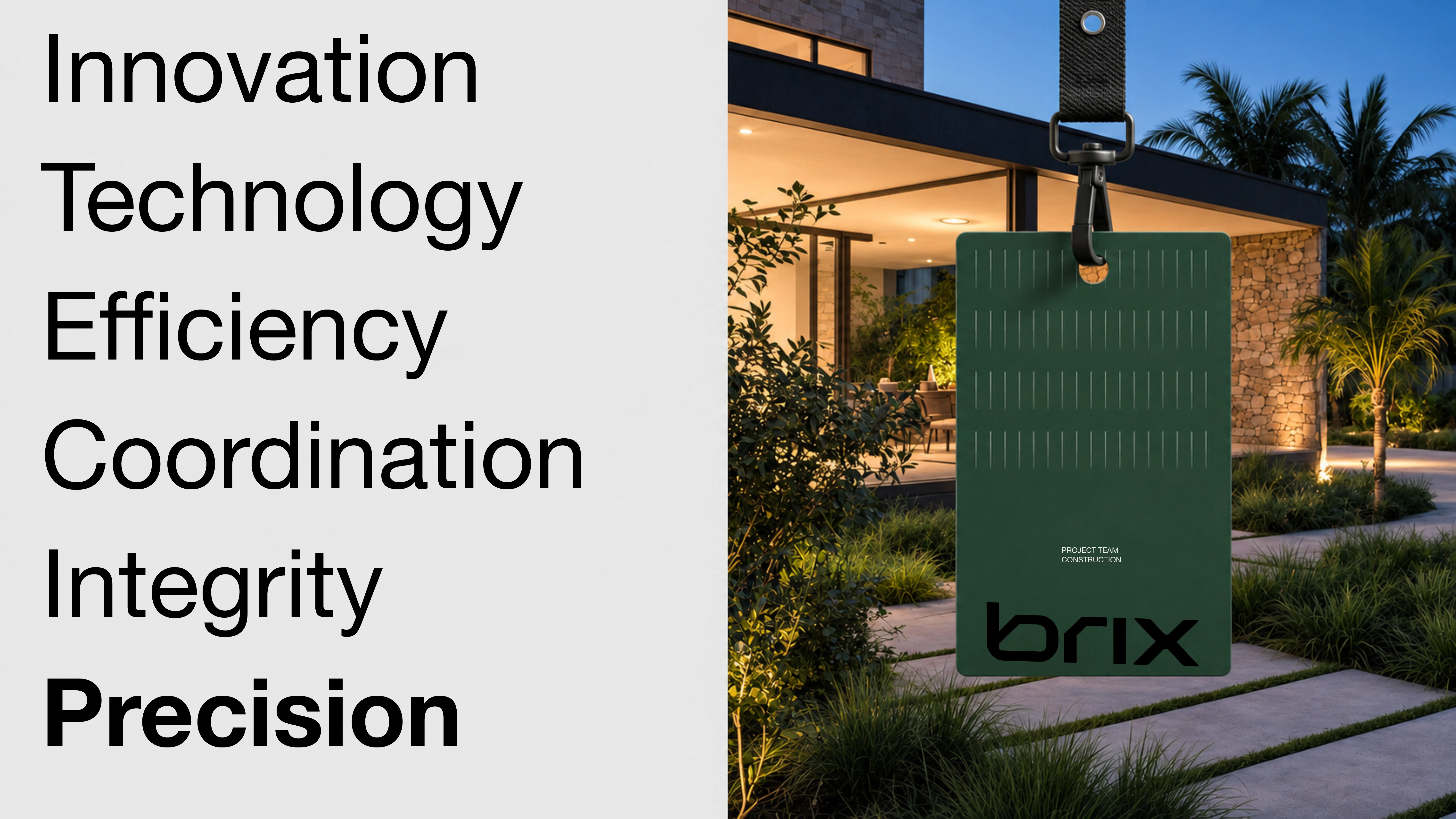
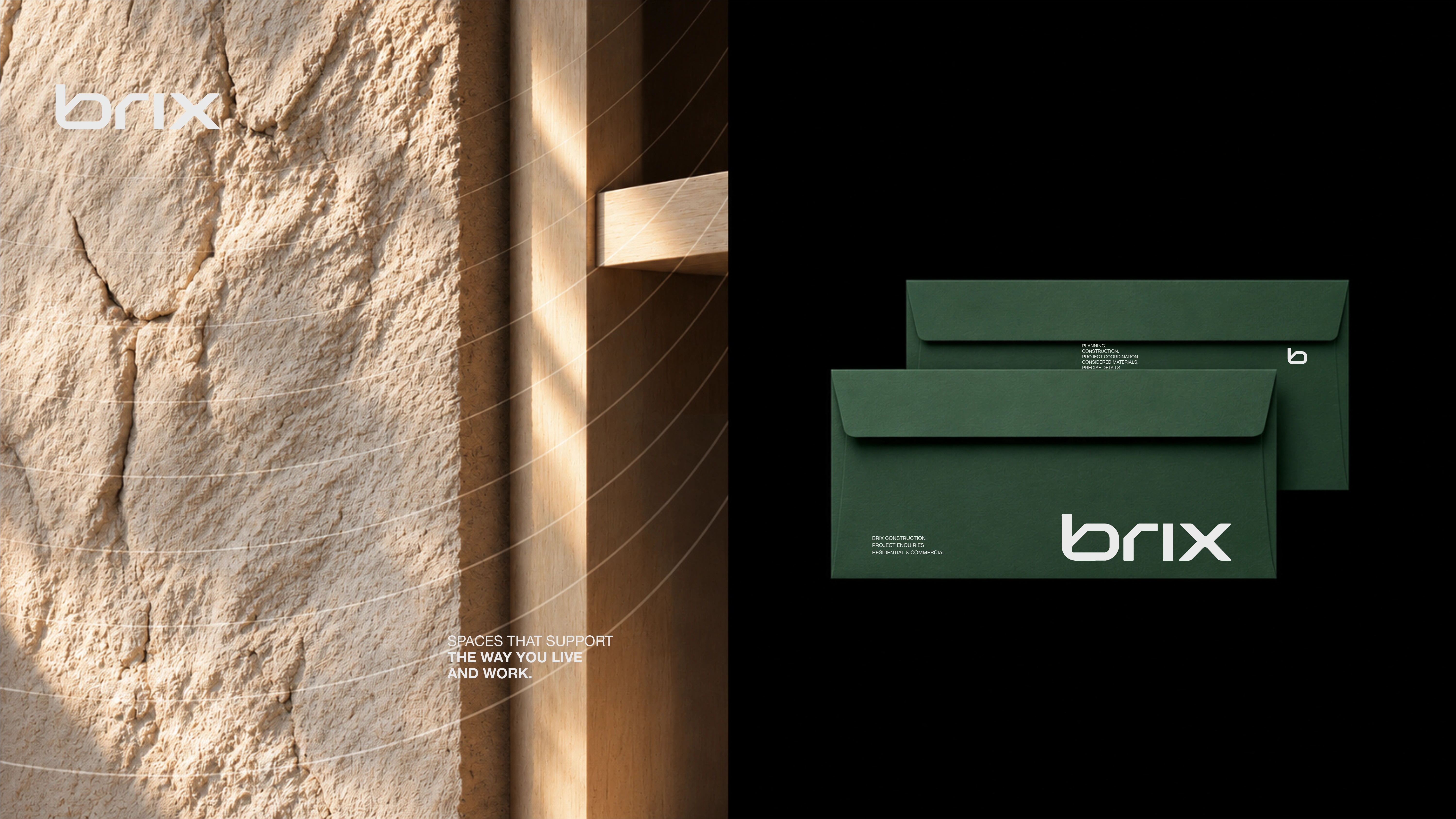
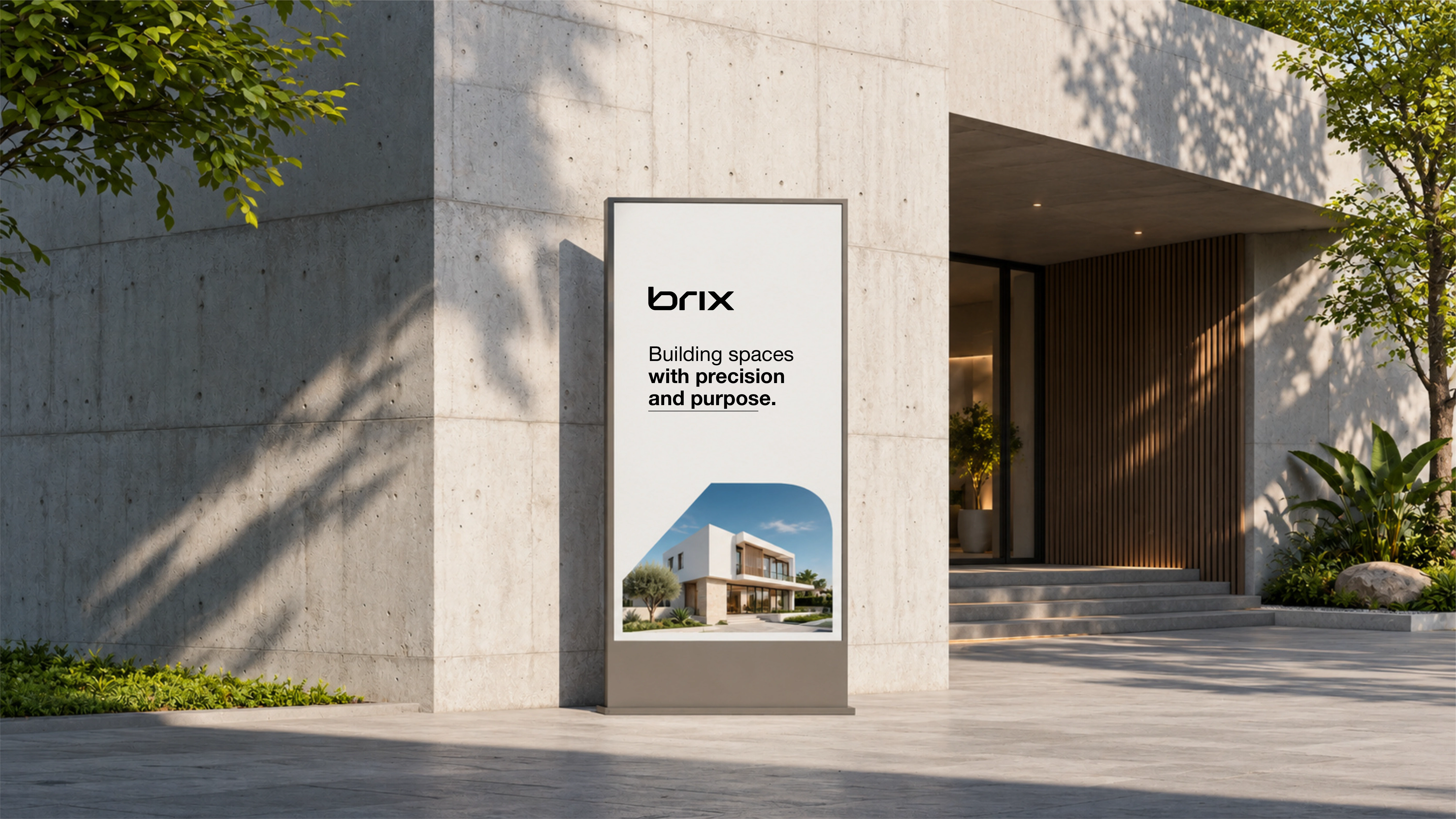
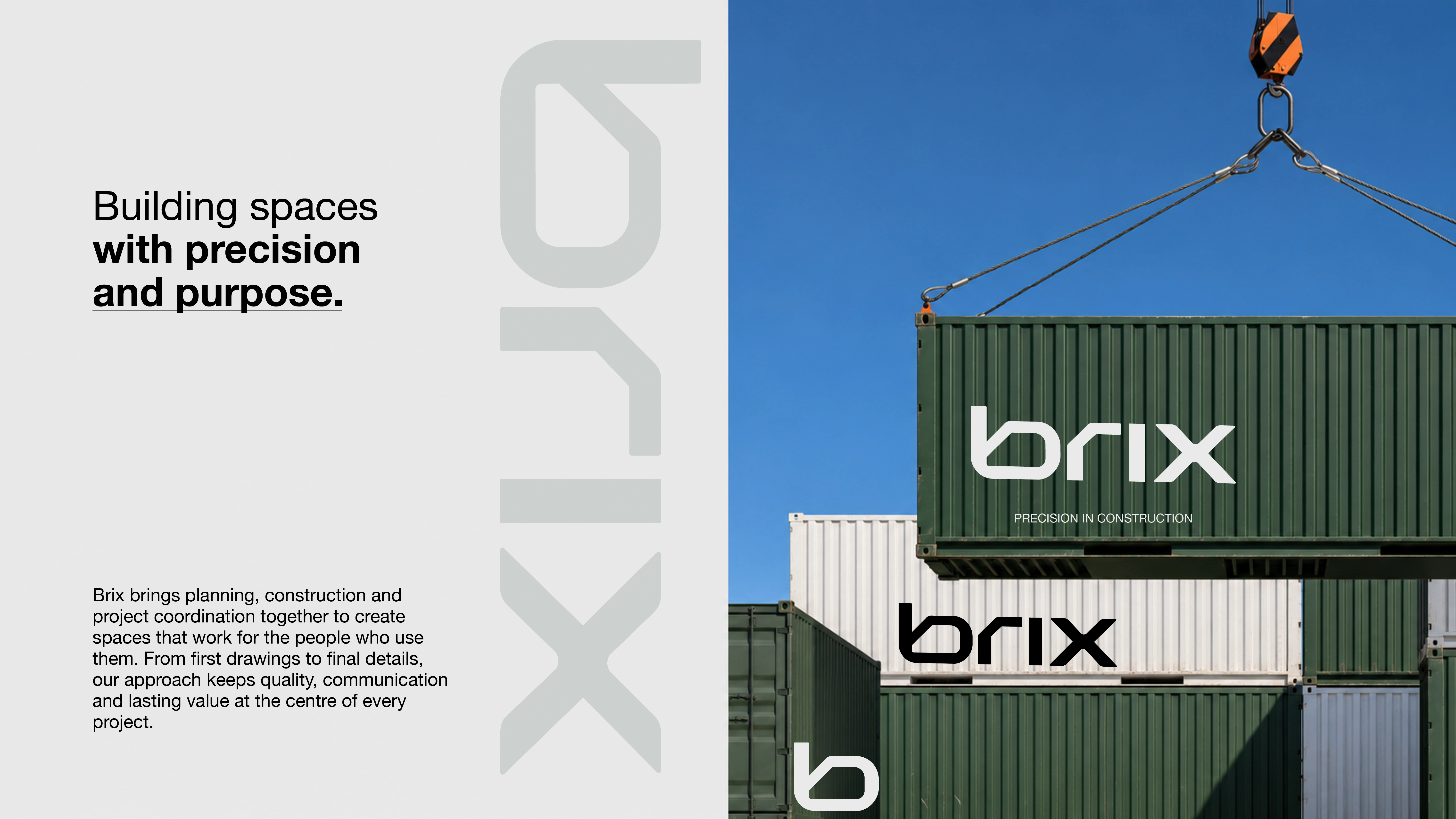
The identity starts with a lowercase bold wordmark and a simple b monogram, set in dark green, black and off white, with a bright yellow accent used sparingly for energy. Thin vertical lines, dashed grids, diagonal cuts and arched photo tops repeat across every piece, giving the brand a precise, architectural rhythm. Photography stays modern and warm, with dusk and sunset houses in stone, wood and glass, so the work always points back to finished homes and the people who live in them. Three decisions hold the system together. Colour with a job to do: deep green carries trust and planning, black adds weight, off white keeps the system calm, and yellow appears only as a highlight, never as a second lead. A voice of reassurance: lines like Building spaces with precision and purpose and More than a building, a place for your future keep the focus on the client's home and future, not on the builder. And motion as proof: the 61 second showreel cuts between guideline pages, mockups and finished houses, letting a prospect feel the whole system in a minute.
Project scope
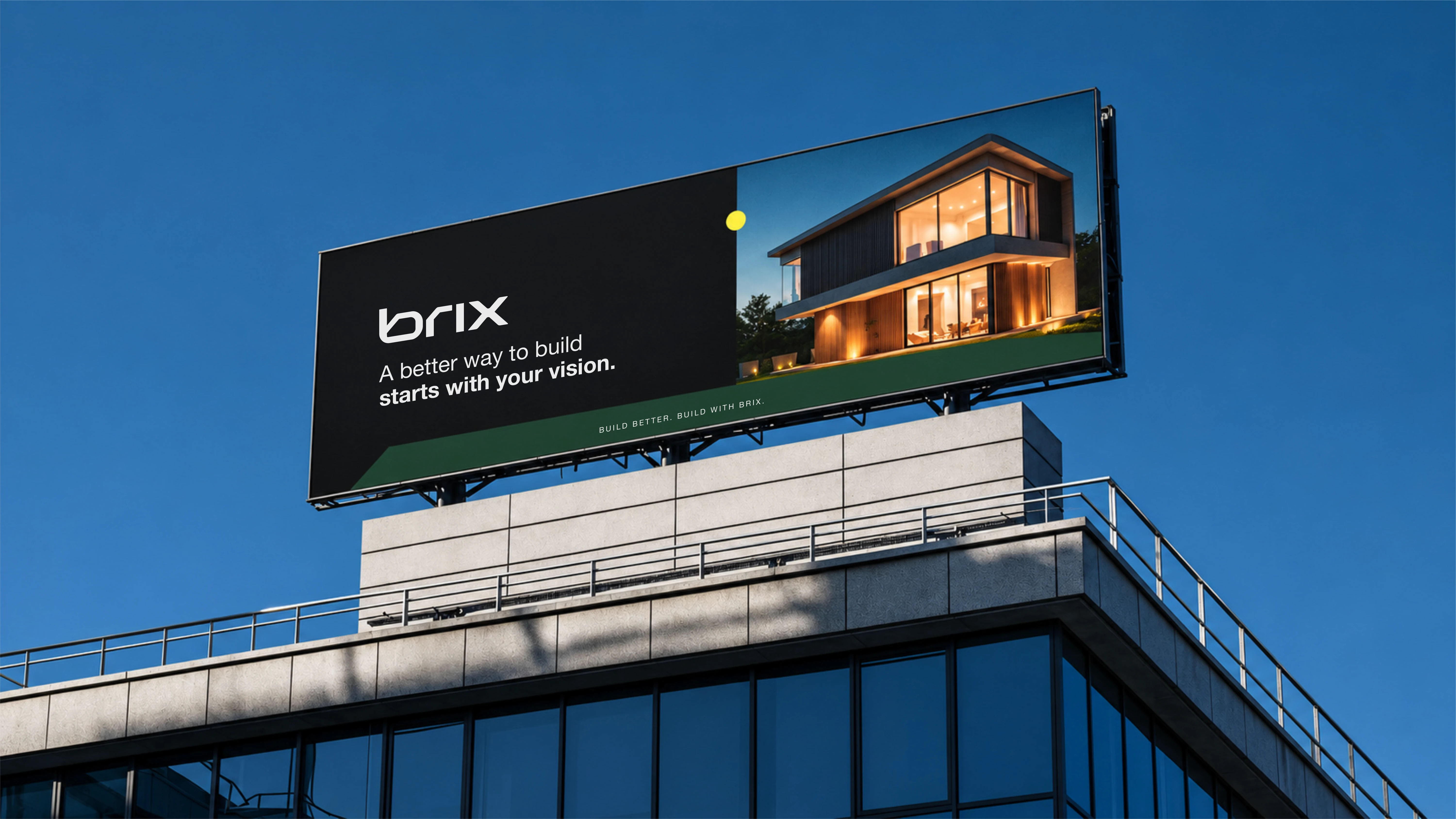
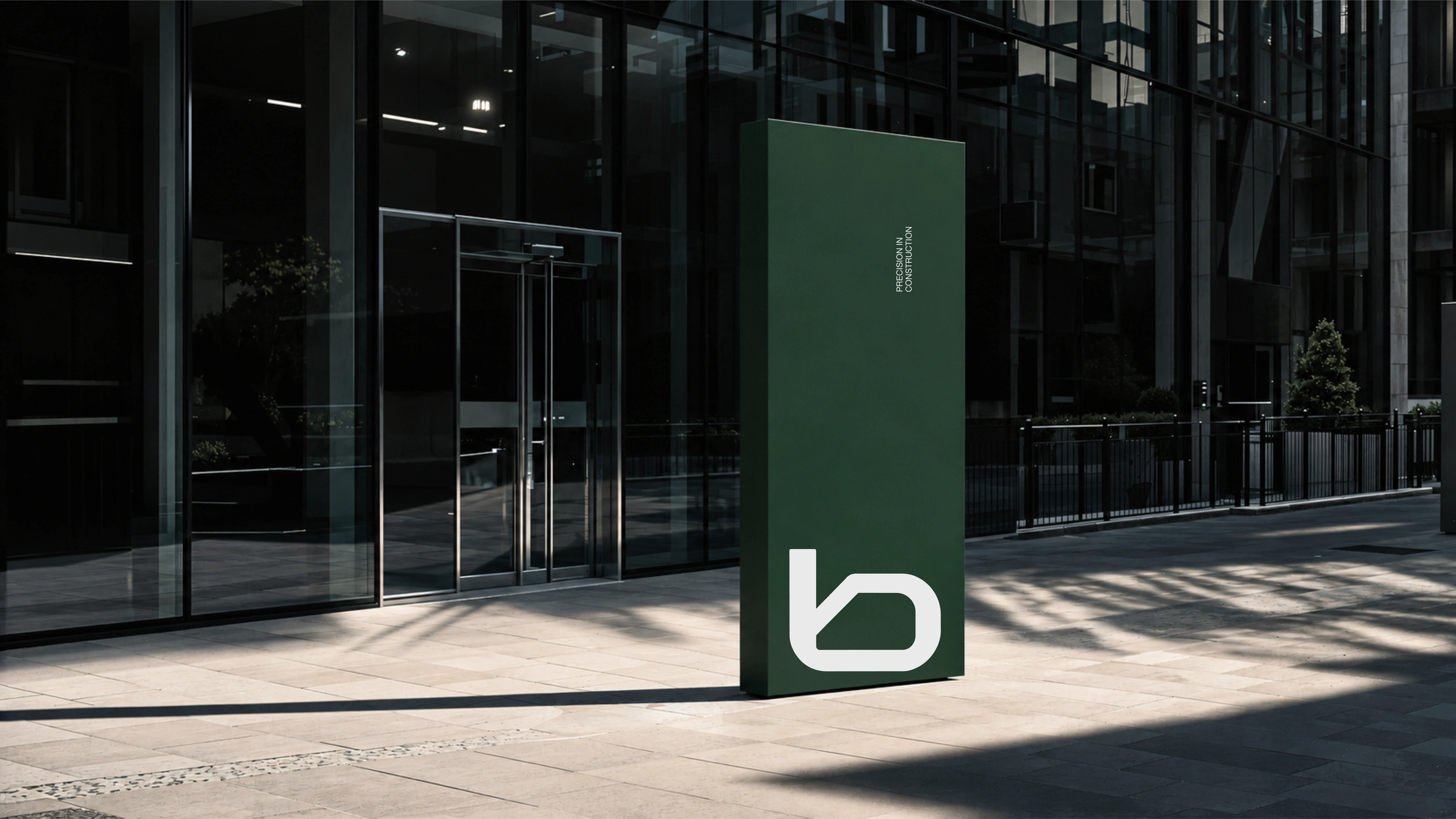
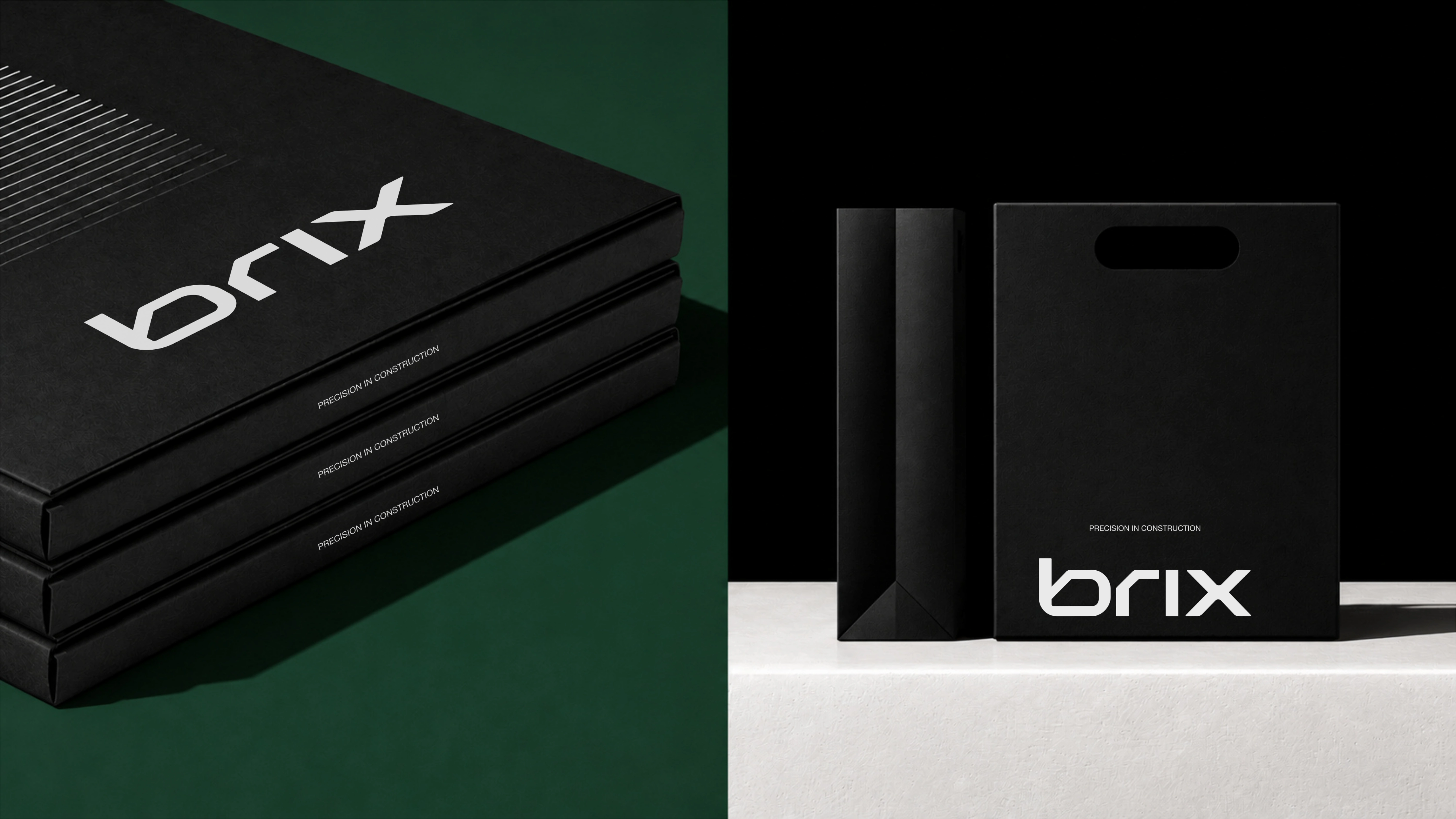
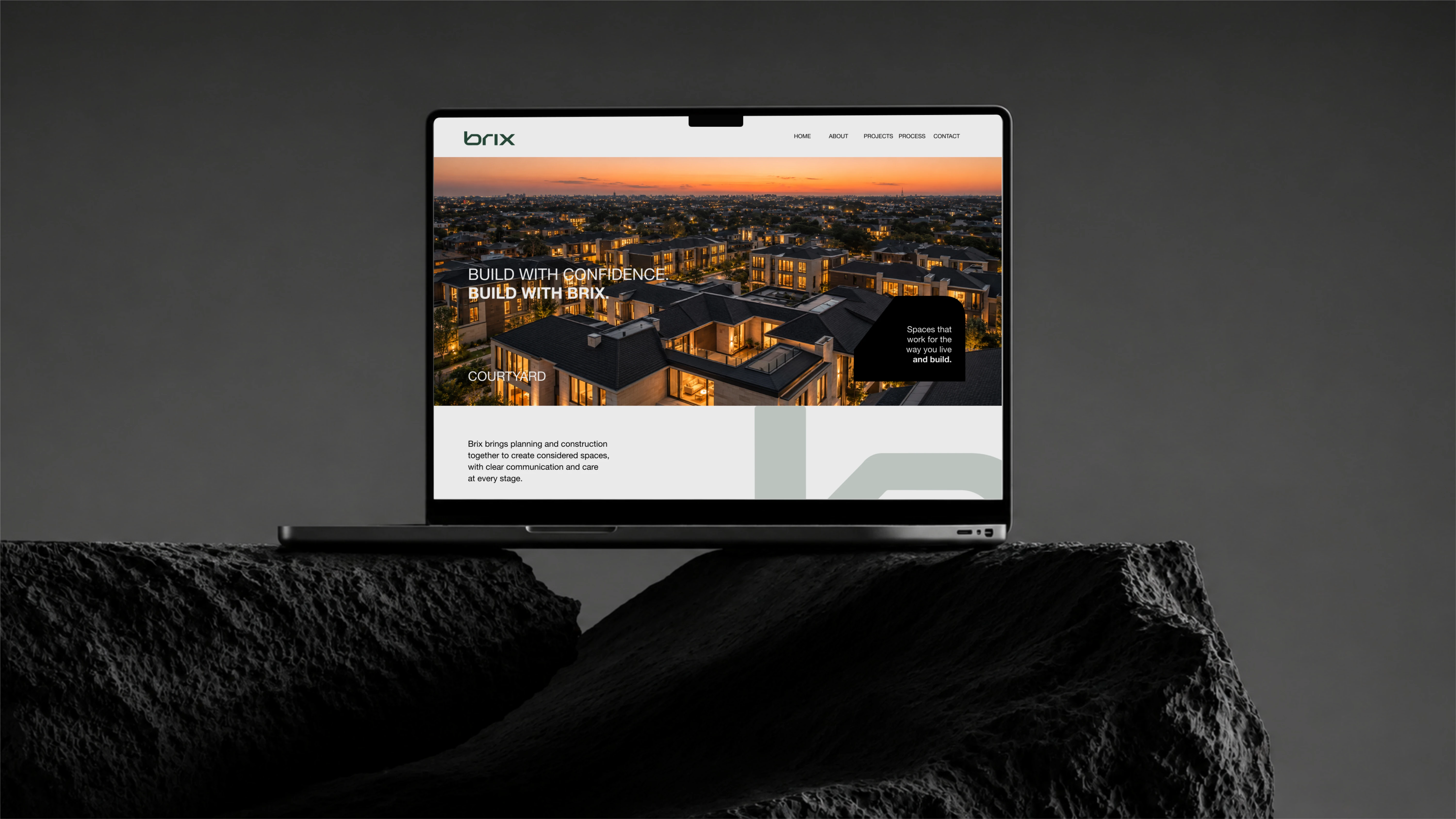
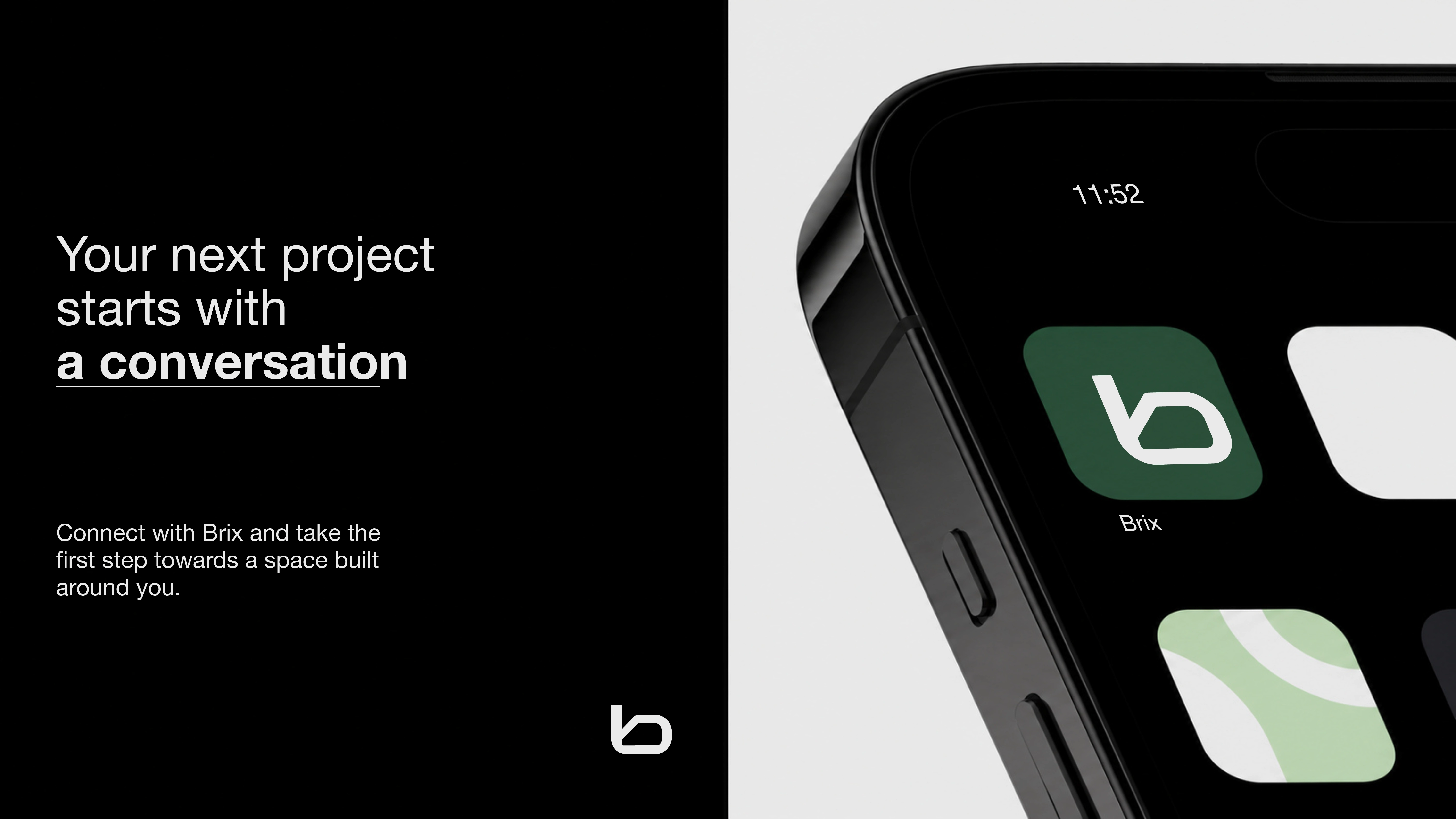
The scope covered the complete identity and its application. Logo and monogram, brand guidelines covering logos, colour, typography and values, stationery and print, signage and outdoor advertising, branded clothing and items, phone screens and app icon, website design, and the animated brand showreel. Every piece was designed as part of the same system, so a client recognises Brix at any size, from a business card to a rooftop billboard.
Final deliverables
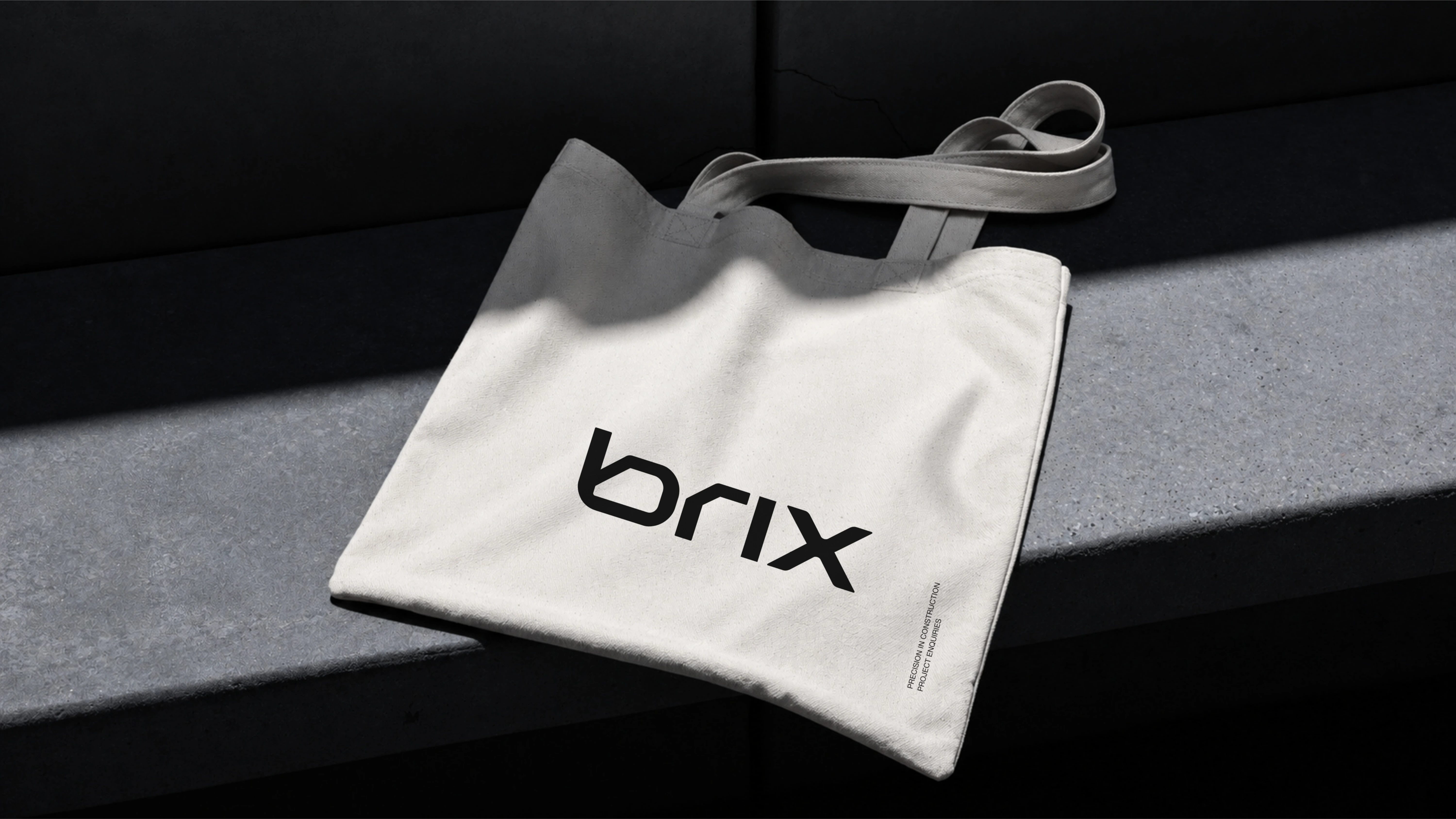
Logo and b monogram. Brand guidelines covering logos, colour, typography and values. Stationery and print: letterhead, envelopes, folders, book, brochure, cards, tube, shopping bag and tote bag. Signage and outdoor: billboard, night poster, rooftop billboard, monolith sign and facade sign. Branded clothing and items: hard hat, T-shirt and ID lanyard. Phone screens and app icon. Website design. A 61 second animated brand showreel. The result is a single system a construction client can trust at a glance: consistent from the first site sign to the final website screen, and flexible enough to grow with the company. No launch metrics are claimed here; the outcome shown is the system itself, applied completely and consistently. If you are building a brand in construction, property or a related service and want an identity that earns trust before the first meeting, get in touch with your project and timeline.
Like this project
Posted Nov 2, 2026
Complete brand identity, website design and animated showreel for Brix Construction, built on precision, planning and modern homes.