The network for creativity
Join 1.25M professional creatives like you
Connect with clients, get discovered, and run your business 100% commission-free
Creatives on Contra have earned over $150M and we are just getting started
Back to feedPost

How do you make a construction brand feel consistent from a business card to a building site?
Brixon’s identity brings angular lettering, an assembled geometric symbol, and a lime, black, and white palette together.
I carried those elements into stationery, brand guidelines, team identification, social graphics, and site signage, then brought the system into motion with Adobe After Effects.
The connecting decision: keep the geometry and layout structure consistent while the logo details, messages, and application previews change within the animated panels.
My contribution covered brand design, graphic design, and motion design.
What draws your attention first: the wordmark, the lime palette, or the rotating symbol?
See the full Brixon case study. If you’re shaping a construction or development brand, I’m available for brand identity and motion projects.

The lime suits the signage.
Thank you Vansita, the lime was the boldest choice in the system. On signage it had to read clearly from a distance while still feeling sharp up close, so I kept the black and grey around it quiet. Glad it landed for you. Which application stood out most to you, the signage or the stationery?

Thank you Ibad, that consistency was the whole point of the system. The lime and black pairing does a lot of heavy lifting here, it keeps every touchpoint recognisable even when the layout changes completely. Did the stationery or the site graphics feel more consistent to you?

Strong concept! I'd love to see how the logo performs at smaller sizes though, especially on helmets and workwear.
Thank you Steve, great question. The mark was built on a simple geometric grid so it holds up when it shrinks, and the full wordmark drops away at small sizes so the symbol carries it alone. Helmets and workwear are exactly where that test matters most, I will keep an eye on how it reads there.

Thank you Hemad, fair point and I agree in places. The type was set tight on purpose to keep the construction feel, but a few applications would breathe better with a little more leading and tracking. Was there one application where it felt tightest to you?

Incomparable work!
Thank you Shakil, really appreciate that. The aim was to make the identity feel solid and built to last, so I am glad that came through. Which part caught your eye first, the mark or the lime?
I would say that both are very well brought out here.
Glad to hear it. The mark and the lime were meant to work as a pair, so hearing that both landed is the best feedback I could ask for. Thanks for taking the time to look closely.


Thank you Amr, appreciate that. The flow mattered a lot here, I wanted each touchpoint to lead naturally into the next while the lime kept it feeling bold. Glad the final look landed well for you.

The brand idea looks great. Excited to see where it goes.
Thank you Joyjit, glad the idea came through clearly. There is more of this system to show, the motion work especially, so keep an eye out for the next part.
The network for creativity
Join 1.25M professional creatives like you
Connect with clients, get discovered, and run your business 100% commission-free
Creatives on Contra have earned over $150M and we are just getting started



Related posts

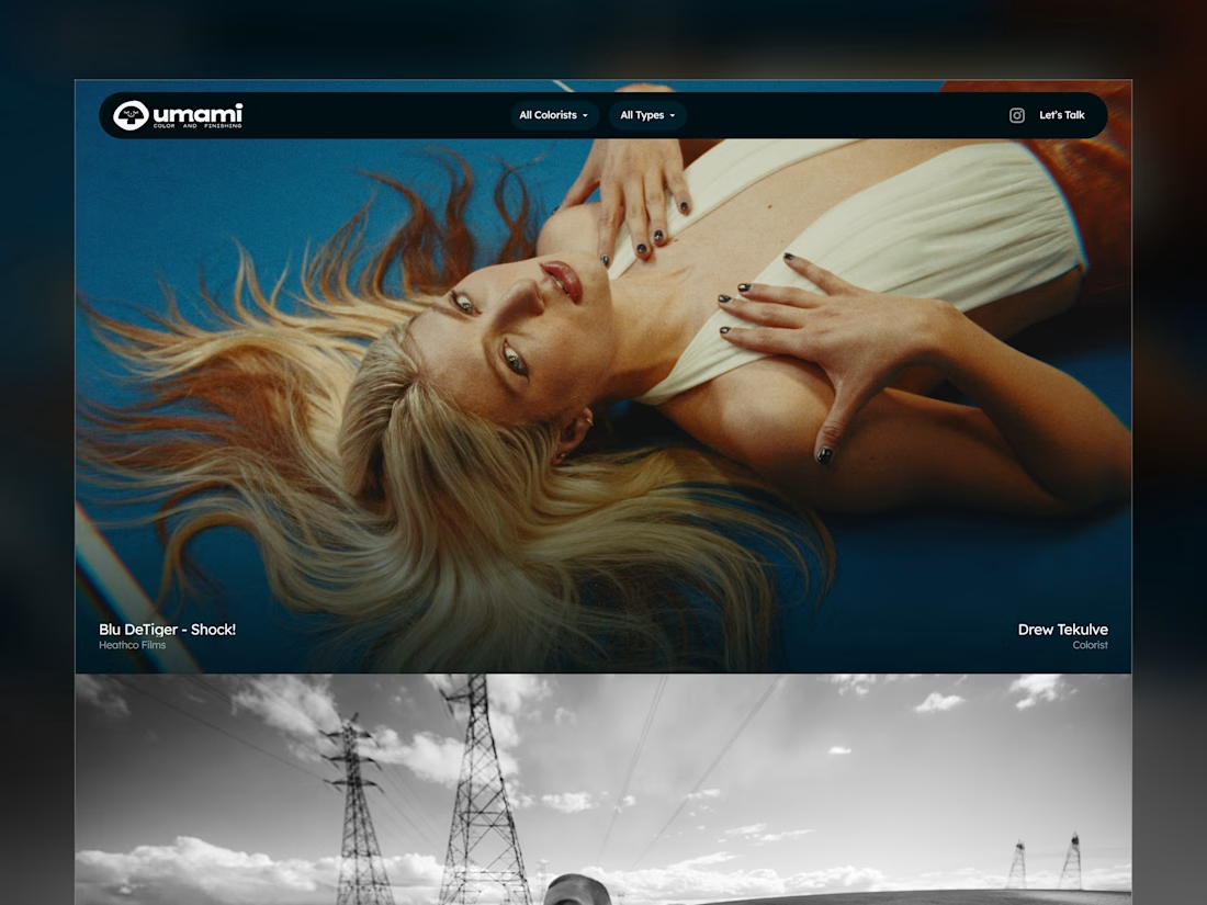
Umami Color & Finishing is an established color-grading studio in LA. Its work and reputation had outgrown its old site, and the studio was ready for one at the level of its work.
I designed and built it around the work itself: every project filterable by type and colorist, and every view with its own link, so the team can send a lead exactly what fits.
Case study
Live site: umamicolor.com


this is amazing work

Brand work for Boofi, DeFi platform
We are working on visual direction, motion and animations


So cute! Love it!

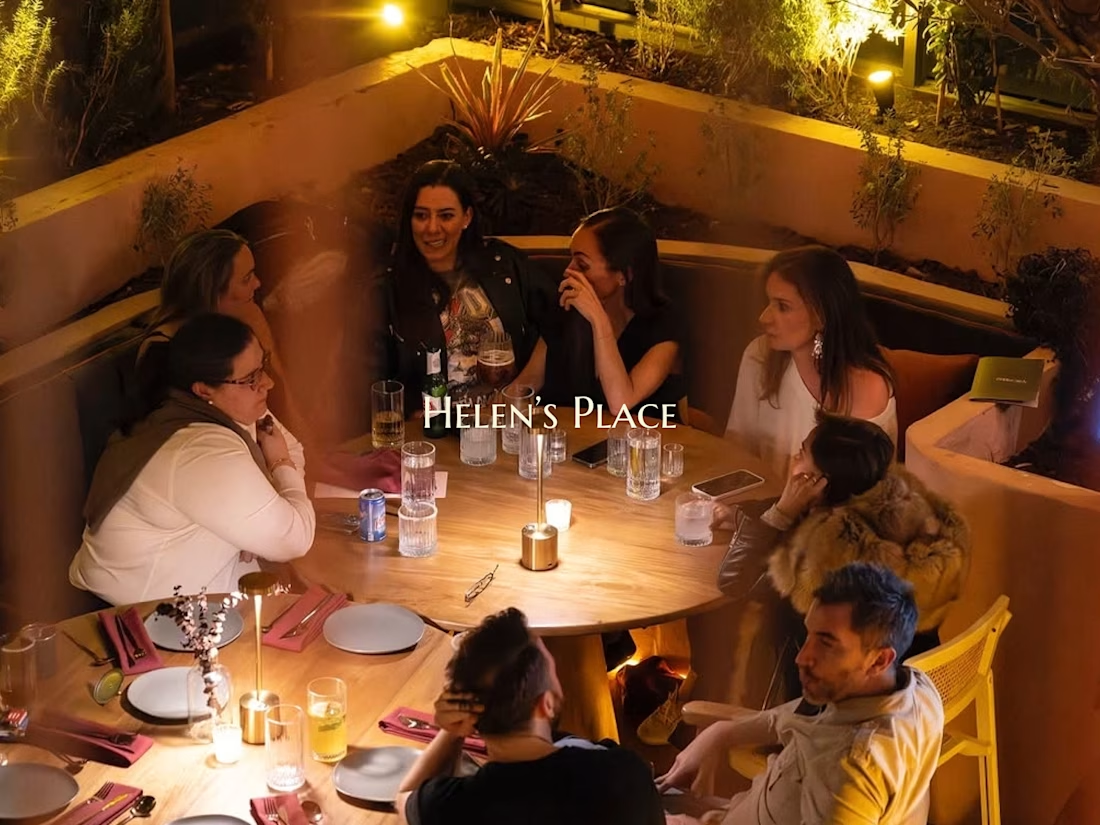
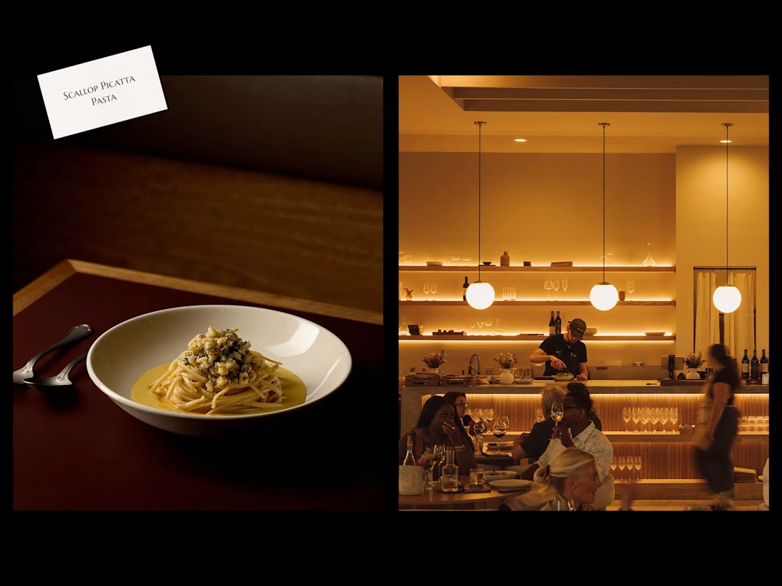
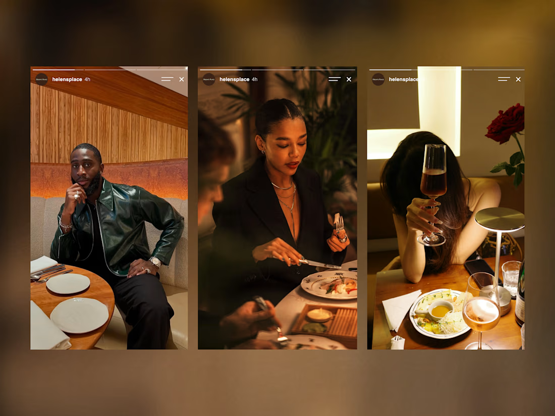
Some meals are about the food. Others are about the people around the table. At Helen’s Place, you get the best of both.
Rooted in the rich culinary traditions of the Mediterranean and Italy, guests enjoy the warm and welcoming ambiance of eating good food with family and friends.
Great food brings you in. The experience is what keeps you coming back.
There’s no place, like Helen’s Place. 🌿
Check it out.

Beautiful work!