
Hoorain Arshad
Branding and Graphic Design


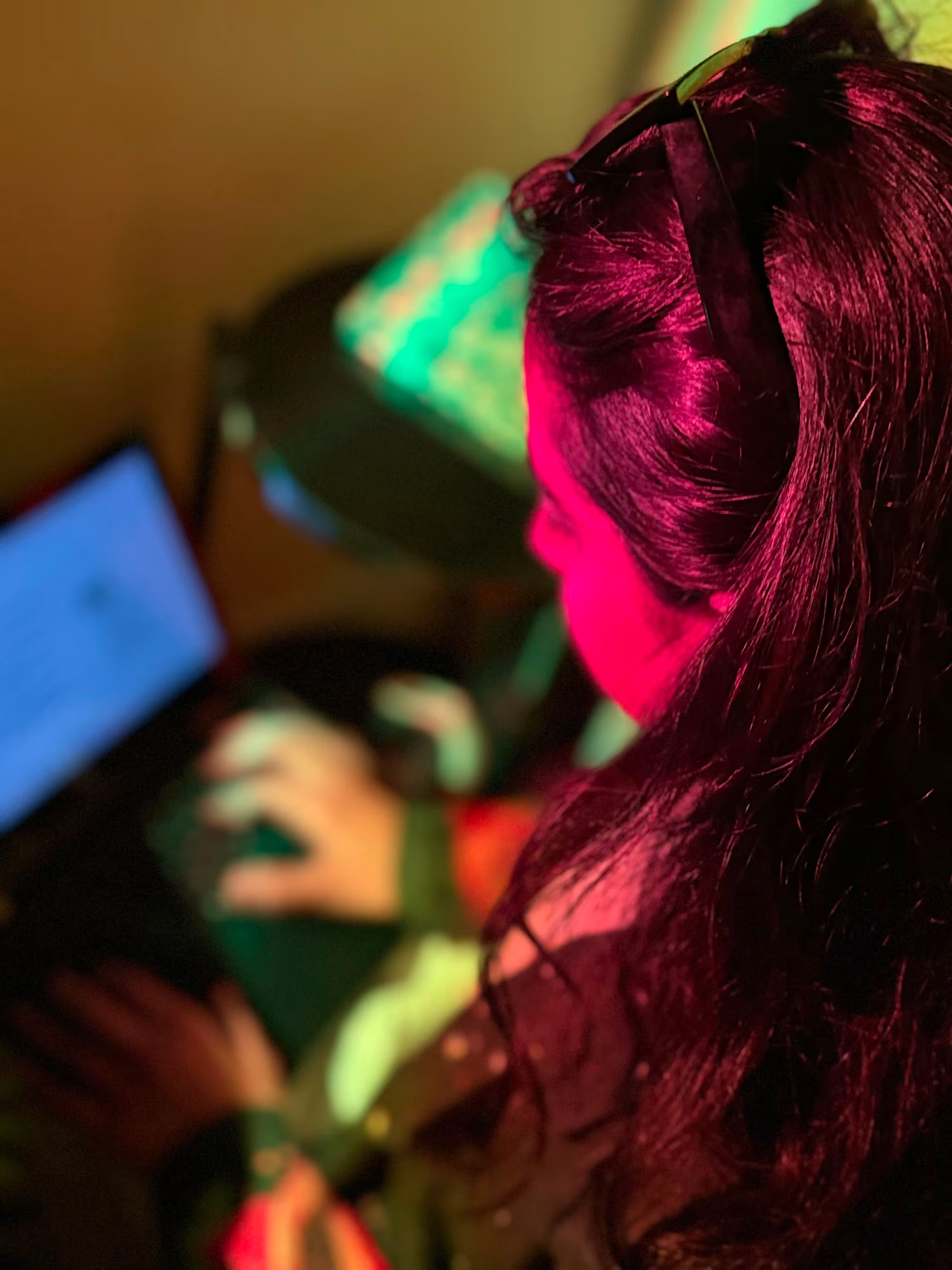
Most cafés are designed for people who want to be seen. I wanted to design one for people who’ve spent years not being seen.
Parents aged 38-52, with kids now grown, spent a decade making everyone else feel looked after. Nobody’s doing that for them anymore.
So the strategy behind Before started with one question: what would it feel like to be taken care of again?
The answer shaped every decision:
→ No clocks. The hourglass became the mark, a reminder that this is time that doesn’t need tracking.
→ Calm palette. Deliberately away from loud café energy and spa-café clichés.
→ A wall of memory and a note on every cup. Small rituals that bring the person back into focus.
Before anyone else, take care of yourself. That’s the whole brand.
Case study below 👇
https://contra.com/p/ZOcEeMYB-before-or-cafe-designed-for-parents?r=hoorain_arshad_h4kb4ubz
#BrandStrategy #BrandIdentity #Branding #CaseStudy
0
70
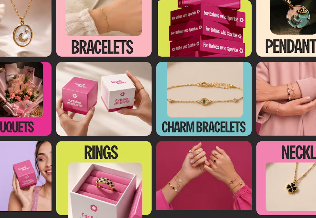
Jewel Babe didn’t need a prettier logo. It needed to know who it was talking to. I started with research into her: a trend-conscious, Pinterest-styled woman who wears jewelry to express herself.
From there I locked the strategy (durability, feminine confidence, affordability, plus a casual, soft, trend-aware voice) before touching a single logo sketch.
The result is a bold pink identity with a new wordmark and symbol, the tagline “For Babes Who Sparkle,” and a system that runs across packaging, print, and social so every touchpoint feels like one brand.
Want an identity built on strategy, not just good looks? Let’s talk.
0
82
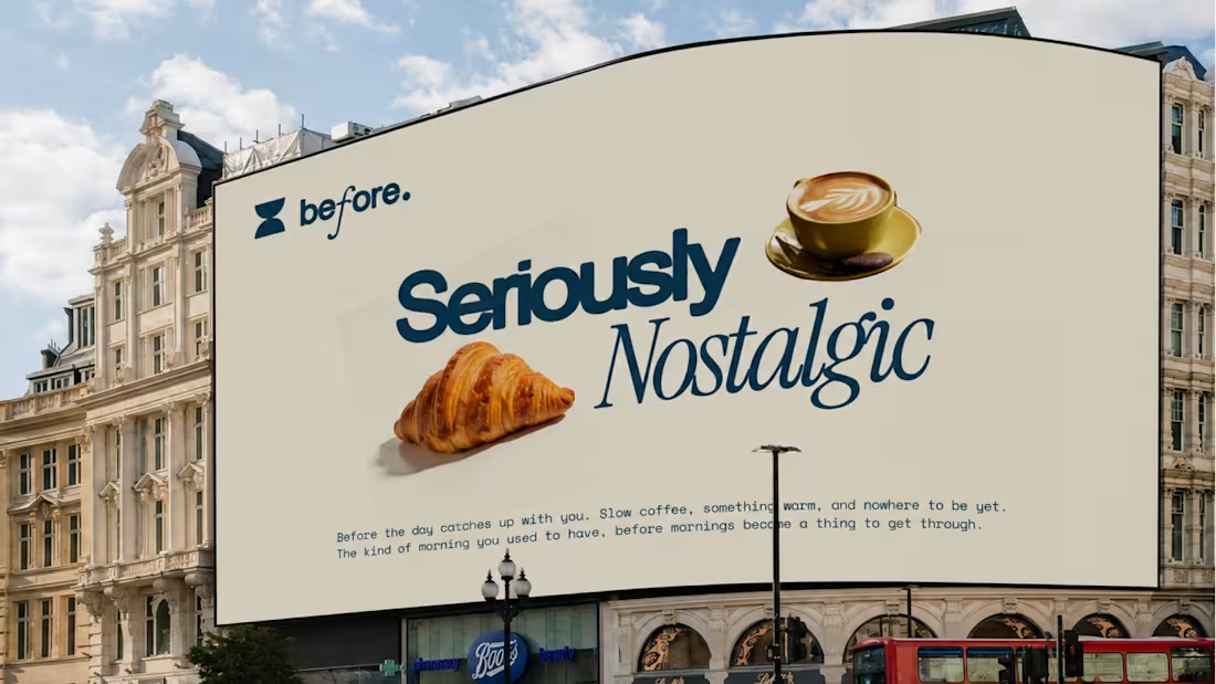
Before | Cafe designed for PARENTS
0
3
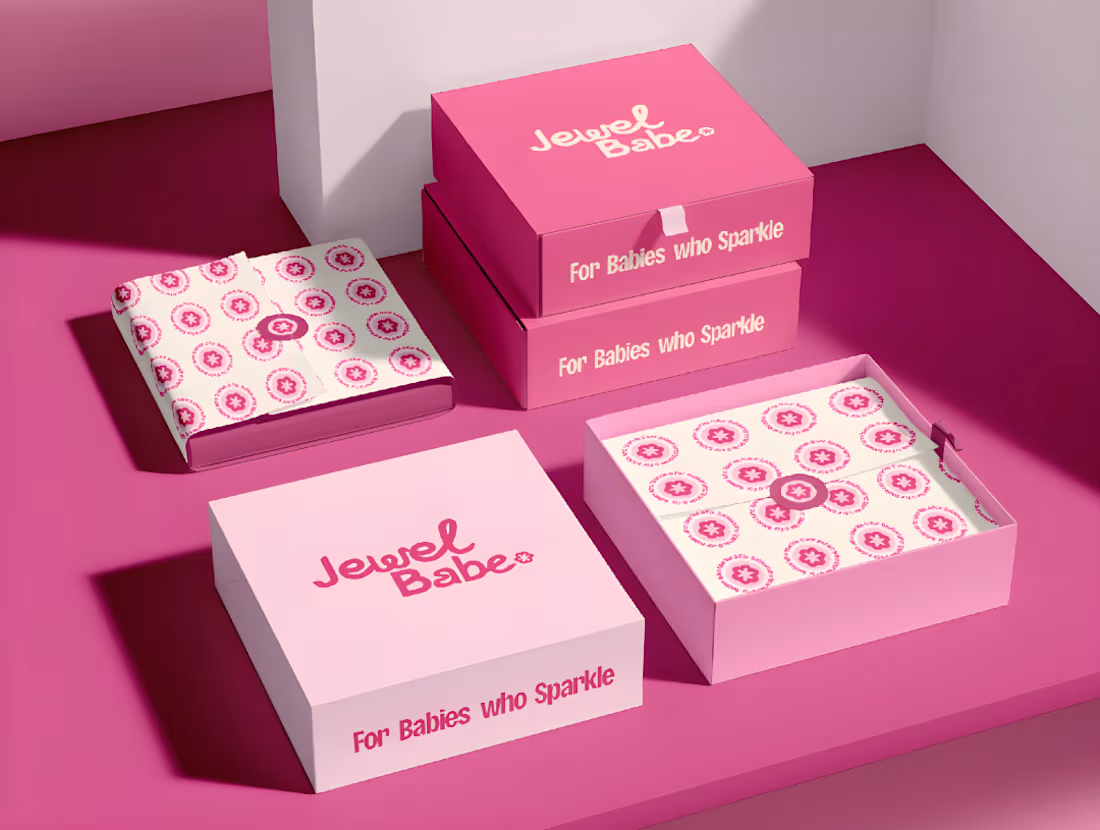
Jewel Babe
0
5