The network for creativity
Join 1.25M professional creatives like you
Connect with clients, get discovered, and run your business 100% commission-free
Creatives on Contra have earned over $150M and we are just getting started
Back to feedPost

Most jewelry brands don’t have a logo problem.
They have a “who is this for?” problem. When KEESA Jewels came to me, the brief was [what they asked for]. But the real issue was "they looked like everyone else in the category"
So before opening Illustrator, I ran Discovery:
→ [Finding about the audience]
→ [Finding about competitors]
→ [Finding about what KEESA could own]
That led to the Direction: [one-sentence positioning].
Then Design:
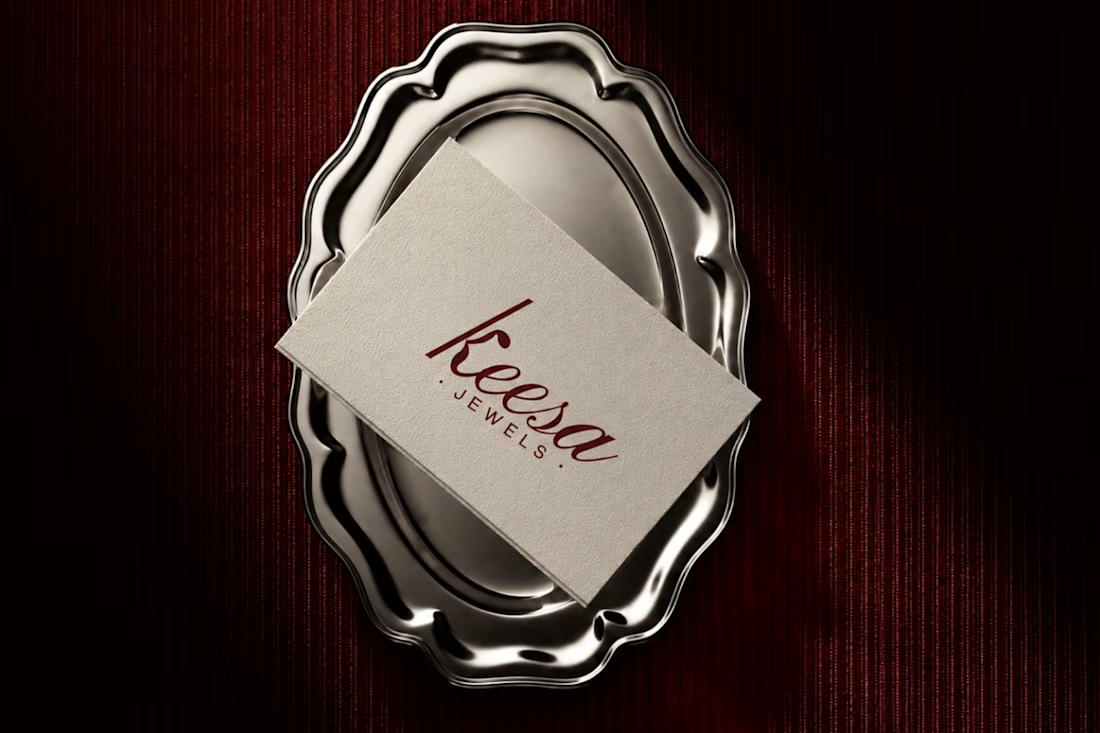
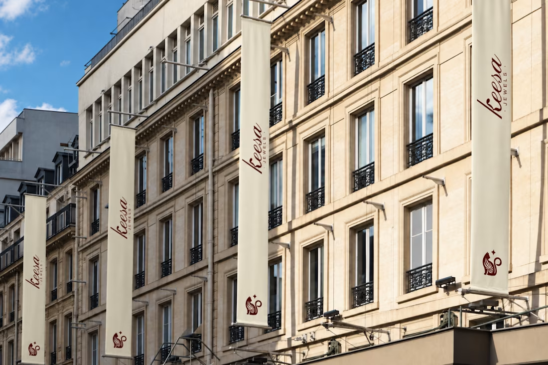
→ The mark: [A poised cat whose tail curls into the curve of the K, with a small star beside it. “Keesa” comes from киса (kisa), Russian for a kitten and a term of endearment, so the cat carries the name’s meaning. Ornamental, not cute.]
→ The palette: [Deep burgundy, warm ivory, and burnished gold. Burgundy brings richness and drama, ivory keeps it light and breathable, and gold carries the jewelry’s glow.]
→ The type: [A high-contrast italic script with the confidence of a serif, with a tall, slanted K as the hero, over widely tracked sans-serif “JEWELS” for structure.]
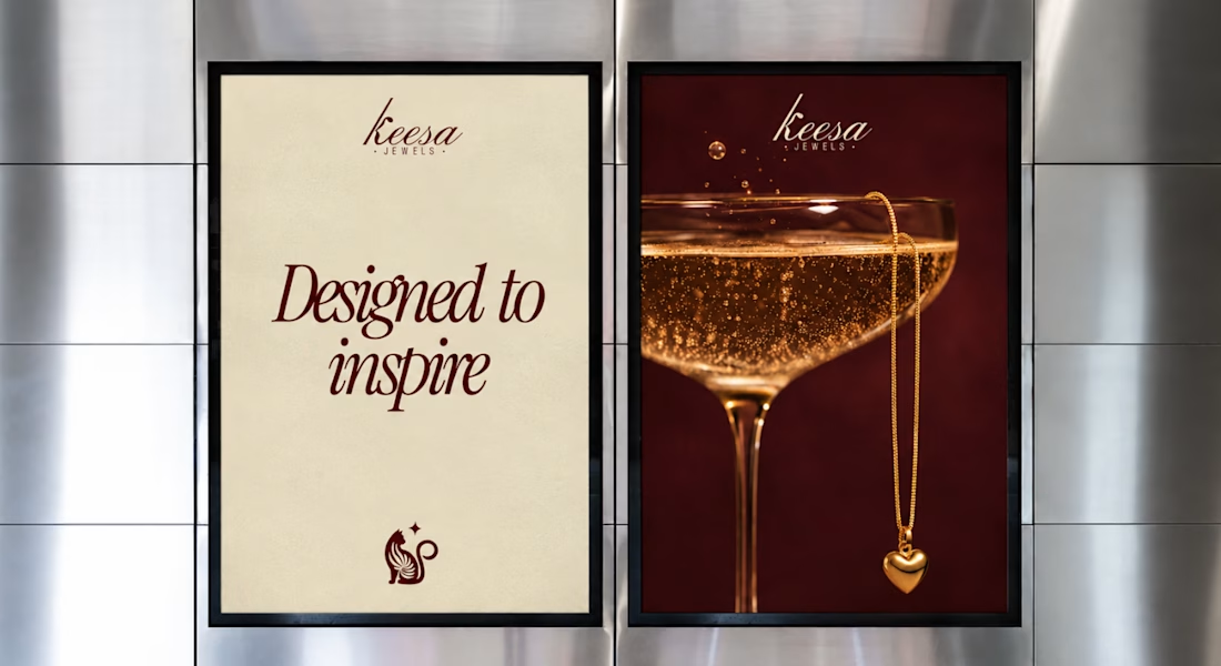
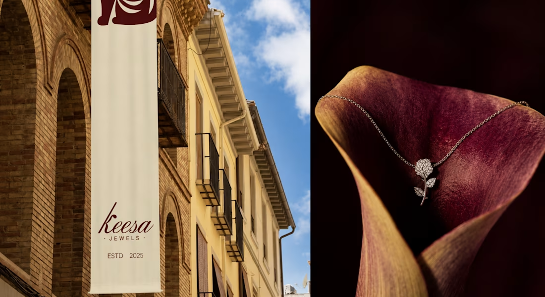
The result is a brand that feels celebratory without being loud, with imagery built from candlelight, champagne, and velvet instead of flat-lay shots, so the jewelry feels like part of a world, not a catalogue.
Full case study on Behance: [CASESTUDY] What’s the one thing a jewelry brand should never compromise on? Tell me below.


The network for creativity
Join 1.25M professional creatives like you
Connect with clients, get discovered, and run your business 100% commission-free
Creatives on Contra have earned over $150M and we are just getting started











Related posts


A Recent Framer-Based Brand Experience for a Real Estate Company


Super clean brand system! 🤌 Love the mint on dark contrast and how the mark works across touchpoints - that ID card mockup is chef's kiss. Great Framer execution for real estate!

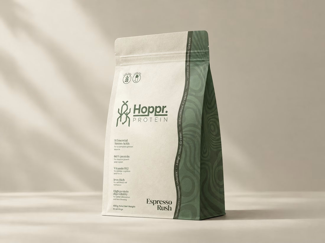
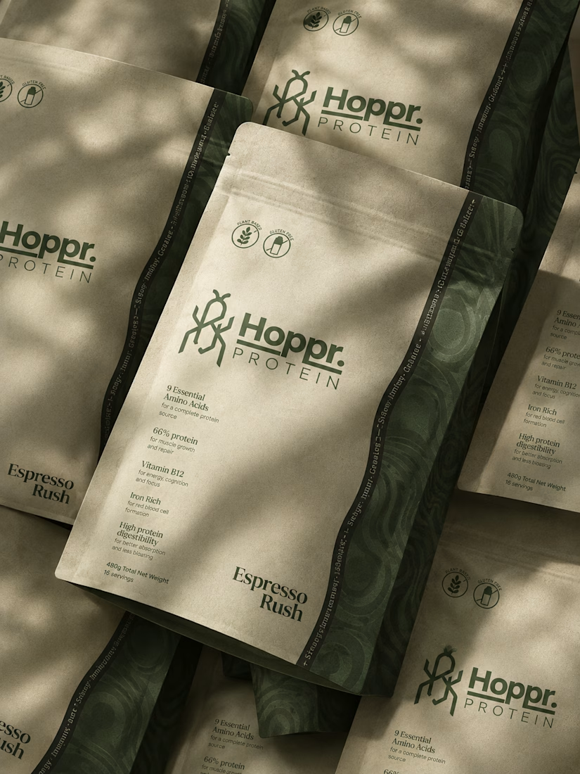
Not every client comes to me for a brand identity and not all my clients are skincare or cosmetic brands.
That was the case with Hoppr, a protein powder brand made from crickets. 🦗 YES, CRICKETS!
Sometimes the logo, colors, and visual system are already there and my job is to bring them to life on packaging and see how far I can push them.
I love projects like this because I get to play with typography, layout, and materials while working within an existing identity.
How much freedom do you think a designer should have when working with an established brand?

Great packaging work, nice job

Santa Monica Tile & Stone E-Commerce Design, 2025.
Buying tile online is mostly guesswork, so I designed a concept store where every page answers one buyer question. Shoppable rooms show how it looks, a coverage calculator tells you how much you need, and free samples let you see it first. Deep green, warm gold, and an AI tile scan that turns inspiration photos into products. Open for e-commerce and web design projects.
Full case study on my Contra Profile

TOP!!


