The network for creativity
Join 1.25M professional creatives like you
Connect with clients, get discovered, and run your business 100% commission-free
Creatives on Contra have earned over $150M and we are just getting started
Back to feedPost

What happens when a brand’s best idea is a hole?
UNDERSTUDY is a theatre identity that opens circles onto doubled eyes, black voids and displaced cheeks, in hot pink Didone on pale sage, with the cast list as texture.
One cut, applied everywhere. Case study live Now.
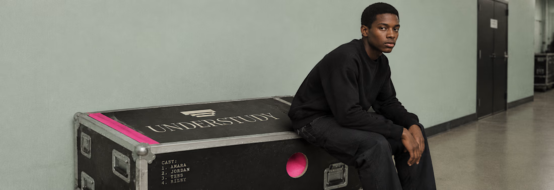

Building a whole identity around a void is a bold call. With the cast list running as texture, how did you keep the circles readable as the hero once it gets down to small formats like tickets or social avatars?

Building a whole identity around a single cut is such a brave constraint, and hot pink Didone on pale sage is a combination I would never have picked on paper but it absolutely works here. Theatre branding this bold deserves a case study.

Great job Revolte🔥🔥
The network for creativity
Join 1.25M professional creatives like you
Connect with clients, get discovered, and run your business 100% commission-free
Creatives on Contra have earned over $150M and we are just getting started








Related posts


Shopping UX hits different when motion meets sound.
Built a fully animated shopping experience prototype with satisfying sound effects for every interaction. Sound ON 🔉

bro this feels so smooth, that sound effect on search is such a nice touch




Super clean work!

Which ZVEZRA logo direction do you prefer? 👀
I’ve been exploring two variations of the wordmark. Both follow the same visual direction, but each has its own character.
Vote below!
I’d love to hear your thoughts! 👇

39 voted
53%
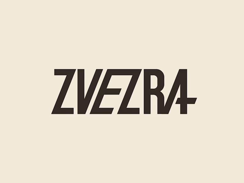
34 voted
47%
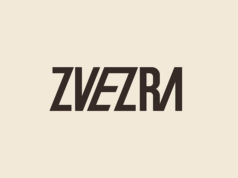
73 votes
Closed

Option 1 for me, it has a bit more personality. Both are strong though, tough call