The network for creativity
Join 1.25M professional creatives like you
Connect with clients, get discovered, and run your business 100% commission-free
Creatives on Contra have earned over $150M and we are just getting started
Back to feedPost
Taste Test
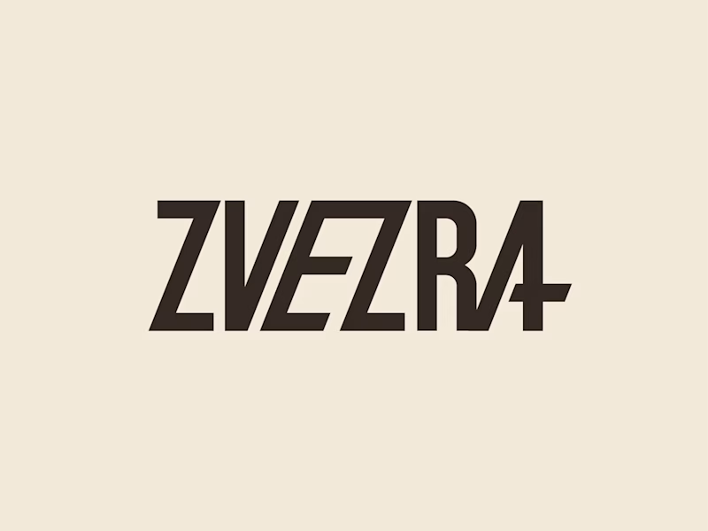
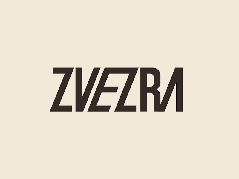
Which ZVEZRA logo direction do you prefer? 👀
I’ve been exploring two variations of the wordmark. Both follow the same visual direction, but each has its own character.
Vote below!
I’d love to hear your thoughts! 👇

22 votes
Ends in 1d

Option 1 is great! It makes the content really easy to read and understand.

Thanks

The first one is 🔥
Thanks

The second one
Thanks

Option 1 for me, it has a bit more personality. Both are strong though, tough call
Thanks

Thanks

First one looks great!
Thanks

I like both and went with 2. The 50/50 vote split is crazy
Thanks)

option 1's A has more of a bold 'pop!' element there, imo.
Thanks

Try this one ❤️
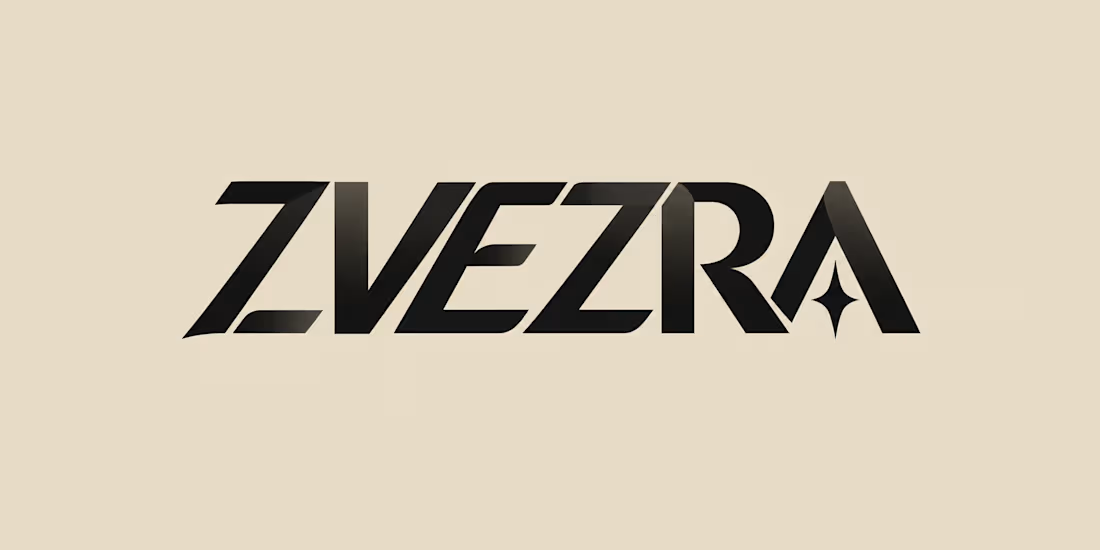

Love this! Both are amazing but Option 1 is calling my name!
The network for creativity
Join 1.25M professional creatives like you
Connect with clients, get discovered, and run your business 100% commission-free
Creatives on Contra have earned over $150M and we are just getting started

Challenges
View all


Related posts


Product first or brand first? 🤔
We're cutting the promo reel for our case study and can't agree on its start. ✨
Which product ad opening would make you stay past the first 3 seconds?
Vote and tell why! 👇
Product DesignSoftware DevelopmentAdobe After EffectsCinema 4DFigmaBrand DesigncreativeaiworkflowUX Design


15 voted
25%
46 voted
75%
61 votes
Closed

I think both is important, but good product first.

Ram Mascot Logo Design



Same course. Same content. But two completely different feelings ✨
Which version would you choose?
27 voted
59%
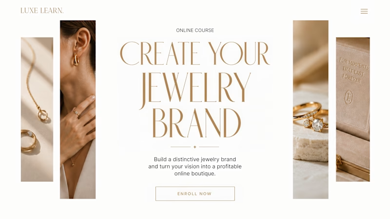
19 voted
41%
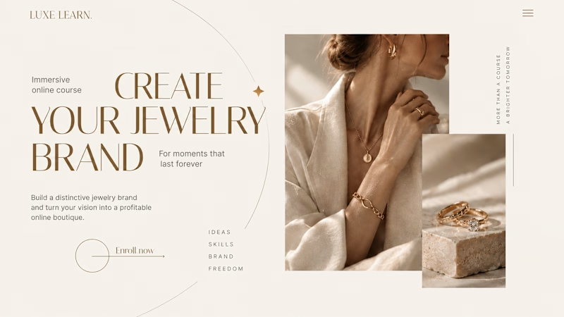
46 votes
Closed

Option 2 is more practical ❤️❤️