The network for creativity
Join 1.25M professional creatives like you
Connect with clients, get discovered, and run your business 100% commission-free
Creatives on Contra have earned over $150M and we are just getting started
Back to feedPost

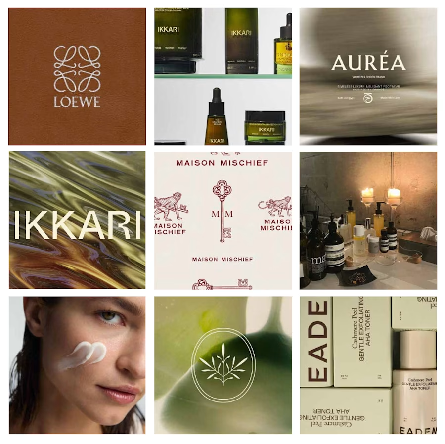
How do you design a skincare brand inspired by olives… without making it look like olive oil? 🤔 🤌🏼 That's the challenge I'm currently working through!
The hero ingredient naturally brings to mind food, kitchens, and grocery shelves. But this brand belongs in a premium skincare space.
So instead of focusing on the fruit itself, I'm exploring the Mediterranean lifestyle, botanical illustrations, tactile packaging, earthy color palettes, and editorial typography to communicate the ingredient without feeling edible.
This project is still a work in progress, but I thought it would be interesting to share the exploration before the final result.
Curious... if you had to communicate olives without illustrating an olive, where would you start?



Love this kind of challenges!
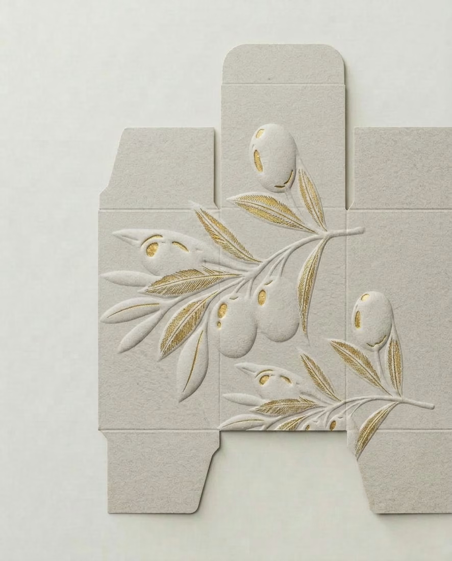
Had some similar problem a while ago😅. I really loved those package design with golden touch. I believe you will achieve your goal that way. I would also try to interpret olive tree. And for the palette, as it is a premium brand, maybe you can use...


I would add a big focus on fonts with a thoughful brand voice, tone & style that describes what the brand is through catchphrases and headlines!

Wowwww, that's already a creative piece of work, Anitaaa

Nice work

Great work

The package design is gorgeous. Is that a velvet-like texture?
Thanks! It's more like a recycled, textured paper!

lovely!

Amazing work Anita

Font speaks more when it comes to something like this


This is such a beautiful work. I believe the end result will be more better than this
Thank you so much!

Nice

The trap is signalling olive five different ways at once. Pick one cue and hold it. Lean into the botanical and skin-nourishment side rather than the culinary one, since the oil association lives in the kitchen, not on skin. What palette are you testing, muted greens or something warmer?
I actually love the neutral tones with the golden accents!

super cleann

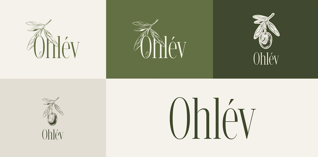
The direction you landed on with Ohlév is the right call. Leaning into the botanical illustration and that deep forest green pulls the olive reference into something that reads as ritual and luxury rather than pantry. The wordmark feels refined too.
Thank you so much!

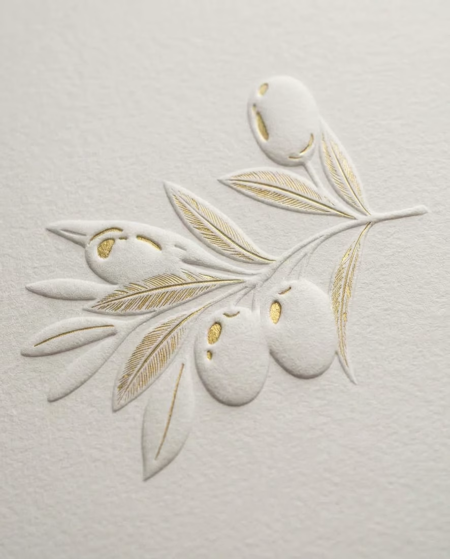
Nicee! that embossed effect of illustrative mark on packaging is so clever. Love it.
Thank you so much!


Great Work


This looks nice

I like it🙂

Amazing!

Wow, awesome!
Thanks!

so clean work

Great attention to spacing and composition.


Nice one

Cool🙌

Amazing

Amazing work, Anita!!


Nice work Anita


This is perfect for https://contra.com/community/topic/envatochallenge/guidelines !
The network for creativity
Join 1.25M professional creatives like you
Connect with clients, get discovered, and run your business 100% commission-free
Creatives on Contra have earned over $150M and we are just getting started

Trending

Claude
Claude has entered the design space. How are you using it?

Contra University
Learn from expert creatives how to earn more using next-gen AI tools.
Brand Design
The best brand designers are on Contra. Scroll to see what's trending in brand design. What are you building?
creativeaiflow
Creative AI workflows are evolving. What tools do you use, and what are their strengths and weaknesses?
freelancerlife
Freelancer life is wins, pivots, and everything in between. What’s yours right now?






Related posts

Skincare branding has one job: make the product feel like it belongs on a shelf someone actually aspires to own.
Serix was built around that standard. A crown mark that communicates premium without being precious. A wordmark bold enough to own a bottle, a social post, and a storefront simultaneously. And a color system that refuses to pick just one mood coral texture, lime green energy, navy depth, and gold luxury all living inside the same identity without contradiction.
"Because your skin deserves the best." "Luxury care, effortless glow." "The secret to timeless beauty." The brand voice was written alongside the visual system, with each line considered as the palette it sits on.
From product packaging to Instagram content, every touchpoint was designed to feel consistent without feeling repetitive. That's the real test of a brand system.
Exquisite. Sophisticated. Premium. Serene. The keyword tags say it best.
Does this feel like a skincare brand worth trusting with your skin? 👇
Designed by :- Orbix Studio
Tools: Figma · Illustrator · jitter
#BrandIdentity #SkincareDesign #PackagingDesign #LogoDesign #BeautyBranding #ContraFreelance #BrandDesign #VisualIdentity


Amazing Branding ✨


AI built the foundation. Human instinct built the brand. 🏛️✨
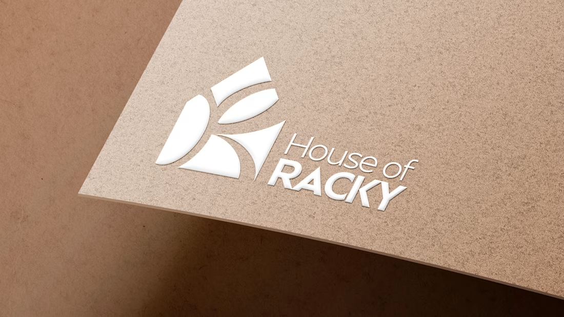
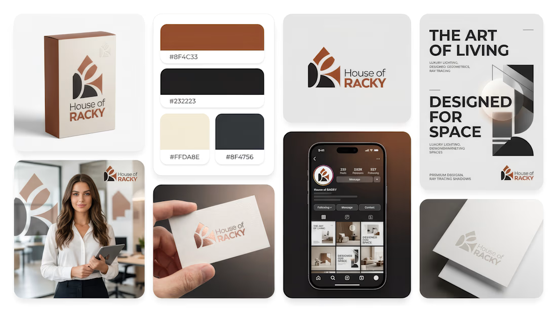
Reposting my submission for the #envatochallenge: a complete luxury visual identity and promo for House of Racky.
As a brand designer and video editor, I used @envato as my primary toolkit to explore what happens when AI speed meets human taste.
The "Human by Design" Pivot:
While AI generated the initial abstract shapes, the raw output lacked soul, structural balance, and usable typography. I stepped in as the director—stripping out the cold machine layout, manually rebuilding the geometric logo grid in Illustrator, and pairing it with a high-prestige typography system to create real emotional connection.
From there, I brought the identity to life using Envato Elements for cinematic stock B-roll, realistic mockups, and layered sound design.
AI is the spark, but human taste is the fire. 🔥
@envato @envatotuts
#envatochallenge #humanbydesign #houseofracky #brandidentity #videoediting #logodesign #motiongraphics #graphicdesign

Envato AI gave me a house. It took human instinct to turn it into a home.
For the #envatochallenge, I wanted to put the "Human by Design" philosophy to the test by creating a complete premium brand identity for House of Racky.
My goal was to use Envato’s creative toolkit to push...


Keep it up and please share the completed version when it's done @Daniel G Bright