The network for creativity
Join 1.25M professional creatives like you
Connect with clients, get discovered, and run your business 100% commission-free
Creatives on Contra have earned over $150M and we are just getting started
Back to feedPost

How do you design a skincare brand inspired by olives… without making it look like olive oil? 🤔 🤌🏼 That's the challenge I'm currently working through!
The hero ingredient naturally brings to mind food, kitchens, and grocery shelves. But this brand belongs in a premium skincare space.
So instead of focusing on the fruit itself, I'm exploring the Mediterranean lifestyle, botanical illustrations, tactile packaging, earthy color palettes, and editorial typography to communicate the ingredient without feeling edible.
This project is still a work in progress, but I thought it would be interesting to share the exploration before the final result.
Curious... if you had to communicate olives without illustrating an olive, where would you start?


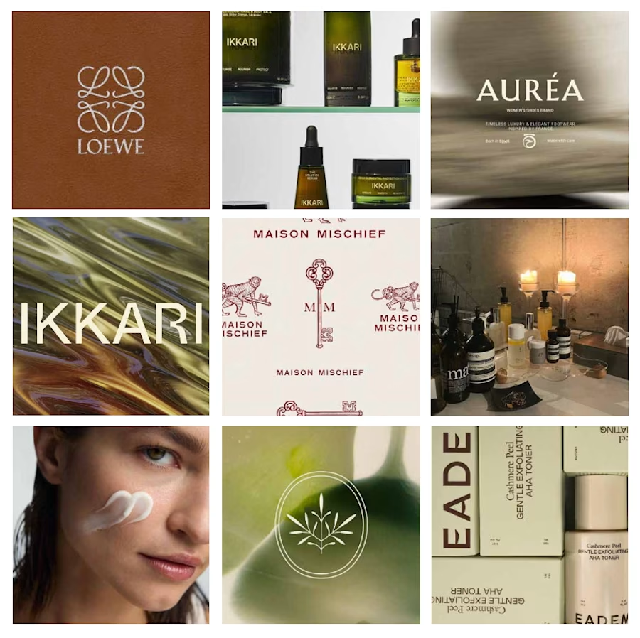


I would add a big focus on fonts with a thoughful brand voice, tone & style that describes what the brand is through catchphrases and headlines!

Wowwww, that's already a creative piece of work, Anitaaa

Nice work

Great work

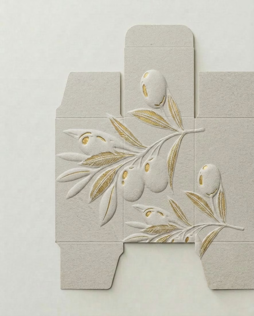
The package design is gorgeous. Is that a velvet-like texture?
Thanks! It's more like a recycled, textured paper!

lovely!

Amazing work Anita

Font speaks more when it comes to something like this


This is such a beautiful work. I believe the end result will be more better than this
Thank you so much!

The trap is signalling olive five different ways at once. Pick one cue and hold it. Lean into the botanical and skin-nourishment side rather than the culinary one, since the oil association lives in the kitchen, not on skin. What palette are you testing, muted greens or something warmer?
I actually love the neutral tones with the golden accents!

super cleann

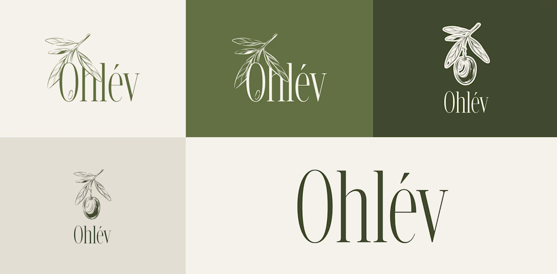
The direction you landed on with Ohlév is the right call. Leaning into the botanical illustration and that deep forest green pulls the olive reference into something that reads as ritual and luxury rather than pantry. The wordmark feels refined too.
Thank you so much!

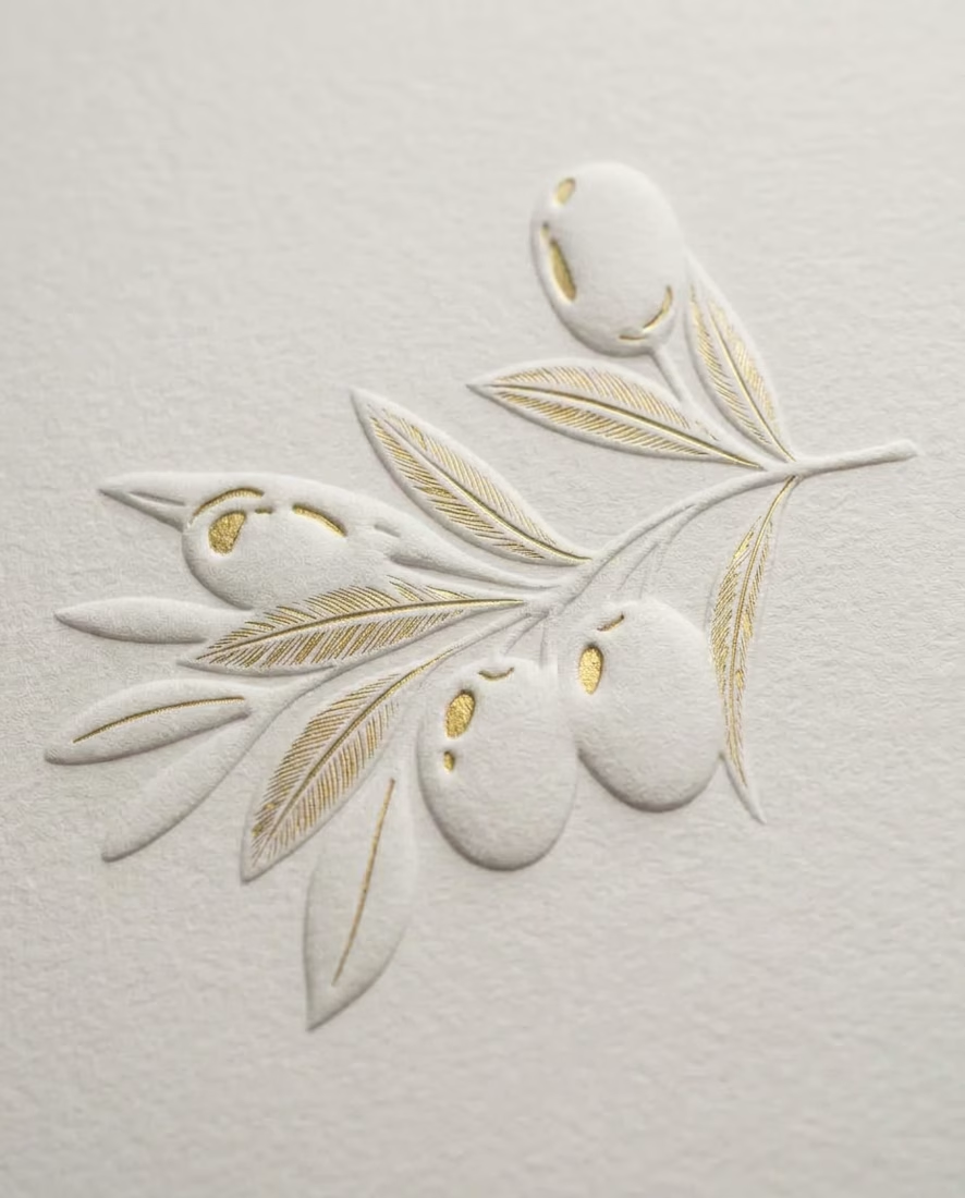
Nicee! that embossed effect of illustrative mark on packaging is so clever. Love it.
Thank you so much!


Great Work


This looks nice

I like it🙂

Amazing!

Wow, awesome!
Thanks!

so clean work


Nice one

Cool🙌

Love this kind of challenges!
Had some similar problem a while ago😅. I really loved those package design with golden touch. I believe you will achieve your goal that way. I would also try to interpret olive tree. And for the palette, as it is a premium brand, maybe you can use...

Amazing work, Anita!!


Nice work Anita


This is perfect for https://contra.com/community/topic/envatochallenge/guidelines !


Ohhhhh, I saw this work on Behance and I liked it immediately… it’s really wonderful work
The network for creativity
Join 1.25M professional creatives like you
Connect with clients, get discovered, and run your business 100% commission-free
Creatives on Contra have earned over $150M and we are just getting started







Related posts

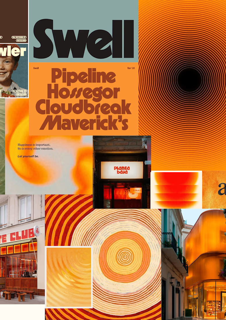
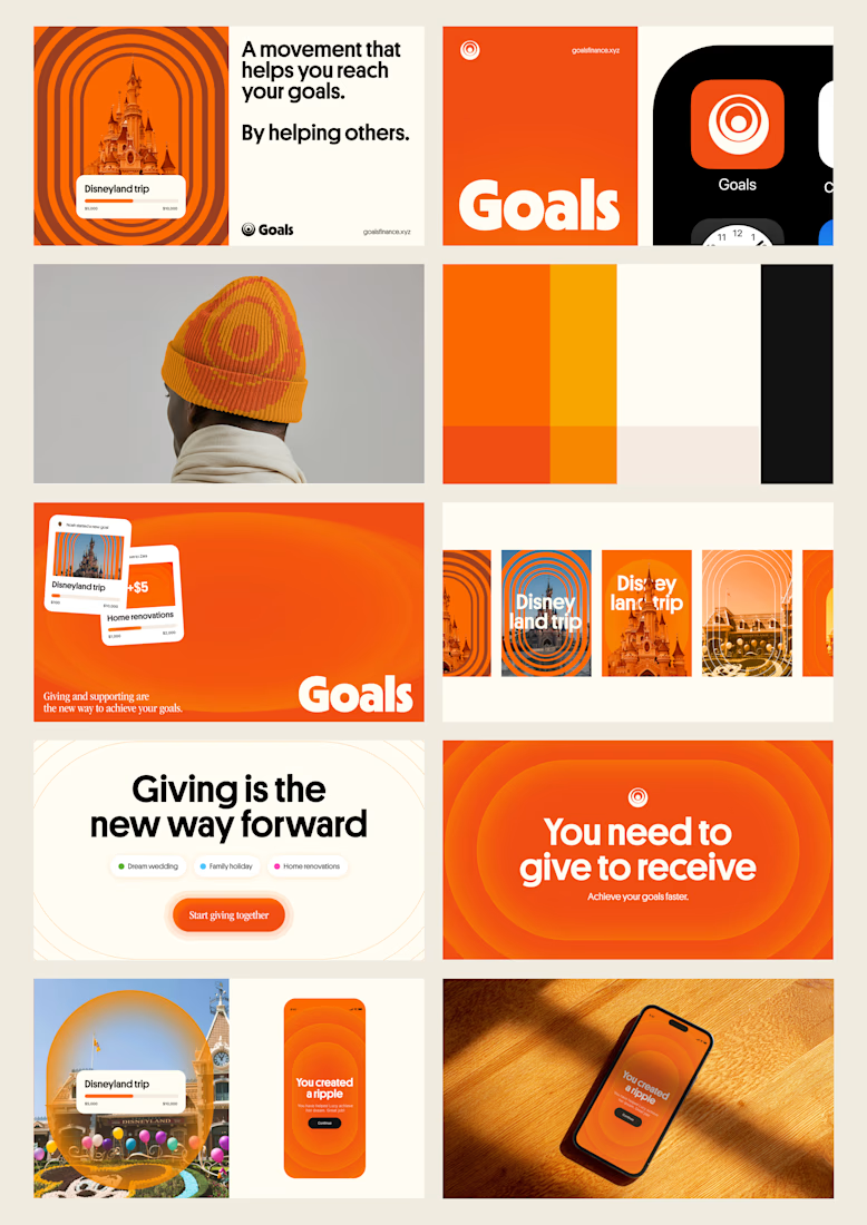
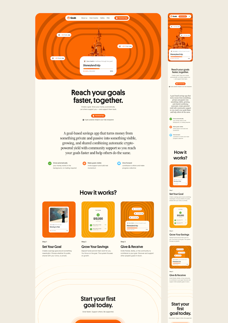
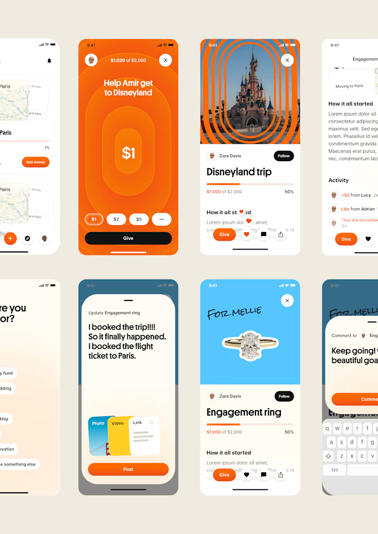
one of my favourite things about running a one-person studio is that nothing gets lost in translation.
the idea behind the brand is the same idea that shapes the website and the product.
no handovers, no starting from scratch, no trying to explain the vision to someone new.
a little look at how that came together for goals, from the first moodboard to the app ↓

Love it!

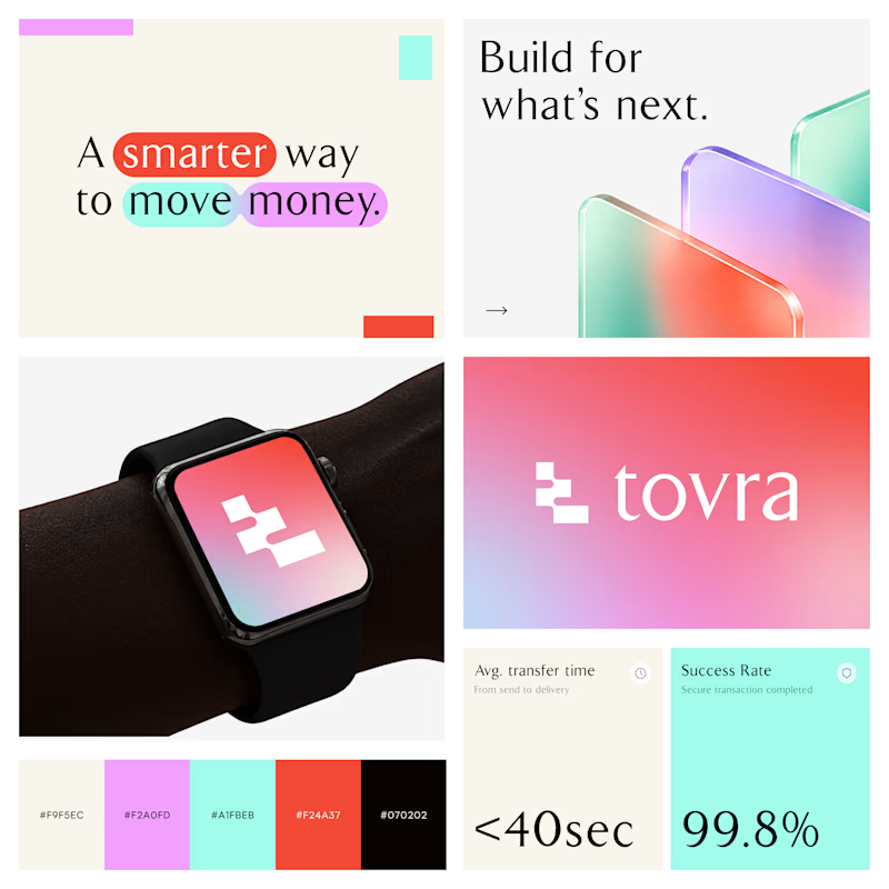
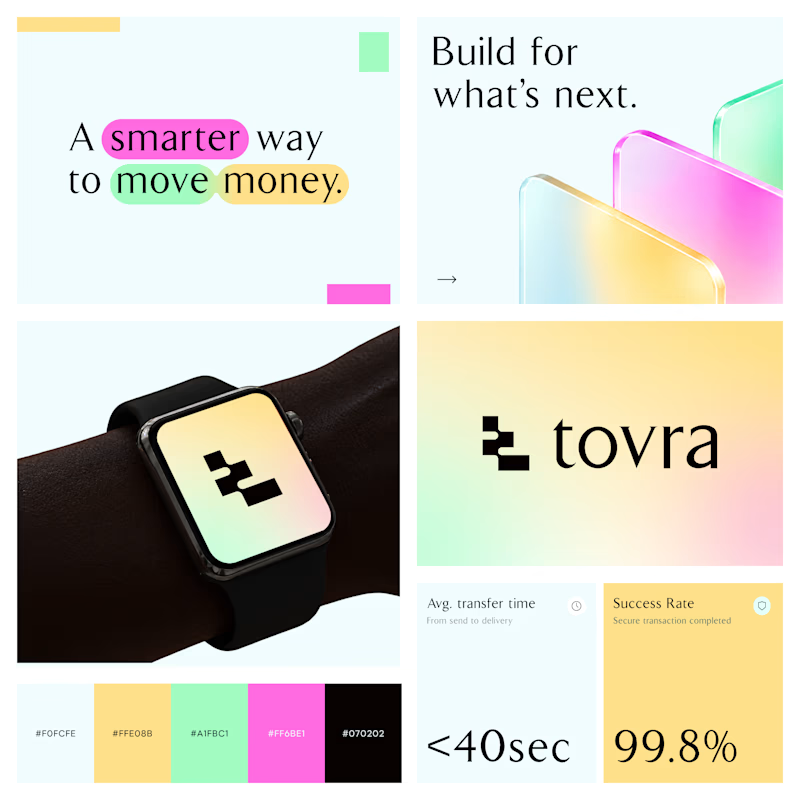
Two Color Directions. One Brand Identity.
Exploring two visual directions for Toyra, a modern fintech brand focused on making money movement smarter and simpler.
Both concepts feature bold typography, vibrant colors, playful gradients, and a clean visual identity.
Which color direction works better for Brand Option A or Option B? 👀
19 voted
40%
29 voted
60%
48 votes
Closed


Real eggs. No apologies 🥚
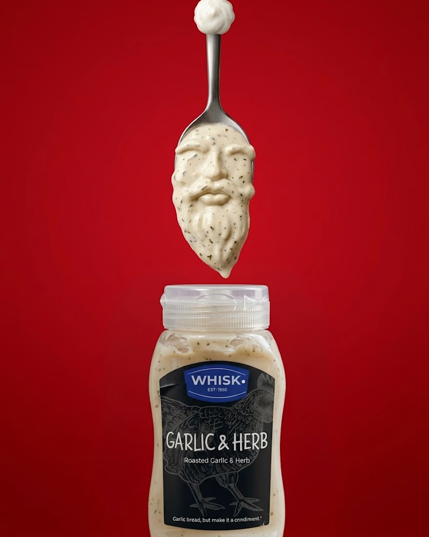
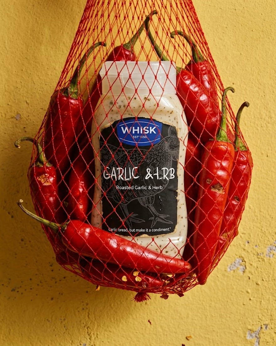
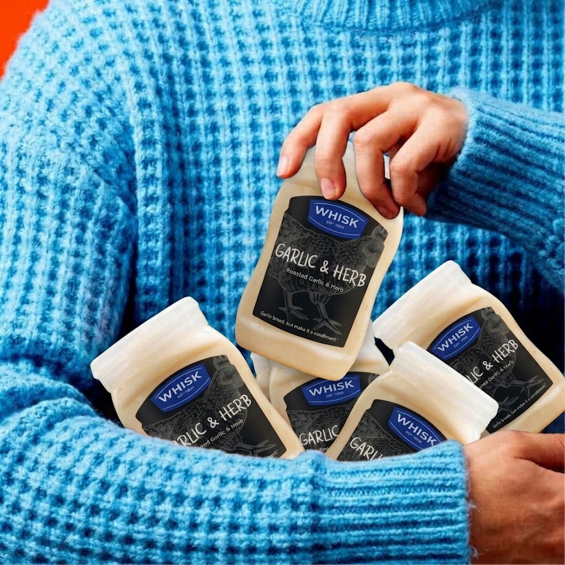
Spent the past week designing WHISK, an artisan mayonnaise brand built on one idea: even the most overlooked item in the fridge deserves a brand that takes it seriously.
No squeeze bottle, no label built to disappear into the shelf. Just a glass jar, a short ingredient list, and four flavors told apart by one accent color each. Classic, garlic and herb, smoked chili, vegan. 🫙
Sometimes the boldest thing a condiment can do is be particular about itself.



The animation looks top tier! Nice work