Built Skin Diary ,a daily photo and product log that lets people with reactive skin actually see the connection between what they used and how their skin responded, instead of guessing after the fact.
The app has 5 connected screens: a daily check-in with mood tags and a product checklist, a photo timeline showing skin condition day by day, a detailed entry view for each day, a product log to track what's in rotation, and an Insights screen that automatically flags patterns , like "reactive days often follow Vitamin C Serum use."
Went from a single prompt to a full working, clickable prototype with a consistent design system across every screen , genuinely fast and intuitive to build with Flowstep.
Prototype: https://app.flowstep.ai/file?activeFileId=d680ab79-5836-4961-9405-5169d2b32270
(https://app.flowstep.ai/file?activeFileId=d680ab79-5836-4961-9405-5169d2b32270)Posted: https://x.com/isabellaguran/status/2080252853621346665?s=20
3
341
Not every website needs to be complicated. CHROMA Hair Studio proves a focused idea, built with intention, beats a crowded one every time.
CHROMA Hair Studio is a hair salon site built around one focused idea: blonde, done right. Not a long menu trying to be everything to everyone, just precision color, real technique, and a brand built entirely on that specialty. For a hair salon, that clarity matters more than flash, clients want to know immediately that this is the place that gets their exact shade right.
Every image and video was AI generated using Kling, then refined in Photoshop, styled to feel like one cohesive editorial shoot rather than stock photography. The palette is lavender and deep plum, bold and feminine without losing polish. A custom serif headline font gives it an editorial voice instead of a templated one.
How Finish Layer was used:
Font Uploads gave the headlines their own identity, a custom typeface instead of a default.
Block Animations bring the homepage and services pages to life on scroll and hover, so the site feels considered rather than static.
Block Transforms rotate the hero image slightly off axis, a small deliberate break from the grid that matches the brand's confidence.
Stacks keep the services menu and booking flow aligned and legible on any screen size.
Link to website (with password):
mandolin-porpoise-a3x9.squarespace.com
(http://mandolin-porpoise-a3x9.squarespace.com)password: chroma2026
Social post link:
https://x.com/isabellaguran/status/2079905886336635378?s=20
6
357
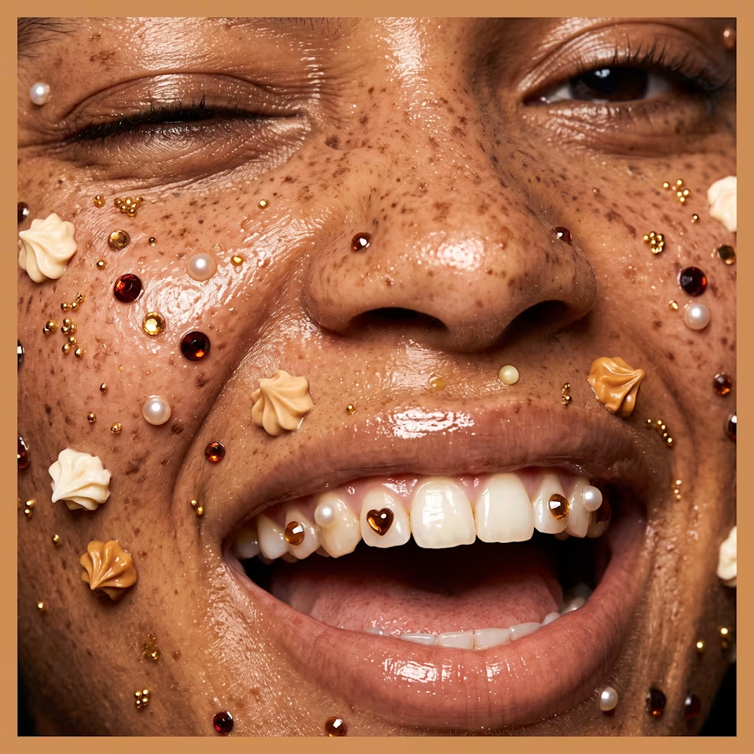
I built an amber glass beauty campaign for the Envato Human by Design Challenge.
I started with a concept and a moodboard: warm, honeyed light, skin and jewelry glowing in gold. Then I went into Envato Elements. From Photos, I picked amber glass and honey textures. From Fonts, I chose Royalford and Garolia. I skipped anything too metallic, I wanted glass, not chrome.
Next, I generated my images with Midjourney. My first results looked warm, but generic, just a sunset filter. That was my human moment. I knew it wasn't right, so I changed my prompt. I asked for light passing through glass, in stripes, onto skin. That gave me the image that actually worked.
I brought my favorite images into Photoshop. I layered the Envato textures on top, added my Envato font, Royalford, as the campaign titles, and built each image like a real campaign page.
For the final video, I used Kling to bring the stills to life, then edited everything together in Adobe Premiere Pro, scored with Music from Envato, "Golden Hour" by Bransboynd.
You can also see it on X : https://x.com/isabellaguran/status/2078906637629210958?s=20
This is Amber Fine Jewelery. Human ideas. AI help. Human choices.
#envatochallenge
BLUE VALENTINE // Editorial Campaign
A bold intersection of pop-art surrealism, retro nostalgia, and modern visual architecture. This campaign concept explores monochromatic saturation, using vibrant cobalt and sky blues contrasted against sharp electric-lime transparency. Built around themes of connection, playful detachment, and sculptural shapes, from oversized metallic hearts to exaggerated avant-garde footwear, the project redefines classic romantic imagery through a high-fashion, high-energy lens.
Creative Direction & Visual Styling: Isabella Guran
Core Themes: Pop-Art Surrealism, Retro-Modernism, Editorial Fashion Campaigns
Color Palette: Cobalt Blue, Electric Lime, Alabaster White
0
185
BLEU CÉLESTE // Video Concept
A surrealist exploration of texture, contrast, and digital realism in high-fashion beauty. This AI-generated visual concept centers on a striking, electric cobalt focal point, seamlessly blending the organic softness of white floral elements with hyper-precise, avant-garde makeup design. Built as an intimate, macro-focused narrative, the piece showcases the power of generative AI in translating complex textures, from the thick, sculptural viscosity of the mascara formula to the flawless, dewy realism of the skin and the delicate veins of a calla lily.
"Bleu Céleste" leverages AI to expand the boundaries of traditional beauty campaigns, offering a flawless, hyper-real lens where technology meets "silent luxury" editorial aesthetics.
4
194
THE BLUE SHIFT — An Editorial Campaign
0
195
OCEAN DRIVE: The Aquarium Tote Concept
An exploration of coastal luxury, surreal transparency, and footwear design.
2
201
Rack ’Em Up: A Polka Dot Playbook
In this creative exploration, I take the classic sophistication of navy polka dots and throw them into the high-stakes environment of a billiards hall. This project explores the balance between the soft, fabric textures of a luxury handbag and the hard, polished surfaces of billiard balls. It’s a game of style where every detail is perfectly racked.
1
169
SWEET STEP: The Sugar-Coated Platform.
This project explores the delicious boundary between luxury footwear and culinary art. Inspired by the nostalgia of pastel bakery treats, soft-serve ice cream, and childhood sprinkles, Sweet Step reimagines the classic platform heel as a decadent dessert.
With a metallic gold base, a stacked "macaron" heel in soft pastel shades, and a generous dollop of whipped cream, this shoe isn't just an accessory, it's a sensory experience.