The network for creativity
Join 1.25M professional creatives like you
Connect with clients, get discovered, and run your business 100% commission-free
Creatives on Contra have earned over $150M and we are just getting started
Back to feedPost

How do you design a skincare brand inspired by olives… without making it look like olive oil? 🤔 🤌🏼 That's the challenge I'm currently working through!
The hero ingredient naturally brings to mind food, kitchens, and grocery shelves. But this brand belongs in a premium skincare space.
So instead of focusing on the fruit itself, I'm exploring the Mediterranean lifestyle, botanical illustrations, tactile packaging, earthy color palettes, and editorial typography to communicate the ingredient without feeling edible.
This project is still a work in progress, but I thought it would be interesting to share the exploration before the final result.
Curious... if you had to communicate olives without illustrating an olive, where would you start?


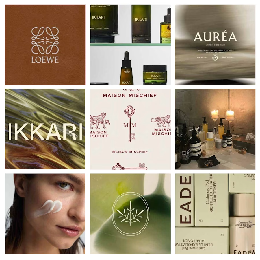
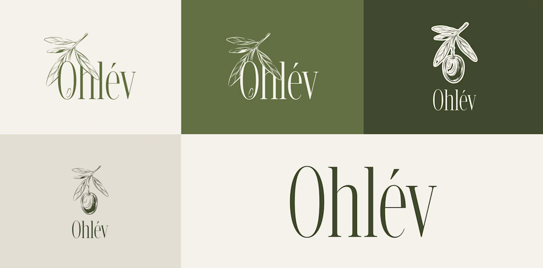
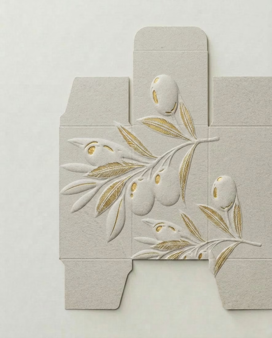
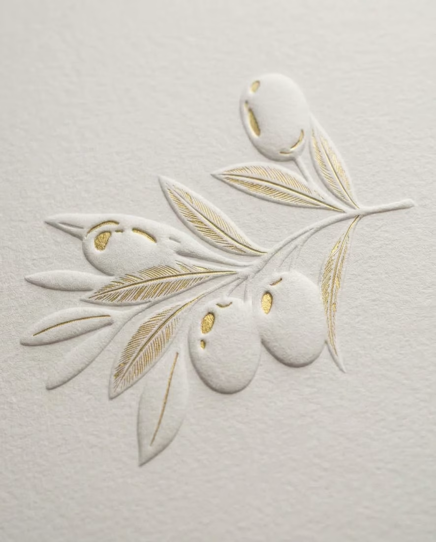


I would add a big focus on fonts with a thoughful brand voice, tone & style that describes what the brand is through catchphrases and headlines!
The network for creativity
Join 1.25M professional creatives like you
Connect with clients, get discovered, and run your business 100% commission-free
Creatives on Contra have earned over $150M and we are just getting started
Related posts

Kalise, Premium Social Media Campaign
Designed a premium social media campaign for Kalise to elevate its brand presence and promote its Vitamin C Hair Serum through elegant visual storytelling. The campaign combined product-focused creatives, educational content, and lifestyle imagery to communicate the serum's benefits while reinforcing a clean, science-backed, and luxurious brand identity.
Role: UI/Visual Designer
Deliverables: Social media campaign, Instagram creatives, product advertisements, educational carousel, visual branding assets
Tools: Figma, Adobe Photoshop
Goal: Build a premium brand presence and create high-converting social media assets that educate customers, showcase the product's benefits, and maintain a cohesive visual identity.


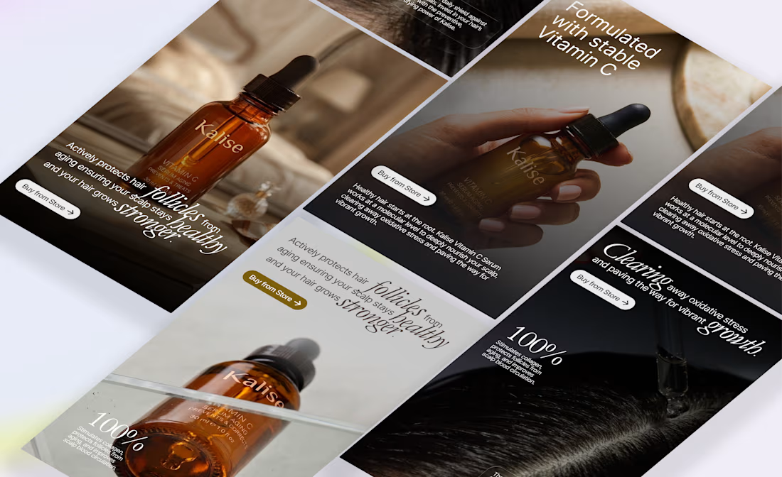
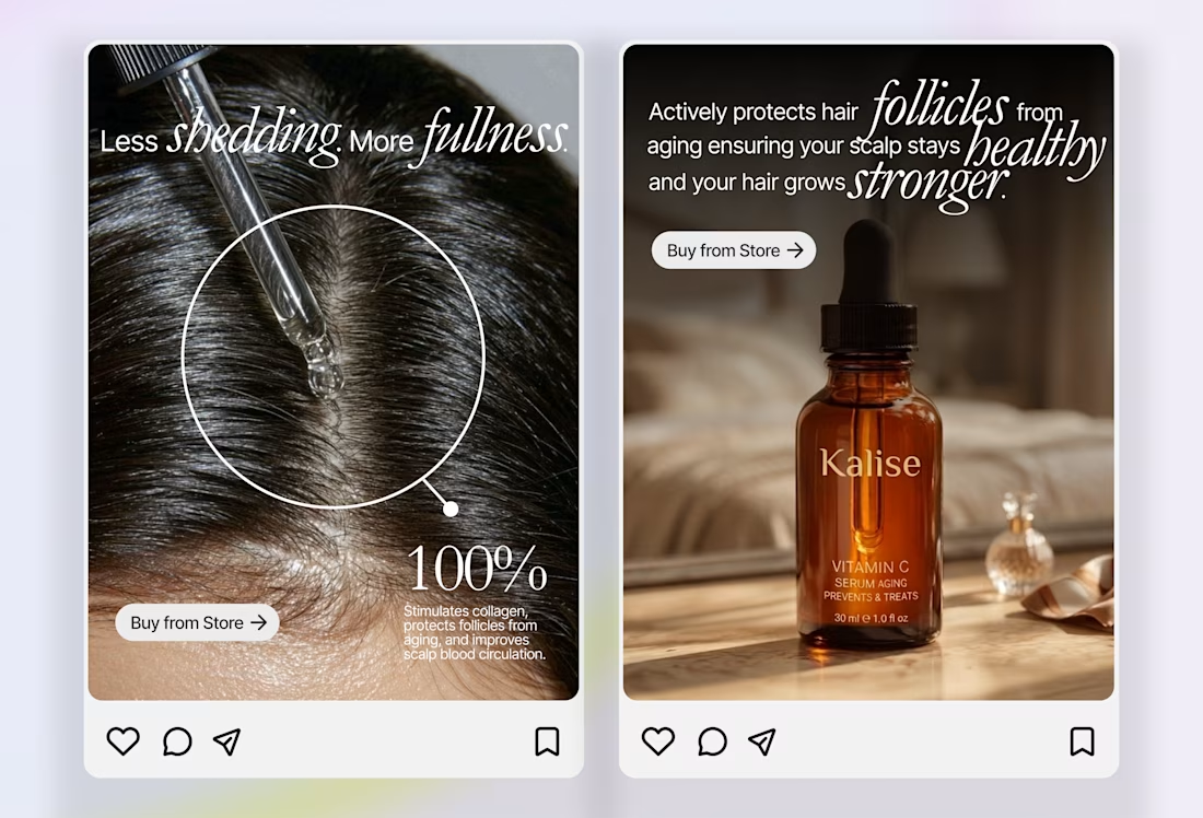
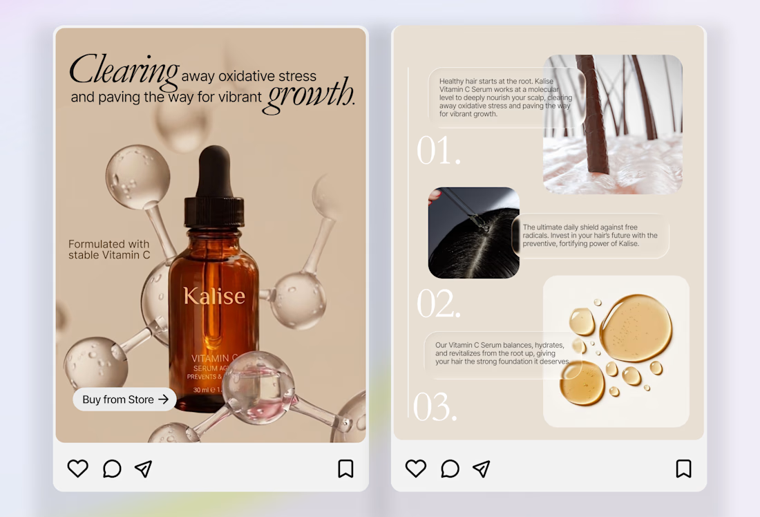

One of the best designs I’ve seen today. Really solid work 👏 keep pushing. The visual storytelling and color gradients here feel incredibly premium. Capturing that level of elegant branding is exactly what inspires the way I approach modern web layouts.
Auricle, Premium Social Media Campaign
Designed a premium social media campaign for Auricle to strengthen its brand presence and showcase its wireless audio products through compelling visual storytelling. The campaign combined product-focused creatives, lifestyle imagery, and feature driven advertisements within a cohesive, modern visual identity to drive awareness and engagement.
Role: UI/Visual Designer Deliverables: Social media campaign, Instagram creatives, product advertisements, visual branding assets
Tools: Figma, Adobe Photoshop, Adobe Illustrator
Goal: Build a premium brand presence and create high-converting social media assets that effectively communicate the product's value while maintaining a consistent, cohesive visual identity.
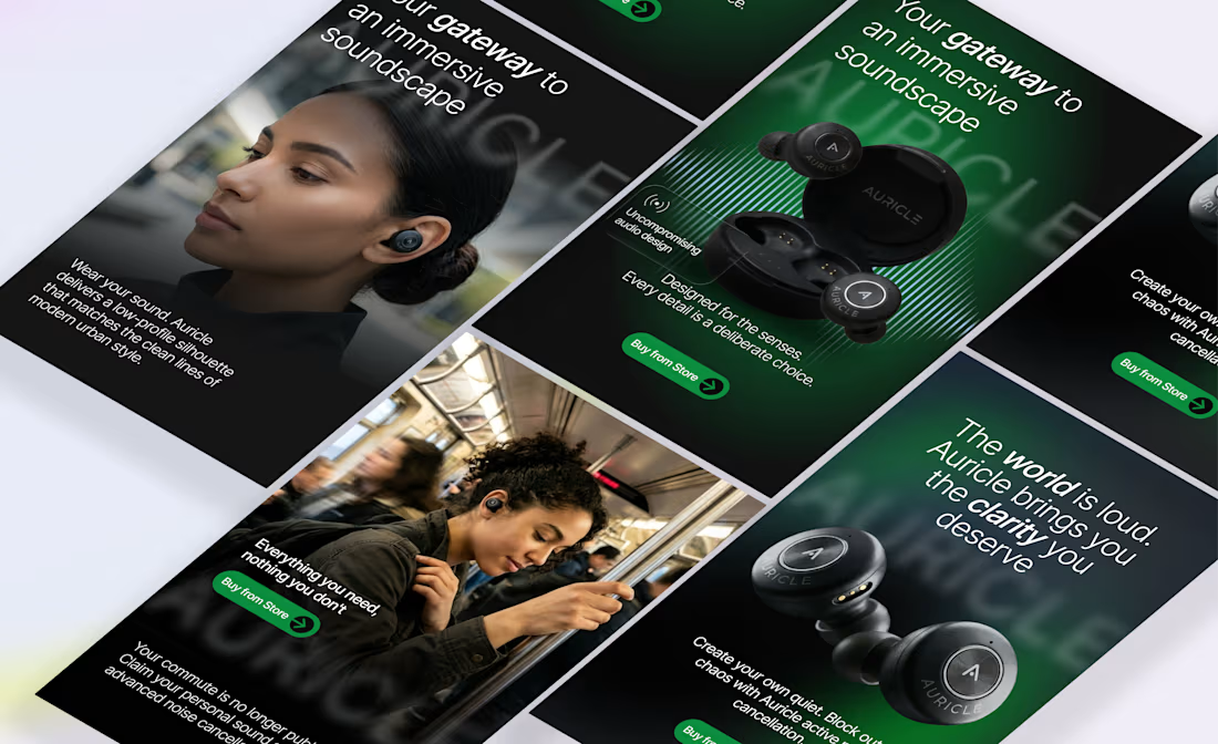
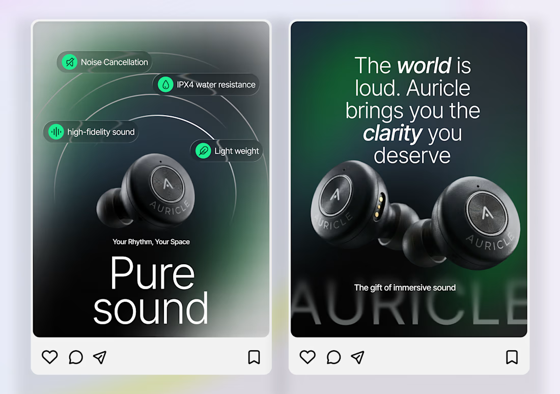
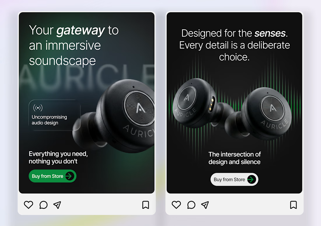
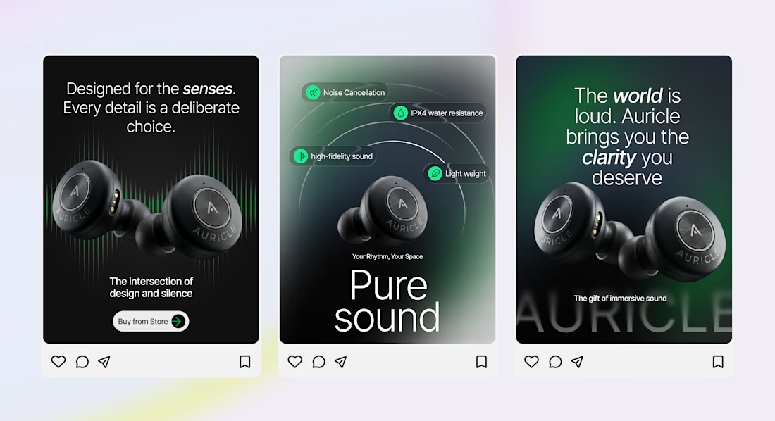

amazing execution

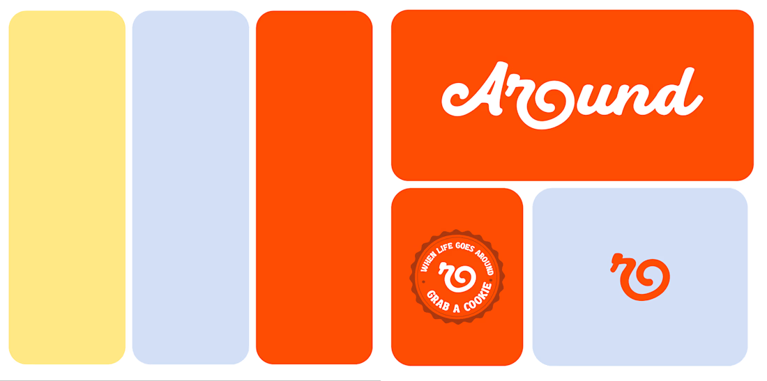
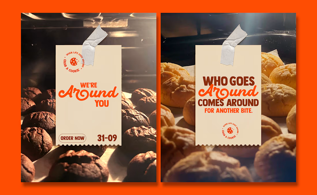
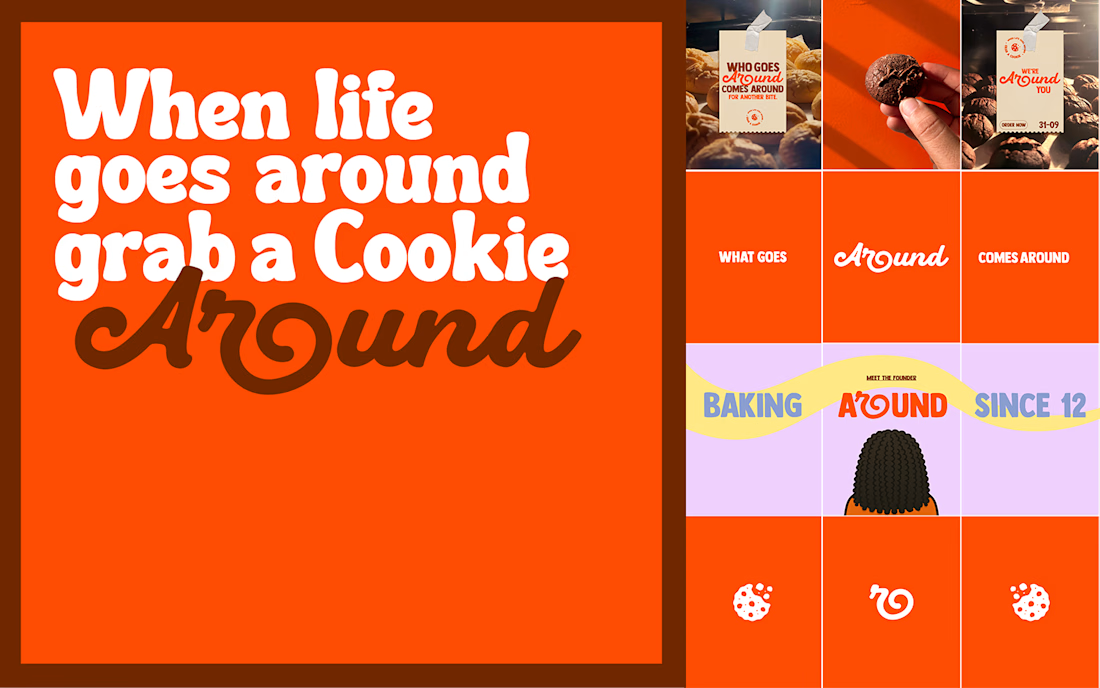
What goes around, comes Around.
Around didn't start with a business plan.
It started with a 12-year-old girl who simply loved baking.
Years later, that passion has grown into a brand built on consistency, craft, and countless batches of cookies.
I had the opportunity to lead the brand identity, communication, and overall brand ecosystem for Around, translating a personal story into a brand experience people can connect with.
The best brands aren't built on marketing gimmicks.
They're built on genuine stories and years of dedication.
And after tasting the cookies myself, I can say one thing: they're impossible to stop at just one.
Excited to see Around make its way into people's homes.
Role: Brand Strategy • Brand Identity • Communication Design


Exceptional work.








Trending

Claude
Claude has entered the design space. How are you using Claude Design?

Contra University
Learn from expert creatives how to earn more using next-gen AI tools.
fifaworldcup2026
The World Cup is here and the whole world's watching. How are you designing for the world stage?
creativeaiflow
Creative AI workflows are evolving. What tools do you use, and what are their strengths and weaknesses?
freelancerlife
Freelancer life is wins, pivots, and everything in between. What’s yours right now?