
Sohan Talukdar
Product Designer · Mobile & Web · UI/UX Design · AI
Ready for work
Sohan is ready for their next project!
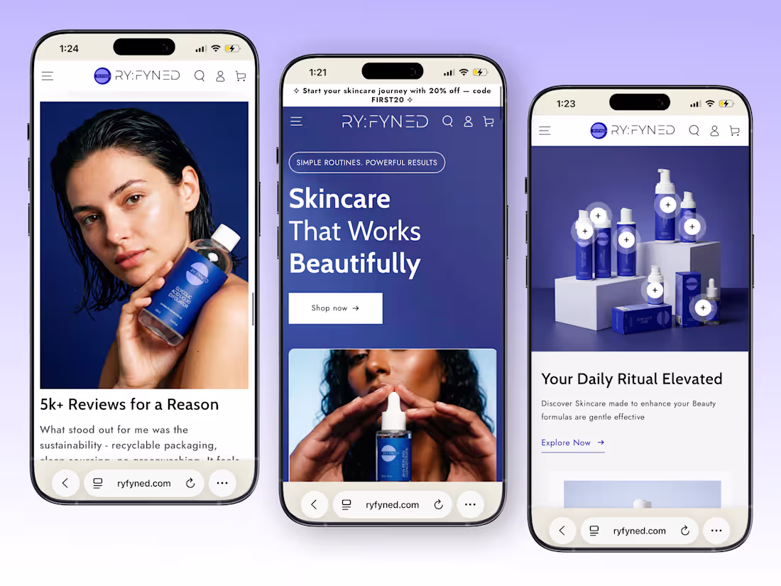
Skincare Website - Mobile Responsive Design
1
3
50
Designed this Logistics Fleet Management SaaS Dashboard to give teams complete visibility over shipments, drivers, and deliveries in one powerful workspace.
Real-time tracking, route monitoring, shipment status updates, and performance insights are presented through a clean dark interface that keeps critical information easy to scan and act on. The neon green highlights create a strong visual focus, helping users track operations more quickly and make decisions with confidence.
Because when logistics move fast, clarity becomes your biggest advantage.
1
4
277
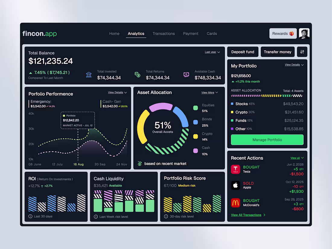
Investing should feel clear, not complicated.
We designed this AI-Powered Investment Portfolio Dashboard to help users monitor assets, analyze portfolio performance, and make smarter financial decisions from one intuitive workspace. Clean data visualization, AI-driven insights, and a modern dark interface transform complex financial information into actionable intelligence.
Because better insights lead to better investments.
𝗢𝘂𝗿 𝗦𝗲𝗿𝘃𝗶𝗰𝗲𝘀:
UI/UX Design | Website Design | Product Design | Mobile App Design | Brand Identity Design
Building a fintech or AI-powered SaaS product?
Let's create an experience your users can trust.
1
57
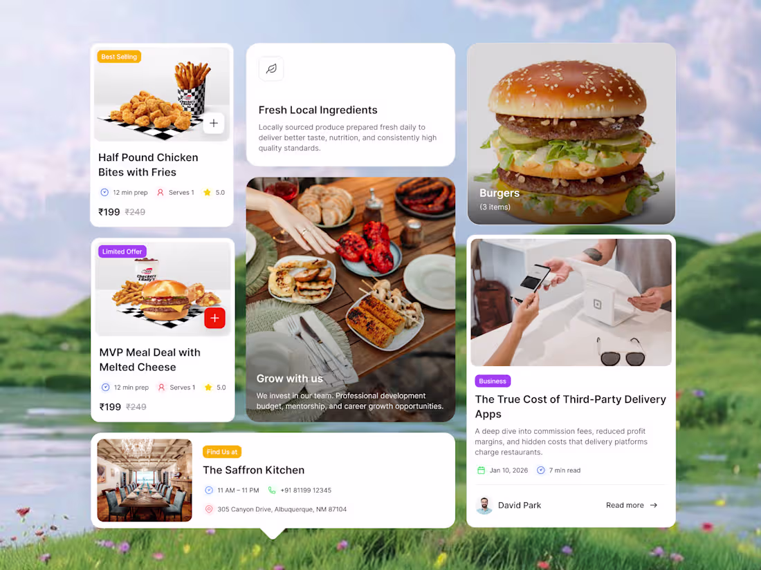
Great restaurant products are built on consistent experiences, not just beautiful screens.
We designed this Restaurant Management Dashboard Component System to create a scalable UI library that maintains visual consistency across every card, menu, review, listing, and management module, making them easy to reuse. A flexible component system accelerates product development, enhances usability, and ensures every interaction feels familiar across the platform.
Because strong products start with strong design systems.
𝗢𝘂𝗿 𝗦𝗲𝗿𝘃𝗶𝗰𝗲𝘀
UI/UX Design | Website Design | Product Design | Mobile App Design | Brand Identity Design
Building a restaurant or food-tech product?
Let's create a design system that's built to scale.
0
55
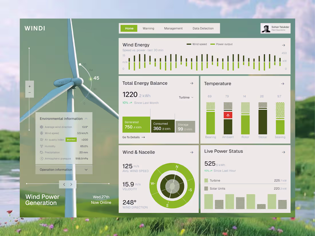
Clean data drives smarter energy decisions.
We designed this Wind Energy SaaS Analytics Dashboard to help operators monitor turbine performance, power generation, environmental conditions, and system health in one intuitive workspace. The clean layout and nature-inspired visuals make complex energy data easier to understand and act on.
Because better insights lead to more efficient renewable operations.
𝗢𝘂𝗿 𝗦𝗲𝗿𝘃𝗶𝗰𝗲𝘀:
UI/UX Design | Website Design | Product Design | Mobile App Design | Brand Identity Design
Building an energy or industrial SaaS platform?
Let's create dashboards that turn data into smarter decisions.
0
53
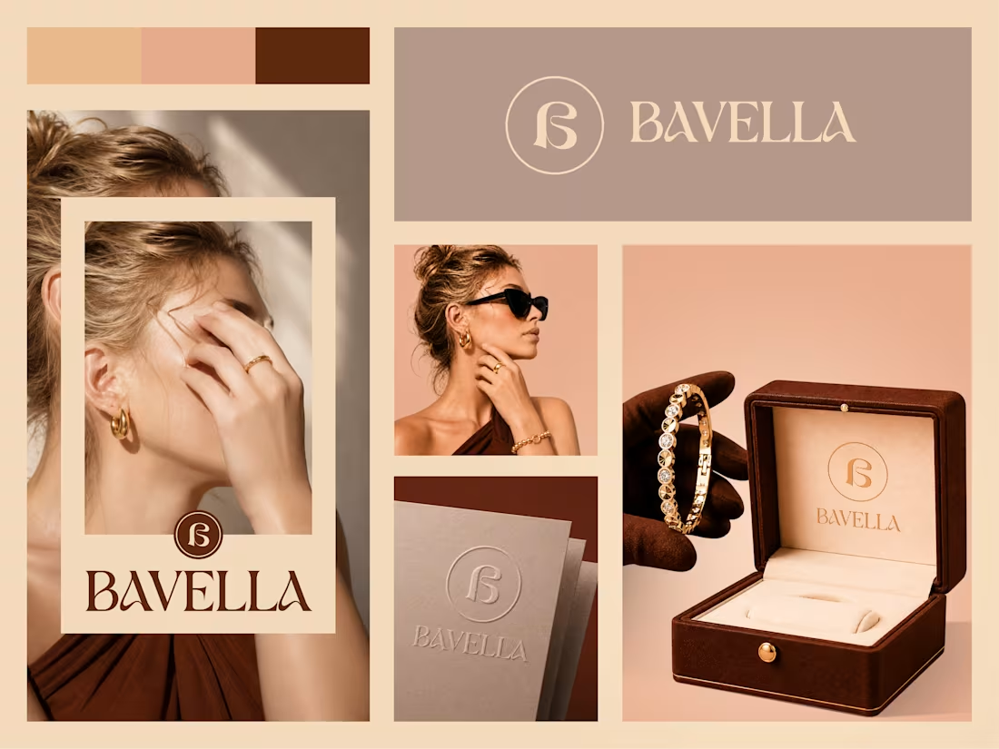
Luxury is more than appearance; it's how a brand makes people feel.
We created the BAVELLA brand identity to reflect elegance, craftsmanship, and timeless sophistication. From the refined logo to premium packaging and cohesive visual elements, every detail is designed to elevate the customer experience and create a memorable luxury presence.
Because great branding turns products into iconic experiences.
𝗢𝘂𝗿 𝗦𝗲𝗿𝘃𝗶𝗰𝗲𝘀:
UI/UX Design | Website Design | Product Design | Mobile App Design | Brand Identity Design
Building a premium fashion or jewelry brand?
Let's create a brand identity that leaves a lasting impression.
1
64
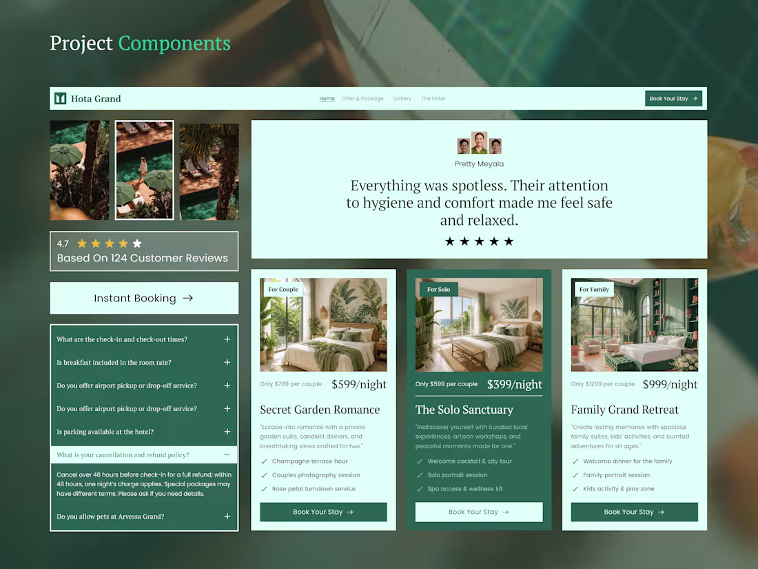
Every interaction shapes a guest's booking decision.
We designed these Hotel Booking Website Components to create a smoother reservation experience, from trusted reviews and curated room cards to instant booking and FAQs. Each component is built to reduce friction, increase confidence, and help hotels convert more visitors into confirmed guests.
Because thoughtful components create memorable experiences.
𝗢𝘂𝗿 𝗦𝗲𝗿𝘃𝗶𝗰𝗲𝘀:
UI/UX Design | Website Design | Product Design | Mobile App Design | Brand Identity Design
Building a hospitality platform.....?
Let's design components that improve every booking journey.
0
50
Sports Mobile App UI Design
1
3
83
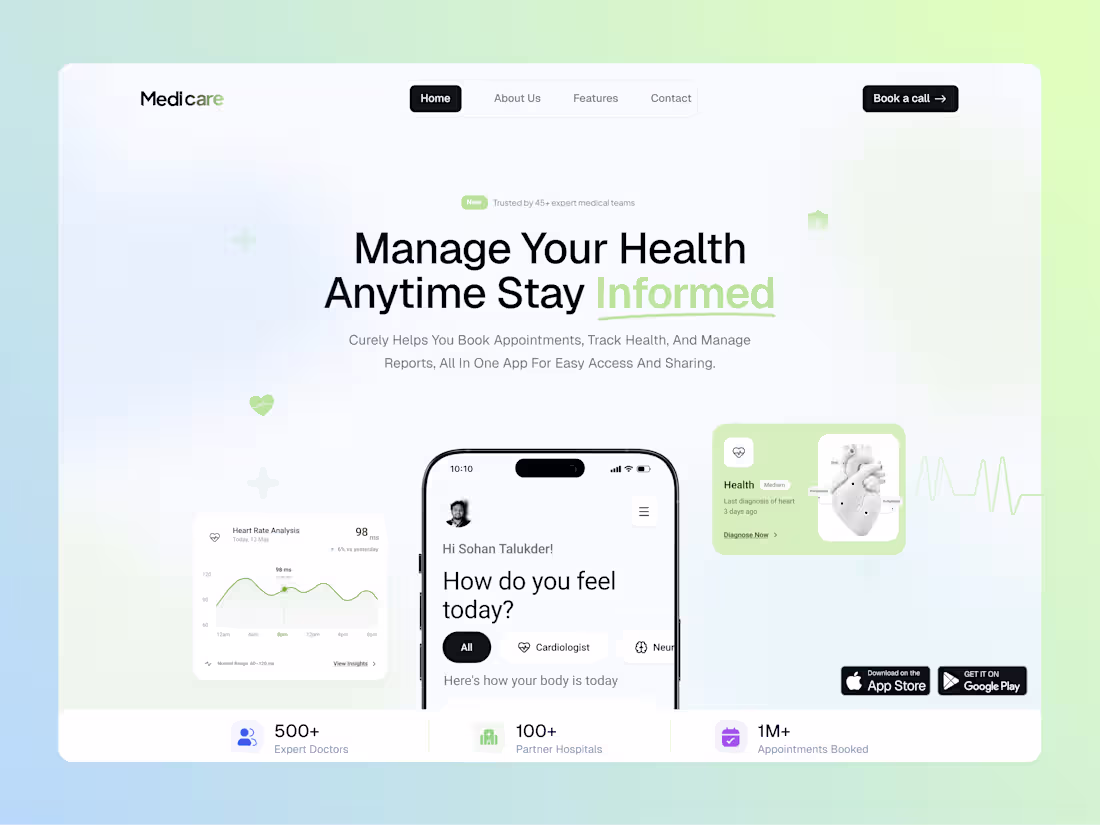
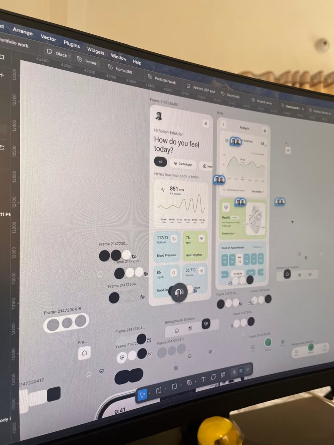
Healthcare should feel simple, accessible, and reassuring.
We designed this Healthcare SaaS Landing Page to help users book appointments, monitor health, and connect with medical professionals through one seamless platform. A clean layout, soft green accents, and intuitive visuals create a calm experience that builds trust from the very first interaction.
Because great healthcare starts with a better digital experience.
𝗢𝘂𝗿 𝗦𝗲𝗿𝘃𝗶𝗰𝗲𝘀:
UI/UX Design | Website Design | Product Design | Mobile App Design | Brand Identity Design
Building a healthcare or health-tech product?
Let's create an experience your users can trust.
3
5
124
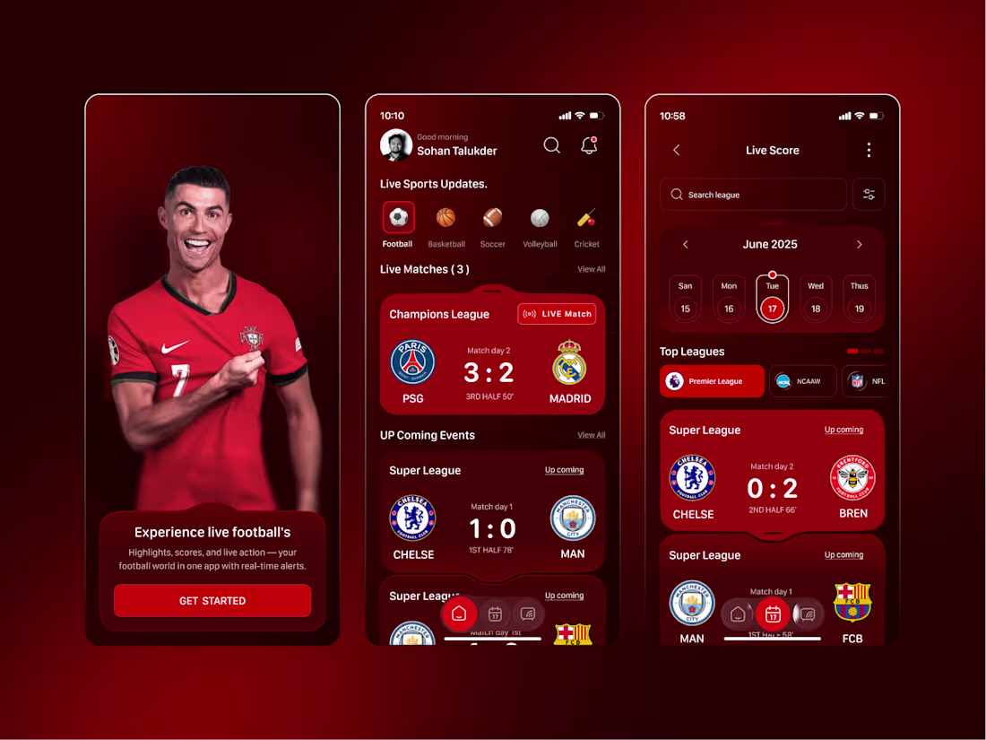
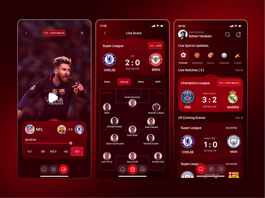
Sports fans don’t just need scores; they want it all, live.
That’s why we created this Live Sports Tracking & Streaming App, which provides scores, match tracking, team lineups, schedules, and streaming in one integrated package. The striking red design is not only exciting but also ensures that every update is quick and easy to understand.
As every second counts on match day.
𝗢𝘂𝗿 𝗦𝗲𝗿𝘃𝗶𝗰𝗲𝘀
UI/UX Design | Website Design | Product Design | Mobile App Design | Brand Identity Design
CTA
Looking for a sports, fantasy, or Live Streaming app?
Let us build an app that users would love staying in.
1
2
53
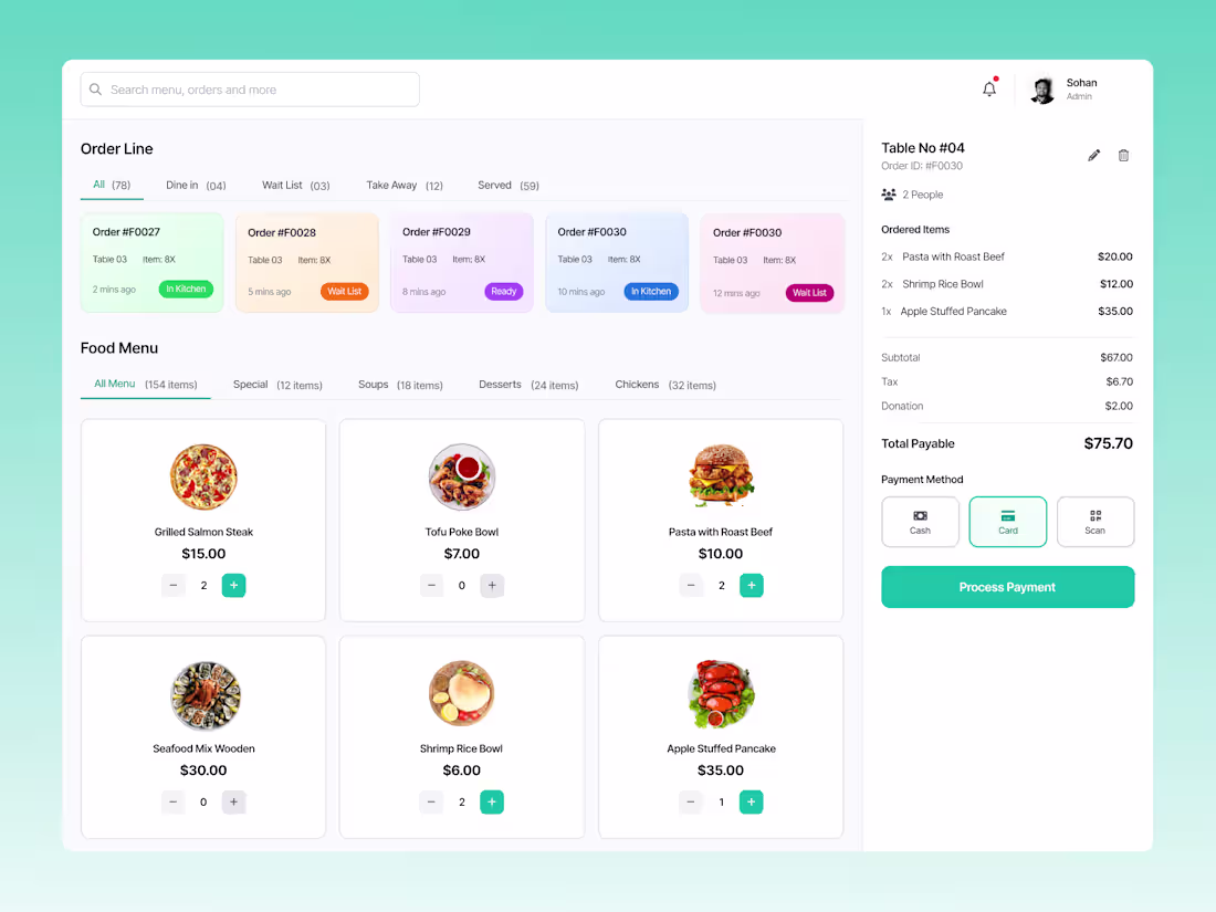
Restaurant POS System Dashboard UI Design
1
53
CRM Dashboard UI/UX Design
2
6
95
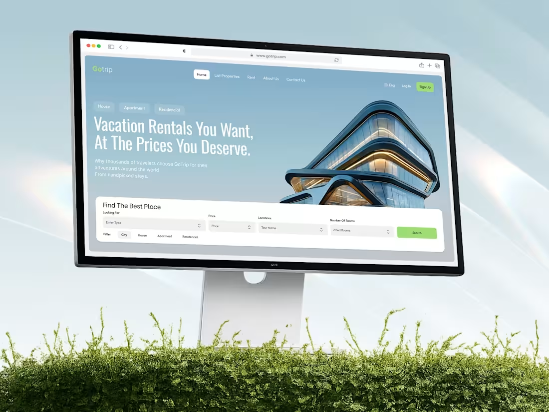
Booking a ride should feel fast, reliable, and stress-free.
We designed this Car Rental Website to help travelers discover routes, compare vehicle options, and reserve rides with confidence. The bold typography, dark premium interface, and high-impact visuals create a strong brand presence while keeping the booking journey simple and focused.
From destination discovery to vehicle selection and customer reviews, every section is structured to build trust, reduce friction, and encourage more bookings.
Because great travel experiences start long before the journey begins.
𝗢𝘂𝗿 𝗦𝗲𝗿𝘃𝗶𝗰𝗲𝘀:
UI/UX Design | Website Design | Product Design | Mobile App Design | Brand Identity Design
Building a transportation, travel, or car rental platform?
Let's create a digital experience that turns visitors into loyal customers.
3
79
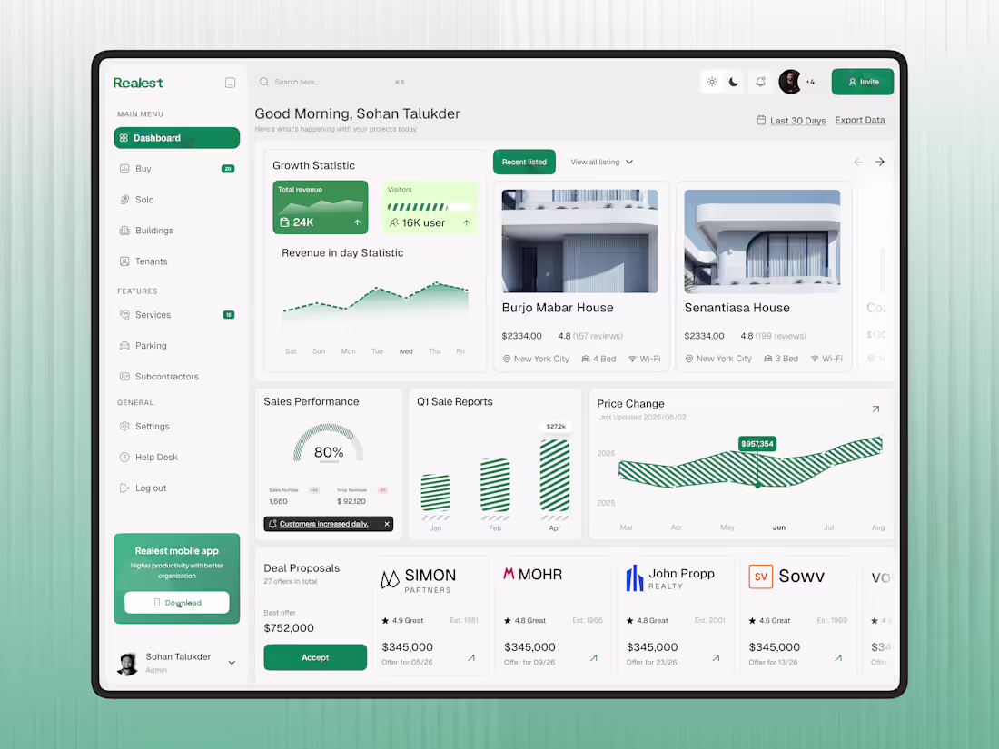
Managing properties, tenants, and revenue should feel simple, not overwhelming.
We designed this Real Estate Property Management SaaS Dashboard to help real estate teams track listings, monitor performance, manage deals, and gain valuable business insights from one centralized workspace. The clean layout, modern data visualization, and fresh green accents create a professional experience that makes complex operations easier to manage.
Because better visibility leads to better decisions.
𝗢𝘂𝗿 𝗦𝗲𝗿𝘃𝗶𝗰𝗲𝘀:
UI/UX Design | Website Design | Product Design | Mobile App Design | Brand Identity Design
Looking to build a real estate or SaaS platform?
Let's create something exceptional together.
4
4
123
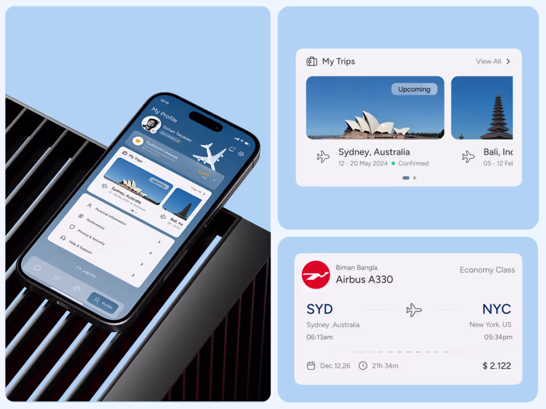
Travel should feel exciting, not complicated.
We designed this Flight Booking Mobile App to make searching flights, selecting seats, managing trips, and tracking bookings simple and seamless. The clean blue interface and intuitive user flow create a premium travel experience from booking to boarding.
Because every great journey starts with a smooth booking experience.
𝗢𝘂𝗿 𝗦𝗲𝗿𝘃𝗶𝗰𝗲𝘀:
UI/UX Design | Website Design | Product Design | Mobile App Design | Brand Identity Design
Would you be interested in building a travel product?
Let's create something exceptional together.
2
55
Hotel Booking Website - UI/UX Case Study Design
1
1
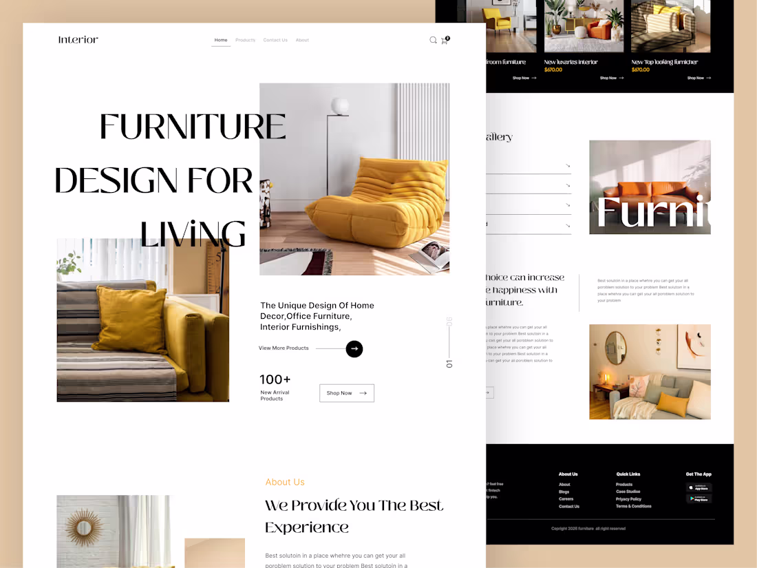
We designed this Premium Furniture E-Commerce Landing Page to create a clean, elegant, and inspiring shopping experience. With spacious layouts, warm visuals, and carefully showcased products, the design helps users explore collections effortlessly while strengthening the brand's premium identity.
Because great products deserve a great presentation.
𝗢𝘂𝗿 𝗦𝗲𝗿𝘃𝗶𝗰𝗲𝘀:
UI/UX Design | Website Design | Product Design | Mobile App Design | Brand Identity Design
Looking to elevate your furniture brand online?
Let's create something exceptional together.
2
74
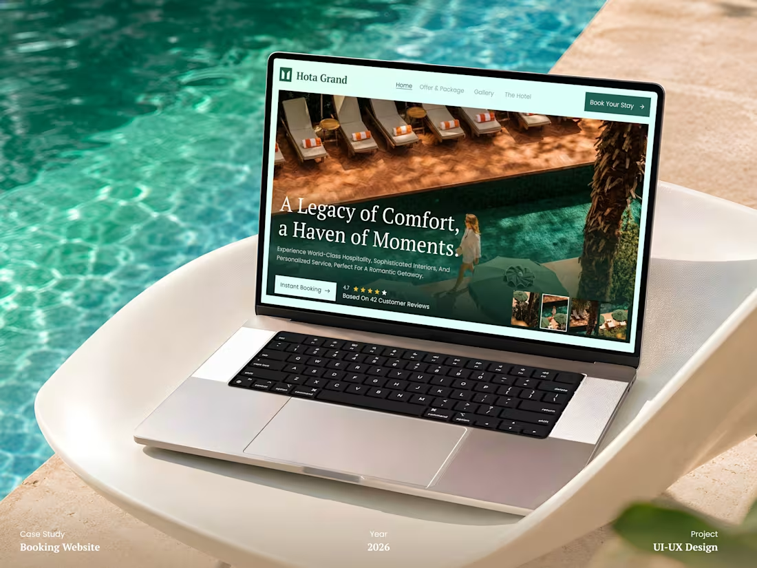
Just published a new Hotel Booking Website UI/UX case study on Behance.
Because booking a stay should feel inspiring, not complicated.
We designed this experience to make discovering, exploring, and reserving feel effortless.
→ Immersive hotel storytelling
→ Clear booking journey
→ Trust-building guest experience
→ Premium hospitality-focused UI
✓ Better engagement
✓ Faster booking decisions
✓ Stronger guest confidence
Because great hotel experiences start long before check-in.
P.S. What makes you trust a hotel website instantly?
2
80
We designed this Logistics Fleet Management SaaS Dashboard to give teams complete visibility over shipments, drivers, and deliveries in one powerful workspace.
Real-time tracking, route monitoring, shipment status updates, and performance insights are presented through a clean dark interface that keeps critical information easy to scan and act on. The neon green highlights create a strong visual focus, helping users track operations more quickly and make decisions with confidence.
Because when logistics move fast, clarity becomes your biggest advantage.
𝗢𝘂𝗿 𝗦𝗲𝗿𝘃𝗶𝗰𝗲𝘀:
UI/UX Design | Website Design | Product Design | Mobile App Design | Brand Identity Design
Building a logistics or SaaS product?
Let's create an experience that keeps your operations moving smoothly.
1
0
78
Golf News Website UI Design
1
3
98
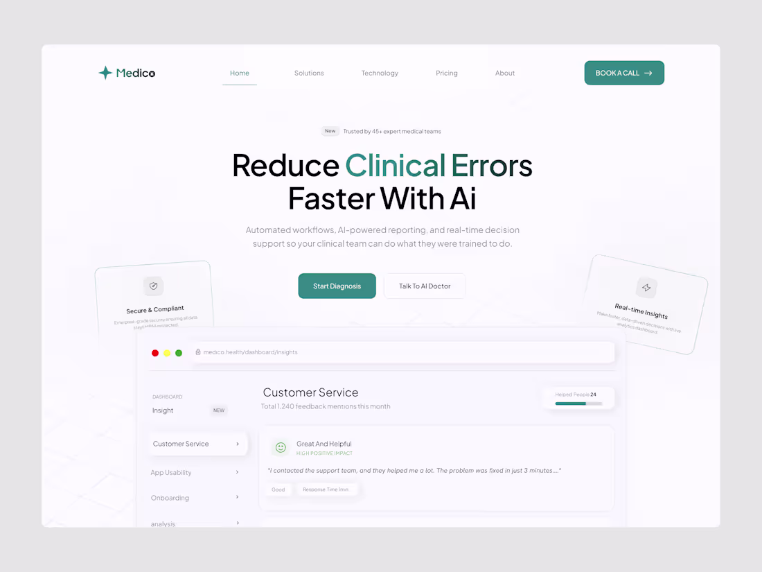
We designed Medico, an AI-powered healthcare landing page that makes clinical intelligence feel clear, trusted, and easy to understand.
Clean layouts, soft healthcare visuals, and structured content help simplify complex workflows, such as AI reporting, real-time insights, and decision support.
Because great healthcare technology should feel simple to use.
𝗢𝘂𝗿 𝗦𝗲𝗿𝘃𝗶𝗰𝗲𝘀:
UI/UX Design | Website Design | Product Design | Mobile App Design | Brand Identity Design
Building a healthcare or AI product?
Let's design an experience people trust.
1
2
102
Adventure starts before you hit the slopes.
We designed this Ski Coaching & Sports Website to capture the energy, excitement, and confidence of outdoor sports.
Bold visuals, action-packed imagery, and strong typography create an immersive experience that guides users through training programs, coaching services, and event registrations with ease.
Because great sports experiences begin with great first impressions.
𝗢𝘂𝗿 𝗦𝗲𝗿𝘃𝗶𝗰𝗲𝘀:
UI/UX Design | Website Design | Product Design | Mobile App Design | Brand Identity Design
Building a sports or fitness brand?
Let's create something people can't ignore.
0
69
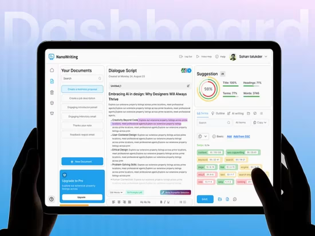
AI Content Writing Dashboard Design
1
89
We're excited to share the new brand identity for Olack Agency.
Built to reflect creativity, clarity, and digital growth.
Here's what shaped the new look:
→ Logo Design – Bold, simple, and memorable
→ Typography – Gilroy for a clean modern feel
→ Color Palette – Teal, dark tones, and warm accents
→ Brand Assets – Consistent across every touchpoint
→ Digital Elements – Crafted for engaging experiences
From business cards to hiring posts,
Every detail follows one visual system.
The goal was simple:
Create a stronger, clearer, and more recognizable brand.
Because great branding is not just seen.
It's remembered.
P.S. Which element stands out most:
Logo, colors, or typography?
3
124
CRO Website UI Design
0
76
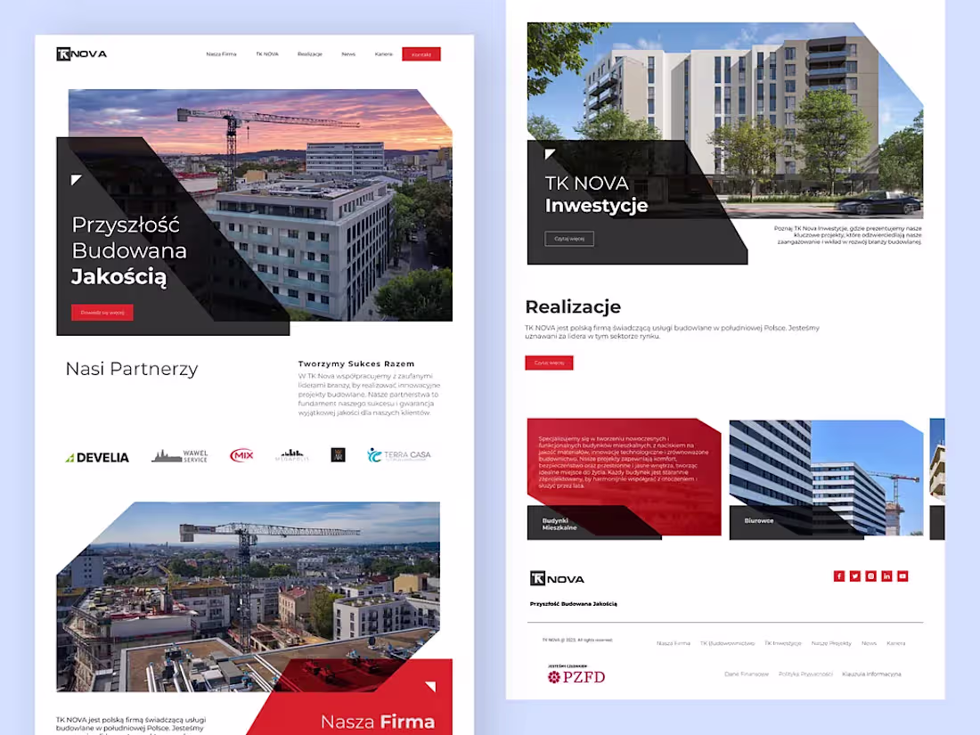
Real Estate Development Company Landing Page Design
0
61
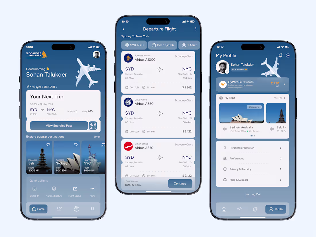
Flight Booking Mobile App Design ✦ Singapore Airlines
4
119
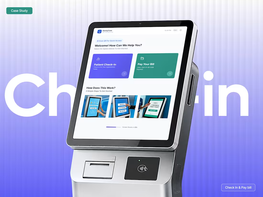
We have just uploaded a new case study, 'Patient Check-In and Bill Payment Flow Design,' to Behance or Dribbble. Could you check it out now?
Check out the full project in the comment below. 👇
1
2
98
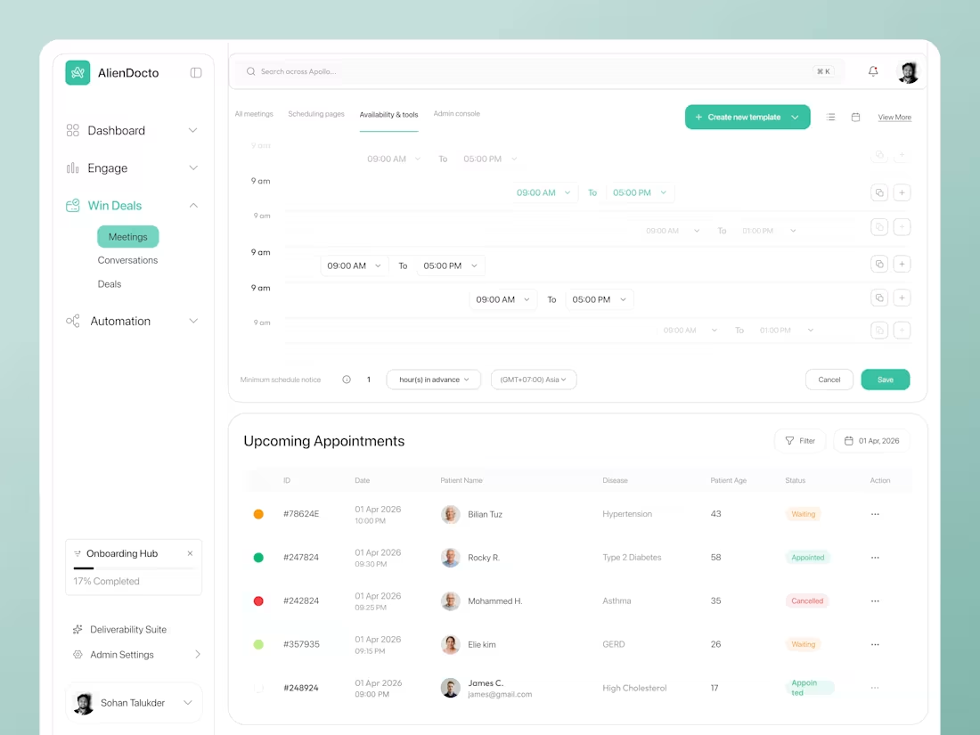
Doctor Appointment Management Dashboard Design ✦ AlienDocto
2
3
122
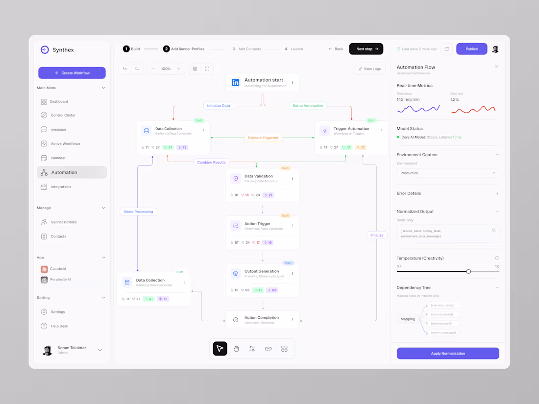
AI Workflow Automation SaaS Dashboard UI Design ✦ Synthex
1
2
142
AI Health Monitoring App - Doctor Appointment Booking App Design
1
110
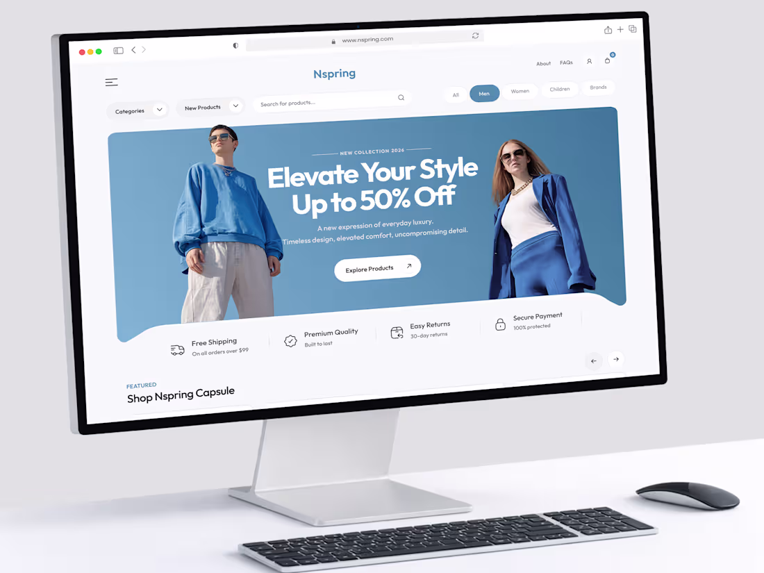
I just completed a fashion e-commerce website design for a client.
5
4
237
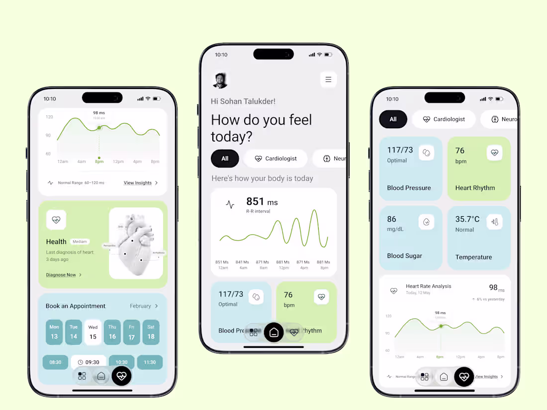
AI Health Monitor App UI Design
2
118
Travel Booking Website - Homepage UI Design
0
100
Good design is not magic.
It is a clear process.
But many skip steps to save time.
That creates weak products.
We learned this in early projects.
We rushed, and users felt confused.
So we fixed our design process.
Step by step, no shortcuts.
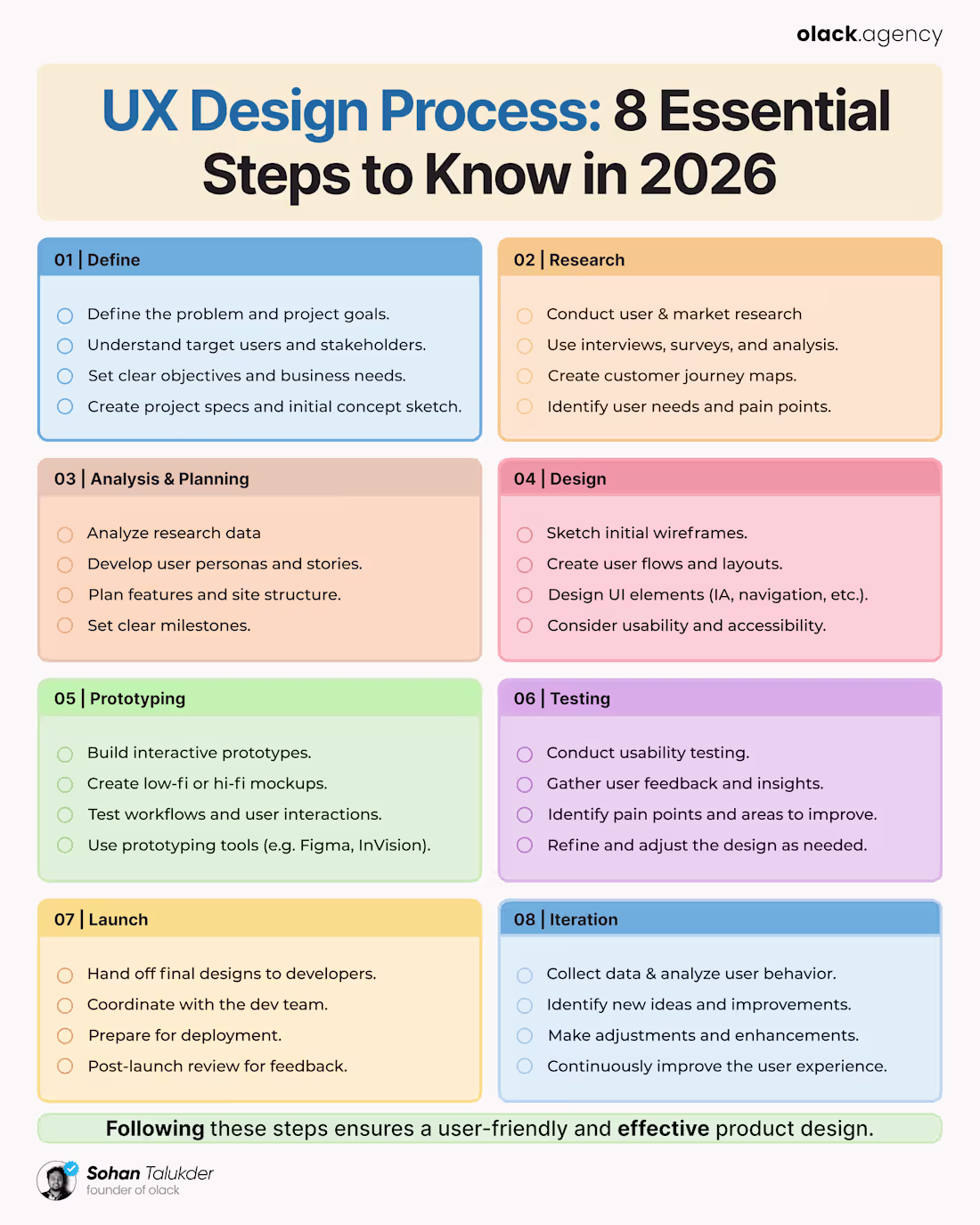
Here is our simple UX process:
→ 01 Define
↳ Set clear goals
↳ Know the user and the problem
→ 02 Research
↳ Talk to real users.
↳ Find pain points
→ 03 Plan
↳ Map ideas and flow.s
↳ Set a clear structure
→ 04 Design
↳ Create wireframes
↳ Build a clean UI
→ 05 Prototype
↳ Make it clickable
↳ Test real actions
→ 06 Test
↳ Get user feedback
↳ Fix real issues
→ 07 Launch
↳ Work with developers
↳ Ship with clarity
→ 08 Improve
↳ Track user behavior
↳ Keep making it better
This is how we design at Olack.
Simple steps, strong results.
Good UX is not luck.
It is repetitive thinking.
Follow the process carefully.
Users will feel the difference.
P.S. Do you follow a clear UX process?
1
102
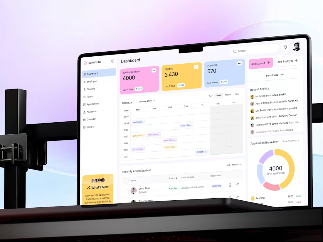
Applicant Tracking System Dashboard Design
This Applicant Tracking System dashboard is designed to simplify the management of applications, students, and internal workflows for institutions. The interface consolidates data, actions, and communication into a single, clean, and structured environment, making complex processes feel easy and manageable.
The goal was to create a system that feels fast, clear, and reliable for daily administrative use.
3
121
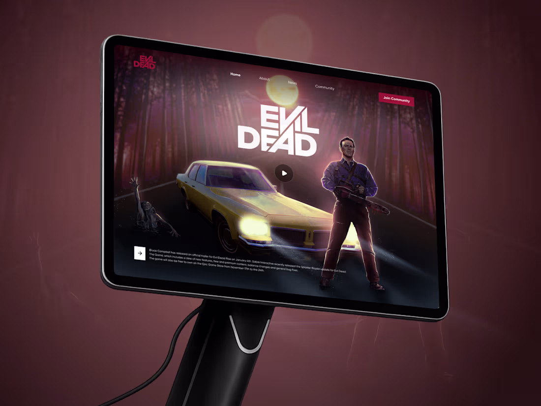
Evil Dead Rise - Horror Website Design
2
111
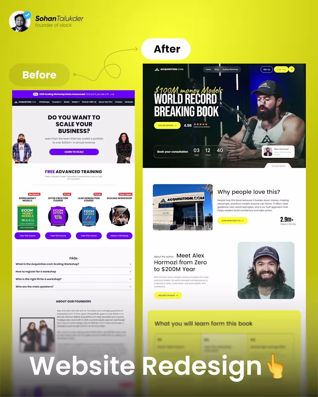
We redesigned Alex Hormozi's company, ACQUISITION, website.
2
102
AI Agent Customer Service Dashboard Design
2
3
99
Flight Booking Website UI Design
2
2
96
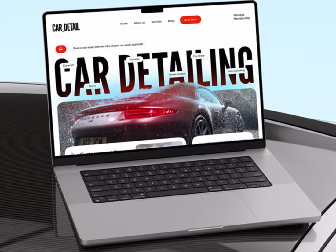
Carwash Website Landing page UI Design by Sohan Talukder for Ol…
1
3
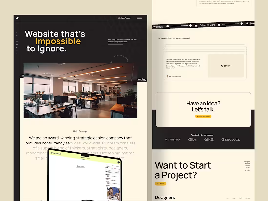
Digital Agency Modern Website UI Design
1
4
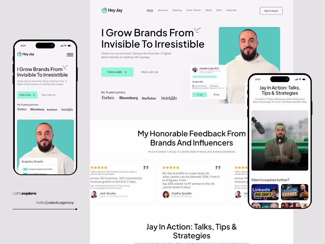
Jasmin Alić Landing Page ReDesign by Sohan Talukder
1
6