The network for creativity
Join 1.25M professional creatives like you
Connect with clients, get discovered, and run your business 100% commission-free
Creatives on Contra have earned over $150M and we are just getting started
Back to feedPost

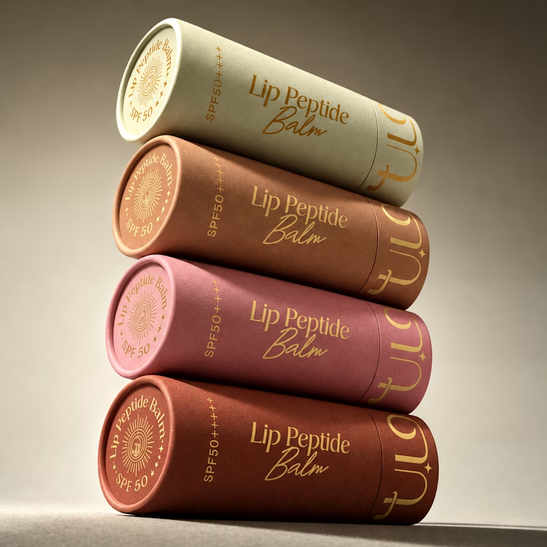
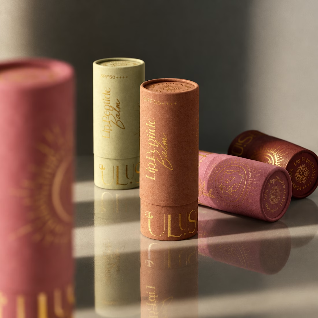
A little packaging design appreciation 🌞
UluSoleil was one of my first big clients, and over time, I helped bring four of their products to life through packaging design.
This lip balm tube was all about balancing a delicate, feminine aesthetic with clear product communication, thoughtful typography, and functional packaging.
I’m still working on the full case study, but I wanted to share a little peek at the process!
More to come ✨



High end packaging
thank you so much! that's the idea
Welcome and you executed your idea very successfully

The colour shift down the stack, from sage through terracotta to rose, makes the range read as one family while each tube keeps its own cue. Curious how you handled the gold foil type so it stays legible on the lighter sage tube.
Thank you so much! the gold foil was honestly challenging as it needed to be readable in every background color. I tried to find colors where the combination was as harmonious but functional as possible

These product shots are stunning 😍
Thank you so much!

Gorgeous color story and tactile packaging! Beautiful work, Anita!
thank you so much!

Outstanding Work❤️

wowww such a new packaging in over saturated industryyy love it
aawww thanks!!

Lovely work, Anita. The soft sage, blush and terracotta palette feels delicate and feminine without losing shelf presence, and the gold foil sun motif ties the whole line together. The script on “Lip Peptide Balm” sits nicely against the clean product info, so it’s clear at a glance. ☀️
thank you so much!!

gorgeous work, i love the down-to-earth feel!
appreciate it!

That stacked tube shot is beautiful. The colour running from sage through terracotta to rose feels so considered, and the gold foil catching the light really sells the premium feel. Balancing delicate with clearly communicative is genuinely hard to pull off. Was the tube format...
Thanks! The shape of the tube came from the client!

Clean, modern, and inspiring!

amazing work

Great work, Anita!
The packaging and the color palette feels premium.
I appreciate it!!

Thank you so much!

so premium and amazing packaging 😍
Thaaaaanks!

Gold type on those muted tones works really well.
It really does, right? Thanks!

It is so cool that you have worked with them for so long and helped bring four products to life. The full case study is going to be amazing. I cannot wait to see the whole process.
Me tooo, I need to work on it though but I am super excited to share!

Stunning Packaging!!

Those soft muted tubes look so good stacked together. Delicate but the type still reads clearly, which is hard on such a small surface. Excited for the full case study

Beautiful work, Anita!
The network for creativity
Join 1.25M professional creatives like you
Connect with clients, get discovered, and run your business 100% commission-free
Creatives on Contra have earned over $150M and we are just getting started











Related posts


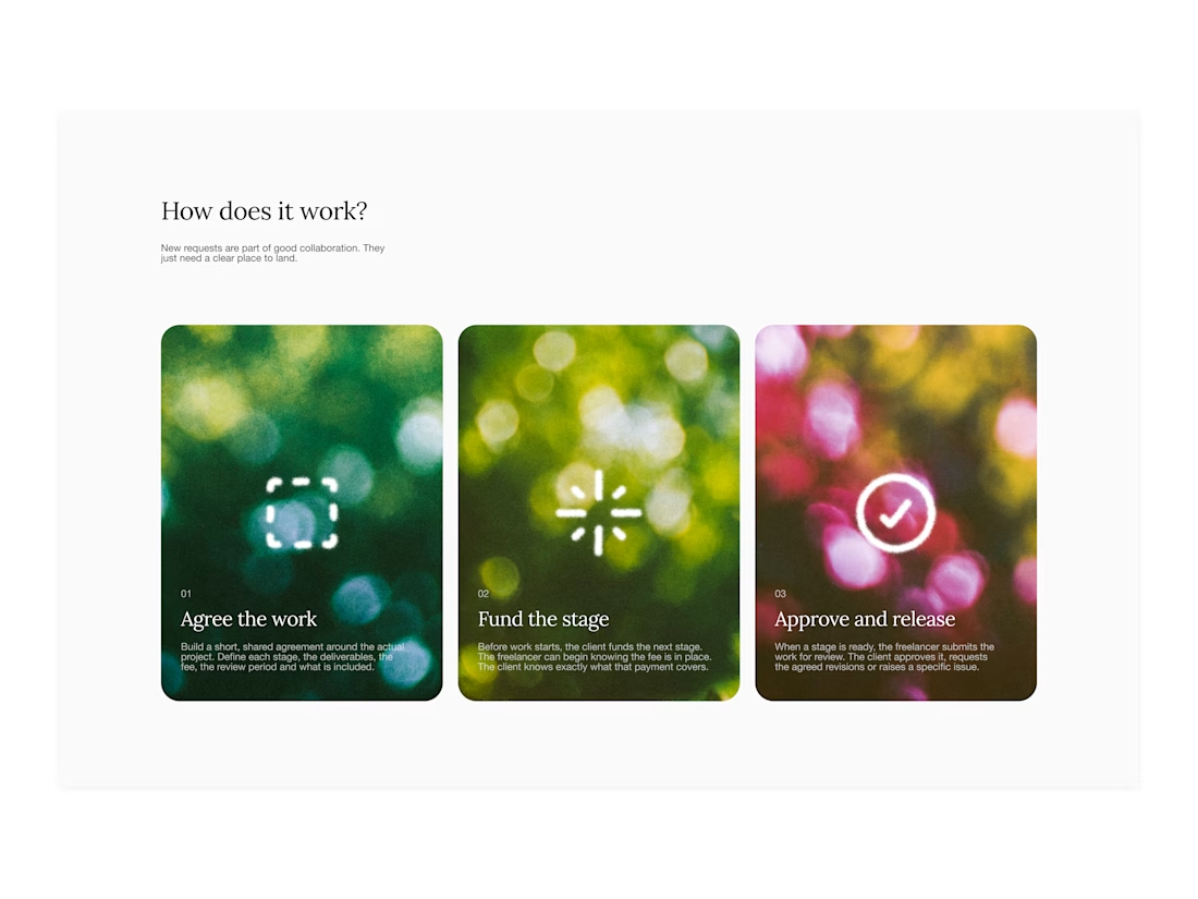
Your web sections always have such strong art direction. Great to see the brand carried right into the layout.


One letter. Eight personalities. 🔤
I explored the letter S in 8 different directions: soft and rounded, sharp and angular, bold and blocky, and fast like a bolt.
Same letter, same white-on-black treatment. The only thing that changes is the character.
Each mark could suit a different kind of brand, from tech and sports to fintech and lifestyle.
Which S would you pick, and what kind of brand would it belong to? Drop the number below. 👇
Looking for a logo mark or a full brand identity? My services are on my profile.


S letter designs is the best ❤️
Great job Shahwaiz🔥🔥

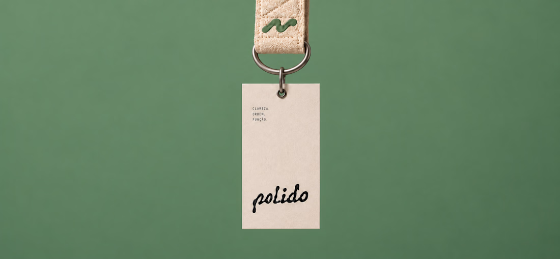
POLIDO — Brand Identity & Visual System
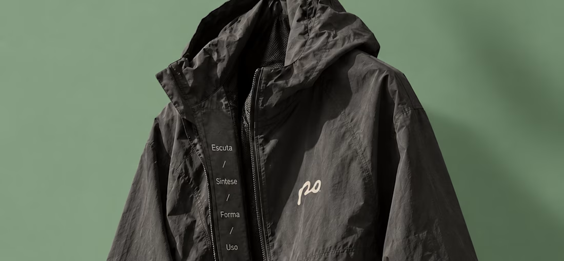
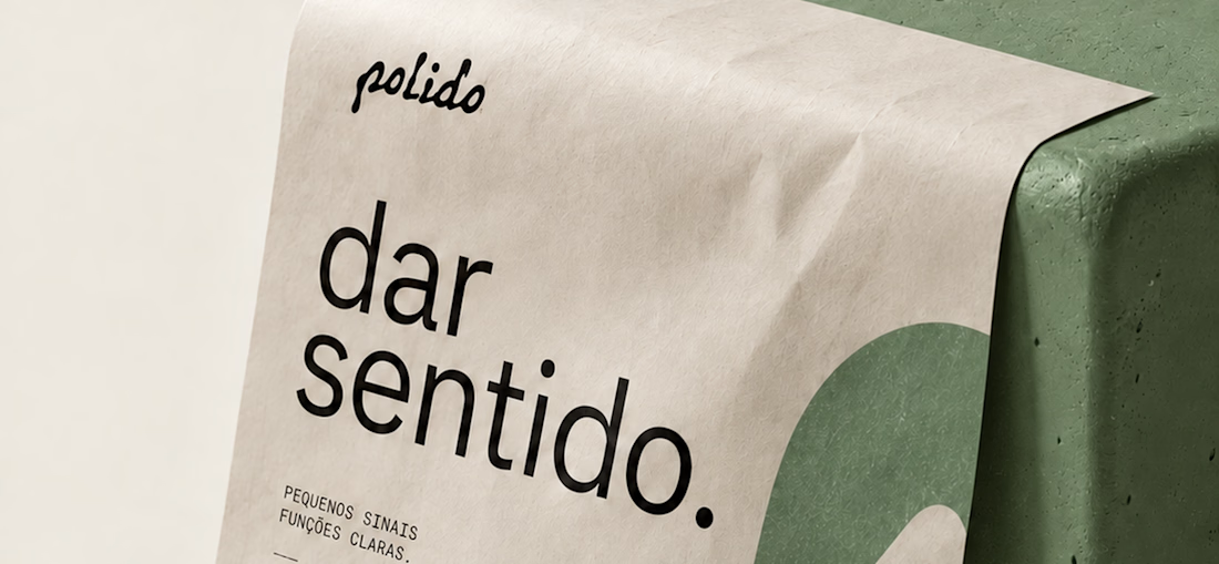
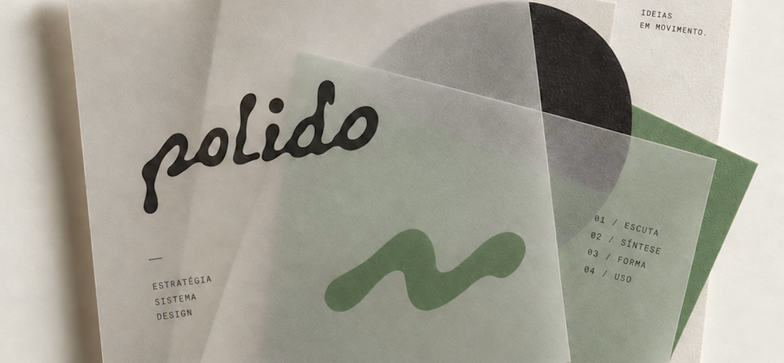
POLIDO is the visual identity of my independent brand design practice, shaped by a process of listening, synthesis, form, and use.
The identity brings together a hand-drawn signature, restrained typography, tactile materials, and a palette of warm paper, graphite, and Basil green.
From printed matter to apparel and physical applications, the project explores how a consistent visual language can adapt to different materials and contexts while maintaining its character.
Scope: Brand Strategy, Visual Identity, Art Direction, and Mockup Design.

High end branding