The network for creativity
Join 1.25M professional creatives like you
Connect with clients, get discovered, and run your business 100% commission-free
Creatives on Contra have earned over $150M and we are just getting started
Back to feedPost


Is text on album covers really tacky?
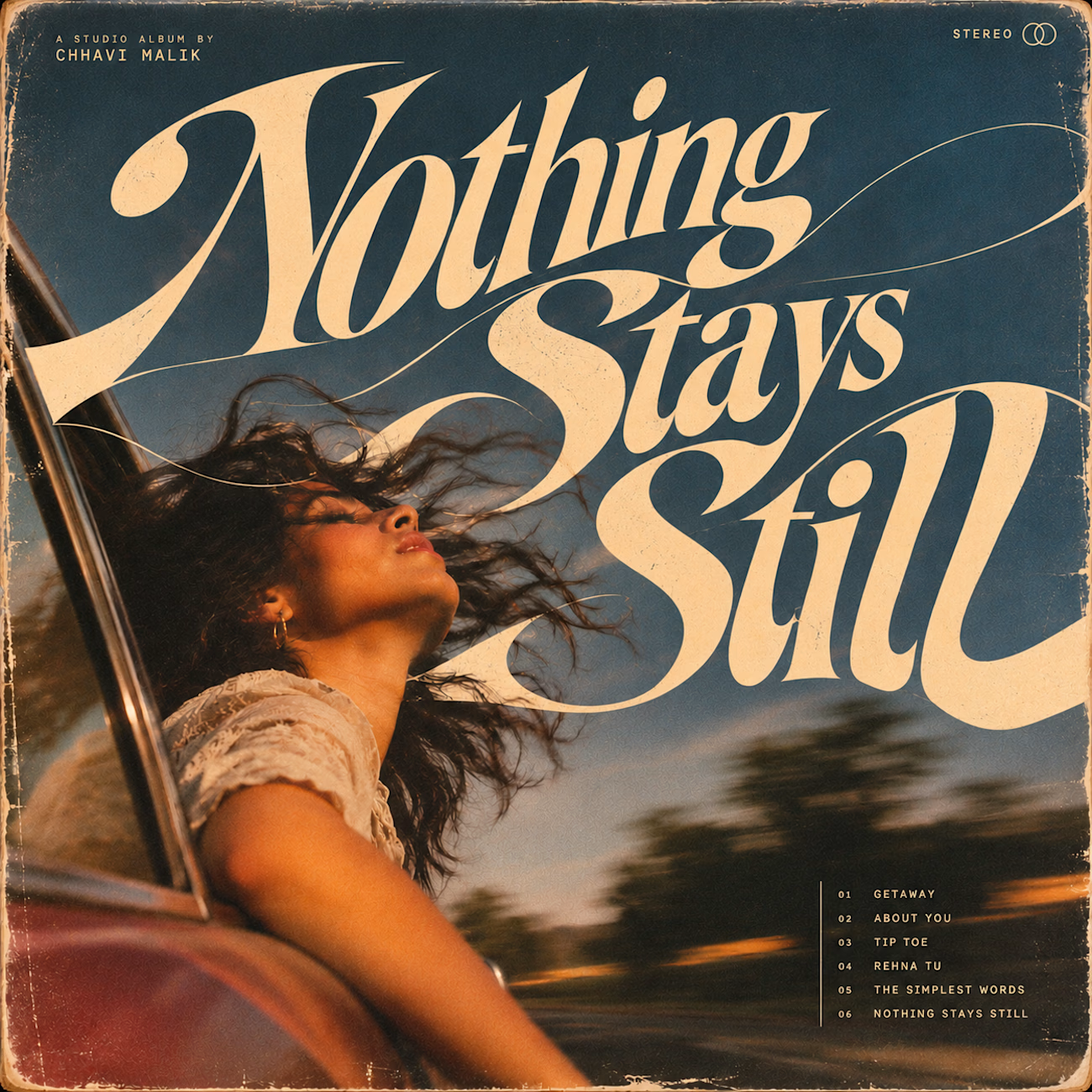
This question has been doing the rounds on X and I have to say, I'm firmly on the other side of that argument. I've always loved seeing typography become part of the artwork rather than just a title sitting on top of it.
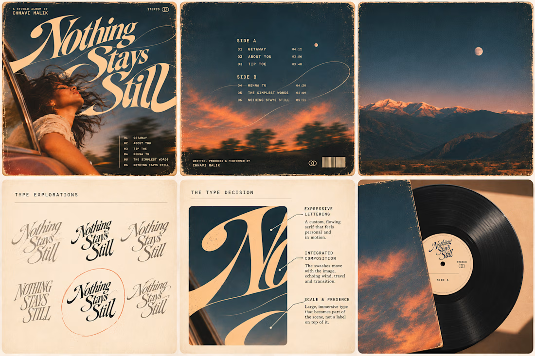
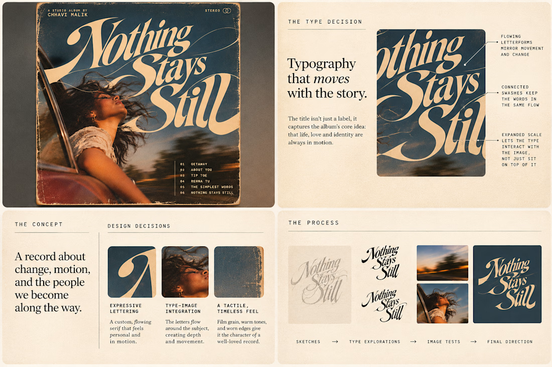
So I wanted to put that idea to the test with an imagined album called Nothing Stays Still, inspired by change, fleeting moments and everything in between:)
I played around with the lettering until it felt expressive, a little restless, and inseparable from the photograph.
Because I think badly considered typography is tacky. Typography itself? Give it a chance :)
What's an album cover where the type really makes it for you?

Stunning work

Great job

i'm with you on this one, when the type becomes part of the artwork the cover is way more memorable


It was super fun designing this!

Amazing designs

Not tacky at all when the type becomes part of the art. Some of the best covers ever are type led

For me, typography that really makes an album cover is when it becomes part of the emotion — not just text on top.
That "Nothing Stays Still" example you posted is perfect — the wavy, stretched serif feels like movement, like memory fading. The type IS the story.
In my own work...

I love it !

A distinctive identity with a cohesive visual language.

Good Job!

Modern!

this is so cool, custom font? or what's the name?

Peter Saville's Movement sleeve for New Order is mine, cold architectural type carrying the whole cover with no photograph at all. Your lettering runs the opposite way, warm and spilling off the edge, but it lands on the same idea: the type is the image.

The oversized lettering and warm colour palette work so well together. Really love this direction!

Nice work!
The network for creativity
Join 1.25M professional creatives like you
Connect with clients, get discovered, and run your business 100% commission-free
Creatives on Contra have earned over $150M and we are just getting started



Related posts

Aesthetically pleasing 😍


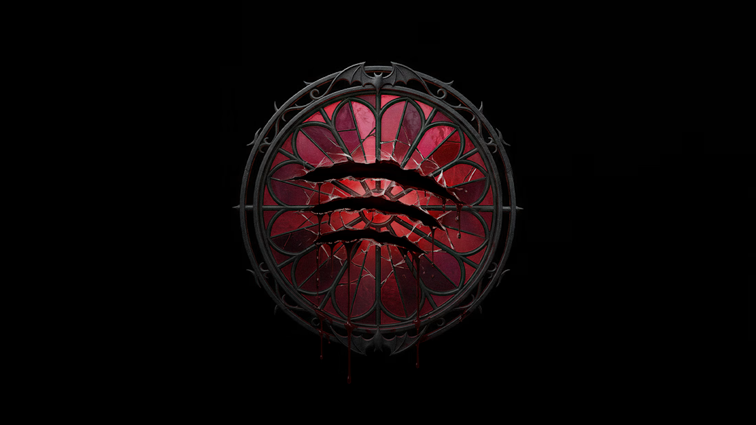
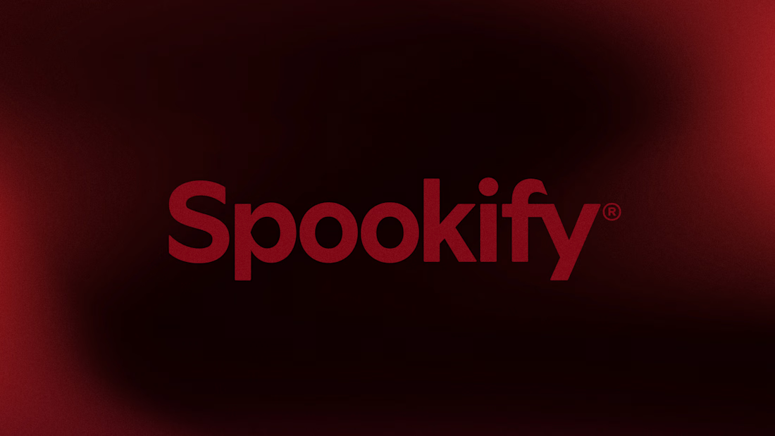
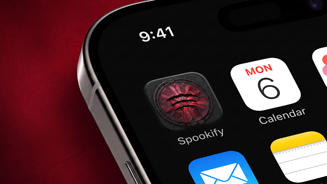
What would Spotify wear for Halloween? 🦇
I don’t usually like to design using well-known brands, but this one was too fun to skip hahaha
Concept: Spotify → Spookify 👻
- Went with a gothic stained glass window + with bats on the frame
- The original 3 sound waves are now claw...

Love this!

Are you still designing Brand Guidelines presentations from scratch?
I created this Mini Brand Guidelines template as a modular, editorial-style system built to help designers and studios present brand identity work with structure and clarity in no time.
Whether you’re delivering a new identity to a client or documenting internal brand assets, this template provides a confident, consistent framework.
Tap the link above to get it.

Clean and smooth, love it


The movement flow so naturally, it feels effortless to watch.