The network for creativity
Join 1.25M professional creatives like you
Connect with clients, get discovered, and run your business 100% commission-free
Creatives on Contra have earned over $150M and we are just getting started
Back to feedPost


What would Spotify wear for Halloween? 🦇
I don’t usually like to design using well-known brands, but this one was too fun to skip hahaha
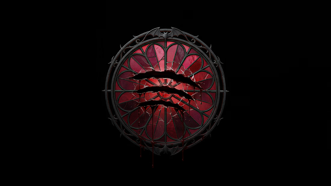
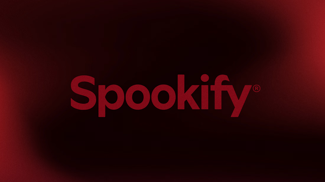
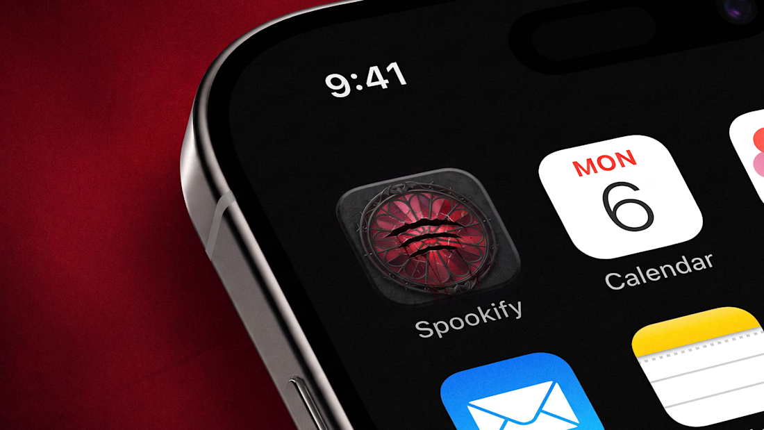
Concept: Spotify → Spookify 👻
- Went with a gothic stained glass window + with bats on the frame
- The original 3 sound waves are now claw marks slashed right through the glass
- (Obviously) the green went full blood red
Still instantly recognizable, just a bit more… haunted.
If you use Spotify, would you like it to become Spookify during October? 👀

Woah hanna it looks amazing nice work!

LOVE this idea, especially the inspo of a stained glass window! that's so fire.

Great job
The network for creativity
Join 1.25M professional creatives like you
Connect with clients, get discovered, and run your business 100% commission-free
Creatives on Contra have earned over $150M and we are just getting started



Related posts


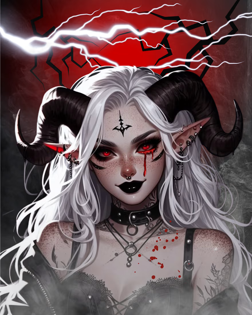
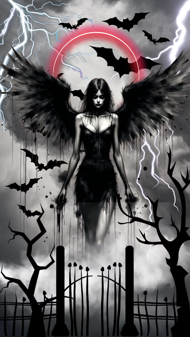
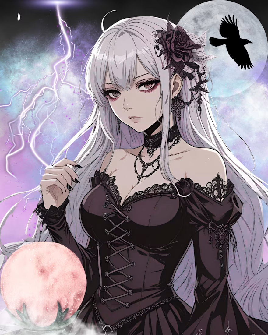

The grayscale bats and lightning panel has real atmosphere, and then the lavender portrait hits you with color. Nice contrast. One idea: add a small title line so it reads as a poster and not just two great images. A slow flicker on the lightning would be spooky in the best way.

What if your biggest streaming platform got a Halloween makeover? 🕸️
As Halloween is closing by, I decided to do a short campaign teaser for one of the biggest streaming platforms.
I redesigned their logo and played with the wording as part of their brand messaging in a spooky theme for the upcoming Halloween event.
I retained the brand consistency across the typography and overall logo shape and changed few details within.
Any twitch streamers, viewers or halloween celebrants here?


Fun concept and perfect timing. The spooky wordmark twist still feels on brand, nice one.

A little Halloween idea turned into Pumpkin Studio 🎃
I wanted to bring the fun of pumpkin carving to the browser. Rotate a 3D pumpkin, cut out shapes, or draw your own design.
Built with Three.js, with a focus on realistic textures, simple controls, and a clean interface.
Give it a try—I’d love to see what you carve.
Try it out- https://pumpkin-studio-maneesh.netlify.app/
#CreativeCoding #ThreeJS #InteractiveDesign


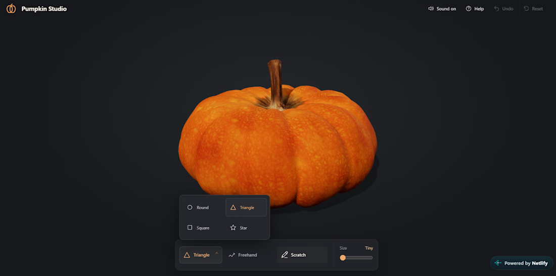

Pumpkin carving with zero mess. The textures look really good for a browser.