The network for creativity
Join 1.25M professional creatives like you
Connect with clients, get discovered, and run your business 100% commission-free
Creatives on Contra have earned over $150M and we are just getting started
Back to feedPost
Taste Test

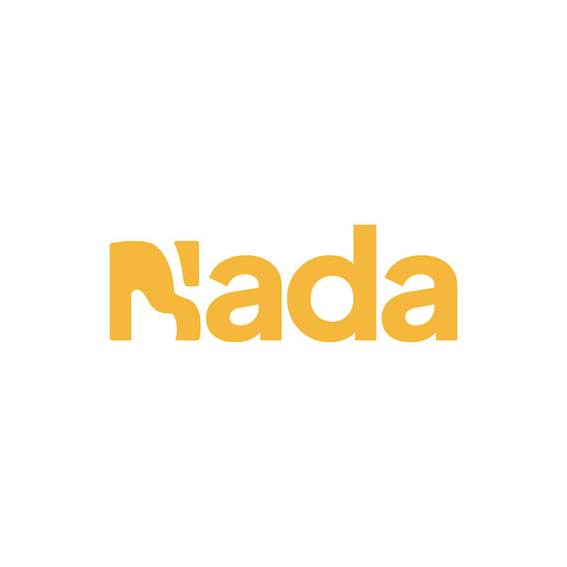
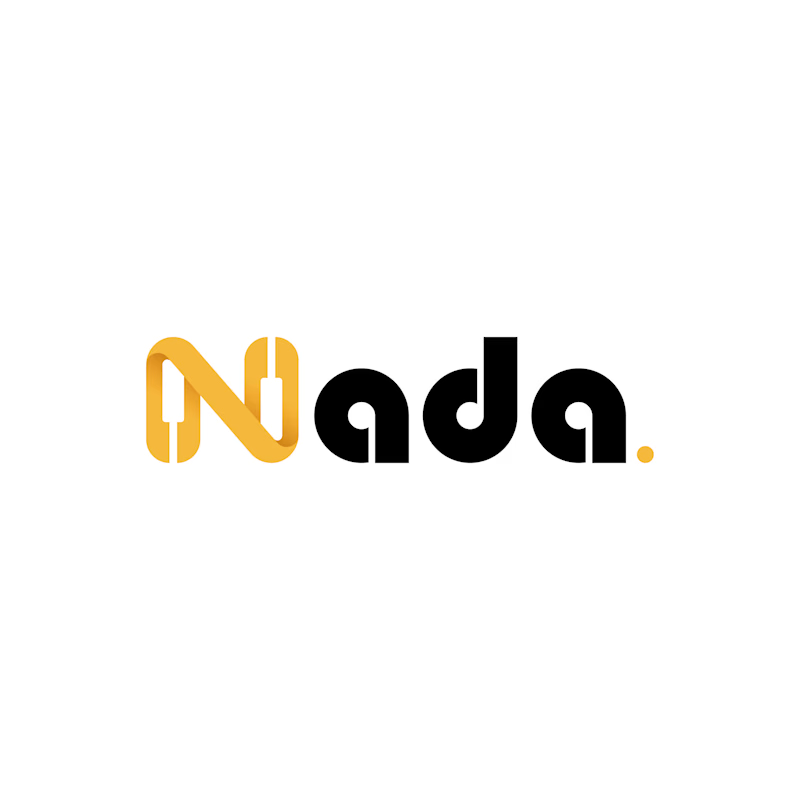
Challenge: Nada's old logo had a unique shape, but the "N" was hard to read and the design didn't connect to music.
Solution: I redesigned the logo with a piano-built "N" monogram and letterforms that carry music notes. A golden dot closes the wordmark like a final note. The warm gold stays, now paired with black for a more premium look.
Result: A clearer, more memorable logo that tells the brand story at a glance. The client loved it.
1 vote
Ends in 1d
The network for creativity
Join 1.25M professional creatives like you
Connect with clients, get discovered, and run your business 100% commission-free
Creatives on Contra have earned over $150M and we are just getting started






Related posts

two brands, one tiny taste test.
would you rather look through an Oriel or answer a Calling?
winner gets the full brand. reply with your pick.
35 voted
85%
6 voted
15%
41 votes
Closed

The biggest misconception about branding is thinking it's just a logo. What actually saves founders time and money later is a compact system a focused 2–3 color palette and clear sub-brand rules so every new deck, social post, or product launch looks cohesive without starting from scratch.

Had some fun with this one.
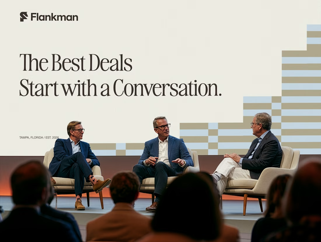
Exploring how typography, colour, and a few unexpected details can give a brand its own personality.
Meet Flankman. Full case study is live! ↓




clean


How far can you take a logo beyond the first draft?
I started with Recraft's Logo Maker and a fictional idea: Bibu's Paws, a cosy little dog rescue and adoption shelter.
I wanted the identity to feel warm, homely and full of character, so I explored a few logo directions before settling on the little dog tucked inside a house.
From there, I took the idea further, building out the visual identity with an earthy colour palette, typography, illustrations and a few real-world applications: the shelter space, dog merchandise and an adoption welcome kit.
I enjoyed seeing how a small starting point could grow into a brand with its own personality and world.
Now I'm curious: if you were building a brand around this logo, what would you create next?






It turned out so cozy, you did great